IndexStyle
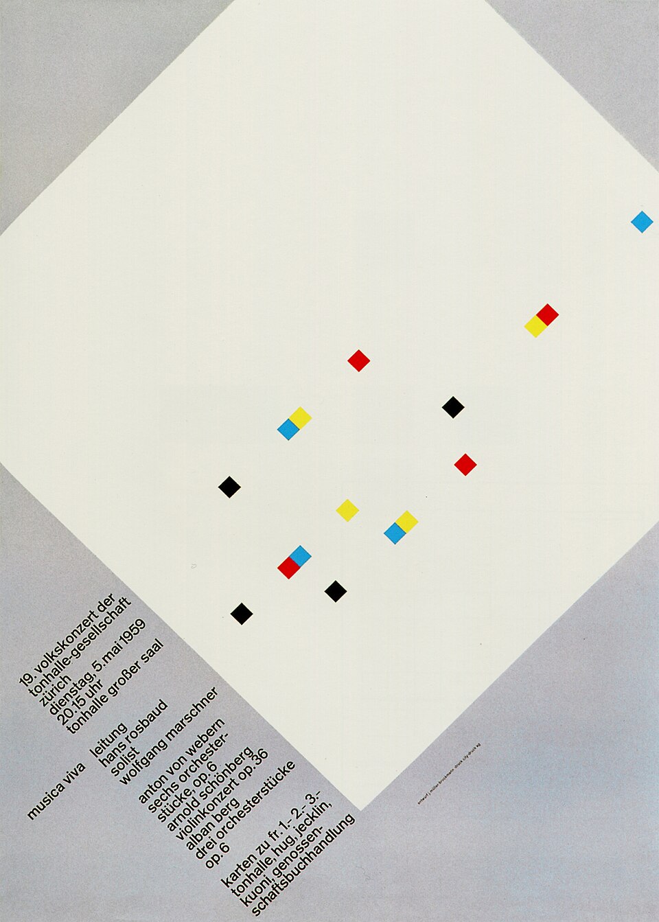
Puts order front and center and makes the information itself the protagonist.
Josef Müller-Brockmann, Musica Viva poster — Wikimedia Commons / Public domain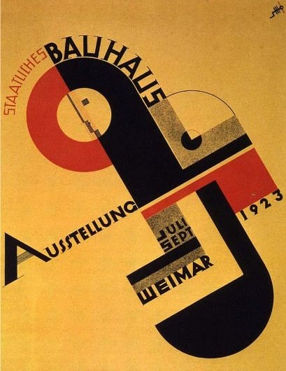
Makes function and play coexist through the circle, triangle and square.
Joost Schmidt, Bauhaus Exhibition 1923 poster — Wikimedia Commons / Public domainTurns a message into motion with diagonals and hard contrast.
El Lissitzky, Beat the Whites with the Red Wedge, 1919 — Wikimedia Commons / Public domain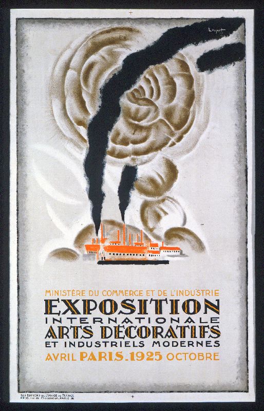
Stages urban luxury with repeating geometry and a metallic sheen.
Poster for the 1925 Paris International Exposition of Decorative Arts — Wikimedia Commons / Public domain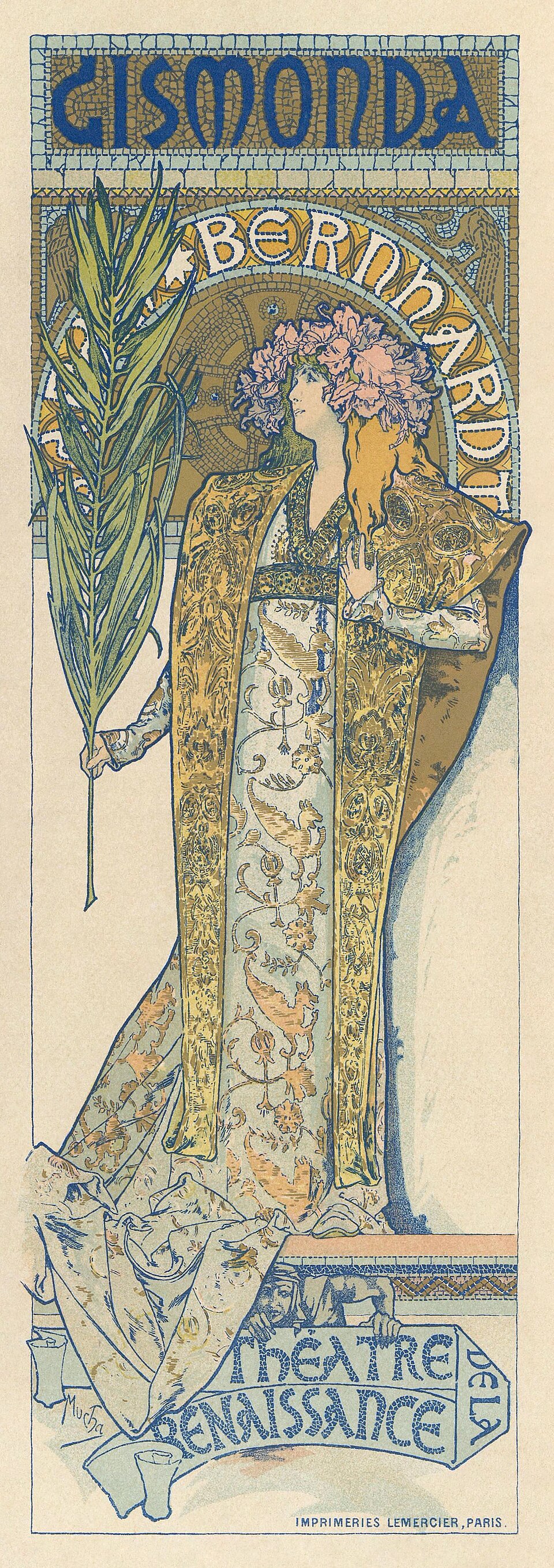
Joins letters, figures and ornament into one flowing, plant-like line.
Alphonse Mucha, Gismonda poster, 1894 — Wikimedia Commons / Public domainReplaces ornament with reasoned form and aims at universality. The particular answers stand as their own entries, and Bauhaus, Swiss, Minimalism and Streamline Moderne are all separate solutions arrived at from this one stance.
Mies van der Rohe, Barcelona Chair and the Barcelona Pavilion — Wikimedia Commons / CC BY-SA 4.0 · © Cl3phact0Removes elements to maximize the meaning and tension of what remains.
Dan Flavin, Untitled (to Don Judd, Colorist) 1–5, 1987, Tate Modern — Wikimedia Commons / CC BY 2.0 · © Grand Parc—Bordeaux, France from France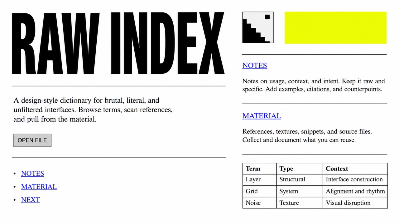
AI interpretation, not a reference
Puts the browser's default rendering straight on screen and refuses the finished look of templates. The bare structure of the HTML becomes the style itself.
Adds hand-felt curves and warmth to rational geometry.
Charles and Ray Eames, Lounge Chair, 1956 — Wikimedia Commons / CC BY 2.0 · © Casey MarshallBuilds cheerful nostalgia from thick round shapes and earthy warm color.
Zazpiribai performance poster (Basque Country), 1972 — Wikimedia Commons / CC BY 3.0 · © http://www.badok.info/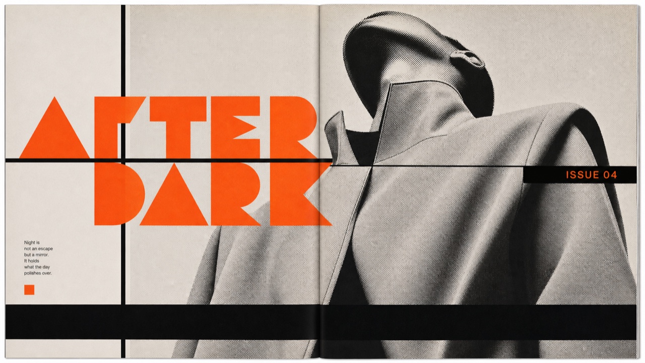
AI interpretation, not a reference
Redraws its headline letters and section marks issue by issue, then sets them into a page of heavy rules and black bars with the same weight as the photographs.
A DIY objection to the authority of the tidy, made by cutting, pasting and dirtying.
Hüsker Dü concert flyer (Goofy's Upper Deck) 1982 — Wikimedia Commons / CC BY-SA 4.0 · © Hoff EntertainmentDoubts the single right answer and mixes quotation, irony and ornament as play. The answers per field stand as their own entries, with Memphis in furniture, Postmodern Architecture in building, and New Wave on the page.
Alessandro Mendini, Poltrona di Proust, 1978 (Studio Alchimia) — Wikimedia Commons / CC BY-SA 4.0 · © SailkoDismantles an achieved order and makes tension and instability the new structure.
Frank Gehry, Guggenheim Museum Bilbao, 1997 — Wikimedia Commons / CC BY-SA 4.0 · © kallernaMelts contour and color until reality itself starts to sway.
Helix vol. 1 no. 8 cover, 1967 — Wikimedia Commons / Public domainReplays the future the 1980s imagined, in neon and horizon lines.
G. Casqueiro, Chase The Sun, 2019 — Wikimedia Commons / CC BY-SA 3.0Keeps punk's freedom while re-editing color and grid with urban polish.
April Greiman, Design Quarterly 133: Does It Make Sense?, 1986 — Wikimedia Commons / CC BY-SA 4.0 · © MadeInSpace.laAmplifies the vocabulary of ads and comics until mass culture itself becomes the picture.
Andy Warhol, Campbell's Soup Cans, on view at MoMA — Wikimedia Commons / CC BY-SA 2.0Laughs off functionalism and enjoys the dissonance of shape and color.
Ettore Sottsass, Carlton, 1981 — Wikimedia Commons / CC BY 3.0 · © Sailko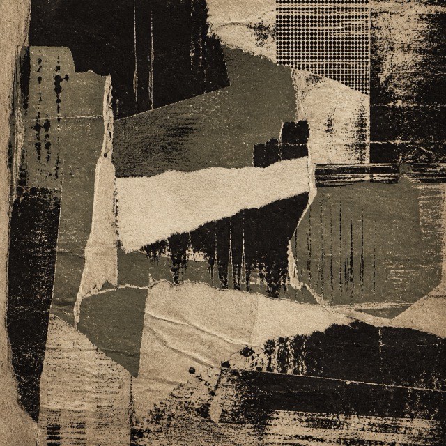
AI interpretation, not a reference
Uses dirt, tears and wear as resistance to the neatly managed screen.
Reuses the naivety of the constrained early web as directness and charm. In the 2020s it came back as a movement to take the personal site back, gathering under names like Neocities and Yesterweb.
Netscape Navigator 1.22 screen — Wikimedia Commons / CC0Expresses optimism for the new millennium in translucent plastic and rounded futures. Its shine comes from resin and metal you could hold rather than from a screen, which separates it from the interface gloss of the same years.
Marc Newson, Ford 021C, 1999 — Wikimedia Commons / CC BY-SA 4.0 · © TaurusEmeraldExplains digital interaction as something touchable through gloss, roundness and reflection. It names what the web made when it tried to reproduce the texture of Aqua with images and CSS.
CreativeAlys 3D business icon set — Wikimedia Commons / CC0Borrows cues from real materials and tools to make unknown interactions understandable. It names the principle, so Aqua and Brushed Metal are what the principle looked like when one company shipped it.
Flachatmer, guitar amp skeuomorphic UI, Guitarix 0.35.0, 2016 — Wikimedia Commons / CC BY-SA 4.0Makes background and controls one material, showing relief through soft shadow alone.
Vectorium, Neumorphic UI elements, 2020 — Wikimedia Commons / CC BY-SA 4.0Shows depth and hierarchy through translucent layers, floating information lightly.
Apple, Spotlight in macOS Big Sur — Wikimedia Commons / Public domainTurns memories of consumer society and early digital life into dreamlike unease.
Ostarisk, Vaporwave art example, 2017 — Wikimedia Commons / CC BY-SA 4.0Advanced technology and ruined daily life share the same frame, so the future arrives as promise and as threat.
Neon signs in Kabukicho, Shinjuku — Wikimedia Commons / CC BY 4.0 · © ノボホショコロトソLayers quantity, color and pattern without fear, making excess itself the richness.
Victorian parlour of the 19th century, Auckland — Wikimedia Commons / CC BY-SA 3.0 · © Jorge RoyanSummons mystery, awe and permanence through verticality and dark ornament. What is described here is the medieval body of work; the nineteenth-century movement that dug it up stands separately as Gothic Revival.
North rose window, Chartres Cathedral — Wikimedia Commons / Public domain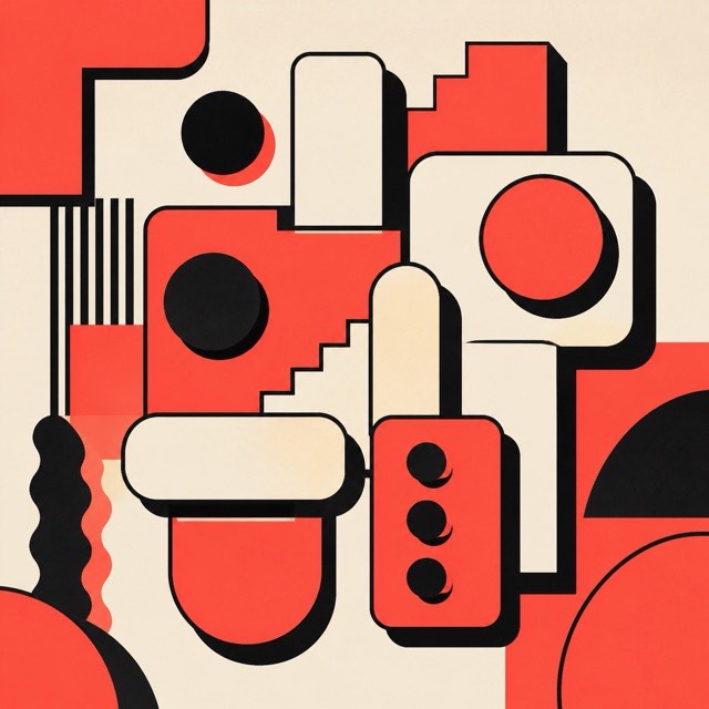
AI interpretation, not a reference
Rebels warmly against the over-polished web with thick borders and blunt color.
Reduces information to plain planes and color, portable across screens and media.
Google, Material Design UI components, 2015 — Wikimedia Commons / Public domainPaints vague hope for the future in the teal glow bleeding through club darkness.
Green room of the Ultraschall club, Munich, 1997, photo by David Weber — Wikimedia Commons / CC BY-SA 4.0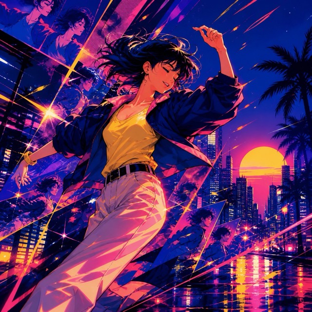
AI interpretation, not a reference
Re-edits 1980s Japanese pop at high speed into dazzling euphoria.
Extends steam-age materials and machinery into a tangible alternate history.
Machinery plate from Dickinson's Comprehensive Pictures of the Great Exhibition, 1854 — Wikimedia Commons / Public domain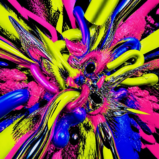
AI interpretation, not a reference
Slams fluorescent color and distortion together at high pressure, shaking the eye with aggression.
Refuses to hide error and corruption, exposing the fragility of the digital medium itself.
Glitch art by James Connolly and Eric Pellegrino — Wikimedia Commons / CC BY-SA 4.0 · © jonCatesRecalls toys, stickers and school supplies in unconditionally bright color.
Rainbow Decora, photo by KazumiKawaii, 2016 — Wikimedia Commons / CC BY-SA 4.0Steps away from the norms of skill, making plain observation and imbalance the charm.
Henri Rousseau, A Carnival Evening, 1886 — Wikimedia Commons / Public domainInstead of a finished object it shows the lines of the thinking behind it, communicating structure and possibility.
Blueprint of the University Bridge, 1915, Seattle — Wikimedia Commons / CC BY 2.0 · © Seattle Municipal Archives from Seattle, WAKeeps the per-color plates and their happy misregistration, giving each copy its own body heat.
Two colour risograph print, 2014 (CC BY 2.0) · © Mario Felipe
AI interpretation, not a reference
Divides different kinds of information into independent boxes, giving the whole picture at a glance.
Keeps depth while looking down from above, explaining relationships among many parts in a single image.
オーギュスト・ショワジー《ビザンティンの建築術》図版18 コンスタンティノープル 1883年 — Wikimedia Commons / Public domainRefuses to oppose nature and technology, painting a bright future that is tended by hand.
Solarpunk illustration (CC BY 4.0) · © The.lemonaut.ukrConnects African diasporic history, culture and future, reclaiming stolen time and new possibility.
Sun Ra, 1973 — Wikimedia Commons / Public domainBorrows the shadows of old scholarly rooms to build an obsession with knowledge and a secretive intimacy.
The Long Room, Trinity College Library (CC BY-SA 4.0) · © Diliff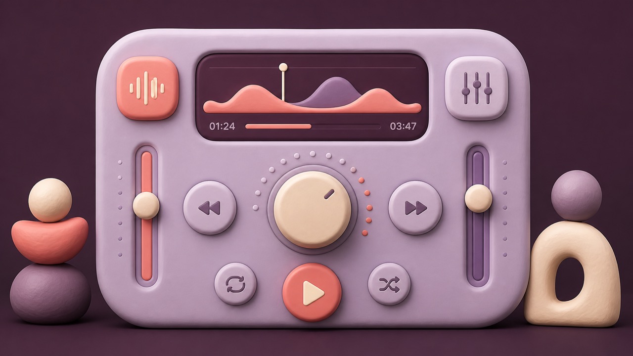
AI interpretation, not a reference
Makes digital components soft and playable with rounded, clay-like volume.
AI interpretation, not a reference
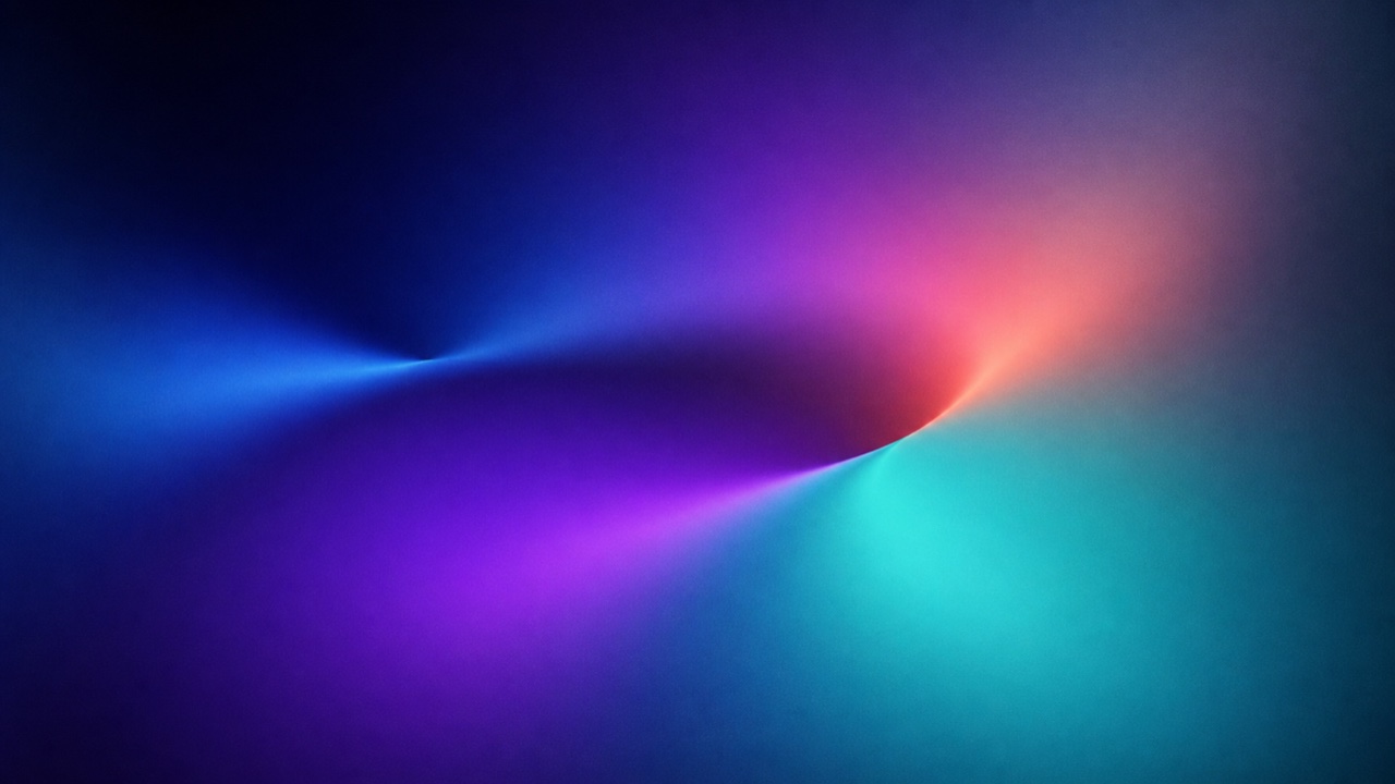
Blends several color focal points smoothly, giving a flat plane the depth of light and atmosphere.
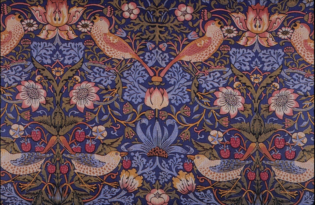
Returns material and handwork to the center of design, joining every detail of daily life under one conviction.
William Morris, Strawberry Thief, 1883 — Wikimedia Commons / Public domainBuilds a thickly layered system of ornament from many revival styles and the riches of industrial printing.
Owen Jones, The Grammar of Ornament, Plate LX, 1868 — Wikimedia Commons / Public domainTightens organic ornament with geometry and flat composition, erasing the border between art and design.
Alfred Roller, XIV Vienna Secession exhibition poster, 1902 — Wikimedia Commons / CC BY 2.0 · © Jean-Pierre DalbéraCuts advertising down to the product and its name, delivering meaning at a glance from across the street.
Lucian Bernhard, Priester Matches poster, c. 1905 — via People’s Graphic Design Archive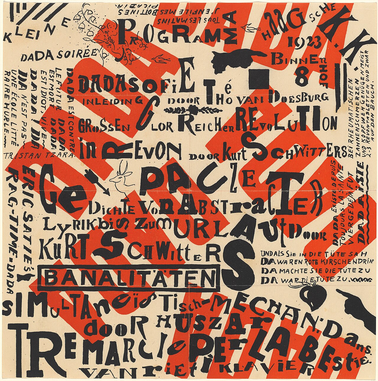
Deliberately dislocates meaning and order, making authority itself the material of the joke.
Theo van Doesburg & Kurt Schwitters, Kleine Dada Soirée, 1922 — Wikimedia Commons / CC0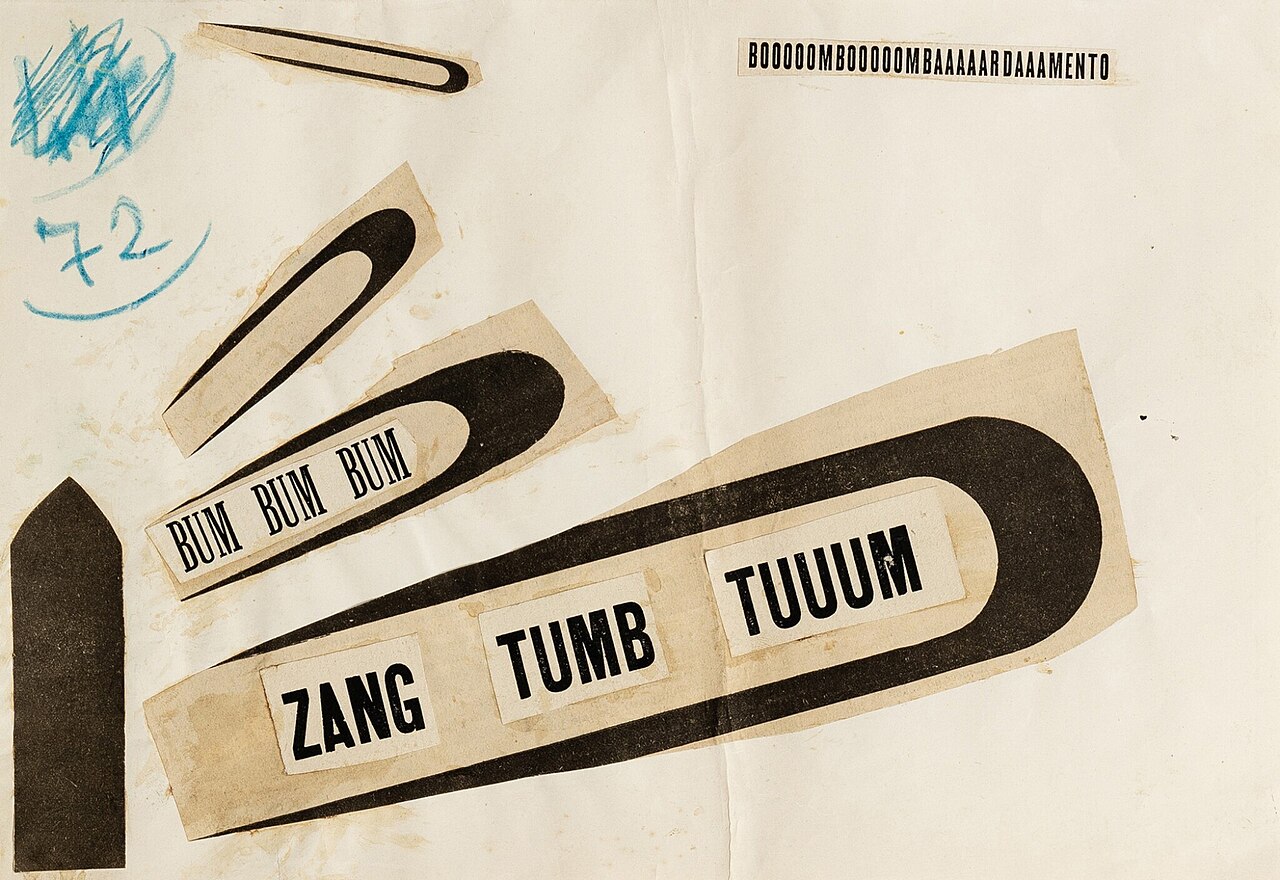
Converts speed, noise and shock into the size and trajectory of letters, setting the quiet page in motion.
Filippo Tommaso Marinetti, ZANG TUMB TUUUM, 1915 — Wikimedia Commons / Public domain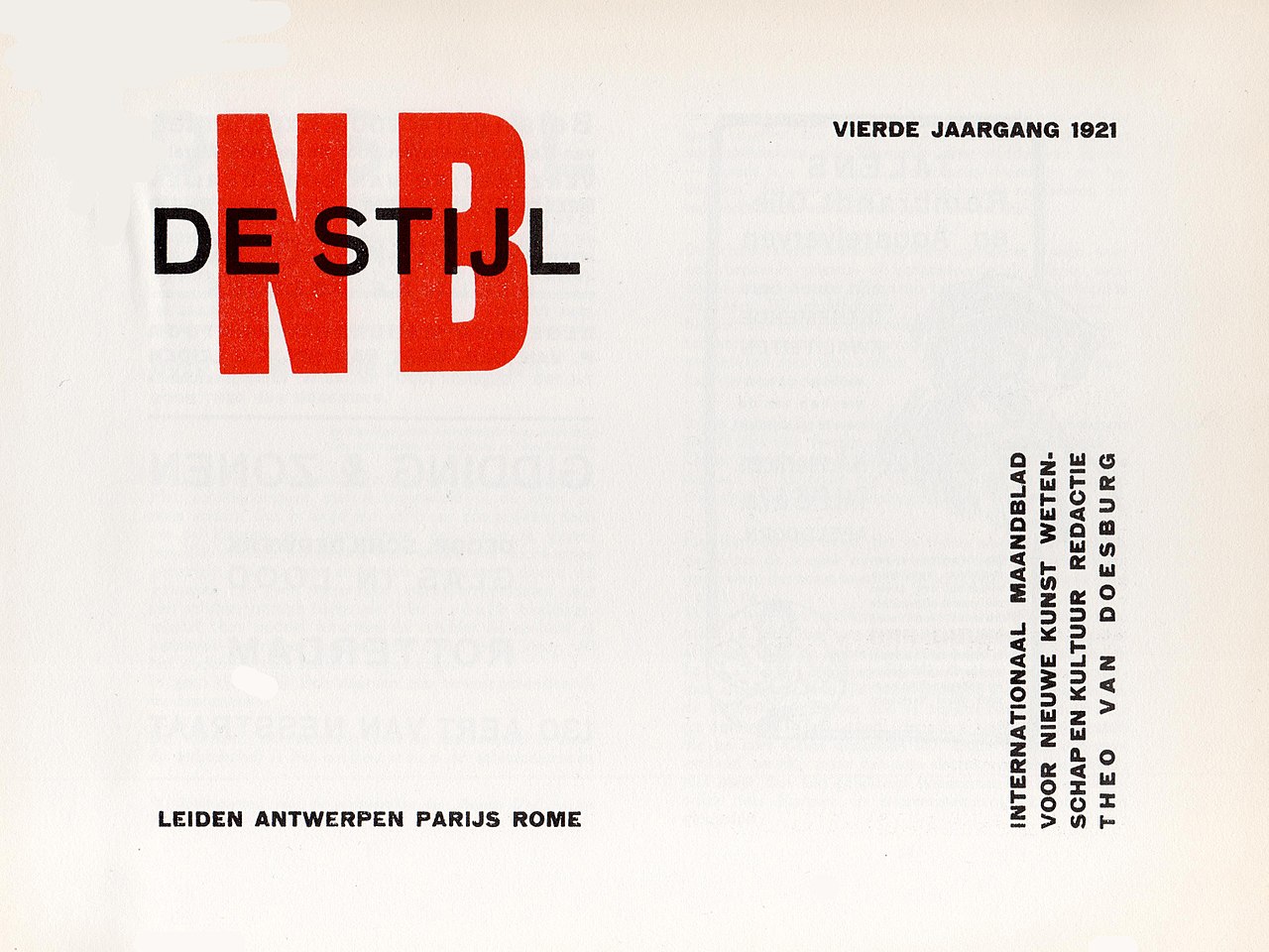
Restricts the vocabulary to vertical, horizontal and primary color, building universal order from balance.
De Stijl magazine, vol. 4 no. 3 front cover, 1921 — Wikimedia Commons / Public domain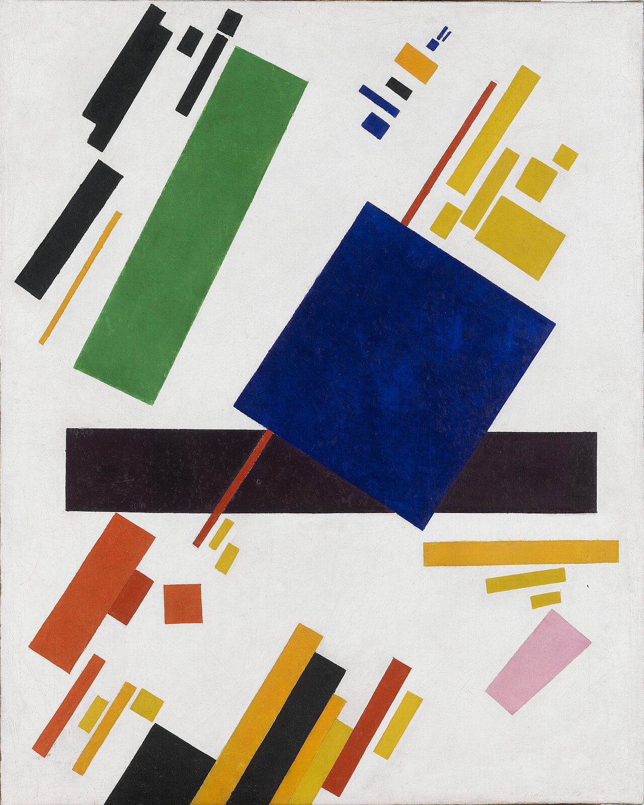
Leaves depiction behind, raising felt tension from a few geometric forms and empty space.
Kazimir Malevich, Suprematist Composition, 1916 — Wikimedia Commons / Public domain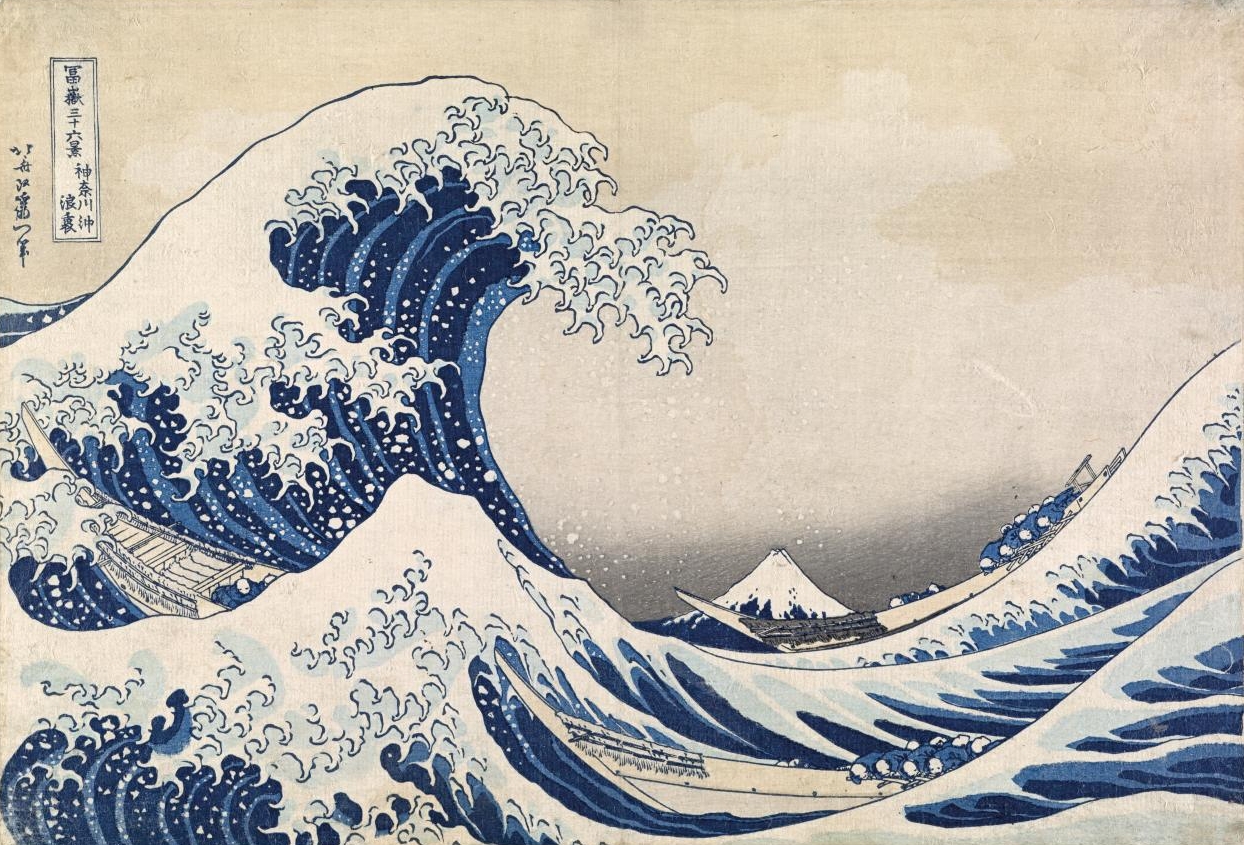
Fixes a passing moment of daily life or landscape into strong composition with contour, flat color and daring crops.
Katsushika Hokusai, Under the Wave off Kanagawa, c. 1830–32 — Wikimedia Commons / Public domainCarries a public purpose broadly and forcefully through simple imagery and few printed colors.
Harry Herzog / Federal Art Project, See America, 1936–40 — Library of Congress / No known restrictions on publicationTranslates quantity into repeated same-size symbols, making comparison readable before language.
Otto Neurath & Gerd Arntz, Gesellschaft und Wirtschaft, 1930 — via gerdarntz.orgArranges words into the shape of what they say, so that reading and seeing happen in the same moment.
Guillaume Apollinaire, Il pleut, 1918 — Wikimedia Commons / Public domainFixes the outline of a light-struck object directly into deep blue, making record and lyric the same image.
Anna Atkins, Dictyota dichotoma, 1843–53 — Wikimedia Commons / Public domainPrints the surface left after carving, raising an image through line direction and the pressure of black and white.
Albrecht Dürer, The Four Horsemen, 1498 — Wikimedia Commons / CC0Cuts the smooth block boldly, giving few colors and repeated figures a driving rhythm.
Ethel Spowers, Wet Afternoon, 1930 — Wikimedia Commons / Public domainSets physical type, joining the repeatable order of text with the touch of impression on paper.
金属活字 — Wikimedia Commons / CC BY 2.5 · © Willi HeidelbachColor floated on liquid is lifted onto paper once and only once, producing an order that cannot be repeated. It names the family, and under it sit separate disciplines: Turkish ebru, combed into figures, and Japanese suminagashi, disturbed by breath and brush.
Unknown maker, French marbled endpaper, c. 1735 — Wikimedia Commons / Public domainBuilds print color stencil by stencil, giving publications the crisp planes and fine variance of hand coloring.
Gazette du Bon Ton, “Mirage” by Paul Poiret, 1920 — Wikimedia Commons / CC0Weaves text, image and gilding into one page structure, turning reading into ritual.
Book of Kells, Chi Rho monogram, c.800 — Wikimedia Commons / Public domainWith only ink gradations and emptiness, keeps a subject's presence, speed and distance rather than its shape.
Sesshū, Haboku Landscape, 1495 — Wikimedia Commons / Public domainDivides light with colored glass and lead lines, making contour itself structure and story.
North rose window, Chartres Cathedral — Wikimedia Commons / Public domainRaises perceptual vibration and depth inside a still image through repeated line, form and value.
ブリジット・ライリー《Bolt of Colour》(シナティ財団, マーファ) — Wikimedia Commons / CC BY-SA 4.0 · © ColmandavidRe-edits asymmetry, flatness and daring crops learned from Japanese prints into Western modern composition.
Van Gogh, Portrait of Père Tanguy, 1887 — Wikimedia Commons / Public domainHides the picture plane's boundary, aligning material, shadow and scale until you believe the thing is there.
Borrell del Caso, Escaping Criticism, 1874 — Wikimedia Commons / Public domainShows glossy digital technology as an approachable future by tying it to blue sky, water, grass and bubbles. The gloss is the same as Aqua's, but Aqua is the texture of a control and this is the world of the wallpaper and the advert.
Frutiger Aero example (CC0)Explains digital services as safe and friendly through simplified figures, geometry and soft color.
Katharina Brenner, Illustration in the Corporate Memphis style, 2019 — Wikimedia Commons / CC BY 4.0Edits nostalgic spaces by the logic of dreams, producing images like memories in which comfort and wrongness sit together.
Dreamcore example (door on a hill and a rainbow) — Wikimedia Commons / CC0Layers low-res images, unrelated text and warped symbols until reality's connections feel slightly broken.
Weirdcore example — Wikimedia Commons / Public domainPhotographs transitional spaces empty when people ought to be in them, drawing out déjà vu, loneliness and the sense that time has stopped. The subjects carry their own names in circulation, from the empty indoor pool to the night corridor to the mall after closing.
Empty shopping centre (CC BY-SA 4.0) · © JIPMixes ocean CG, turquoise, dolphins and 90s 3D with the music and fashion of the social-media age.
Seapunk example (CC BY-SA 3.0) · © Ridley369Treats the browser, the link, the transmission error and the network itself as both the material and the site of the work.
Teo Spiller, Capriccess for Netscape — Wikimedia Commons / CC BY-SA 4.0Uses limited characters on a monospace grid as pixels, building image and tone from text alone.
Image built from ASCII characters (CC BY 3.0) · © CopperwidthTreats the pixel as an honest unit, building clear form from limited resolution and palette.
Pixel art landscape (CC BY-SA 4.0) · © FahmirayanLeaves the few polygons and hard facet changes visible, using simplicity of form as the expression.
Low poly 3D model (CC0)
Rather than explain a film or a play, it turns the assignment into a psychological image built from painting, metaphor and hand-drawn letters.
Jan Lenica『Wozzeck』(1964、Culture.plより引用)Turns film promotion into independent interpretation through collage, fantastical rendering and experimental letters.
Poster for the Czechoslovak film Vtáčkovia, siroty a blázni, 1969 — Wikimedia Commons / CC BY-SA 4.0 · © Jakubisko Film Europe, SETurned printed matter into rational information structure through asymmetry, sans-serifs, photography and functional hierarchy.
Typographic collage by Moholy-Nagy, 1922 (CC BY 3.0) · © SailkoJuxtaposes anime, manga, advertising and traditional painting on one flat plane, questioning the border of high art and consumer culture.
Takashi Murakami, installation in the Hall of Mirrors at Versailles, photo: Dimitry B (CC BY 2.0)Cuts and rejoins photographic fragments, assembling relations and critical meanings that never existed in the original reality.
グスタフス・クルーツィス《全モスクワが地下鉄を建設する》1934年 — Wikimedia Commons / Public domainTreats the placement, repetition, blank space and sound of words as the poem itself, not only what they mean.
Mallarmé, Un coup de dés jamais n'abolira le hasard, 1897 — Wikimedia Commons / Public domainGives even stationary things speed and machine-age optimism through streamlines, horizontals, rounded corners and metal.
Greyhound Bus Terminal 1938 (CC BY 4.0) · © BmzuckermanPaints factories, silos, cities and machines reduced to clear contour, simple geometry and smooth planes.
Demuth My Egypt 1927 — Wikimedia Commons / Public domainLooks for perception only a camera can produce, using views from far above and far below, extreme close-ups and experiments with light.
Photogram by Moholy-Nagy — Wikimedia Commons / Public domainNo camera is involved. Objects laid on the sensitive surface and exposed to light turn contour, transparency and distance into the picture.
Photogram by Moholy-Nagy 1923 — Wikimedia Commons / Public domainRe-exposes the print mid-development, reversing part of the tonal scale into glowing edges and metallic light.
Print showing the Sabattier effect (CC BY-SA 4.0) · © N0TABENEPresented photography as art equal to painting, through soft focus, staged scenes and handworked prints.
Steichen The Pond — Moonlight 1904 / Public domain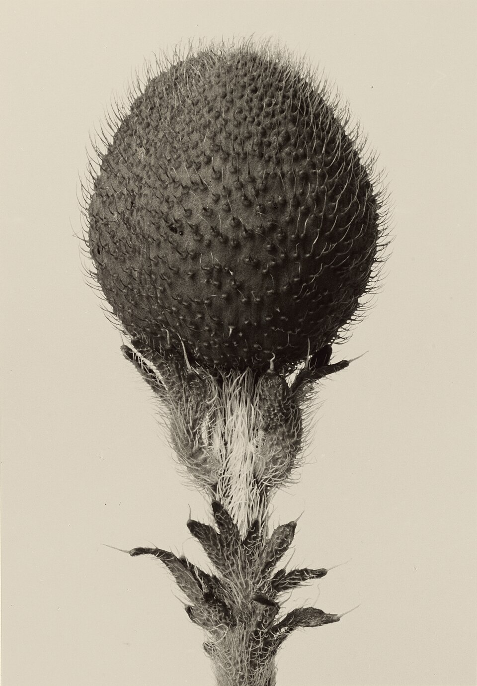
Steps back from sentiment and records the structure of people and things coolly: sharp focus, frontality, typology.
Plant photograph by Blossfeldt — Wikimedia Commons / Public domainDecomposes movement into successive instants, making the structure of time visible in one or a series of photographs.
Muybridge Chronophotography of a galloping horse 1878 — Wikimedia Commons / Public domain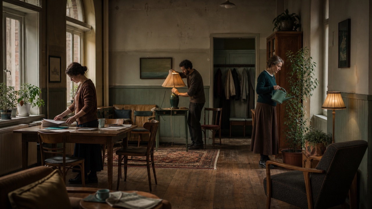
AI interpretation, not a reference
Assembles the scene before the shutter and holds it in a single print made to hang like a painting, its figures acting as if no viewer were there.
Extends asymmetric, continuous forms suggesting cells, bones, organs and plants into abstraction, furniture, vessels and space.
バーバラ・ヘップワース《Elegy III》(クレラー・ミュラー美術館) — Wikimedia Commons / Public domainStrips ornament and aims at a universal architectural language crossing borders: the box, the free plan, steel, concrete and glass.
Mies 860–880 Lake Shore Drive (CC BY-SA 2.5) · © User:JeremyAConceives city and building as one vast system that can grow, exchange and renew itself like an organism.
Nakagin Capsule Tower (CC BY-SA 3.0) · © Jordy MeowDucts, structure, elevators and joints, all of them normally hidden, are pushed to the outside so that the building reads as an enormous machine.
Rogers Lloyd's building (CC BY-SA 4.0) · © ColinAdapts modern architecture to hot, humid climates through canopies, louvers, ventilation and sun control.
Chandigarh Secretariat Building (CC BY-SA 3.0) · © Sanyam Bahga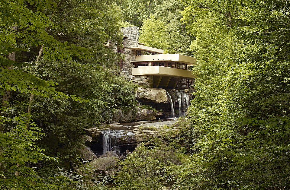
Refuses to treat building, furniture, material, terrain and light separately, designing them as one continuum that includes the place and the life lived in it.
Wright Fallingwater — Wikimedia Commons / Public domainObjects to functionalism and consumer society, critiquing architecture's own premises with fictional cities, furniture, photographs and collage.
Archizoom Superonda 1967 (CC BY 3.0) · © SailkoRebels against modernism's universality, reintroducing historical quotation, ornament, sign, color and irony to city and building.
Graves Portland Building 1982 (CC BY-SA 3.0) · © Steve MorganTheatricalizes roadside commerce with exaggerated roofs, neon, glass and space-age shapes readable in an instant from a car.
LAX Theme Building 1961 — Wikimedia Commons / CC0Translates the hopes of the space race into capsule forms, spheres, molded plastic, vivid color and lightweight furniture.
Aarnio, Ball Chair, 1963–65 (CC BY 2.5) · © sailkoA cultural movement that rebuilt Black self-representation and modernity in the words and images of Black people themselves, working through literature, music, theater, publishing and art.
The New Negro, first edition, 1925 — Wikimedia Commons / Public domainPaints post-revolutionary history, labor, indigenous culture and visions of the future onto the vast walls of public buildings.
Rivera, murals at the Palacio Nacional — Wikimedia Commons / CC0Visualizes Black communal affirmation and political consciousness through blazing color, rhythm, lettering and Africa-centered images.
Wadsworth Jarrell, Revolutionary, installation view (Loz Flowers, CC BY-SA 2.0)Carries transnational solidarity with anti-colonial liberation movements through flat color, photography, iconography and short multilingual text.
Che Guevara poster from Tricontinental — Wikimedia Commons / Public domainDivides, repeats and combines circles, squares, polygons and stars, building infinite extension and order on a finite plane.
Tilework at the Alhambra (CC BY 2.0) · © Sharon MollerusCondenses court life, history, nature and story into a small plane through precise brushwork, gold, pigments, ornamental borders and multiple viewpoints.
Bichitr, illustration from the Padshahnama — Wikimedia Commons / Public domain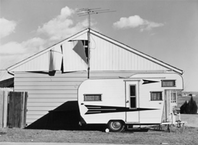
Turns from grand natural scenery to the landscapes people have altered, recording suburbs, graded building sites and industrial zones without heat.
Robert Adams『Tract House, Westminster, Colorado』(1974、SFMOMAより引用)Cuts distrust, isolation and fatalism into the frame with low-key lighting, deep shadow, oblique composition, the city at night, reflections.
Detour, 1945 — Wikimedia Commons / Public domainCuts and pastes handwritten and typed words, then copies them as they are, keeping the photocopier's crushed blacks and the crooked page.
ジン《Riot Grrrl》コンベンション告知のページ 1992年 — Wikimedia Commons/ CC BY 2.0 · © RockCreek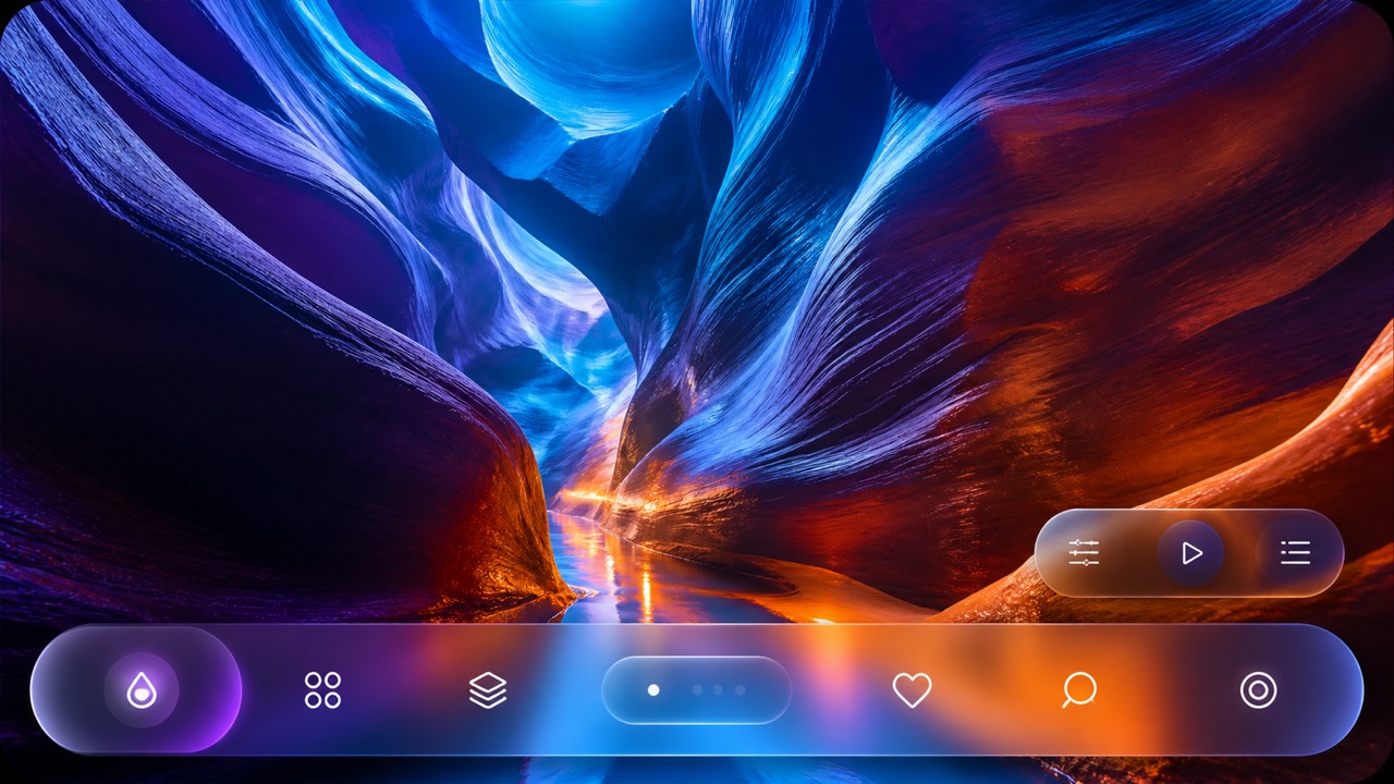
AI interpretation, not a reference
Unifies the floating control and navigation layer as a fluid glass material that refracts and adapts to the content beneath.

AI interpretation, not a reference
Tokenizes color, type, spacing, radius and depth, deploying Solid, Acrylic, Mica and Smoke materials by role across Microsoft products.
Values the act and the participation above the finished piece, working in scores, boxes, cheap multiples, performances and events until the border between art and daily life gives way.
Maciunas, Fluxus Manifesto, 1963 — Wikimedia Commons / Public domainTakes up earth, branches, cloth, stone, fire and metal, materials that are neither precious nor stable, and uses them to intervene in the commodification of art and the values of industrial society.
Mario Merz, igloo — Wikimedia Commons / Public domain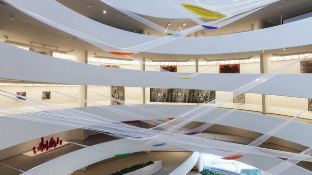
Acts directly on body, mud, paper, water, smoke and light bulbs, making the work an event in which spirit does not master material and each exposes the nature of the other.
『Gutai: Splendid Playground』展示風景(© Solomon R. Guggenheim Foundation、同館より引用)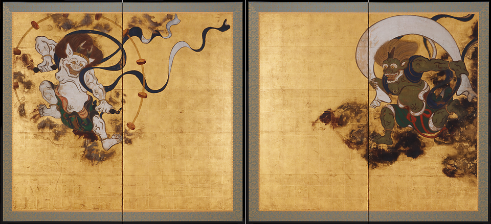
Gold and silver grounds, mineral pigment, simplified nature, empty space, repetition and tarashikomi run across its work, pulling painting, craft and calligraphy into one bold, flat composition.
Tawaraya Sōtatsu, Fūjin Raijin-zu byōbu (Wind and Thunder Gods), 17th century — Wikimedia Commons / Public domainJoins function and mass production to the warmth of natural materials, curves that follow the body, and clear usable form.
Aalto Vase (CC BY 4.0) · © Unknown author Unknown authorOn huge canvases, with bodily strokes, drips, stains and broad fields of color, what stays on the surface is the act of painting and strong inner feeling rather than a depicted subject.
Franz Kline, Sabra (Berardo Collection) — Wikimedia Commons / CC BY 2.0 · © Pedro Ribeiro Simões from Lisboa, PortugalLarge continuous fields, soaked edges and few forms build a space of color that fills the entire surface and asks to be looked at for a long time.
Interior of the Rothko Chapel (CC BY-SA 4.0) · © Alan IslasPuts the idea at the center of the work and presents it through words, definitions, rules, documentation and placement, caring little for finish as an object.
Kosuth, One and Three Chairs, installation view(CC BY 2.0) · © Gautier PoupeauShapes the landscape itself with earth, stone, branches, terrain and machinery, folding place, time, erosion and documentation into the work.
Smithson, Spiral Jetty 1970(CC BY-SA 4.0) · © NetherzoneReleases geometric abstraction from a fixed visual order and opens the work to touching, moving and entering, so that it becomes an experience that changes as the body takes part.
Lygia Clark, Bicho(CC BY-SA 4.0)Mixes vivid color, music, sand, plants, temporary structures and audience participation to criticize both the repression of military rule and the outsider's image of a 'tropical paradise.'
Oiticica, Penetrável (Inhotim)(CC BY 2.0) · © Marcelo CostaParts of a mesh screen are blocked and parts left open, and a squeegee forces ink through, printing hard contours and flat, strong color one layer at a time.
WPA screenprint poster, 1930s — Wikimedia Commons / Public domainUses the repulsion of oil and water to reproduce crayon and tusche drawing from stone or plate, keeping all the softness of the hand.
Daumier, Rue Transnonain 1834 — Wikimedia Commons / CC0Ink is left in lines and hollows cut below the surface of a metal plate, and heavy pressure drives damp paper into them, picking up precise lines and the trace of the plate's edge. How the plate is lowered gives each technique its name, so a plate bitten with acid is an etching and a plate roughened then burnished is a mezzotint.
Dürer, Melencolia I 1514 — Wikimedia Commons / Public domainThe whole plate is roughened to hold a deep black, then burnished back to raise the lights, so that the image emerges from soft velvet darkness instead of from lines.
Mezzotint by John Martin — Wikimedia Commons / CC0A needle draws through the acid-resistant ground and the acid bites the metal it exposes, cutting lines into the plate that are thin, fluid and close to handwriting.
Rembrandt, The Hundred Guilder Print c. 1649 — Wikimedia Commons / Public domainCapitals cut for stone, with geometric proportions and serifs, became the skeleton of the Latin alphabet and the archetype of authority for two thousand years.
Inscription on Trajan's Column 113(CC BY-SA 2.0) · © MumblerJamieThe manuscript hand compressed into dense black verticals, filling the page with an even darkness like woven cloth. It was also the first typeface of printing.
Gutenberg 42-line Bible, Genesis c. 1455 — Wikimedia Commons / Public domainSet the standard for text faces that read without fatigue: the pen's oblique axis and gentle stroke contrast.
Garamond type in the Plantin specimen c. 1585 — Wikimedia Commons / Public domainThe humanist cursive cast in type: slanted letters that made pocket books possible, later becoming the second voice beside roman.
Aldine Virgil 1501 — Wikimedia Commons / CC0Raising the axis toward vertical, sharpening the contrast between strokes and designing paper and ink along with the letter moved type past handwriting into an object made in its own right.
Baskerville's Virgil 1757 — Wikimedia Commons / Public domainA constructed roman that pushes the contrast of hairline and thick vertical stem to its limit, standing at once as the terminus of the Age of Reason and as a sign of luxury.
Bodoni, Manuale Tipografico 1818 — Wikimedia Commons / Public domainAdvertising swelled the didone's stems to extremes. The result was the earliest display type, built to shout across the street.
Fat face in the Caslon specimen book 1841 — Wikimedia Commons / Public domainSquare serifs as thick as the strokes turned letters into machine structures. Industrial society's advertising and notices found their sturdy voice.
Caslon slab serif specimen 1841 — Wikimedia Commons / Public domainWhen the letter dropped its serifs it was at first called grotesque, but its odd evenness became the new voice of notices and headlines.
The first sans serif type specimen c. 1816 — Wikimedia Commons / Public domainThe grotesque had its quirks removed and neutrality set in their place as the design goal. What came out became the voice of postwar rationalism and the global corporation.
Helvetica signage in the New York subway(CC BY-SA 4.0) · © DanTDIt reduced letterforms to the circle, the line and the triangle, trying to build the letters of a new era out of geometry rather than out of the habits of the hand.
Futura printed specimen(CC BY 2.0) · © James PuckettKeeping the roman's skeleton and proportions without serifs, it stays functional while remembering the hand, which made it the standard for public signage.
Underground roundel set in Johnston (CC BY 2.0) · © R/DV/RSGigantic letters cut from wood for broadside posters created the display vocabulary of extreme condensation, extension and ornament.
Wood type (CC BY-SA 4.0) · © MichellecornelisonThe engraver's thin, fluent line produced the ideal of the written hand, and it settled into the letter of formality, of society and of certificates.
Bickham's The Universal Penman 1733–43 — Wikimedia Commons / Public domainA trade that paints commercial lettering with brush and paint straight onto buildings and windows, giving the street a lettering that carries the trace of a hand.
Sign writer at work (CC BY 2.0) · © Peter DunningIt regularizes the kaisho skeleton into thin horizontals and thick verticals suited to carving, and with its uroko serifs it still carries the body text of Japanese.
Kangxi Dictionary 1827 — Wikimedia Commons / Public domainThe Japanese sans-serif of nearly even strokes: born for headline emphasis, it grew into the text face of the screen.
Japanese Gothic on a station name sign (CC BY 3.0) · © Bergmann at Japanese Wikipedia This photo was taken with Panasonic Lumix DMC-FX9Fixed-width letters born from the typewriter's mechanism, settled as the voice of work-in-progress: drafts, forms and code.
Sholes & Glidden typewriter 1873–78 — Wikimedia Commons / CC0A movement answering industrialized printing: type, paper, composition and binding unified under one ideal, remaking the book as a total work of art.
Kelmscott Press, The Works of Geoffrey Chaucer 1896 — Wikimedia Commons / Public domainThe illustrated medium that delivered the latest fashion in hand-colored prints, the ancestor of the magazine, the illustration and the style drawing.
Journal des Dames et des Modes, 1820 — Wikimedia Commons / CC0A menswear aesthetic that makes a work of the self through tailoring, cleanliness and restraint rather than ornament. From it come the plain suit and a long line of self-assertion through dress.
Portrait engraving of Beau Brummell — Wikimedia Commons / Public domainA reform movement that refused the corset and the trailing hem and redesigned clothing around health and freedom of movement. In dress it is what functionalism is in design.
Bloomer costume plate 1864 — Wikimedia Commons / Public domainThe 1920s woman who made the body's liberation visible in a straight silhouette, a short hem and bobbed hair, wearing the same period spirit that Art Deco gave to geometry.
Louise Brooks, c. 1926 — Wikimedia Commons / Public domainA popular kimono that carried bold abstract patterns and the bright colors of chemical dye on a cheap ikat technique. It was a Japanese modernism, translating Deco and the avant-garde into everyday dress.
Kitano Tsunetomi, Ashikaga Hon-Meisen poster — Wikimedia Commons / Public domainThe earliest street style: suits with wildly exaggerated shoulders and pegged trousers, by which Black and Mexican-American youth asserted their existence in a discriminatory society.
Young man in a zoot suit 1943 — Wikimedia Commons / Public domainCinched waists and long skirts of lavish fabric turned away from wartime utility clothing and brought the curve back, opening the golden age of postwar couture.
Display at a Dior exhibition (CC BY-SA 3.0) · © shakkoWorking-class youths appropriated Edwardian upper-class dress. Postwar Britain's first youth subculture, it set the pattern for every youth culture that followed.
Teds on a street in Southend 1977 (CC0)Slim Italian suits, scooters and modern jazz made a rebellion carried out through refinement, and completed the marriage of consumerism and youth culture.
Carnaby Street 1966 — Wikimedia Commons / No restrictionsRefusing ready-made clothes and mixing handwork, folk dress and secondhand finds, it made the counterculture visible and brought DIY and eclecticism into fashion.
Hippies in Haight-Ashbury 1967 — Wikimedia Commons / Public domainThe practical menswear system of America's East Coast universities, whose button-downs and blazers taught a broken-in correctness that reached the world through Japan and became the standard of trad.
J.PRESS scarlet blazer with white shirt and black knit tie 2021 — Wikimedia Commons / CC BY-SA 4.0 · © Matthew.eyesBronx youth culture turned sportswear and gold into a language of self-expression, and in fifty years it travelled from the street to the center of luxury.
Run-D.M.C. 1984 (CC BY 4.0) · © Ian Dryden, Los Angeles TimesThe aesthetics of black dress born from post-punk music, borrowing Victorian mourning and horror-film signs to make darkness a communal style.
Whitby Goth Weekend (CC BY-SA 2.0) · © Christine MatthewsA Japanese street style referencing Rococo and girls' culture, building a community that constructs cuteness for oneself, not for the gaze of others.
Gothic Lolita, Harajuku (CC BY-SA 4.0) · © ToastchanTans, bleached hair and heavy makeup inverted everything school called correct. Born in Shibuya, it was a communal fashion that magazines and the street updated together.
Gyaru, Ikebukuro 2009 (CC BY-SA 3.0) · © NesnadA Harajuku style that layers masses of hairclips and toy-like accessories until sheer quantity becomes the organizing principle. It is maximalism worked out on the body.
Everjean 撮影 原宿 2005年 — Wikimedia Commons / CC BY 2.0The Congolese Society of Ambience-Makers and Elegant People turns the flawless wearing of vivid suits into a practice of dignity. It is a peaceful dandyism whose weapon is dress.
Sapeurs in Brazzaville (CC BY 2.0) · © Enric BachPuts a large printed image or logo at the center, and shows the body as a broad face of heavy cloth rather than a silhouette.
Supreme store in Paris (CC BY-SA 4.0) · © The i-iThe trend-forecasting group K-HOLE gave a name to stepping out of the race to differentiate and choosing a plainness that can connect with anyone. Naming it turned fashion discourse on its head.
Normcore outfit, 2014 — Wikimedia Commons / CC BY-SA 3.0 · © Rossco wmThe couture avant-garde of the 1960s translated the optimism of the space race into experiments with material, using metal, plastic and geometric cuts to present the body as an object of the future.
Pierre Cardin exhibition, 2019 (CC BY 2.0) · © MaureenWarped sets, painted shadows and extreme contrast turned a character's inner state directly into landscape, bringing a scenery of the mind into cinema.
Still from The Cabinet of Dr. Caligari, 1920 — Wikimedia Commons / Public domainAn editing theory that generates meaning from the collision of opposing shots. Meaning lives not in the single image but in the gap between two.
Battleship Potemkin, the Odessa Steps, 1925 — Wikimedia Commons / Public domainDialogue and description were cut into the film as separate cards of type. This is where cinema and typography first met.
Intertitle from Chaplin's The Kid, 1921 — Wikimedia Commons / Public domainBrought saturated color to cinema by separation negatives and dye transfer, fixing 'color more vivid than reality' in film memory.
The Toll of the Sea lobby card, 1922 — Wikimedia Commons / Public domainCinema that left the studio to film non-professional actors in the street, taking postwar poverty and daily life as its subject and standing on the side of reality.
Anna Magnani in Rome, Open City, 1945 — Wikimedia Commons / Public domain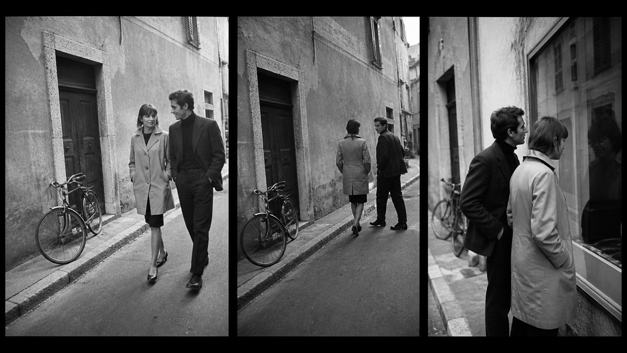
AI interpretation, not a reference
Critics picked up cameras and went out into the street, using handheld shots, jump cuts and self-reference to turn the grammar of film into a playground.
It carves form out of strong contrast and lets light itself tell the story and carry the feeling. The grammar of that light runs from painting through to film noir.
Caravaggio, The Calling of Saint Matthew, 1599–1600 — Wikimedia Commons / Public domainPainting what was felt rather than what was seen. Warped forms, violent brushwork and unnatural color moved the anxiety of the city and the age straight onto the surface.
Kirchner, Berlin Street Scene, 1913 — Wikimedia Commons / Public domainKeeps the uprights short and draws the horizontals long, massing letters of straight strokes and right angles into a band of even height.
Kufic Qur'an manuscript, 8th–9th century — Wikimedia Commons / Public domainMultiple viewpoints, jewel-like pigments and a composition unafraid of empty space paint poetry and history as complete worlds contained inside a book.
Sultan Muhammad, The Court of Gayumars, 1520s — Wikimedia Commons / Public domainPilgrims bought these paintings by the sheet at the temple gates of Calcutta, where thick contours and bold omission rendered gods and social satire in the same hand.
Kalighat painting, 19th century — Wikimedia Commons / CC0Women of the Mithila region in Bihar have painted these festival images on walls and floors for generations. Pattern crowds out every empty space, and the mythic imagery is still alive and still being updated.
Mithila painting (CC BY-SA 3.0) · © Bhuvana MeenakshiJavanese cloth resisted with wax and dyed over and over again. The line drawn by the canting builds a pattern system that also speaks of rank, region and rite.
Artisan applying wax with a canting (CC BY-SA 4.0) · © AhaetullaJavanese shadow theater works pierced leather puppets between a lamp and a screen, and in doing so perfected a formal language of contour, silhouette and the stylized profile.
Wayang kulit performance (CC BY-SA 4.0) · © FaizAttariqiThe strip-woven cloth of Ghana's Asante and Ewe gives every color and every pattern a name and a meaning, so that wearing it makes a statement.
Kente from Tafi, Volta Region — Wikimedia Commons / CC0The Akan compressed their proverbs into figures and stamped them onto cloth with gourd blocks. One shape carries one thought, which makes the set a working graphic language.
Adinkra cloth — Wikimedia Commons / Public domainBamana cloth from Mali is drawn with fermented river mud. Iron reacting with plant dye yields a black-and-cream geometry that records story and protection.
Bogolanfini (CC BY-SA 4.0) · © RhodapenmarckNdebele women in South Africa paint high-chroma geometry across the walls of their houses. The straight lines are ruled by hand alone, and the house itself becomes a banner of resistance and identity.
Ndebele painted architecture (CC BY 4.0) · © Angela AbelPortugal's blue-and-white tile works as the skin of architecture, opening story, map and ornament onto the street until the city itself can be read as a printed plate.
Azulejos at São Bento station (CC BY-SA 4.0) · © John SamuelFor Mexican festivals dozens of sheets of tissue are chiseled through at once. The delicate openings let light and wind pass, and they carry celebration and remembrance of the dead with the same lightness.
Papel picado for the Day of the Dead (CC BY-SA 4.0) · © Thirty twoMoves flat cut paper shapes and hand drawn capitals along simple straight paths in time with the music, stating the theme before the film begins.
Saul Bass, Spartacus title logo 1960 — Wikimedia Commons / CC0UPA's animators dropped Disney-style dimensional realism for flat color fields, simplified lines and stylized movement, bringing mid-century graphic sensibility into animation.
UPA, Hell-Bent for Election 1944 film fragment — Wikimedia Commons / Public domainDeliberately reduces the number of drawings, using held frames, repeats and partial movement as style. UPA established it as an aesthetic; television and Japanese commercial animation grew it into grammars of their own.
UPA, Hell-Bent for Election title card 1944 — Wikimedia Commons / Public domainThe division-of-labor technique of painting only the moving parts on transparent celluloid layered over a still background. It defined the industrial structure of commercial animation for nearly a century.
Winsor McCay, The Sinking of the Lusitania cel 1918 — Wikimedia Commons / Public domainMoving puppets and models one frame at a time to give matter life. The faint tremor of handwork and the presence of real materials remain a charm CG cannot replace.
Willis O'Brien, The Lost World 1925 — Wikimedia Commons / Public domainTracing live-action footage frame by frame. Patented by the Fleischers, it mixes the gravity of live action with the freedom of drawing into a distinctive wavering line.
Koko the Clown, born of rotoscoping 1924 — Wikimedia Commons / Public domainFilm art that translates musical structure into abstract shape, color and motion. From the color organ through abstract animation to today's audiovisual work, it forms a lineage of listening with the eyes.
Richard Monkhouse, Image from the EMS Spectre video synthesiser 1977 — Wikimedia Commons / CC BY 3.0 · © Richardmonkhouse at English WikipediaImages made without a camera, by drawing, scratching and pasting directly onto the filmstrip. The film stock itself becomes the brushstroke and the rhythm.
Norman McLaren drawing directly on film 1944 — Wikimedia Commons / Public domainLong exposure through a slit while the camera or the subject moves, stretching space and time into a single image. The Stargate sequence of 2001: A Space Odyssey wrote it into film history.
Self-portrait made with a slit shutter camera (Steve Mann, CC BY-SA 3.0) · © Glogger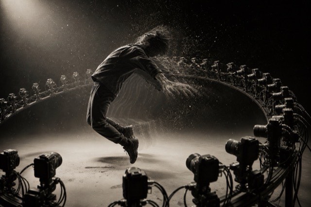
AI interpretation, not a reference
An arc of still cameras fired at once or in sequence: time nearly stops while the viewpoint alone moves. The Matrix popularized the idea of the virtual camera.
The calibration image broadcast during setup and downtime. Color bars, grids, circles and skin-tone references answered an engineering necessity, yet they became a public geometry lodged in a generation's memory.
SMPTE RP219 colour bars (CC BY-SA 4.0) · © Chris319The countdown at the head of a print, there for synchronization and inspection. Reversed lettering, punch holes and numbers falling from 8 to 2 were purely functional shapes, and they turned into the cultural sign that the film is about to start.
Scan of a film leader countdown 3 — Wikimedia Commons / CC BY-SA 4.0 · © YLP24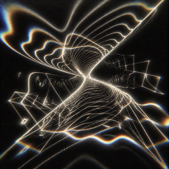
AI interpretation, not a reference
An analog video synthesizer that distorted images on a CRT electrically and in real time. It is the true source of the glowing, flying, undulating logos of 1970s and 80s television, and it carried the motion industry before digital.
Generating and modulating the video signal itself like an instrument. Nam June Paik and Shuya Abe's synthesizer turned the television from receiver into raw material, opening video art's technical ground.
Nam June Paik, TV Cello (CC BY 2.0) · © Sarah StierchDeliberately breaking a video's keyframes so that the previous image is dragged along and dissolved by the next motion. The technique turns the inner workings of the compression algorithm into an aesthetic.
Mosh caused by video compression corruption (CC BY-SA 4.0) · © 3dollarsinmybankaccount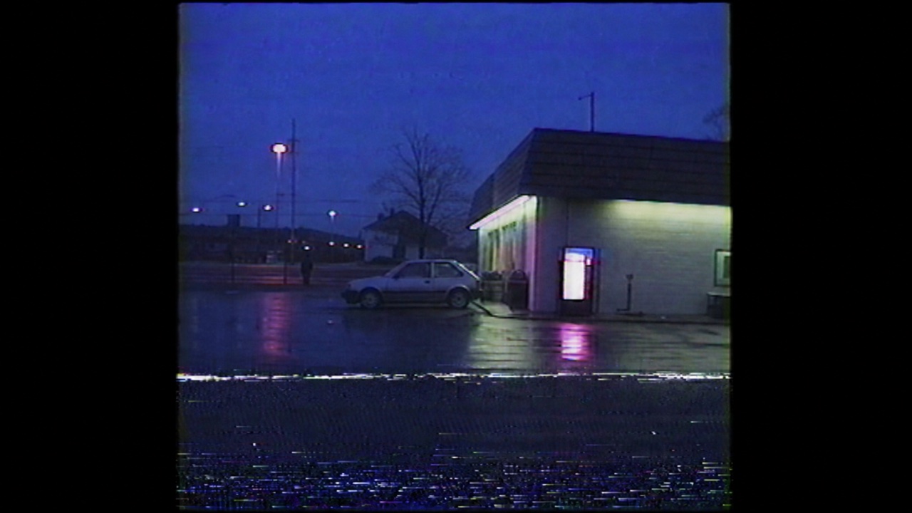
AI interpretation, not a reference
Scanlines, tracking noise, bleeding color and timestamp overlays: the degradation and on-screen displays of the home recording medium, stylized into the texture of recorded memory.
Palladio distilled proportion, the temple front and strict symmetry from Roman antiquity into a formula for the villa. His Four Books carried it to Britain and America, where it became the archetypal correct face of public architecture.
Palladio, Villa La Rotonda — Wikimedia Commons / Public domainA total art that draws the viewer in with ovals, curved surfaces, dramatic light and an excess of ornament. Architecture, sculpture, painting and city planning were handled as one staging, turning power and faith into spectacle.
Bernini, baldachin of St. Peter's Basilica — Wikimedia Commons / CC0Turned Baroque grandeur toward interior intimacy: shell-like curves, pale color and asymmetrical ornament composing a light-footed social space. One of the first styles in which decoration broke free of architecture to take the lead.
Interior of the Wieskirche (CC BY-SA 3.0) · © LlezThe academic synthesis of the classical taught at the École des Beaux-Arts in Paris. Grand axes, sculptural ornament and a hierarchy of formality were laid over the new technologies of iron and glass, giving the modern city its public face in stations, museums and banks.
Grand staircase of the Palais Garnier (CC0)An architecture of the horizontal line answering the midwestern prairie. Deep eaves, ribbon windows, low roofs and continuity between inside and out established the first American modern house free of imported European styles.
Wright, Robie House 1910 (CC BY 4.0) · © BmzuckermanArchitecture that speaks emotion and symbol through sculptural curves and brick detail. Mendelsohn's streamlines and the Amsterdam School's undulating housing mark modernism's other road, the one functionalism never absorbed.
Mendelsohn, Einstein Tower (CC BY-SA 3.0) · © CoenenProducts, factory and printed matter all handed to one architect, so that a company looked as though a single hand had made it. The lettering, objects and buildings Behrens drew for AEG from 1907 became the prototype of corporate design.
Behrens, AEG Turbine Factory 1909 (CC BY-SA 4.0) · © Felix MüllerThe workshop founded by Hoffmann and Moser designed buildings, furniture, tableware and clothing to a single geometry and a single standard of handwork. It practiced the total work of art, treating all of daily life as one piece, inside a commercial enterprise.
Hoffmann, Stoclet House (CC BY-SA 3.0) · © BusoniHoward's diagrammed proposal for self-contained towns of planned population joining the advantages of town and country. The concentric diagram materialized at Letchworth and became the template for suburbs and new towns worldwide.
Howard, The Three Magnets diagram 1898 — Wikimedia Commons / Public domainThe experimental housing program commissioned by Arts & Architecture for the postwar shortage: steel and glass from off-the-shelf parts, popularizing an image of bright modern living open to the California climate.
Eames House (No.8) (CC BY-SA 4.0) · © Gunnar KlackA postwar ethic of public building that leaves béton brut exposed and hides neither structure nor services. Bound up with the ideals of the welfare state, it is now the subject of preservation campaigns.
Barbican Estate (CC BY-SA 4.0) · © ColinPlainness practiced as an article of faith by the Shaker communities of the United States. With ornament refused, their furniture and rooms were arrived at through use and honest workmanship alone, anticipating functionalism and Scandinavian design.
Round Stone Barn at Hancock Shaker Village (CC0)Thonet's chair No. 14 reduced steam-bent beech to a handful of parts, the first industrial furniture to ship knocked-down and be made in quantity. Rational components and an elegant curve arrived together, which is why it is called the origin of modern design.
Thonet chair in the MAK collection (CC0)The light, informal residential style born of tea-ceremony aesthetics: slender posts, bark-edged timber, earthen walls and shoji light that let material nature and empty space become the quality of the room. Katsura became modernism's pilgrimage site.
Katsura Imperial Villa (CC BY-SA 3.0) · © John ChangThe golden age of industrial products made by postwar Italian industry and its designers, who added feeling and sculptural presence to functionalism. Castiglioni's lamps and Olivetti's machines exported the product as culture.
Sottsass, Olivetti Valentine (CC BY-SA 4.0) · © Maksym KozlenkoFounded by Max Bill as the Bauhaus's successor, the school redefined design as science, method and system. Its collaboration with Braun made the functionalist face a world standard.
Max Bill, Ulm Stool (CC BY-SA 3.0) · © Christos VittoratosBuilding that raises unbroken walls as sculptural mass and works on feeling through color, direct sun and stillness alone. Goeritz gave it the name in the 1953 manifesto he wrote for El Eco, against the functionalism of his day.
Casa Luis Barragán (CC BY-SA 3.0 IGO) · © Francesco BandarinA style that relates every element continuously through parameters and organizes architecture as flowing surface and gradient change. Schumacher named it, and the work of Zaha Hadid Architects became its demonstration.
Zaha Hadid, London Aquatics Centre (CC BY-SA 4.0) · © Ank KumarEurope's imagined China: longing for imported porcelain and lacquer unfolded into wallpaper, furniture and garden pagodas, joined to Rococo lightness. Read it as a decorative world born of desire, not description.
Chinese Room, Hellbrunn Palace (CC BY-SA 4.0) · © Wolfgang SauberDiscards geographic accuracy for horizontal, vertical and 45-degree lines with evenly spaced stations. Beck's 1933 London Underground diagram established it as the common language of transit maps worldwide.
Contemporary example of a schematic transit map (CC BY-SA 3.0) · © Oslo_Metro_diagram.svg : Arsenikk derivative work: Arsenikk (talk)Unified symbol systems that name facilities and actions without language. Tokyo 1964 systematized sport and wayfinding symbols; the AIGA/DOT transportation set became the public-domain world standard.
AIGA/DOT symbol "Restaurant" — Wikimedia Commons / Public domainThe tourist bird's-eye map style perfected by Hatsusaburō Yoshida: extravagantly curved horizons, exaggerated landmarks and a view that pulls distant cities into one sheet, turning Taishō and Shōwa era travel into pictorial maps.
Yoshida Hatsusaburō, Ise meisho zue (Famous Places of Ise) — Wikimedia Commons / Public domainWhite walls, even light and an unadorned room, so that only the work stands up. MoMA made it standard, and though O'Doherty's criticism exposed it as an institution disguised as neutrality, it remains the default for showing contemporary art.
Interior of White Cube Bermondsey, London, 2014, photo Matt Brown — Wikimedia Commons / CC BY 2.0The early modern collection room heaped natural and man-made things, specimens and art, into one space without distinction. Its floor-to-ceiling density aimed at a model of the world, making it the ancestor of the museum and the origin of an aesthetics of collecting.
Ole Worm's museum 1655 — Wikimedia Commons / Public domainThe Paris Salon's way of stacking paintings frame to frame from floor to ceiling. Height announced a work's rank, and looking became competition and society. It is the exact opposite of the white cube, and its origin.
Martini, The Salon of 1787 (CC0)The natural history museum format that fuses taxidermy, real foreground and curved background painting into a slice of habitat. Akeley raised it to an art, and it became the prototype of immersive display.
AMNH "Water Hole" diorama (CC BY 4.0) · © VicpetersA giant painting covering the entire inner wall of a rotunda placed the audience at the center of the landscape. Lighting and real objects in the foreground erased the edge of the picture, and this 19th-century immersion machine became the summit of mass visual entertainment before cinema.
Panorama Mesdag 1881 (CC BY-SA 4.0) · © DonarreiskofferThe commercial sign style of bent glass tubes glowing as letters and pictures. Hong Kong's street-spanning character signs and Las Vegas's escalating light wars built each city's nighttime visual language.
Neon on Stanley Street, Hong Kong (CC BY 2.0) · © VasenkaPhotographyHand-painted brick-wall advertisements faded by weather. The lettering of the craftsmen called wall dogs, through peeling and fading, is being rediscovered as a stratum of urban memory.
Ghost sign in London (CC BY-SA 4.0) · © AcabashiEnvironmental graphics at a scale that overruns the wall, bending geometry and letters around architecture to alter spatial perception itself. Solomon fused Swiss typography with Californian boldness at Sea Ranch.
Solomon, Sea Ranch supergraphics (CC BY 4.0) · © Dale Cruse - 10M viewsShow bills that mustered chromolithography and wood type to announce the spectacle in overloaded scenes and the largest words available. Pasted up until they occupied whole walls, they were advertising that turned the city into a theater.
Barnum & Bailey poster 1899 — Wikimedia Commons / Public domainThe Southern California movement that takes light itself, spatial perception and the limits of vision as material. Turrell's openings to the sky and Irwin's scrims make the act of seeing the artwork.
Turrell, Skyspace Three Gems (CC BY-SA 4.0) · © Otheralex01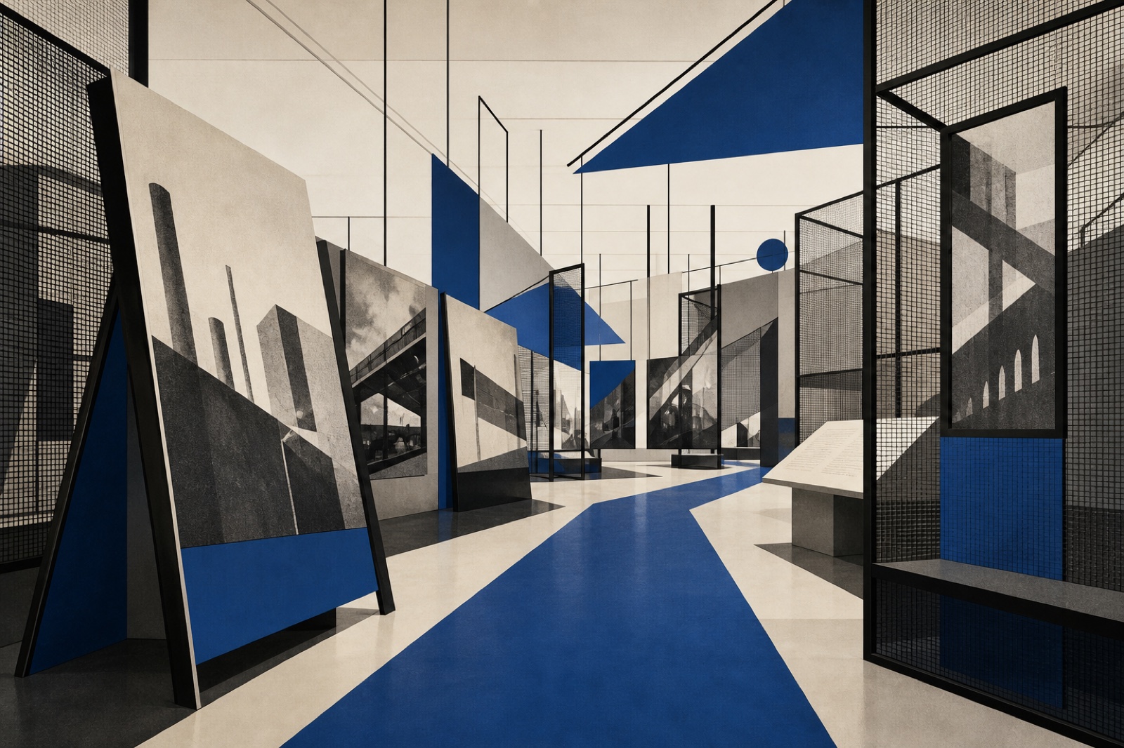
AI interpretation, not a reference
The modernist movement that designed the exhibition as printed matter you walk through. Lissitzky's dynamic installations and Bayer's extended field of vision invented display as an information space that edits the visitor's path and gaze.
Sets and costumes rebuilt as a painter's single picture. Jewel-deep colors laid over one another, with swirling curves and orientalist pattern drawing the dancing body itself into the design.
Bakst, stage design for Les Orientales 1910 — Wikimedia Commons / Public domainSchlemmer's stage workshop turned the body into geometry. Spheres and cones in the Triadic Ballet costumes set the human figure dancing as a form in space, and performance art traces its origin to them.
Schlemmer, costumes for the Triadic Ballet — Wikimedia Commons / Public domainRevolutionary Russia's style that discarded painted backdrops for a bare working machine on stage. The turning structure Popova built for The Magnanimous Cuckold remade stage design as working construction.
Popova, set for The Magnanimous Cuckold 1922 — Wikimedia Commons / Public domainThe stage reform that dropped painted realism for light, levels and simple volumes shaping space for music and the body. Appia's living light and Craig's moving screens created the very profession of lighting design.
Appia, stage design for Little Eyolf — Wikimedia Commons / Public domainMasks and fixed costumes let Italy's improvised comedy name each character at a glance. Harlequin's lozenges and Pulcinella's white belong to a system of visual signs that art, fashion and graphics have never stopped quoting.
Callot, from Balli di Sfessania (CC0)Kabuki makeup that exaggerates muscle and vein in red and indigo lines, diagramming a role's character on the face. With Sharaku's actor prints, the origin of the strong graphic face in Japanese design.
Sharaku, Ōtani Oniji as the Servant Edobei 1794 — Wikimedia Commons / Public domainNicholson and Pryde's cut-paper poster style: contours dropped, subjects summarized in flat shapes of few colors. Commercially unsuccessful in its day, its radical economy anticipated the 20th-century poster.
Beggarstaff Brothers, Don Quixote poster 1895 — Wikimedia Commons / Public domainDuring the civil war the ROSTA news agency pasted stencil-replicated poster serials in the windows of empty shops. Mayakovsky and others turned the news into comic-strip panels of simple shapes and rhymed verse, inventing the prototype of rapid-response graphics.
Mayakovsky, ROSTA Window No.742 — Wikimedia Commons / Public domainRussia's popular print: thick outlines, flat hand-coloring, image and text sharing the sheet, circulating sacred stories and satire cheaply. The avant-garde rediscovered it in the 20th century as Russia's native form.
The Mice Are Burying the Cat, 18th century — Wikimedia Commons / Public domainPellerin of Épinal mass-produced popular prints whose clear outlines and stencil color told stories, armies and morals. They shaped popular vision so completely that 'image d'Épinal' came to mean a rosy cliché.
Épinal print Souriquet — Wikimedia Commons / Public domainThe skeleton satires Posada engraved for Mexican broadsides: dressed-up calaveras laughing at class and death alike. La Catrina became a national icon of the Day of the Dead and Mexican graphics.
Posada, La Calavera Catrina, c. 1910 — Wikimedia Commons / Public domainGlaser and Chwast's studio worked as the counterpoint to Swiss rationalism, building an illustration-led eclecticism out of historical styles, comics and popular prints. Fat contours and ornamental planes of color repainted the magazines and records of the 1960s and 70s.
Seymour Chwast (Push Pin Studios), Giovanni's Room first edition cover 1956 — Wikimedia Commons / Public domain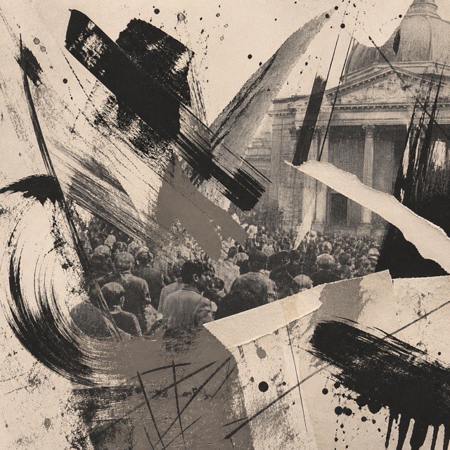
AI interpretation, not a reference
The French collective was born out of May '68. Hand-scrawled letters, splatters and graffiti over photographs brought a festive roughness to posters for politics, theater and city halls, and made resistance to polish into a style.
In Basel, the home of Swiss style, Weingart took the grid apart from the inside. Exploded letterspacing, stepped settings and layered film exposures turned rebellion within discipline into New Wave typography.
Odermatt + Tissi, Typografische Monatsblätter 1984 no. 3 cover 1984 — Wikimedia Commons / Public domainThe mass-distributed persuasion pictures of the PRC from founding through the Cultural Revolution: the nianhua folk tradition fused with Soviet socialist realism into red suns, flushed cheeks and arms pointing to the future.
Cultural Revolution propaganda poster — Wikimedia Commons / Public domainMumbai's poster workshops painted film advertising in oil on giant canvases. Saturated color, montages of several scenes and exaggerated star faces ruled the Indian street for half a century, until digital printing arrived.
Anarkali film poster 1953 — Wikimedia Commons / Public domain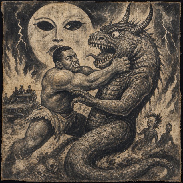
AI interpretation, not a reference
Ghana's hand-painted movie posters on flour-sack canvas, made for mobile cinema: unconstrained imagination reinterpreting Hollywood with exaggeration and local horror into a painting style like no other.
Lima's cumbia shows produced a fluorescent poster style. Hand-drawn letters in day-glo pink and green on black shout loudly enough to be read from a passing night bus, and the look is now reclaimed as the aesthetic of Andean migrants to the city.
Chicha concert poster, Puente Piedra, northern Lima 2022 — Wikimedia Commons / CC BY-SA 4.0 · © QM KeenPainted decoration covers every surface of the trucks of Pakistan and India. Floral phool patti, portraits of heroes and saints, and relief work in mirrors and chains turn a working vehicle into a rolling palace of pride.
Decorated truck on the N-5 highway (FAL) · © A.SavinBuenos Aires's decorative linework grew out of cart painting and shop signs. Swirling acanthus, ribbons, flowers and heavily shaded letters work as a single system in this urban brush craft, now inscribed by UNESCO.
Fileteado sign — Wikimedia Commons / Public domainEdward Saidi Tingatinga began painting in Dar es Salaam with bicycle enamel. Glossy flat color, animals in bold outline and a surface with no empty ground were carried on as a cooperative's house style, and the school became East Africa's defining popular painting.
Tingatinga on an aircraft tail fin (CC BY-SA 4.0) · © Bair175Elders of the Western Desert moved ceremonial sand designs onto acrylic and canvas. Fields of dots with concentric circles and journey lines paint Country as map-like knowledge, and the movement opened a place for Indigenous art within contemporary art.
Painting by Doreen Reid Nakamarra, documenta 13 installation view (CC BY-SA 3.0) · © David Gómez FontanillsThe children's books of the revolutionary avant-garde: Lebedev and others brought constructivist flatness and simple shapes to storytelling, making cheap lithographed picture books a laboratory of 20th-century book design.
Sergei Chekhonin, cover of Colourful Children 1927 — Wikimedia Commons / Public domain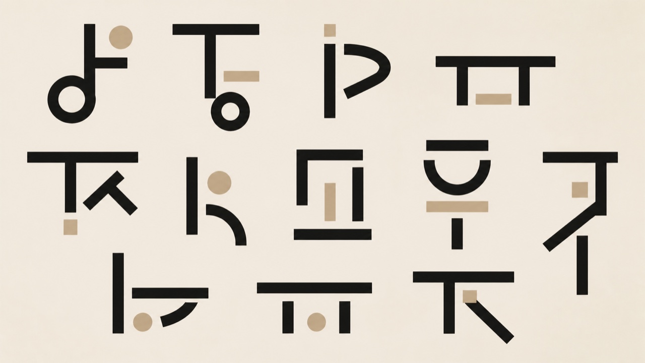
AI interpretation, not a reference
Hangul type that gives up fitting each syllable into a square and stacks consonant and vowel as fixed shapes, so height and width change from letter to letter. Ahn Sang-soo's typeface and posters carried the form to a wide audience.
The woodblock revival led by publisher Watanabe Shōzaburō: ukiyo-e's carver-printer division joined to Western light and atmosphere. Hasui's nights and rains became the beloved image of a lyric Japan abroad.
Kawase Hasui, Shinagawa (CC0)Chinese paper cutting works red paper with scissors and knife. As window flowers it dresses the windows at the New Year, weaving auspicious patterns and stories out of connected line alone, a positive-negative figure design still transmitted as intangible heritage.
Year of the Dog jianzhi (CC BY-SA 3.0) · © Made by FanghongYanagi Sōetsu and his circle found 'the beauty of use' in the everyday wares of unnamed craftsmen. By making anonymity, repetition and utility the measure of healthy form, the movement became the bedrock of Japanese design thought.
Shōji Hamada bowl 1922–23 (CC0)Unnamed painters of late Joseon Korea made pictures for ordinary people. Tigers and magpies, pictorial ideographs and scholar's-shelf still lifes follow set formulas, but composition unbound by perspective and a streak of humor made them a popular visual language that laughs at authority.
Minhwa, Tiger and Magpie — Wikimedia Commons / Public domainThe woodblock prints of Vietnam's Đông Hồ village: printed with natural pigments on dó paper coated with ground seashell, New Year pictures like 'The Rat's Wedding' carrying village philosophy in satire and auspice.
Đông Hồ print, The Mouse's Wedding — Wikimedia Commons / Public domainAt the Chinese New Year these woodblock prints go up on doors and interior walls. Door gods, wealth gods and opera scenes in vivid color, with regional styles such as Yangliuqing and Taohuawu, built a visual language centuries deep that later supplied socialist posters with their iconography.
Nianhua of a martial door god (CC0)Tibetan Buddhist scroll paintings render deities and mandalas under strict iconometric rule. Vivid mineral pigment and gold line make them maps for meditation, and because they roll up for travel they sustained a nomadic life of faith.
Thangka with four mandalas 15th century — Wikimedia Commons / Public domainThe icon tradition inherited from Byzantium uses reverse perspective, gold grounds and stylized bodies so that the panel becomes a window for prayer rather than a picture to look at. Rublev's Trinity marks its spiritual summit.
Rublev, The Holy Trinity c. 1425 — Wikimedia Commons / Public domainLarge almond eyes, heavy outlines and vivid flat color give the sacred painting of Ethiopian Orthodoxy its own manner. The Byzantine inheritance is rewritten there in an African sense of form.
Triptych icon of the Virgin — Wikimedia Commons / Public domainAcross the Pacific islands, bark is beaten out into cloth. Geometric patterns stamped, drawn and smoked onto it serve as communal insignia in ritual and gift exchange, and every island keeps its own pattern system within this Pacific graphic language.
Fijian wedding tapa (LACMA) — Wikimedia Commons / Public domainScroll patterns run along the rafters of Māori meeting houses. Built from the koru, the unfurling fern shoot, and worked in red, black and white alone, they unfold symmetry, rotation and reflection as a mathematics of curves that records genealogy and story overhead.
Kōwhaiwhai pattern — Wikimedia Commons / Public domainWomen along the East African coast wear this printed cloth in a single piece. Its three-part composition of border, central image and Swahili proverb (jina) makes the act of wearing an act of speech.
Kanga cloth (CC BY-SA 4.0) · © Bukulu StevenBetween the wars, Sweden laid light ornament and craftsmanship over neoclassical poise. Hald's glass and Asplund's buildings showed a graceful modernity that gave Scandinavian modern its running start.
Glass by Edward Hald (CC BY-SA 2.0) · © Tim Evanson from Cleveland Heights, Ohio, USAThe bright socialist-bloc modernism named for Czechoslovakia's triumph at Expo 58: asymmetric curves, thin splayed legs and atomic patterns spreading thaw-era optimism from housewares to animation.
Jaroslav Ježek, Elka porcelain set (photo Jan Jeništa) — Wikimedia Commons / CC BY 2.5The Iranian graphic culture Morteza Momayez opened: the line of Persian calligraphy fused with modernist composition, growing a poster tradition that speaks in poetic metaphor across revolution and war.
Morteza Momayez, The Deer (Gavaznha) poster 1974 — Wikimedia Commons / Public domainThe hand-painted signboards of West African barbershops: numbered haircut samples in a grid, flat repeated faces sitting between product catalogue and portraiture.
Sign of the LEO COIFFURE barbershop in Abidjan, Côte d'Ivoire (National Museum of Ethnology, collected 2005) — Wikimedia Commons / CC BY-SA 3.0 · © Yanajin33Turkish marbling: pigments floated on thickened water, drawn into flowers and swirls with comb and stylus, lifted onto paper. Grown from calligraphy's ground into an art of its own, inscribed by UNESCO.
Example of ebru (CC BY-SA 4.0) · © ZkarapatlakMexico's votive paintings give thanks for deliverance from disaster. Painted on tin, they hold the scene of the crisis, a holy image and a handwritten testimony on one small sheet, and the urgency of the untrained brush drew Kahlo and other modern painters to them.
Ex-voto 1887 — Wikimedia Commons / Public domainUkraine's Easter eggs are dyed by wax resist. Lines of hot wax and repeated dye baths build geometry and the tree of life in layers across the curved shell, where motif and color carry a whole system of prayer in miniature.
Pysanka (Kyiv, Ukraine) — Wikimedia Commons / CC BY 2.0 · © neiljs @ flickrGuna women in Panama make reverse appliqué. Layers of colored cloth are cut back and stitched down until every contour ripples in several lines, printmaking in fabric that is worn daily as the panels of a blouse.
Guna mola (CC0)The indigo resist cloth of Yoruba women: raffia ties and cassava-paste painting and stenciling reserve white patterns against deep indigo, weaving proverbs and signs into the contrast.
Design for Adire Cloth — Wikimedia Commons / Public domainLonging for Chinese porcelain, Delft produced tin-glazed pottery of its own. Windmills, ships and Eastern scenes painted in blue alone fixed 'blue and white' as a Western language of table and room, chinoiserie put into practice.
Delftware plate c. 1760 (CC0)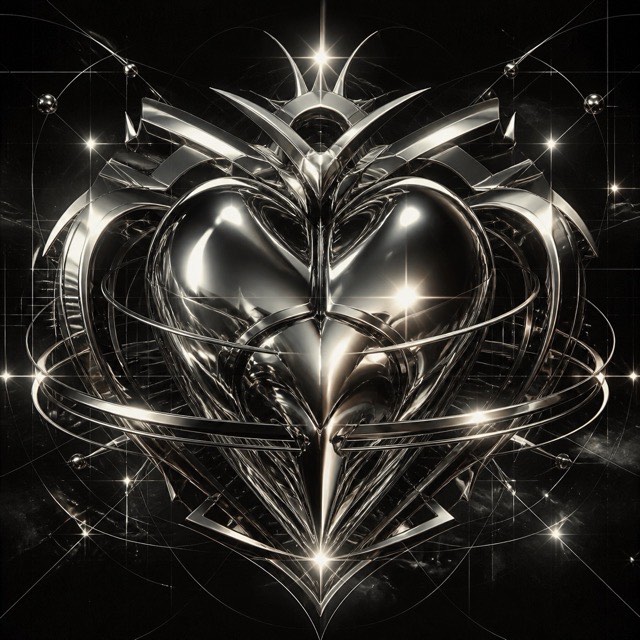
AI interpretation, not a reference
Early 3D software gave this fin-de-millénaire style its chrome, liquid metal, aggressive bevels and lens flare. Dressed in techno and science-fiction imagery, it ruled rave flyers and games magazines around Y2K.
The movement that forced reality's objects into impossible meetings under the logic of dream and the unconscious. Dépaysement spread from painting into photography, film and advertising as the grammar of impossible adjacency.
Max Ernst, Habakuk, Düsseldorf — Wikimedia Commons / CC BY-SA 3.0 · © Hans Peter SchaeferThe revolutionary-era film posters the Stenberg brothers built in lithography: photomontage-like giant faces, careening letters and violently exaggerated perspective translating cinematic motion onto a sheet of paper.
Battleship Potemkin poster, 1925 — Wikimedia Commons / Public domainIn the Paris uprising of May '68 students occupied the art school and ran its print workshop. One-color silkscreens, simple figures and declarative slogans came off the press nightly under rules of anonymity, no sale and street posting, which became the prototype of protest graphics.
La lutte continue, 1968 (CC0)Teige gave the Czech avant-garde group its picture poem. Setting photograph, type and sign together as verse, the group's lyrical strain of constructivism turned interwar Prague into a laboratory of book design.
Karel Teige, Pozdrav z cesty, 1923 — Wikimedia Commons / Public domainThe lithographed tourism posters railways and shipping lines competed with: idealized destination landscapes, ornamental lettering and proud route names inventing travel itself as an image of desire.
PLM, Oasis of Nefta, 1925 — Wikimedia Commons / Public domainFiction magazines printed on cheap pulp paper competed on sensational covers. Melodramatic oil painting, the instant of peril and screaming logotypes cast the visual language of science fiction, horror and crime, which flowed on into paperbacks and comics.
Weird Tales, August 1930 issue — Wikimedia Commons / Public domainFrom the tripartite color bands of the first covers through Tschichold's composition rules to Marber's ruled grid, Penguin kept reinventing the cover as a design system. The paperback became a textbook of modern design.
Penguin Books, The Tanker Derbent, 1944 — Wikimedia Commons / Public domainPostwar Britain's bright modernism spreading from the 1951 festival site: thin legs, molecular patterns and light script faces turning post-austerity optimism into a national visual language.
Skylon, 1951 (CC BY-SA 4.0) · © Heresy0ukThe golden age of corporate identity established by Rand, Chermayeff and their peers: geometric marks, gridded standards manuals and disciplined application speaking for corporations in modernism's abstract language.
Paul Rand, IBM eight-bar logo, 1972 — Wikimedia Commons / Public domainNew York in the phototype era produced a style of huge x-heights and tightly packed settings. Lubalin's conceptual typography and U&lc magazine staged letters as pictures and gave the period its face.
Herb Lubalin, Avant Garde magazine logotype, 1968 — Wikimedia Commons / Public domainThe Olympic identity Wyman built for Mexico City: concentric lines radiating from the logotype into venues, uniforms and stamps, fusing Op art with folk art and wrapping a whole city in pulsing imagery.
Mexico 68 emblem — Wikimedia Commons / Public domain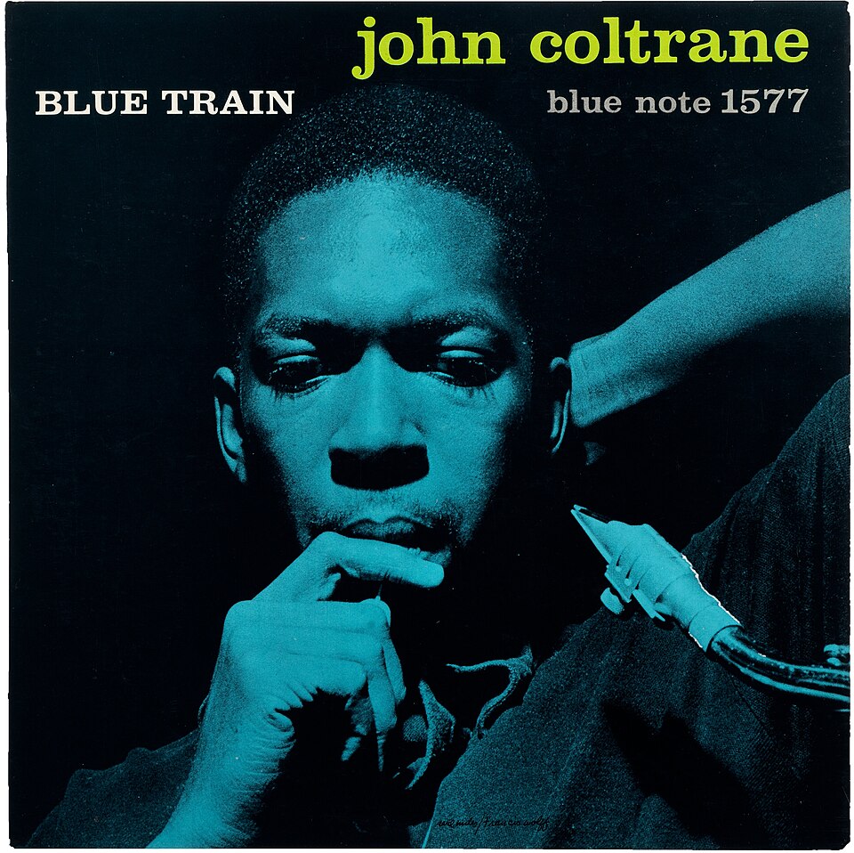
Reid Miles turned out sleeve after sleeve for the jazz label with monochrome photography, two-color printing and boldly cropped type. Improvisation inside constraint became the graphic translation of jazz itself.
Reid Miles (photograph by Francis Wolff), John Coltrane / Blue Train, 1957 — Wikimedia Commons / Public domainAt the Manchester label Saville made sleeves that refuse to explain the music. Borrowed industrial color charts, classical paintings and waveform diagrams turned post-punk's intelligent void into a style.
Peter Saville, Power, Corruption & Lies, 1983 — Wikimedia Commons / Public domain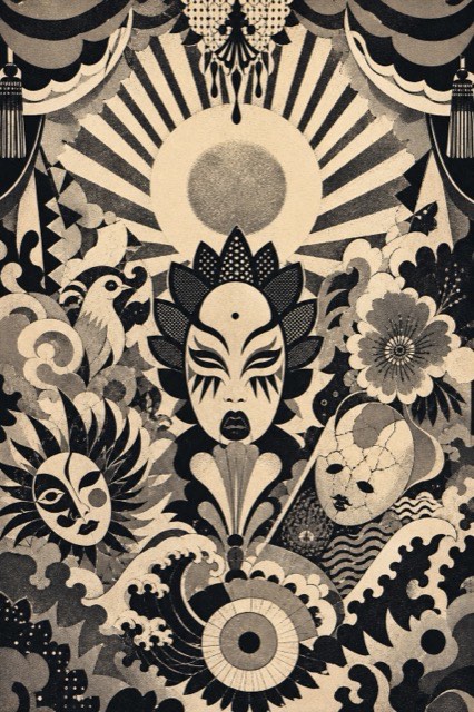
AI interpretation, not a reference
Yokoo Tadanori and his peers printed the posters for Situation Theatre and Tenjō Sajiki. Ukiyo-e, kitsch and psychedelia collide there in an excess that the world discovered as a revolt against modernism.
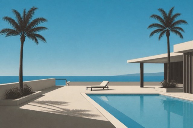
AI interpretation, not a reference
Hiroshi Nagai and Eizin Suzuki gave record sleeves a cloudless sky, a swimming pool, palm trees and a flat horizon. Vaporwave later carried this urban-resort landscape of pre-bubble longing out into the world's shared imagery.
The visual strategy of the AIDS-crisis direct-action movement. The pink triangle of SILENCE=DEATH, a clarity seized from advertising's own grammar and the principle of free reproduction forged activist graphics as strong as the ads they stood against.
SILENCE=DEATH badge — Wikimedia Commons / Public domainCompressed air lays down gradients with no visible join, and commercial illustration's golden age was built on them, rendering chrome reflections, wet gloss and idealized skin. Before digital, this was what a perfect surface meant.
Fabiosaurusrex, airbrush illustration (Ford advertisement), 2016 — Wikimedia Commons / CC BY-SA 4.0Endless pixel cities in vanishing-point-free oblique view. eBoy's pixoramas established the mode, exporting games' isometric projection into print and advertising as a graphic language.
Peterson Freitas, Curitiba, 2004 — Wikimedia Commons / CC BY-SA 4.0 · © PropetersonA short screen bolted to the front of cracked software as a group's calling card. An oversized group name, text scrolling without end and a run of greetings turned the home computer display into a stage.
Jovis, pixel art from the Atari ST demoscene, 1989–1994 — Wikimedia Commons / CC BY-SA 4.0 · © Dpla-frGame imagery drawn stroke by stroke as an electron beam traces bright lines across a vector monitor. Glowing wireframes hanging in black void carried a tension that defined how the early arcade pictured the future.
Atari, screen from Bradley Trainer, 1981 (the military version of Battlezone) — Wikimedia Commons / Public domainThick vector outlines, tweened morphs and splash-page cursor play: the decade in which Flash gave individuals expressive power and turned the web into one animated artwork.
Bennett Foddy, QWOP, 2008 — Wikimedia Commons / CC0The fixed-segment LCD screens of Game & Watch and its kin. Movement had to be told through a handful of poses etched in advance, and this art of frames, layered over a printed background, produced a picture unlike any other.
Game & Watch Turtle Bridge, 1982 (CC BY-SA 2.0) · © Joe Haupt from USALogin screens and group art packs drawn in the 16-color text mode of the BBS age. Block-character shading and inter-group competition made the summit of pre-web screen decoration.
Example of ANSI art — Wikimedia Commons / Public domainThe terminal look: monospaced phosphor characters on black. The VT100's green afterglow became the primal image of the computer's face, repeated from hacker cinema to modern CLI tools.
Autopilot, Colossal Cave Adventure running on a DEC VT100, 2014 — Wikimedia Commons / CC BY-SA 3.0One hundred and seventy six pictographs that tell faces, weather and things apart using only the placement of dots on a twelve by twelve grid. Shigetaka Kurita drew them for NTT DOCOMO's i-mode, and MoMA holds the original set.
VSchagow撮影《絵文字を象った収集玩具》2019年 — Wikimedia Commons / CC BY-SA 4.0A way of working in which the maker writes only the rule and the randomness, leaving the drawing to the machine. As in Nees's plotter work, the result is shown as several variants born of one rule.
Vera Molnár, Interruptions à recouvrements, 1969 — Wikimedia Commons / CC0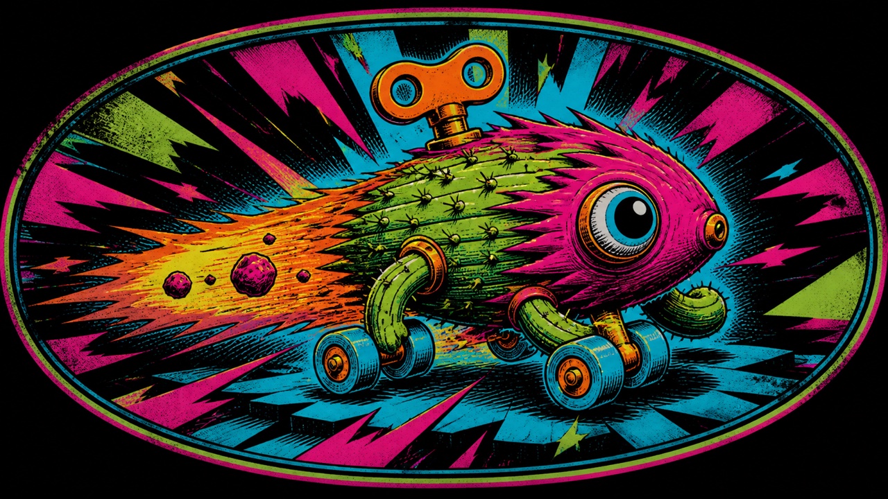
AI interpretation, not a reference
Imagery that fills the whole underside of a deck with a single emblem. Bones, skulls and dragons in heavy outline, set on the board as a team's flag in full knowledge that grinding will wear them away.
A net-born video genre that builds fear out of VHS decay, emergency-broadcast formats and the voice of the classroom film. By turning the signs of public-broadcast trust inside out, it makes the format itself the thing that frightens.
Local 58 station logo (WCLV), 2019 — Wikimedia Commons / Public domainThe internet aesthetic idealizing the cottage, handcraft and fresh bread: soft natural light and handmade texture rebuilding the pastoral as a reaction to digital fatigue.
Cottagecore aesthetic (CC BY-SA 4.0) · © Elisa TheresaJapan's aesthetic of round contours, big eyes, pastel and looseness that summons the urge to protect. From girls' handwriting and fancy goods it softened the surface of an entire society, from public signage to corporate mascots.
Inside 6%DOKIDOKI in Harajuku, 2012, photo by GoToVan — Wikimedia Commons / CC BY 2.0Painting from outside the museum, schooled on hot rods, comics, tattoos and B movies. It renders pop memory in exacting oil technique, and Juxtapoz magazine gave it a home under the name Pop Surrealism.
Old Man Parker, Tiki Cat, 2016 — Wikimedia Commons / CC BY-SA 4.0The future as the 1980s pictured it, built from CRTs, physical buttons, thermal paper and squared-off white plastic. Its matte pragmatism is now being reappraised as the counterproposal to sleek science fiction.
IBM 729 tape drives at Camp Smith, 1969 — Wikimedia Commons / Public domainThorgerson and Powell's studio brought a photographic surrealism to the record sleeve, staging a burning handshake or a pig adrift in the sky. Trick photography made before CG defined what music looks like when it dreams.
Hipgnosis / George Hardie, The Dark Side of the Moon, 1973 — Wikimedia Commons / Public domainThe classic American tattoo style, built from heavy black outlines, a short list of pigments and stock motifs like the anchor, the rose and the swallow. Sailor culture and the copying of flash sheets standardized a graphic language worn on skin.
Tattoo flash (anchor, sailing ship, eagle), 20th century, Smithsonian American Art Museum — Wikimedia Commons / CC0Japanese tattooing that took its cue from Kuniyoshi's Suikoden heroes, carving a narrative across the whole back and outward over the body. Ground patterns of wave and cloud wrap each figure in a frame, and the body becomes a single ukiyo-e.
Kuniyoshi, Tsuzoku Suikoden, Zhang Shun — Wikimedia Commons / Public domainScreen art made inside broadcast text, a mosaic of 40 by 24 characters in eight fixed colors. The extreme abstraction of Ceefax weather maps and news pages is being revived now as a classic of constraint.
Teletext colour test screen — Wikimedia Commons / Public domainThe banknote style in which lathe-cut guilloche curves and engraved portraits refuse forgery while making credit visible. America's 1896 Educational Series raised the banknote to allegorical masterpiece.
United States Educational Series 2 dollar note, 1896 — Wikimedia Commons / Public domainA small print of ownership pasted to a book's endpaper. Since Dürer, engravers have cut heraldry, allegory and the collector's own exact self-image into a few centimeters, making a private graphic where book culture meets printmaking.
Dürer, bookplate for Willibald Pirckheimer — Wikimedia Commons / Public domainThe 52-sheet design polished by centuries of use: double-ended court cards, the semiotics of suits, repeating back patterns. Wear and recognition produced a completeness that is also the prehistory of UI design.
King of hearts by Pierre Maréchal of Rouen compared with the Spanish suited king of coins — Wikimedia Commons / Public domainFrom the Visconti gold grounds through Marseille woodcuts to the Waite-Smith narrative scenes: allegory systematized into 78 cards. Its openness to rereading keeps drawing designers in.
Visconti-Sforza tarot, 15th century — Wikimedia Commons / Public domainJapan's crest system that geometrizes plants, animals and objects with compass and line alone. Some twenty thousand patterns designed in black-and-white reversal completed the scalable mark centuries before logo design.
Taka-no-ha hawk feather crest (CC BY-SA 2.5) · © Kace Kaminaga / Kubo MichalEurope's armorial system, born from the need to tell one man from another on the battlefield. Exact description in the language of blazon, the rule of a limited set of tinctures and a grammar of division and combination add up to a design system that has run for 800 years.
Wijnbergen Armorial, 13th century — Wikimedia Commons / Public domainEast Asia's seal art: seal script carved in stone, composed in a few square centimeters through the reversal of red and white (zhuwen and baiwen). Participating in paintings as signature, it perfected design inside the small square.
Seal impression by Kawamura Minsetsu (Nihon no Tenkoku, 1966) — Wikimedia Commons / CC BY-SA 4.0 · © KAWAMURA MyohkeiThe Baroque celestial atlas layering constellation mythology over observation. Cellarius's Harmonia Macrocosmica marks the summit of an age when scientific diagram could also be decorative art.
Cellarius, Harmonia Macrocosmica 1660 — Wikimedia Commons / Public domainThe style Vesalius's Fabrica established: muscled bodies posing in landscapes. Scientific accuracy cohabiting with theatrical staging governed the grammar of anatomical plates for centuries.
Vesalius, De humani corporis fabrica 1543 — Wikimedia Commons / Public domainThe tradition of plant portraiture holding scientific precision and decorative beauty together. Redouté's roses in stipple engraving and hand color established elegance-through-accuracy as a style.
Redouté, Les Roses 1817–24 — Wikimedia Commons / Public domainA medieval working sea chart, crossed by radiating rhumb lines. Coastlines and place names run precisely along the vellum while flags and monsters fill the empty water, from a time when a map's usefulness and its ornament had not yet parted.
Portolan chart of the Mediterranean, 16th century — Wikimedia Commons / Public domainJapanese cards that compress twelve months of flowers, birds, wind and moon into 48 sheets. Their bold flat-color stylization against black came out of a long history of redesigning the deck to slip past bans, and it was where Nintendo began.
Hanafuda cards, ca. 1870 — Wikimedia Commons / Public domainThe name for the naturalist's plates that showed unknown life as both taxonomy and wonder, with botanical illustration sitting under it as the branch that narrowed to plants. The symmetrical compositions of Haeckel's Kunstformen der Natur became the junction where science plates flowed into Art Nouveau's language of form.
Haeckel, Art Forms in Nature, jellyfish — Wikimedia Commons / Public domainThe modern revival of Western writing begun when Johnston rebuilt the foundational hand from medieval manuscripts. Through the Underground letters and Gill, the written hand became a source of modern design.
Lettering by Johnston, ca. 1915 (CC BY 2.0) · © mikeyashworth from UKLithographed covers kept alive by the piano in the parlor. Illustration of the song's scene combined with ornamental lettering into a single picture, and before the record sleeve existed this was how music was shown.
Sheet music cover by Winslow Homer (CC0)Dyeing stencils cut from persimmon-tannin laminated paper: drill, tool and stripe cutting produce continuous patterns so fine that the stencils themselves startled fin-de-siècle Europe as an art of line.
Ise katagami stencil (CC0)Japan's pictorial board sheets dividing one page into a story of squares. Careers and pilgrimages arranged in spiral progressions show the sugoroku sheet as ancestor of information design and game UI.
Hanabutai atari sugoroku (CC0)
AI interpretation, not a reference
The magazine Provoke called itself provocative materials for thought. Working through are-bure-boke, coarse grain and blur and lost focus, it stripped photography of tidy meaning and gave seeing back its rawness.
The Bechers' method of shooting one kind of structure under identical conditions and hanging the results in a grid. Repetition under overcast light, dead-on and without people, turns individuals into types, and by way of the Düsseldorf school it became a grammar of contemporary photography.
Bernd & Hilla Becher, Typology (Winding Towers) — Wikimedia Commons / CC BY-SA 4.0 · © Vidar00
AI interpretation, not a reference
The art photography of the everyday in color, legitimized by Eggleston's MoMA show. Dye-transfer density gave banal scenes gravity and overturned the rule that color was vulgar.
A way of shooting that waits for the event and the shape of the frame to coincide, then releases once. Cartier-Bresson set it out in his 1952 book and made using the whole uncropped frame part of the method.
Henri Cartier-Bresson, Mother Playing Tennis 1950 — Wikimedia Commons / Public domainA manifesto for straight photography from Weston, Adams and their circle, who took as their banner the edge-to-edge sharpness of an aperture stopped to f/64. Rejecting the haze of Pictorialism, they held that large-format precision and full tonal range were themselves the beauty of a photograph.
Adams, The Tetons and the Snake River 1942 — Wikimedia Commons / Public domainThe page form LIFE perfected: photographs edited into narrative arcs. Spread-scale contrasts, opening and closing images and the voice of captions gave photography a story grammar.
Urbain Faurec, Vu magazine, Madagascar at War 1940 — Wikimedia Commons / Public domainThe documentary program of Depression-era America's Farm Security Administration. Lange's Migrant Mother and 270,000 archived negatives defined the public role of documentary.
Lange, Migrant Mother 1936 — Wikimedia Commons / Public domainThe postwar Japanese movement Domon Ken led under 'absolutely unstaged, absolute snapshots.' Hiroshima and Children of Chikuho faced society directly, drawing amateur monthly contests into the reconnection of photography and life.
Ken Domon, Shoeshine Boy in Ginza, ca. 1951 — Wikimedia Commons / Public domainA movement that wrote the accidents of the Soviet LC-A toy camera into a charter. Vignetting, color casts and cross-processed saturation were all affirmed under ten rules and the instruction not to think but to shoot, which made it the forerunner of post-digital love for analog.
Cross-processed shot from an LC-A (CC BY 3.0) · © Toomore ChiangThe first practical photography, fixing an image directly onto a silvered plate. A one-of-a-kind picture reversed as in a mirror and housed in velvet like jewelry is where the experience of owning an image begins.
Daguerreotype portrait (CC0)Polaroid made the picture appear on the spot. The white-bordered square, the soft color of chemical development and the fact that only one copy exists became a language of intimacy that outlived digital and carries on in Instax.
Washington Square Arch on Polaroid 600 film 2021 — Wikimedia Commons / CC BY-SA 3.0 · © TFSyndicateTwo views of one scene taken from slightly separated positions, mounted side by side and sent to each eye through a viewer so the scene reads as depth. Placing an object large in the foreground to force that depth was the standard move.
Stereograph, The Stereograph as an Educator — Wikimedia Commons / Public domainDisdéri patented a card-sized portrait made in quantity. Printing eight poses on a single glass plate made portraiture cheap enough to democratize it, and the collecting of celebrity cards and the album culture around them are where the shared face begins.
Carte de visite by Disdéri 1860s — Wikimedia Commons / Public domainThe 19th-century trade in ghosts produced by double exposure. From Mumler's portrait of Lincoln's widow to the séance boom, it fed on the very belief that a photograph proves something, a style built from media deception and desire.
Mumler, Mary Todd Lincoln with a “spirit”, c. 1872 — Wikimedia Commons / Public domainAn aesthetic that takes the failures of amateur photography since Kodak, the tilted horizon, the head cut off at the edge, the flatness of the flash, and claims them on purpose. The intimacy of the family album became a grammar for art photography from Winogrand to Goldin.
Anastasia Nikolaevna, mirror self-portrait with a Kodak Brownie 1914 — Wikimedia Commons / Public domainScientific photography that records, through a microscope, structures the eye cannot reach. Bentley's snowflakes proved the scientific image could be beautiful, and that claim runs on through polarized color and fluorescence to the Nikon Small World of today.
Snow crystal by Bentley, c. 1905 — Wikimedia Commons / Public domainJapan's photo-sticker culture: doodles, mori enhancement and big-eye retouching plus tiny shareable stickers completed the grammar of edit-then-share selfies before social media existed.
Purikura 2007 (CC0)A Japanese garden that uses no water at all, representing waterscape and cosmos through raked sand and set stones. The fifteen rocks of Ryōan-ji compose by subtraction, and minimalists worldwide still cite them as the archetype for designing emptiness.
Rock garden of Ryōan-ji (CC BY-SA 3.0) · © Stephane D'AluThe daimyo strolling garden edits its scenery so that a new view opens with every step along the path. Bridges, artificial hills and teahouses are set around a central pond until movement itself is the thing designed, spatial design that carries a time axis.
Kenroku-en (CC BY-SA 4.0) · © MotokokaHere the garden is the path to the tea room and nothing else. Stepping stones, the crouching basin and the middle gate set the walker's pace and state of mind, building a mountain retreat inside the city and designing the time it takes to arrive.
Teahouse and roji at the Adachi Museum of Art 2008 — Wikimedia Commons / CC BY-SA 3.0 · © BjoernordA garden that time and humidity grow, as at Saihō-ji, where more than a hundred species of moss cover the ground. Its surfaces are composed from nothing but shades of green, a demonstration of the Japanese balance between tending a place and leaving it alone.
Moss garden of Saihō-ji (CC BY 4.0) · © Hyppolyte de Saint-RambertA technique that pulls the mountain or forest beyond the garden into the composition, framing it with hedges and trees until it belongs there. It is the boldest idea of cropping there is, designing with a landscape no one can own.
Garden of Murin-an (CC BY 4.0) · © Piet ParkietAn 18th-century English revolution that threw out geometry and built nature-seeming scenery by artifice. Rolling lawns, serpentine lakes and temples scattered across the view shaped the land itself into a picture, and the result became the prototype of the public park.
Stourhead (CC BY-SA 4.0) · © MartinvlThe garden of axis, symmetry and perspective that Le Nôtre perfected at Versailles. Shears and sheets of water discipline nature into geometry, and power becomes visible as spatial order.
The axis at Versailles (CC BY-SA 3.0) · © ToucanWingsThe Renaissance garden of terraced slopes, stairs, channels and fountains. The hundred fountains of the Villa d'Este are the engineering art of water, with gravity as the design material.
Fountains of the Villa d'Este — Wikimedia Commons / Public domainThe origin of the chahar bagh, quartered by crossing water channels: a walled paradise of water and shade built against the desert. It gave the word paradise its meaning and the garden its archetype from Islam to the Mughals.
Fin Garden (CC BY-SA 4.0) · © Amir PashaeiThe chahar bagh scaled to empire: stepped water channels and white marble pavilions achieving, at Shalimar and the Taj, the full integration of building and garden.
Shalamar Gardens (CC BY-SA 4.0) · © Shahzaib Damn CruzeThe literati garden crystallized in Suzhou: landscape painting built in three dimensions. Taihu stone peaks, lattice windows as picture frames and turning corridors fold infinite scenery into small plots.
Humble Administrator's Garden (CC BY-SA 4.0) · © King of HeartsThe Joseon garden moves as little earth as possible, and Changdeokgung's rear garden is its model. Pavilions are simply set into valleys and ponds that were already there, a design that leaves the land alone and offers East Asia's other garden ideal.
Buyongji pond, Huwon, Changdeokgung (CC BY-SA 3.0) · © No machine-readable author provided. IGEL assumed (based on copyright claims).The English garden of overflowing mixed planting, stylized from the working kitchen plot. Jekyll's color schemes and Sissinghurst's White Garden raised planned artlessness to an art.
Sissinghurst, the White Garden (CC BY-SA 2.0) · © Brian WhittlePlant sculpture made by clipping evergreens into geometry and animals. Because decades of growth belong to the design, no sculptural technique is slower.
Topiary at Levens Hall (CC BY-SA 2.0) · © Barbara CarrA quarter of a garden where hedge walls are woven into passages and getting lost is itself the designed amusement. The whole figure shows only from above, while anyone standing inside sees walls and forks.
Hampton Court Maze (CC BY-SA 2.0) · © Kris ArnoldPlanting design modeled on perennial meadow ecologies, led by Piet Oudolf: beauty extended to the dead seed heads of winter, a year-round idea rewriting urban public space from the High Line outward.
Planting on the High Line (CC BY-SA 4.0) · © Beyond My KenJapanese living sculpture that condenses the scenery of an ancient tree into a pot. A stylistic vocabulary of trunk line, branch pads and root spread, together with care handed down over generations, makes time itself the work.
John Naka, Goshin (CC BY-SA 3.0) · © Sage RossJapan's art of the flower: space composed from plant line and emptiness. From Ikenobō's rikka to free styles, the craft of letting flowers live remains a textbook of asymmetry and negative space.
Ikenobo ikebana (CC0)A flat bed in which clipped box embroiders arabesques into the ground. It was designed to be looked down on from the floors above, turning the ground into ornament and gardening into graphic design.
Parterre at Vaux-le-Vicomte (CC0)The inventor of modernist landscape, massing Brazilian tropical plants in color fields like abstract painting. As the Copacabana wave pavement shows, he designed the ground as one graphic.
Wave pavement at Copacabana (CC BY-SA 2.0) · © Andréa Farias FariasThe West's oldest musical writing: melodic inflection recorded in curves like the motion of a hand. The gesture of melody before pitch was fixed to lines, still alive in the manuscripts of Gregorian chant.
Chant score of Ave Maria (CC BY-SA 4.0) · © Domínio PúblicoNotation that fixes pitch to a coordinate, running from Guido's invention of the line to the five-line staff. Time reads left to right and pitch up and down, a flat design still in use after a thousand years and the longest-lived format in information design.
Squarcialupi Codex 15th century — Wikimedia Commons / Public domainThe scores Cage and Cardew drew when they abandoned the staff: shapes, lines, map-like pages. Opening performance to interpretation rather than instruction, the score itself became visual art.
Toshi Ichiyanagi, Music for Electric Metronomes 1960 — Wikimedia Commons / CC BY-SA 4.0 · © Leehal1Notation from the player's point of view: not what pitch, but where the fingers go. From lute letter-tablature to guitar TAB, the lineage of practical writing that encodes bodily action directly.
Lute tablature by Attaingnant — Wikimedia Commons / CC BY-SA 3.0 · © The original uploader was Bobby D. Bryant at English Wikipedia .The American hymnody notation that reshaped note heads into triangles, squares and diamonds for fast sight-reading. The Sacred Harp tunebooks and singings made notation design a community tool.
Amazing Grace in The Southern Harmony — Wikimedia Commons / Public domainA recording medium of rolled paper on which the punched holes are the performance itself. It marks the turn from scores read by people to codes read by machines, and it is the ancestor of the punch card and the digital sequencer.
Player piano roll (CC BY-SA 4.0) · © DraconichiaroA visualization that maps sound onto a plane of time, frequency and intensity. From birdsong research to the DAW screen it became the standard way to see the shape of a sound, and artists have since taken to hiding pictures inside it.
Spectrogram of birdsong — Wikimedia Commons / Public domainThe experiment of seeing sound as a pattern in matter, beginning with the Chladni figures that sand draws on a vibrating plate. Each frequency brings out its own geometry, which makes this the oldest device for witnessing how sound and form correspond.
Pattern on a Chladni plate (CC BY-SA 4.0) · © Exhibit made by Estes Objethos Atelier, photo by Rodrigo Tetsuo ArgentonA notation that turns bodily movement into one vertical staff read from the bottom upward. The shape of a symbol carries direction, its shading carries level, its length carries duration, and its position across the staff says which part of the body moves.
ラバノーテーションによる譜 — Wikimedia Commons / CC BY-SA 4.0 · © Raphaël CottinThe dotted-line-and-arrow language systematized by Akira Yoshizawa for writing three-dimensional folding onto flat pages. Mountain and valley folds read across languages, and the crease pattern became an object of mathematics.
Origami crease pattern (CC BY 4.0) · © NicoguaroThe sheet music of handwork, where stitches become symbols laid out on a grid. Japan's JIS stitch symbols compress each operation into one figure, so the pattern is visible before it is read, unlike the written-out instructions relied on in the West.
Marie Niedner / Gussi von Reden, knitting symbols from Beyers Handarbeitsbücher 45: Kunst-Stricken I 1921 — Wikimedia Commons / Public domainA tactile writing system Louis Braille designed at fifteen, giving every letter a two-by-three cell of dots. Sizing that cell to a single fingertip is a rare case of ergonomics and typography arriving at the same answer.
Six embossed-letter systems before braille — Wikimedia Commons / Public domainThe flag system for spelling letters and set phrases at sea. High-contrast geometry chosen solely for distant legibility became a masterpiece collection of abstraction born from function.
Chart of international maritime signal flags — Wikimedia Commons / Public domainThe atmosphere drawn on one sheet with isobars, front symbols and weather signs. Making invisible pressure fields visible through the density of curves became the public's scientific graphic, from newspapers to television.
Surface weather map 1947 — Wikimedia Commons / Public domainAn engineering language that draws circuits with standardized symbols and orthogonal lines. Discarding physical placement to record only connection, it arrived at a topological way of drawing well before the transit map did.
Circuit diagram of a radio receiver 1920 — Wikimedia Commons / Public domainThe Gilbreths invented this process diagram for work analysis. Its grammar of shapes gives a diamond to every decision and a rectangle to every process, and by way of programming it became the common language for thinking in steps.
Gilbreth's process chart symbols 1921 — Wikimedia Commons / Public domainFour figures, the tub, the triangle, the square and the circle, carry garment care across any border. Washing, bleaching, drying and ironing all compress onto a tag a few millimeters wide, information design worked at the smallest possible area.
Care label tag — Wikimedia Commons / Public domainThe signs that recorded substances and operations between secrecy and sharing. The system binding planets to metals vanished into chemical notation, but survives as the graphics of mystery, quoted to this day.
Table of chemical and philosophical symbols 17th century — Wikimedia Commons / Public domainA sign language that corrects a typeset page through dialogue with its margins. The back-and-forth of deletion and stet, and the Western dele, were refined alongside the history of printing into an editing protocol that stands behind every typeset work, this dictionary included.
Proof marked up with proofreading marks — Wikimedia Commons / Public domainMac OS X's design language of buttons you want to lick. Jelly gloss, pinstripes, deep shadows and the genie effect staged digital components as objects you could touch, and set the terms for UI throughout the 2000s. What the web made of it with images is Web 2.0 Gloss.
Aqua dialog box in Mac OS X 2007 — Wikimedia Commons / Public domainWindows XP's look: blue taskbar, green Start button, rounded windows and a meadow wallpaper repainting the gray office machine as household optimism.
Windows XP Start menu and taskbar 2006 — Wikimedia Commons / CC BY-SA 2.5 · © Mickfuzz at English WikibooksThe translucent glass UI of Vista and 7: frosted window frames, live thumbnails and GPU-composited depth making 'through glass' the OS's standard vocabulary.
PuTTY rendered with Aero compositing on Windows Vista 2009 — Wikimedia Commons / CC BY-SA 3.0 · © Lanman132Windows Phone's flat language, which cast type rather than icons in the lead role. Large typography, flat-color live tiles and layouts that run off the edge of the screen transplanted the clarity of transit signage into UI, opening the flat era ahead of iOS 7.
Microsoft Zune HD radio screen — Wikimedia Commons / CC BY-SA 2.0 · © ManimeckerThe hairline-metal windows of iTunes and Safari: a skeuomorphic branch that speaks an app's purpose through material, bringing pro-gear trust to the desktop.
Transmission 1.50 screen, 2009 — Wikimedia Commons / CC BY-SA 3.0 · © AlvBritain's avant-garde detonated in the magazine BLAST: diagonal machine-cut lines, blunt heavy type and lists of blasts and blessings turning typography into a declaration of war.
BLAST, first issue 1914 — Wikimedia Commons / Public domainA postwar avant-garde that linked Copenhagen, Brussels and Amsterdam. Holding up the directness of children's drawings and folk art, it painted rough-brushed creatures in primary colors and turned distrust of refinement into an international style.
Karel Appel, glass mural (Slotervaart Hospital, Amsterdam) — Wikimedia Commons / CC BY-SA 4.0 · © CeescamelThe magazine and foundry that turned digital coarseness into an aesthetic the moment the Mac appeared: bitmap faces, colliding layers and a defense of difficulty at the center of the 1990s design debates.
Zuzana Licko, Filosofia 1996 — Wikimedia Commons / CC BY-SA 4.0 · © KateallalongThe jacket style Lustig built at New Directions: suggestion by sign and abstraction instead of illustration, turning literary covers into small modern artworks and raising postwar American book design.
Lustig, cover for Nausea (CC BY 2.0) · © Karen Horton, diseño de la cubierta de Alvin Lustig, The New Classics Series publicado por New Directions, c. 1952Book design that treats the cover as a print in its own right rather than as a frame for a picture. Representational illustration gives way to abstract shapes and flat colour, and the title lettering sits inside that surface as one of its parts.
Kobayashi Takiji, Kani kōsen (The Crab Cannery Ship), Senkisha edition cover, 1929 — Wikimedia Commons / CC0A way of letting the raw colour of a material stand as the finish of an industrial product. Unbleached paper, uncoloured plastic and unstained wood are the outside of the thing, and the product name moves off that surface onto a hang tag.
Mori Masahiro, MUJI Japanese-style tableware, 2004 — Wikimedia Commons / CC BY 3.0 · © 森正洋デザイン研究所 (Mori Masahiro Design Studio, LLC.)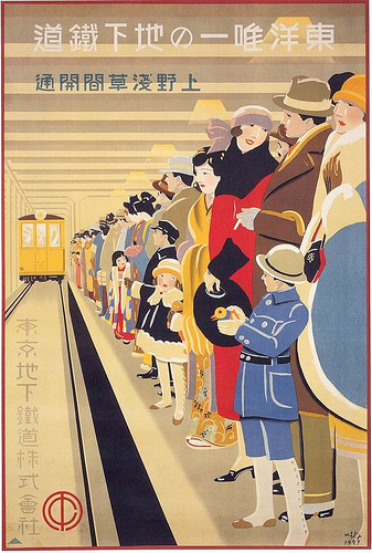
Prewar Japan's commercial modernism, typified by Sugiura Hisui's Mitsukoshi and subway posters: Deco crossed with nihonga, the modern girl's city and refined lettering drawing the dawn of consumer culture.
Sugiura Hisui, Tokyo Underground Railway poster, 1927 — Wikimedia Commons / Public domainAdvertising pictures with a calendar attached, which flowered in Shanghai. Women in qipao rendered in rubbed charcoal and watercolor sold cigarettes and cosmetics while keeping the date, and this East-West hybrid of commercial beauty painting repainted the visual culture of East Asia.
East Asia Tobacco Company advertising poster, 1930 — Wikimedia Commons / Public domainThe mass-printed gods begun at Ravi Varma's press: oil-painted mythology delivered to homes as oleographs, still printed today as bazaar art shaping India's visual everyday.
Oleograph by Raja Ravi Varma — Wikimedia Commons / Public domainThe Polynesia dreamed up by American bars and restaurants. Carved figures, bamboo, torches and mai tai glasses gave style to a postwar wish to escape. It is an imaginary South Seas, and it should be read together with its history of borrowing from Pacific cultures.
Trader Vic's menu cover — Wikimedia Commons / No restrictionsIn Japanese manga, sound effects and even the feel of silence are drawn as pictures, from a booming don to a hushed shiin. Hand-lettering turns the texture of a sound into line weight and shape, dissolving the border between image and word inside the panel.
Unknown artist, Taishō-era manga, hand-drawn katakana scattered across the page — Wikimedia Commons / Public domainA grammar of exaggeration that came out of four colour printing on cheap newsprint. Heavy black outlines fence in every form, areas are filled by overprinted primaries and dot screens, and both motion and sound are drawn as shapes in their own right.
Golden Age comic book cover, 1948 — Wikimedia Commons / Public domainThe style of uniform outline that Hergé established in Tintin. Nothing casts a shadow and every element carries the same line weight, a democratic picture plane whose clarity became an aesthetic, still flowing from European comics into illustration today.
Hergé, The Adventures of Tintin mural (Rue de l'Étuve, Brussels) — Wikimedia Commons / CC BY-SA 3.0 · © Ferran CornellàThe early republic's advertising style built almost single-handedly by İhap Hulusi: flat figures, clean color fields and Latin-script lettering fusing graphics with the state's modernization.
Flyer for the film Ateşten Gömlek, 1932 — Wikimedia Commons / Public domainA pictorial revolution that freed the subject from a single viewpoint, reassembling facets seen from multiple angles on one flat plane. The fractured planes and muted palette of the Analytic phase, then the newspaper collage and lettering of the Synthetic phase, gave twentieth-century graphic design its founding premise: the picture is not a window onto reality but a field of construction.
Juan Gris, Still Life with a Guitar, 1913 — Wikimedia Commons / Public domainA short-lived movement that severed colour from the depiction of its subject, slamming pure hues onto the canvas as flat planes. The brushstroke itself carries the contour, and adjacent complementaries make the surface vibrate. It became the starting point for every later design that uses colour as a device of emotion.
Henri Matisse, Open Window, Collioure, 1905 — Wikimedia Commons / Public domainAn abstraction that returned colour and movement to Cubist fragmentation, painting light itself through rings of simultaneous contrast. Rotating discs and a refracted spectrum generate time and vibration within a static surface. One of the first practices to translate the theory of simultaneous colour contrast into form.
Robert Delaunay, Simultaneous Windows on the City, 1912 — Wikimedia Commons / Public domainA Russian abstraction that declared its subject to be not objects themselves but the crossing of light rays reflected from them. Sharp diagonal bundles of lines intersect, dissolving the object into an interference pattern of light. It marked the point where Russian abstraction broke away from Cubism.
Mikhail Larionov, Rayonism, Red and Blue (Beach), 1911 — Wikimedia Commons / Public domainA movement that attacked Cubism's drift into decoration and called for a return to forms fit for the machine age. Standardized objets-types such as bottles, glasses and guitars are painted within a horizontal-vertical order and a restrained palette. Through the journal L'Esprit Nouveau it became a norm for modern architecture and graphics.
L'Esprit Nouveau, no. 1 — Wikimedia Commons / Public domainA manner of painting named after the partitions of cloisonné enamel: flat fields of colour enclosed by heavy contour lines. It brought the way of seeing of ukiyo-e prints and stained glass into oil painting, abandoning shaded volume in favour of colour laid down from memory. The technique that prepared the flatness of the poster.
Paul Gauguin, Vision after the Sermon, 1888 — Wikimedia Commons / Public domainA group of painters who called themselves prophets, setting out from the declaration that a picture is essentially a flat surface covered in a certain order. They extended interiors and daily life into decorative panels, lithographs, book illustration and stage design, dissolving the boundary between fine and applied art.
Pierre Bonnard, France-Champagne poster, 1891 — Wikimedia Commons / Public domainA method that replaced Impressionist intuition with optical theory, setting down dots of unmixed pure colour to be blended on the retina. The discipline of Divisionism and Pointillism tackled, in advance, the same problems as later halftone printing, mosaic and pixel-based image construction.
Georges Seurat, A Sunday Afternoon on the Island of La Grande Jatte, 1884–86 — Wikimedia Commons / Public domainAn international movement that sought to visualise the inner life through forms and colours suggesting dream, myth and idea, rather than describing the outer world. Blurred contours, closed eyes, ornamentalised plants and emblems are placed as presences whose meaning is never spelled out. It created the vocabulary of fin-de-siècle posters and book decoration.
Gustave Moreau, The Apparition, c. 1876 — Wikimedia Commons / Public domainA realism codified as the state's official style in 1934, depicting workers and leaders in idealised form. It rejected avant-garde experiment in favour of imagery legible to everyone, repeating the regime's narrative through low viewpoints, forward-striding crowds and the light of a bright future. Important as a rare case in which a state decreed a style.
Portrait of Lenin by Isaak Brodsky, 1925 — Wikimedia Commons / Public domainA Paris-born movement that freed the letter from its duty of carrying meaning, treating sound and shape themselves as the material of the work. From surfaces paved with unreadable characters, to hypergraphy's proliferating signs, to marks scratched directly into film stock, it expanded the experiment of handling letters as physical matter.
grammeS, journal of the Ultra-Lettrist group, inside page — Wikimedia Commons / CC0The practice of détournement: hijacking existing images from advertising, comics and film, and swapping only the speech-balloon text to invert their meaning. Its knack for betraying dominant imagery from the inside, at no production cost, runs in a straight line to later culture jamming and internet memes.
Internationale situationniste magazine, no. 1, 1958 — Wikimedia Commons / Public domainA postwar European abstraction that refused both geometric composition and figuration, making the surface out of matter and the traces of the act itself. Thickly piled paint, scratches, stains and tears present a state before form. The source of all design that pushes the physicality of material to the front. Tachisme names the same paintings seen from the speed of the gesture, and Lyrical Abstraction names them seen from the lyric side.
Composition by Wols — Wikimedia Commons / CC BY-SA 4.0 · © G.GaritanA European abstraction named for the tache, or stain, which gives the leading role to the chance of a brushmark and a drip. Planned composition is abandoned, and the speed at which paint lands and runs becomes the order of the surface. Within Art Informel this is the name that fixes on the swiftness of the gesture.
Hans Hartung, T46-17, 1946 — Wikimedia Commons / CC BY 2.0 · © Pedro Ribeiro Simões from Lisboa, PortugalAn Italian movement that slashed and punctured the canvas to open painting from two-dimensional illusion into actual space. The darkness behind the cut appears as real depth, and the support itself becomes the work. The precedent that turned breaking a material's surface into a formal language.
Lucio Fontana, Concetto spaziale, Kröller-Müller Museum — Wikimedia Commons / Public domainWork defined by the condition that it actually moves, or that its image changes as the viewer moves. Mobiles, motor drives and layered grids producing moiré make time a structural element of the work. The foundation of the idea that motion itself is something to be designed.
Jesús Rafael Soto, Double Progression Vert et Blanc, 1969 — Wikimedia Commons / CC BY-SA 4.0 · © FunkyxianAn international current in which large formats, violent brushwork and subjects from history and myth returned, in reaction against the asceticism of Minimal and Conceptual art. Its raw draughtsmanship and layers of grime feed directly into the temperature of 1980s record sleeves and magazine layouts.
Georg Baselitz, BDM Gruppe, 2012 — Wikimedia Commons / CC BY-SA 4.0 · © WamitoA 1980s New York current that re-quoted the vocabulary of geometric abstraction and Minimalism as signs of the commodity society. Smooth industrial paint, fluorescent colour and the gloss of ready-made goods slide abstraction's purity sideways into the imagery of consumption. Geometry as critique.
Peter Halley, installation view, Galería Senda — Wikimedia Commons / CC BY-SA 4.0 · © Abcd09A one-man movement flying as its banner a single word clipped from a bank advertisement, building compositions out of nothing but discards such as tickets, wrapping paper and torn type. Treating rubbish as structural material, and placing typographic fragments abstractly, it settled the vocabulary of collage and magazine design.
Kurt Schwitters, Merz 50 — Wikimedia Commons / Public domainThe programme of the Czech avant-garde group Devětsil, extending poetry onto the page and into life itself. Its 'picture poems' combining photomontage with type, its compositions of circles and diagonals, and its vivid two-colour printing turned poetry books, magazines and posters into one continuous field of experiment.
Karel Teige, Departure for Cythera, 1923–24, Prague City Gallery — Wikimedia Commons / Public domainA Polish theory holding that a picture should contain neither contrast nor centre, existing instead as a single homogeneous organism. The hierarchy of figure and ground is erased, and the colour surface continues with equal weight to the very edge. The theoretical ancestor of the uniform grid and all-over composition.
Władysław Strzemiński, Abstract Composition, 1933 — Wikimedia Commons / Public domainA movement that transfers the photograph itself onto the canvas, rebuilding by hand the quantity of information a mechanical eye records. Shop-window reflections, the warp of chrome, diner neon: the subject is fixed on the surface together with the photograph's own focus, grain and chromatic fringing. What is painted is not what was seen but the fact that a camera saw it that way.
Ralph Goings, Sacramento Airport — Wikimedia Commons / CC BY-SA 4.0Painting whose handling is scrupulously realist, yet whose light, placement and silence tip reality one notch out of true. It uses none of Surrealism's distortions; instead it sets ordinary things down with uncanny clarity, summoning unease and stillness at once. The name comes from German art criticism of 1925.
Georg Schrimpf, Reclining Woman with Child — Wikimedia Commons / Public domainAn American landscape manner in which the brushmark is erased from a smooth surface and atmospheric light is graded in stages to the horizon. Figures are small, water lies still as a mirror, and light itself becomes the subject. A textbook of composition for anyone designing stillness.
Fitz Henry Lane, Owl's Head, Penobscot Bay — Wikimedia Commons / Public domainAn American landscape manner that covers the whole picture in a single tone and dissolves contour into mist and dusk. A narrow range of greys, blue-greys and browns with softened edges produces the vagueness of a landscape held in memory. Feeling designed through a restricted palette.
George Inness, The Rainbow — Wikimedia Commons / Public domainA movement in Depression-era America that refused the European avant-garde and painted the farming and labour of the Midwest in realist terms. Rolling hills, stylised figures and legible narrative became national imagery by way of murals, magazines and postage stamps. The classic case of a region turned into a style.
Grant Wood, American Gothic, 1930 — Wikimedia Commons / Public domainThe first abstract movement to originate in America, holding that colour itself could be structure on the analogy of musical harmony. Planes laid out in spectral order rotate and generate depth, and form follows colour rather than preceding it. The work titles, Synchromies or chords of colour, were the programme itself.
Stanton Macdonald-Wright, Synchromy No. 3 — Wikimedia Commons / Public domainA postwar current that answered the inwardness of Abstract Expressionism by bringing household objects, printed matter and taxidermy onto the picture, working in the gap between art and life. It inherited Dada's gestures while making the materials of consumer society into structural components. The branching point immediately before Pop art.
Photo by Jac. de Nijs, Robert Rauschenberg with his work (solo exhibition at the Stedelijk Museum), 1968 — Wikimedia Commons / CC0A group that declared, in Paris in 1960, the direct appropriation of reality. Layers of torn posters, compressed car bodies and accumulated refuse make the city itself into the work without passing through depiction. The stance of selecting material rather than working it laid the ground for all later assemblage.
Jean Tinguely, Fasnachtsbrunnen (Carnival Fountain), Basel — Wikimedia Commons / CC BY-SA 4.0 · © EinDaoAbstraction that leans neither on geometric discipline nor on violent gesture, assembling a lyric out of flowing strokes and bleeding colour. The name was born in Paris and was later applied in America to thinly painted, stained canvases. A reference point whenever softness and lightness have to be designed.
Karel Appel, Leap into Space, 1953 — Wikimedia Commons / CC BY 2.0 · © Pedro Ribeiro Simões from Lisboa, PortugalPainting that keeps every boundary perfectly sharp and builds the picture out of flat planes of colour alone. Brushwork and gradation are excluded, so the edge of a plane becomes the only event. The precise edge obtained by masking is the direct ancestor of later flat design and vector work.
Ellsworth Kelly, Red Yellow Blue White and Black — Wikimedia Commons / Public domainA movement in ceramics and sculpture around the San Francisco Bay Area that deliberately soiled good taste and the authority of abstraction alike. Garish colour, bodily humour and the wilful misuse of craft materials laugh at the hierarchy of art itself. An early precedent for treating coarseness as a strategy.
Robert Arneson, Portrait of George Moscone — Wikimedia Commons / CC BY 2.0 · © Gary StevensA movement that argued head-on with modernism's premise that ornament is inferior. It brought the repetitions of Islamic geometry, quilts, wallpaper and textiles onto large canvases and placed women's handwork and non-Western idioms at the centre of art. The starting point for treating decoration as a political question.
Robert Kushner, An Interior Decorated — Wikimedia Commons / CC BY 4.0 · © Joycekoz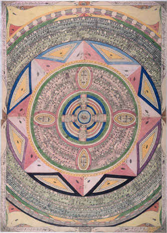
A concept framed to name work made outside art education and the art market, relying on nothing but a system of its own. Repetition filling the whole surface, private alphabets and sign systems, and the exhaustive reuse of materials recur across it. Less a style than the name for the conditions under which a style arises.
Adolf Wölfli, Ring of Sea and Islands — Wikimedia Commons / Public domainA Mexican avant-garde that shouted its praise of the post-revolutionary city, of radio waves and machines. Sharp woodcut lines, type running on the diagonal and imagery of cables and aerials erupted over a few years through magazines and handbills. The moment Latin American vanguardism found a speed of its own.
Ramón Alva de la Canal, The Landing of the Spaniards — Wikimedia Commons / CC BY-SA 4.0 · © Luis AlvazA Brazilian programme that took cannibalism as its metaphor: do not refuse European culture, eat it and turn it into your own blood. Its affirmation of mixture as a method rather than a weakness has run underneath Brazilian design, music and architecture ever since.
Cannibal Manifesto, 1928 — Wikimedia Commons / CC BY-SA 4.0 · © MrwildesonA movement, centred on the Andean countries, that made the bodies, dress and land of indigenous people the subject of the nation. It took local frame and local colour as its standard in place of a European ideal, and spread through painting, printmaking, photography and architectural ornament. It shifted the question of what beauty is measured against.
Cover of Amauta magazine, no. 26 — Wikimedia Commons / Public domainA movement begun in Chile and carried through Paris, which declared that poetry does not copy nature but creates new facts. It produced visual poems in quantity, arranging letters as shapes and making the border between language and page a subject of experiment. With Ultraismo, one of the two pillars of the Spanish-language avant-garde.
Vicente Huidobro, calligram Triángulo armónico from Canciones en la noche, 1913 — Wikimedia Commons / CC BY-SA 2.0 · © Hoder SlangerThe late development of Italian Futurism, which declared the view from an aircraft to be the condition of painting. Plunging perspective, whirling cloud and an earth that turns over fix the sensation of speed and altitude on the canvas. A rare case of a style made out of the height of the viewpoint.
Aeropittura work by Tato — Wikimedia Commons / Public domainA movement that, after the avant-garde had dismantled form, sought a return to the mass and stillness of Italian classicism. Simplified, solid bodies, subdued earth colour and emphatically frontal composition became the vocabulary of interwar public building and mural painting. A leading case of the return to order, and one that has to be read together with its closeness to the regime.
Mario Sironi, Composition with Figures — Fondazione Cariplo / CC BY-SA 3.0An Italian movement that set out to make the abstraction of modern architecture and the classicism of the Mediterranean hold at the same time. What looks like a white box is in fact carrying ancient proportion in the rhythm of its bays, the depth of its overhangs and the planes of its marble. A textbook for refusing to set the modern against the traditional.
Giuseppe Terragni, Casa del Fascio, Como, 1936 — Wikimedia Commons / CC BY-SA 4.0 · © Nicola QuiricoThe manner of government and memorial building in which classical architecture is shorn of ornament, leaving only proportion, axis and the rhythm of the columns. That it still reads as classical without ornament made it a cheap means of speaking authority. Important as a case in which the minimal and the intimidating live together.
Federal Triangle government buildings, Washington, D.C. — Wikimedia Commons / CC BY 2.0 · © User:Ancheta WisAn expression born out of the Mexican American civil rights movement. Murals, silkscreened posters, lowriders and lettering form one continuous vocabulary, and Aztec imagery, Catholic devotional figures and mixed English-Spanish lettering share a single surface. A case in which a movement produced a style.
Murals at Chicano Park, San Diego — Wikimedia Commons / CC BY-SA 4.0 · © Leirbag00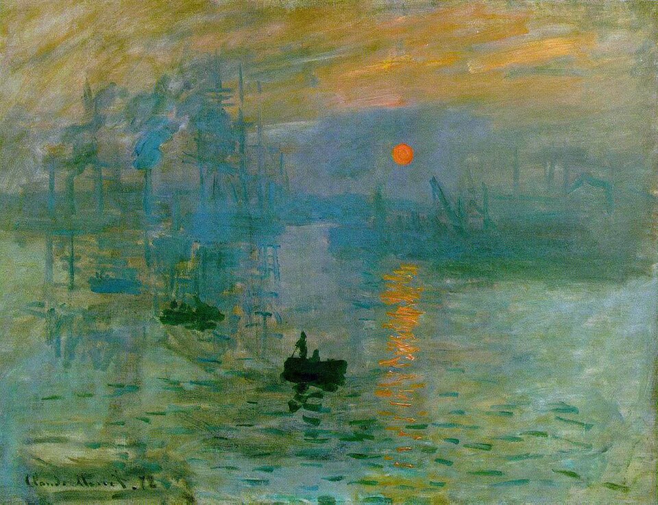
A movement that went outdoors and caught light itself with rapid strokes. It abandoned the contour line, laid shadows in complementary colors rather than black, and painted the same subject differently at each hour of the day. Nearly every avant-garde that followed defined itself by agreeing or disagreeing with it.
Claude Monet, Impression, Sunrise, 1872 — Wikimedia Commons / Public domain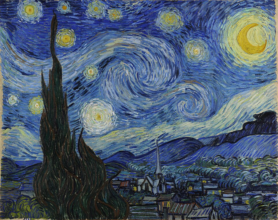
A collective name for painters who found the improvisation of Impressionism insufficient and recovered structure, symbol and emotion, each in their own way. It is not one style but several answers standing side by side, among them pointillism, flat fields of color and surging brushwork. Twentieth century abstraction branched off from here.
Vincent van Gogh, The Starry Night, 1889 — Wikimedia Commons / Public domainA movement that rediscovered ancient proportion and the human body and fixed three dimensions on a flat surface through linear perspective. Mathematics became the common language of painting and architecture, and the norms of the next five hundred years, symmetry, the classical orders and the golden ratio, were established here.
Masaccio, Holy Trinity, 1425–1428 — Wikimedia Commons / Public domainA movement that turned back to ancient simplicity, prompted by the excavations at Pompeii and reacting against the decorative excess of Rococo. Contours are hard, color is held down, and the subjects preach civic virtue. States of the revolutionary period chose this style as their own face.
Jacques-Louis David, Oath of the Horatii, 1784 — Wikimedia Commons / Public domainAn English brotherhood that discarded the formulas established after Raphael and tried to return to the clarity of the early Renaissance. Transparent paint over a white ground made the color uncannily sharp, and because every detail is worked to the same degree, the eye has nowhere to rest.
John Everett Millais, Ophelia, 1852 — Wikimedia Commons / Public domainA movement that deliberately chose the pointed arch and the verticality of the Middle Ages again, in objection to industrialization and to classicism. It was not simple nostalgia. It created the idea that choosing a style is an argument about morality and national character.
Edmund F. Arras, House of Lords chamber, Houses of Parliament, 1913 — Wikimedia Commons / Public domainA movement that rejected the division of labor among designer, carver and printer and declared that one person draws, carves and prints. It chose to leave the trace of the maker's hand rather than technical perfection, taking the opposite road from the shin-hanga of the same years.
Yamamoto Kanae, Fisherman, 1904 — Wikimedia Commons / Public domainA modern framework that redefined Japanese painting from the side of its materials, mineral pigment, animal glue, washi and silk, in response to the influx of Western painting. Its character is a compromise led by material, keeping traditional technique while modernizing subject and composition.
Hashimoto Gahō, White Clouds and Red Trees, 1890 — Wikimedia Commons / Public domain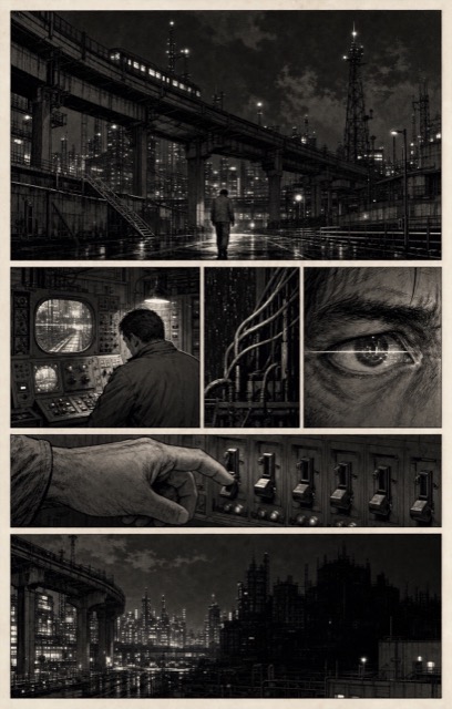
AI interpretation, not a reference
The name Tatsumi Yoshihiro raised in order to separate his work from manga for children. With a thin drawn line, heavy shadow and cinematic panel flow, it treated adult social themes and violence. It decisively widened the range of subjects comics could take on afterwards.
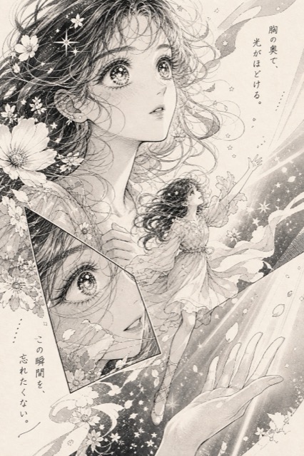
AI interpretation, not a reference
A field that built its own grammar for translating psychology into space. Panels are broken open, flowers and stars scatter across the background, and the inner voice runs out into the margins. The large eyes and the overlaid panels are devices for drawing the flow of feeling rather than the flow of time.
The drawing conventions Japanese television animation accumulated in order to deliver the most information from the fewest drawings. A unified, sign like face, clarity of contour, and speed produced by held drawings and effects have influenced drawing styles around the world.
Danny Choo, character design by Azami Yuko, Mirai Suenaga, character of Culture Japan, 2011 — Wikimedia Commons / CC BY-SA 2.0A design system that reduces the physical metaphor of paper and ink to rules of shadow and overlap. Elements are given elevation, shadow states the hierarchy, and motion carries physical cause and effect. It became the model for UI design being distributed as a system. The 2021 revision added colour derived from the device wallpaper, so the palette differs from one user to the next.
Google, Material Design UI components — Wikimedia Commons / Public domainA technique in which cloth is stitched, bound or clamped between boards before dyeing, so that only the parts under pressure stay white. The result is left to the strength of the craftsman's hands and the movement of the cloth, and no two pieces come out alike even from the same pattern.
Utagawa Hiroshige, Famous Views of the Fifty-three Stations of the Tōkaidō, no. 41 Narumi, shop of the local Arimatsu shibori, 1855 — Wikimedia Commons / Public domainA technique in which the threads are bound and dyed before weaving, calculated so that the pattern appears only once the cloth is woven. A slight shift of the threads blurs the outline, and that wavering is the fingerprint of ikat. Design and chance live in the same process.
Patan patola double ikat (Gujarat, India, trade cloth for the Indonesian market) — Wikimedia Commons / CC BY-SA 4.0 · © JainamishraA technique in which concentric rings of ink dropped on the surface of water are disturbed by breath or brush and then lifted onto paper. The flow that appears on each sheet cannot be repeated, and from Heian period decorated papers to contemporary bookbinding it has continued as a method for inviting chance on purpose.
Nishi Honganji Sanjūrokunin kashū, Tsurayuki shū volume 1, suminagashi paper, early 12th century — Wikimedia Commons / Public domainMulticolor printing in which a separate lithographic stone is prepared for each color and the stones are overlaid in exact register. A dozen or more stones built up an intensity like oil paint and sent reproductions, labels, posters and cards into the world in quantity. The popularization of color printing begins here.
Liebig trading card, Woman of Naples, 19th century — Wikimedia Commons / Public domainThe pottery reached by the Ottoman kilns, setting brilliant blue and red on a white body. Tulips and carnations turn in spirals around the curve of the vessel, and on the wall tiles of a mosque geometry and plant ornament coexist on a single surface.
Iznik dish, late 16th century, photo Faqscl — Wikimedia Commons / CC BY-SA 4.0Painting made by scholar officials rather than professional painters, not to sell but to show their own spirit. It valued the spirit of the brush above skill and treated poetry, calligraphy, painting and seal as equals on one sheet. At the core of the style is a refusal to fear looking unskilled.
Ni Zan, Six Gentlemen, 1345 — Wikimedia Commons / Public domainApple's own name for the default appearance of Mac OS 8, shipped alongside the Appearance Manager, a framework built so the entire look could later be swapped for another. It drains the color out of the interface and works in grays alone, embossing whatever can be pressed and flattening whatever cannot until it merges with the background. The newly thickened window frame was a signal that the window could now be dragged by any edge.
Mac OS 8.1 desktop and "About This Mac" — Wikimedia Commons / CC0This is the design language Apple named itself, in the 1987 guidelines book whose subtitle reads The Apple Desktop Interface. Working with one bit of black and white, it wrote down a house style: halftone dot patterns standing in for gray, rounded window corners, a title bar of stacked horizontal rules, and a heavy bitmap face.
Macintosh System 3 screen, 1986 — Wikimedia Commons / CC0The screen language Apple set out for Vision Pro in its Human Interface Guidelines. A window is an upright plane whose background is a material Apple calls glass, so the room shows through it while specular reflections and shadows report where the plane sits and how big it is. visionOS defines a point as an angle rather than a count of pixels, which keeps a window's apparent size constant as it moves away.
visionOS 2 home screen, 2025 — Wikimedia Commons / CC0The screen language Microsoft set down in its 1995 handbook for software design. Gray panels are carved with a doubled outer and inner edge, so the direction of the shadow alone says what can be pressed. A bar sits permanently along the bottom, and every application is assembled from the same system parts.
Polish edition of Windows 95, desktop and Start menu — Wikimedia Commons / CC0Google's design language for Android, introduced with 3.0 and pushed so hard that carrying it unmodified became a compatibility requirement for every 4.0 device. It rules a black ground with hairlines and lets a single cyan blue carry selection, focus and progress. It arrived as a guarantee as much as a look, since an app that asked for the theme by name would be drawn the same way even on a phone wearing a manufacturer's skin.
Android 4.1 lock screen (Galaxy Nexus), 2012 — Wikimedia Commons / CC BY 2.5 · © Android Open Source projectMotif is the interface language of UNIX workstations, maintained by The Open Group, standardized as IEEE 1295 and shipped on more than two hundred platforms. Its own data sheet calls the look a distinctive 3D beveled appearance, meaning every part sits on a gray face edged with one light line and one dark line.
Default screen of the Motif Window Manager (mwm), 2014 — Wikimedia Commons / CC0A screen language for Unix workstations, specified by Sun Microsystems in a functional specification published by Addison-Wesley in 1989. The book defines two parallel designs, one black and white for monochrome displays and one three dimensional for grayscale and colour, sets a single sans serif variable width face for every common element, and tells implementers that restraint is the key to colour. Each pop-up window carries a pushpin at the left of its header, and pinning it leaves the window on the workspace.
OPEN LOOK style windows and window menu (olvwm), 2016 — Wikimedia Commons / CC BY-SA 4.0 · © AmacbrideThe screen language NeXT laid down in its 1993 interface guidelines. The document states the goal outright: a color scheme based on black, white, and gray, and a simple appearance that uses shading for a three dimensional effect. The main menu stands as a vertical column at the upper left, and docked application icons run down the right edge.
The WorldWideWeb browser on NeXTSTEP — Wikimedia Commons / Public domainThe screen language Commodore set down for the Amiga in its own style guide. Early Workbench works in four colors, blue with white and orange, and packs Topaz, a blocky bitmap face, into a 640 by 200 grid. Its signature move is that the screen itself is a layer, so grabbing the bar at the top and dragging it down reveals another screen running behind it with its own palette and resolution.
Amiga Workbench 1.x screen, 1985 — Wikimedia Commons / CC BY-SA 4.0Be's interface language threw away the full width title bar and put a short yellow tab on the top edge of each window instead. The user's guide calls sliding that tab a unique feature of Be windows: hold Shift and the tab travels sideways, so stacked windows leave a row of visible tabs rather than burying one another.
Tullius, BeOS screen, 2005 — Wikimedia Commons / CC BY-SA 3.0 · © The original uploader was Tullius at Norwegian Wikipedia .Adwaita is the name GNOME gives its default visual style, defined in the project's Human Interface Guidelines. One set of components has to carry a light style, a dark style and a high contrast style, so colour arrives as named variables that switch rather than as fixed values. A header bar crosses the top of every window holding buttons drawn with no background and no border, and interface icons are monochrome symbolics built on a 16 by 16 pixel grid.
Nathan Hadley, GNOME Settings 48, 2025 — Wikimedia Commons / CC BY-SA 4.0 · © Nathan Hadley (Pigeon)Sun's default look and feel for Swing, built so that a program looks the same on every operating system. Metal was Sun's internal project name for it and stuck as the public one. Blue violet fills, thin straight borders, and a flat refusal to imitate the host platform are its signature.
DavidL, Metal look and feel in Swing, 2020 — Wikimedia Commons / CC BY-SA 4.0Samsung's design language for Galaxy devices. It cuts the screen at the height a thumb reaches most easily and calls the part above that the viewing area and the part below the interaction area, so titles sit high while buttons, tabs and dialogs are gathered low. Content is collected into containers with heavily rounded corners, the ground is either white or true black, and a single blue carries every accent.
Armen777444, One UI 7 Device care screen, 2025 — Wikimedia Commons / CC BY 4.0Sony's trademarked interface language for its consoles and televisions. As the official manual puts it, the horizontal row shows system features in categories and the vertical column shows the items available under each category, and the single point where the two cross lights up gold to say where you are. Everything else stays pale blue on a dark field.
Tatcher, XMB on a Sony BRAVIA, 2010 — Wikimedia Commons / CC BY-SA 3.0The interface General Magic put on its communicating handhelds, running on the Motorola Envoy and the Sony Magic Link. Instead of imitating single objects it imitates a place, opening on an Office where a telephone, a Rolodex, a notepad and a calendar sit on a desk, with a wall clock, in and out boxes and a filing cabinet behind it. From there a Hallway, furnished and hung with pictures, leads to the Game Room, the Living Room, the Storeroom and the Control Room.
Josh Carter, Sony Magic Link, 2010 — Wikimedia Commons / CC BY-SA 3.0The design language the UK government's Government Digital Service publishes and maintains for public services. Everything runs in one undecorated left aligned column set in GDS Transport, and the green button keeps square corners while carrying a darker green band along its bottom edge, dropping by exactly that depth when pressed. Whatever holds keyboard focus turns yellow with a black rule under it.
GDS Transport set on the GOV.UK homepage, 2025 — Wikimedia Commons / Public domain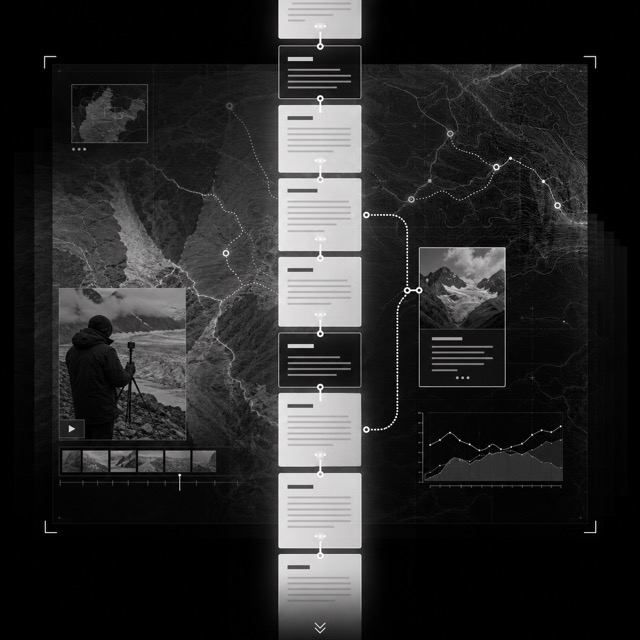
AI interpretation, not a reference
A web page form in which the reader's scroll position is the clock of the story, with graphics, maps and video changing as the page moves and reversing when the reader scrolls back. Visualization researchers treat it as the web equivalent of long form journalism and describe its structure as either linear or elastic, the elastic kind letting a reader dive deeper on demand. News outlets including the New York Times, the BBC and The Economist built the form out.
Scott McCloud's name, given in Reinventing Comics in 2000, for a way of laying out webcomics. The screen is treated as a window onto one unbroken surface rather than as a page, so panels can run in any direction for any distance. Because the medium measures time with space, the gap between panels becomes the pace of the story.
Scott McCloud, The Right Number, 2003 — Wikimedia Commons / Public domainA comics layout that grew on Korean portals and runs down a single column. The blank space between panels stops being a mere break and becomes the material, because its length carries elapsed time or a change of scene while it also takes on background colour, falling rain, and even the dialogue lifted out of the frames. Since the reader cannot glance ahead, the act of scrolling becomes the passage of story time.
Second generation webtoon in a single vertical column, 2014 — Wikimedia Commons / CC BY-SA 4.0 · © Seoung13The name Bret Victor gave, in a March 2011 essay of the same title, to writing that embeds a running model inside the prose. Numbers in the body text carry a dotted underline and can be dragged, and pulling one rewrites the rest of the sentence and the figure beside it at the same time. He described the result as a written argument whose assertions are backed by explorable computational models.
Vi Hart and Nicky Case, Parable of the Polygons, 2014 — Wikimedia Commons / CC0The name that stuck to the craft of making the screens that appear inside films. It spread around the work of Mark Coleran, who says he is given credit for the term without being sure he can take it, and who describes these screens as illustration and a storytelling device that was never designed to be used. He works with light, shape, form, movement and sound so that each film screen has one thing the audience is meant to read.
LCARS panel from Star Trek: Voyager, photographed 2016 — Wikimedia Commons / CC BY-SA 4.0 · © Niesy74A name for the corner of game interface design where an element belongs both to the fiction and to the three dimensional world. A 2009 master's thesis at Chalmers University of Technology, written with EA DICE, mapped game UI on those two axes and reserved the word for that corner. Health glowing on the hero's own suit is the type case.
Three One Zero, ADR1FT, 2014 — Wikimedia Commons / CC BY-SA 3.0The way of drawing icons in nothing but black and white that Susan Kare established for the Macintosh. She worked each design out on graph paper with one square standing for one pixel, and restated commands as ordinary objects, a pair of scissors for cutting and a bin for deleting, so the set could be read without a caption in any country. Her sketchbook now sits in a museum collection.
Macintosh System 2 desktop — Wikimedia Commons / CC0Stacks of screens made and passed around by amateurs, drawn one bit black on white. A single card fills the screen instead of a page, picture and text are pasted onto the same surface, and a row of small icon buttons along the bottom jumps to another card or another stack.
Karl Baron, HyperTalk script editor on a Macintosh Plus, 2008 — Wikimedia Commons / CC BY 2.0
AI interpretation, not a reference
Player faces drawn and passed around by amateurs. The rectangular window frame is thrown away for the front panel of a piece of stereo equipment, and even the digits and letters are drawn as bitmap pictures laid side by side on a single sheet.
A service page built to finish inside one screen of a grid terminal. The name of the service sits along the top, the choices run down the screen as a numbered list, and headings and pictures are assembled from coarse blocks that divide the character cell.
Bernard Marti, Thomson videotex terminal used in the Vélizy Télétel trial, 1980 — Wikimedia Commons / CC BY 3.0A movement the Australian collective VNS Matrix claimed for itself in 1991, and which the theorist Sadie Plant named independently in Britain at the same moment. Its manifesto travelled by fax, by mail, as a wheatpaste poster, as a billboard, and as an online post. Against a computer culture that wanted to leave the body behind, it put slime and sex back at the centre.
Old Boys Network, 100 Anti-Theses of Cyberfeminism, 1997 — Wikimedia Commons / CC BY 4.0 · © Sollfrank, Cornelia & Old Boys Network ed. 1998. First Cyberfeminist International. Hamburg: obnCobalt blue brushed onto a white porcelain body, sealed under a clear glaze and fired once. Potters at Jingdezhen in Jiangxi established it during the Yuan dynasty by adding kaolin to the clay and improving their firing technology. Because the palette is held to a single colour, every gradation has to come from thin and thick washes and from shapes reserved in white.
Blue-and-white foliate-rim dish with rocks, flowering plants and melons, Yuan dynasty, 14th century — Wikimedia Commons / CC0An overglaze enamelled porcelain style that began in China and is built on an opaque enamel running from pink to purplish rose. The pigment is Purple of Cassius, made from colloidal gold, and it reached China with Jesuit missionaries around 1685. The style peaked under the Yongzheng reign of 1723 to 1735 and afterwards was produced largely for export to Europe.
Famille rose bowl with lotus scroll, Qing dynasty, Qianlong era, 1736-1795 — Wikimedia Commons / CC BY 4.0Blanc de Chine is the European name for the white porcelain fired at the Dehua kilns in Fujian. Nothing is painted on it, so the whole effect rests on a milky, faintly bluish glaze and on bodies pressed in piece moulds with details modelled separately and applied by hand. Guanyin figures and libation cups copied from carved rhinoceros horn became its signature pieces.
Dehua ware white porcelain standing Guanyin, second half of the 17th century — Wikimedia Commons / CC0The main ceramic style of Korea's Goryeo dynasty, built around glazes that range from green to bluish, the finest of which was called bisaek, or jade colour. The clay body carries traces of iron and fires a grayish white, which sets it apart from the pure white porcelain of the same centuries. Because the glaze stays translucent, inlaid decoration cut into the body and filled with white and red slip reads as if held under water.
Celadon maebyeong with inlaid cloud and crane design, Goryeo dynasty, 13th century — Wikimedia Commons / CC BY-SA 3.0 · © The original uploader was Korea history at English Wikipedia .Buncheong is Korean stoneware whose bluish grey body is covered with white slip, and its name shortens a phrase used by the art historian Go Yuseop. The group is sorted by how the slip is applied, through inlay, stamping, sgraffito, incising, iron painting, brushed slip and dipped slip. Because the coating is never even, the marks of the hand stay on the finished pot.
Buncheong jar with sgraffito peony design, Joseon dynasty, second half of the 15th century — Wikimedia Commons / CC0Porcelain from the Arita district of Hizen, painted with bright enamels laid over the glaze on a fine white body. The name comes from a family of decorators said to have brought overglaze enamelling to Arita in the 1640s. Wide areas of the white body are left bare and the painting is pushed to one side of them.
Kakiemon-style enamelled dish, Arita, c. 1675-1725 — Wikimedia Commons / Public domainA stoneware style fired in the Seto and Mino kilns from the Momoyama period into the early Tokugawa years, centred on utensils for the tea gathering. Surfaces stay rough and the glazes are few, simple and warm in colour. Copper green covers only part of the pot, and the reserved body carries iron brushwork.
Oribe square bowl, Mino ware, Edo period, 17th century — Wikimedia Commons / Public domainRaku is pottery covered with a lead glaze and fired at a very low temperature, with the piece pulled from the kiln while still hot and left to cool in open air. The glaze never fully levels and the body stays soft and porous, so no two pieces from one firing carry the same surface. The Getty vocabulary lists the Japanese process and the wider technique as two separate entries.
Hon'ami Kōetsu, white Raku tea bowl named Fujisan, 17th century — Wikimedia Commons / Public domainA way of painting maiolica in which the whole face of a dish becomes one picture, carrying a historical, mythological, Biblical or allegorical scene in colour all the way to the rim. It first appears around 1500 and is associated with Urbino. The vessel stops being a decorated object and turns into a support for painting.
Urbino workshop, footed dish with Abraham and Isaac, 16th century — Wikimedia Commons / CC0Talavera is the tin-glazed earthenware that Spanish potters' technique became in and around Puebla, painted over a thick milky white glaze. Local potters borrowed the blue-and-white schemes of Chinese porcelain that crossed the Pacific and passed through the city, then mixed in local figures such as the quetzal and the double-headed eagle. That crossing is what separates it from the Spanish maiolica it started from.
Talavera jar, 18th century, Museo Franz Mayer — Wikimedia Commons / CC BY-SA 3.0 · © AlejandroLinaresGarciaCeramics made by individual artist potters in their own workshops, where one person carries a pot from forming through glazing to firing. It emerged in the early twentieth century as part of a wider revival of crafts and is deliberately non industrial. The Leach Pottery, opened at St Ives in Cornwall in 1920, became its best known centre.
Hans Coper, spade form vase, 1968 — Wikimedia Commons / CC0A technique of enamelling in which thin metal strips are laid on a metal or porcelain ground to form chambers, and vitreous enamel paste is packed into each chamber. The strips survive the firing as visible metal lines, so every area of colour stays closed inside a line. Getty files it under processes rather than styles.
Cloisonné panel with dragons, Ming dynasty, late 16th–early 17th century, The Metropolitan Museum of Art — Wikimedia Commons / CC0Kintsugi is the Japanese craft of repairing broken ceramics with urushi lacquer and gold or silver, so the mend is shown rather than hidden. The Getty vocabulary files it under repairing, as a restorative process rather than a style. The break decides where the metal lines run, so one vessel can never produce the same drawing twice.
Ko-Karatsu tea bowl repaired with kintsugi — Wikimedia Commons / CC BY 2.0 · © Jean-Pierre DalbéraA family of Japanese decorating techniques in which powdered gold, silver or coloured pigment is sprinkled onto lacquer while it is still damp. The name means sprinkled picture, and by the Heian period these techniques had become the dominant way of decorating Japanese lacquerware. Tone is built from how coarse the powder is and how densely it falls, not from mixing colour.
Nakayama Komin, sweetmeat container with insect-cage maki-e decoration, 19th century, Tokyo National Museum — Wikimedia Commons / Public domainMokume-gane is a Japanese metalworking process that bonds layers of different metals into one billet, then cuts and rolls it so the surface takes on a pattern like wood grain. The figure is a cross section of the stack rather than a decoration laid on top, so filing or polishing cannot remove it. It began as a way of decorating sword fittings.
Hamano Masanobu, sword guard (tsuba) with hawk and sparrows, 1836, Walters Art Museum — Wikimedia Commons / Public domainCased glass built from two or more layers in contrasting colours, where the outer layer is carved, cut or engraved away so the design stands out from the ground. Getty classifies it as a material rather than a period style. The image is not painted but left behind, and the thickness left standing is what decides how opaque it reads.
Cup with Bacchus and Ariadne, Rome, c. 25 BC–AD 25, Getty Villa — Wikimedia Commons / CC BY-SA 3.0 · © sailkoThe glass made on Murano in Venice, and the forms that its material dictates. Soda glass is light and highly malleable, so shapes are drawn, twisted and applied while hot rather than cut away when cold. Opaque white lattimo and threaded filigrana run inside the body, while gilding and enamel painting sit on the surface.
Betrothal cup with enamel and gilding, Venice, 1475–1500 — Wikimedia Commons / CC BY-SA 2.0 UK · © David JacksonBiedermeier is a satirical label pinned on Central European art and interiors of the 1820s to the 1850s, which then stuck as the name of the style. The Getty vocabulary ties it to middle class taste, to uncomplicated and modest forms, and to emotional depictions of people and nature. The name came from those mocking the taste rather than from anyone who made the work.
Biedermeier sofa, Austria, c. 1815–1825, Montreal Museum of Fine Arts — Wikimedia Commons / Public domainEnglish furniture of the 1750s and 1760s, made to the designs of the cabinetmaker Thomas Chippendale, whose name then became the name of the style. Getty also records it as the Director Style. The framework stays largely Rococo, and what identifies a piece is openwork and ornamental carving gathered into the chair back and the legs.
Side chair (one of a pair), Britain, c. 1755, Metropolitan Museum of Art — Wikimedia Commons / CC0Empire is the style of interiors, furniture and dress that spread out of France during and after Napoleon's empire of 1804 to 1814. Large plain veneered surfaces carry gilt metal mounts placed as isolated points rather than as continuous carving. Lions' paws, winged sphinx heads, lotus and round rosettes arrive in symmetrical pairs, which is what makes it read heavier than the neoclassicism before it.
Jacob workshop, Joséphine's chair with swan-shaped arms, c. 1804, Château de Malmaison — Wikimedia Commons / CC0A British and American movement of the 1870s and 1880s that ran through painting, furniture, textiles and architecture alike. Following art for art's sake, it put beauty and the independent value of art above didactic purpose, narrative content or weighty subject matter. Ornament therefore says nothing, and every decision is settled on the harmony of the surface.
James McNeill Whistler, The Peacock Room (Harmony in Blue and Gold), 1876–77, Freer Gallery of Art — Wikimedia Commons / CC BY-SA 4.0 · © VotpuskeA style of architecture, interior design and decorative arts that prevailed in the United States from about 1870 to about 1925. It follows the English Arts and Crafts movement in rejecting historical styles for plain simplicity, but its carriers included social reformers, educators and women's organisations as well as architects. It appears most often in modest houses such as bungalows, where materials are treated simply and left visible.
Gustav Stickley (United Crafts), armchair, 1901, Art Institute of Chicago — Wikimedia Commons / CC BY 3.0 · © SailkoEastlake is the name given to a decorative and architectural style in nineteenth century America, tied to the furniture designs of Charles Locke Eastlake. Its architecture borrows the vocabulary of furniture directly, with columns that resemble table legs, curved brackets, spindles, and knobs of various shapes made of circular perforations.
Eastlake-style armchair, Missouri History Museum — Wikimedia Commons / Public domainSwedish neoclassicism as it took shape under Gustav III, who reigned from 1771 to 1792. Its model was the formal classicism of the Louis XVI style, and the king visited Versailles and then brought French craftspeople in to work at the Swedish royal palace. What makes it a style of its own is substitution, since domestically produced glass stood in for costly materials, and small clear glass beads did the work that carved rock crystal did in France.
Sturehov Castle, the Green Room, 1781 — Wikimedia Commons / CC BY-SA 4.0 · © Holger.EllgaardDroog is the shared manner of a Dutch designers' cooperative that formed in the 1990s, and droog is the Dutch word for dry. Familiar things, a salvaged drawer or a knot, are kept as the structure of the object instead of being hidden by finishing. The group made simplicity and wit into a common type, which set it against the slicker industrial design of the same years.
Marcel Wanders, Knotted Chair, 1996 — Wikimedia Commons / CC BY 4.0 · © Sandra Fauconnier
AI interpretation, not a reference
The name of an exhibition the Museum of Modern Art held in New York from March to April 1934. Springs, pots and pans and scientific instruments, all factory made and all utilitarian, were placed on pedestals and treated as sculpture. Philip Johnson screened the walls and ceilings of the museum's nineteenth century brownstone to hide its mouldings, so that undecorated objects could be seen against nothing.
The screen language set by the Xerox 8010 of 1981. Labelled iconographic symbols stood for folders, in and out baskets, file drawers and other office accessories, which the brochure of that year said amounted to an electronic desk top. Objects on the screen could be moved, copied and deleted with the hand held pointer that the same brochure still had to gloss as a mouse.
Desktop and icons of the Xerox 8010 Star (ViewPoint) — Wikimedia Commons / CC BY 2.0 · © J RPLATO was the computer-assisted teaching system started at the University of Illinois in the early 1960s under Donald Bitzer, and its screen is a style in its own right. It ran on plasma flat panels with touch input, and the TUTOR language placed text and drawing by coordinate rather than by line flow, so a lesson was assembled straight onto the surface. Its notes files, private messages and multiplayer games set the shape of later online screens.
Plasma display of a PLATO V terminal, 1981 — Wikimedia Commons / CC BY 3.0 · © Mtnman79 [1]The default visual style KDE introduced with Plasma 5, described in its own announcement as a high contrast, flat theme for the workspace. Graphics assets are simpler and more monochromatic, and layouts lean on typography rather than ornament so elements stay recognisable. Light and dark variants shipped as a matched pair from the beginning.
Breeze on KDE Plasma 5, light colour scheme (Kubuntu 20.10), 2020 — Wikimedia Commons / CC BY 4.0 · © Kubuntu, BreezeAcme is the interface Rob Pike described in a 1994 paper, a hybrid of window system, shell and editor. It has no icons and no pop-up or pull-down menus; any string anywhere on screen can be executed with the middle button or opened with the right one. Windows are stacked in columns, and each is only a one line tag above a body.
The acme screen of Plan 9 from Bell Labs — Wikimedia Commons / CC BY-SA 4.0The screen of the system Niklaus Wirth and Jürg Gutknecht built at ETH between 1986 and 1989. Windows never overlap: the display is split into vertical tracks and each track is tiled top to bottom. Any text anywhere on the screen can be run as a command if it reads M.P and you click it with the middle button, so the system needs no menu widget at all.
Oberon-0 screen, tag lines and gapless tiled surface — Wikimedia Commons / CC BY-SA 4.0 · © PeterEasthopeA command bar that organises a program's features into a series of tabs at the top of a window, replacing both the menu bar and the toolbars. Microsoft introduced it with Office 2007 and named its parts in the Windows guidelines: core tabs, groups, contextual tabs, galleries, the Application button and the Quick Access Toolbar. Every command carries a label, and its size follows how often it is used.
Office 2007-style ribbon with contextual tabs — Wikimedia Commons / CC BY-SA 4.0 · © Halil Şimşek PSolarized is a sixteen colour scheme for terminal and GUI applications published by Ethan Schoonover with every value in the open, eight monotones and eight accents. The monotones hold symmetric CIELAB lightness differences, so moving between the light and the dark background keeps the same perceived contrast. It lowers brightness contrast on purpose and lets hue relations, not brightness, separate one token from the next.
Xcode 4 with Solarized Light applied, 2011 — Wikimedia Commons / CC BY 2.0 · © Jason Brennan from Ottawa, Canada
AI interpretation, not a reference
A loading treatment that drops the spinner and shows a blank version of the page instead, then fills information into it as the data arrives. Luke Wroblewski named the technique in 2013, writing about his own app Polar, where a spinner had made testers report that the app felt slower than the previous version. The aim is to show advance toward the goal rather than the act of waiting.
Stamen Design published three named basemap styles: Toner in high contrast black and white, Terrain built from hill shading and vegetation colour, and Watercolor made of washes with soft edges over paper texture. What changed with them is that the look of a basemap became a style you pick, not a set of colour settings you adjust. Cooper Hewitt acquired Watercolor, which was launched in 2012 and released under a Creative Commons Attribution licence.
Map rendered with Stamen Design's Watercolor tiles, 2022 — Wikimedia Commons / CC BY-SA 4.0 · © Alexschneider250
AI interpretation, not a reference
A site made of a single page on its own domain that does exactly one thing. Jason Kottke gave the form its name in February 2008, and around four hundred readers wrote in with examples, which is how it settled into a recognised type. There is no navigation and nowhere to go next: the answer fills the screen and that is the whole site.
The visual novel has two named text layouts, of which ADV mode presents dialogue and narration one line at a time, generally in a window at the bottom of the screen. NVL mode presents several lines at once in a window that takes up the entire screen and starts a fresh page at marked breaks. The Ren'Py documentation defines the pair in exactly those terms.
NVL-style screen from the Korean edition of Higurashi When They Cry — Wikimedia Commons / Public domain
AI interpretation, not a reference
GitHub's design system for turning dense development workflows into shared rules for color, type, icons, spacing and components. It favors flow over decoration, keeping many states and actions in a small area without giving up accessibility or responsive behavior.
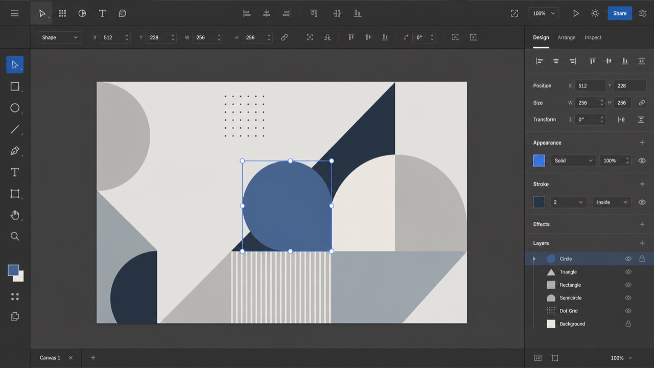
AI interpretation, not a reference
Adobe's cross-application design system. Under the principles Rational, Human and Focused, it changes density between desktop and mobile while keeping tool-heavy interfaces from pulling attention away from the work itself.

AI interpretation, not a reference
A system that translates the complexity of Jira and Confluence into shared tokens, content rules, spacing, grids and components. Consistency builds trust while keeping large sets of issues, documents and states navigable.

AI interpretation, not a reference
A design system that keeps enterprise web applications at low entropy through reusable components and page patterns. Its values — Natural, Certain, Meaningful and Growing — systematize tables, forms, hierarchy and state without reducing information density.

AI interpretation, not a reference
Shopify's UI framework for giving products, orders, payments and customers one commerce language. Cards and sections separate decisions, while short status and action language helps a merchant keep the store moving.
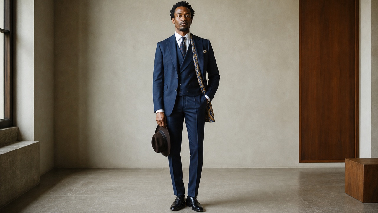
AI interpretation, not a reference
A lineage of using tailoring and bearing as self-fashioning, editing back against a racialized gaze. It is not one level of ornament: it knows the codes, shifts the details, and carries dignity, resistance and identity at once.
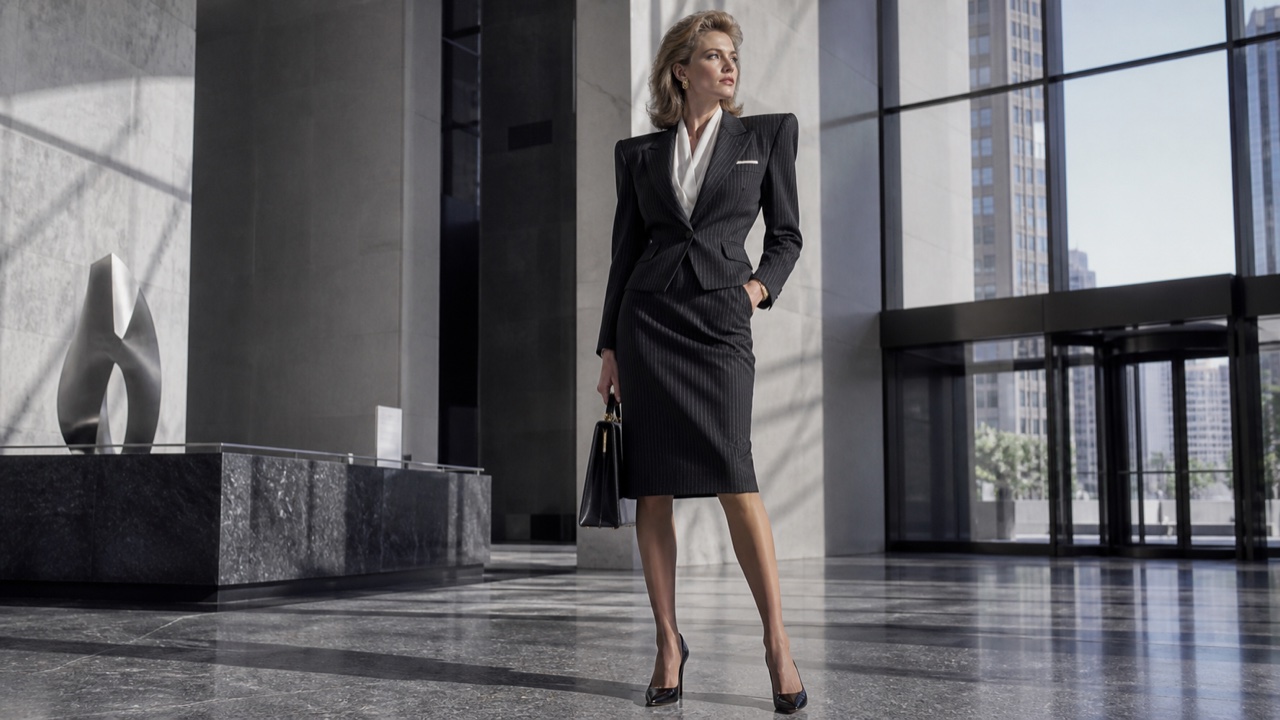
AI interpretation, not a reference
Dress that makes workplace authority visible. In the 1980s the sharply tailored, big-shouldered suit became a sign of upward mobility for women and men, enlarging and hardening the silhouette while also carrying the pressure to conform.
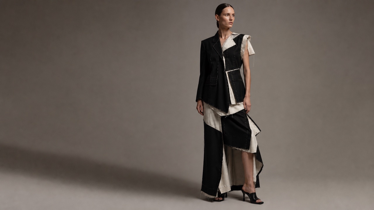
AI interpretation, not a reference
Exposes seam allowance, lining, raw edge, pattern and asymmetric joining instead of hiding clothing as a seamless whole. It does not merely destroy; it dismantles conventions and builds a different body from their parts.
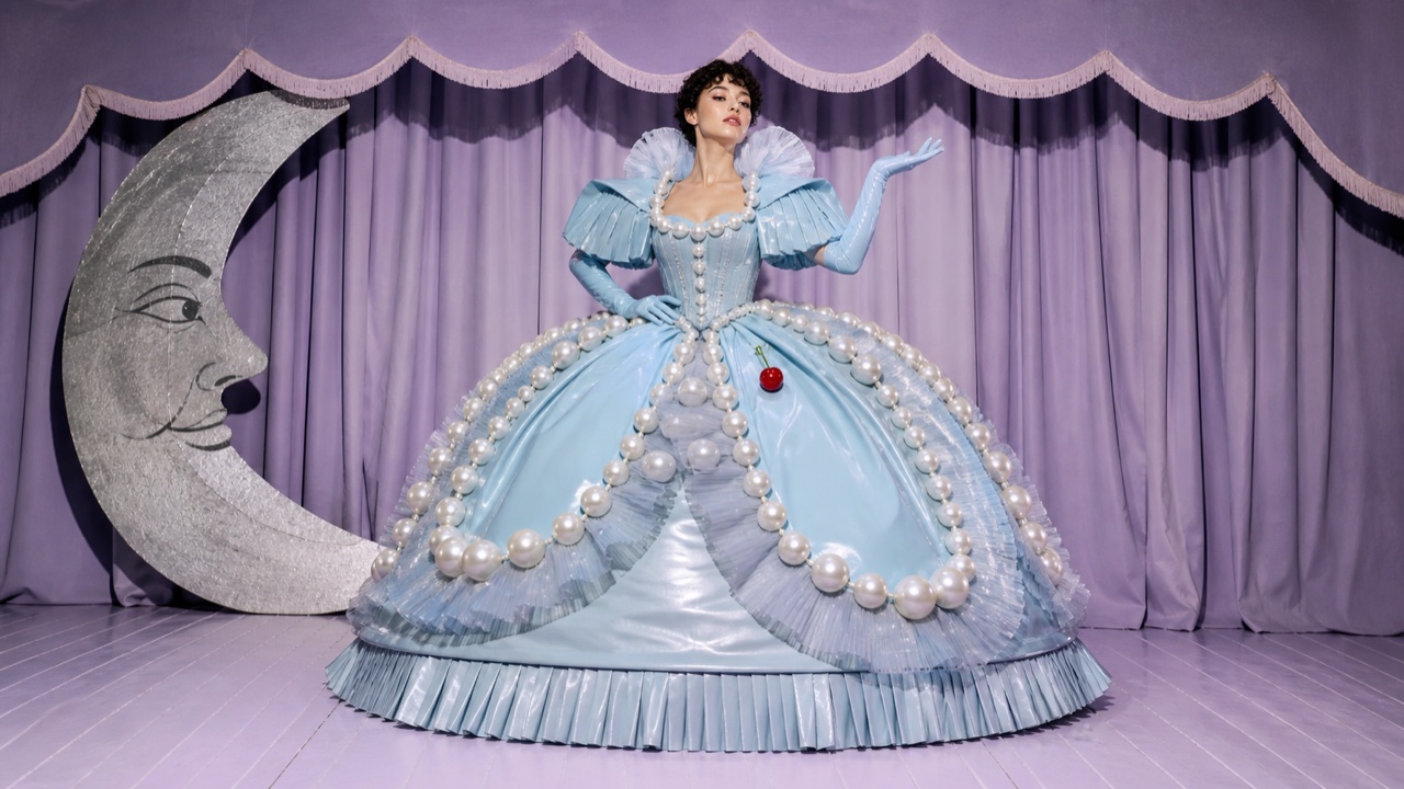
AI interpretation, not a reference
A sensibility that loves artifice, exaggeration, theatricality, parody and excess, enjoying the line between good and bad taste. Its force is not loudness alone but seriousness enlarged until it turns into humor and critique.
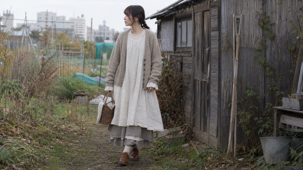
AI interpretation, not a reference
A Japanese street fashion built by urban wearers imagining a girl who might live in a forest. Loose layers, ecru and earth colors, natural textures and old accessories extend into a story about a slower life.
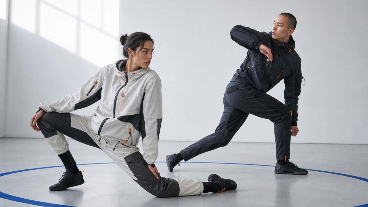
AI interpretation, not a reference
The exchange by which mobility, protection and new materials from sport enter everyday dress and fashionable shapes return to athletic clothing. From divided skirts to stretch, nylon and neoprene, functional movement helped form modern casual clothing.

AI interpretation, not a reference
IBM's system for data-heavy enterprise products, combining a strict grid, IBM Plex type and compact components so complex work remains legible.

AI interpretation, not a reference
Salesforce's interface language for record-centered business work, organizing objects, actions and status into repeatable workspace patterns.

AI interpretation, not a reference
SAP's role-based design language reduces enterprise processes to the information and actions each person needs, then carries them consistently across devices.
A shared system for accessible, mobile-friendly and trustworthy U.S. federal web services, built from tested public-service patterns.
USA.gov homepage, 2023 — Wikimedia Commons / Public domain
AI interpretation, not a reference
The NHS system makes urgent health information and services calm, direct and consistent through plain language, strong focus states and tested clinical patterns.
AI interpretation, not a reference
BBC's global experience language unifies news, video, audio and children's products through readable hierarchy, accessible media controls and reusable editorial components.
AI interpretation, not a reference
Mozilla's flexible web system puts content and global accessibility ahead of decoration while retaining a vivid open-web personality.

AI interpretation, not a reference
Elastic's interface system is made for searching, filtering and diagnosing large data sets without losing operational density.
Material You makes adaptability itself consistent: dynamic color, generous shapes and personalized motion vary by person while semantic roles stay stable.
Google《マテリアル3のコンポーネント》2021 — Wikimedia Commons / CC BY 4.0 · © Google LLC
AI interpretation, not a reference
James Bridle's New Aesthetic names the way machine vision and network imagery leak into physical culture through pixels, satellite views, detection boxes and sensor errors.
AI interpretation, not a reference
Post-Internet art treats the internet as an ordinary condition of life and production, turning the circulation between online images, objects, exhibitions and documentation into the work.
AI interpretation, not a reference
Retrofuturism revisits futures imagined in the past through their vehicles, materials, advertising and cosmic visions, preserving both their hope and their blind spots.

AI interpretation, not a reference
Red Hat's open-source screen language for enterprise products keeps complex infrastructure manageable through dense navigation, data views and tightly controlled status color.

AI interpretation, not a reference
elementary OS builds a consistently beautiful, immediately understandable desktop from concise language, single-purpose windows, distinctive app icons and restrained depth.

AI interpretation, not a reference
GitLab's screen language connects code, issues, review, CI/CD and security inside one DevSecOps product through GitLab Sans and Mono, persistent navigation, dense lists and a purple-inflected neutral palette.

AI interpretation, not a reference
Introduced with Firefox Quantum, Photon unified desktop and mobile around a fast, recognisable Firefox language of compact browser chrome, vivid color, light icons and motion that stays behind the web content.
AI interpretation, not a reference
Ubuntu's community-built default theme overlays Adwaita-based GTK and GNOME Shell with Ubuntu orange, dark header bars and Suru-derived icons, distributing windows, shell, icons, cursors and sound as one suite.

AI interpretation, not a reference
Canonical's CSS-based screen language unifies Ubuntu, MAAS, Juju and related sites and applications through Ubuntu type, split grids, ruled sections and generous space, optimized for scanning long technical content.

AI interpretation, not a reference
The Firefox 89 redesign made the browser brighter and calmer by streamlining toolbars and menus and adopting floating rounded tabs, lighter iconography, more spacing and a purple-inflected palette across desktop, iOS and Android.
AI interpretation, not a reference
Pixel Sorting selects image pixels by a brightness or hue threshold and reorders them within rows or columns, drawing long color streaks out of a still-recognisable source image. Kim Asendorf's released code enabled widespread reimplementation.
AI interpretation, not a reference
Google's visualization technique repeatedly amplifies features learned by an image-recognition network, making eyes, animals and towers emerge excessively from clouds, rocks and leaves until misrecognition becomes a recursive hallucinatory surface.
AI interpretation, not a reference
Born around London's Blitz club, New Romantic dress turned punk's black destruction into theatrical self-invention by mixing pirates, Regency dress, cabaret and futuristic materials. A look was built as a character for the night, not bought complete.
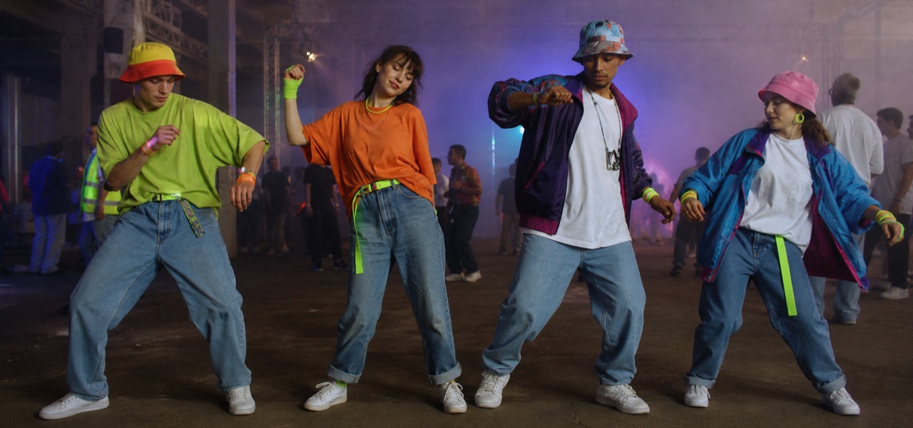
AI interpretation, not a reference
Second Summer of Love warehouse raves put yellow smileys, fluorescent color and reflective material onto oversized tees and functional clothing made for hours of dancing, compressing community recognition into one simple face.
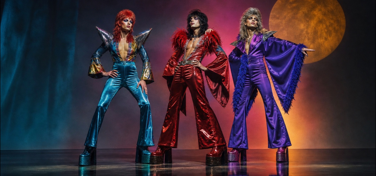
AI interpretation, not a reference
Early-1970s British rock used glitter, platforms, emphatic makeup, body-fitting clothes and quotations from science fiction and cabaret to turn performers into deliberately artificial stars separated from everyday life.
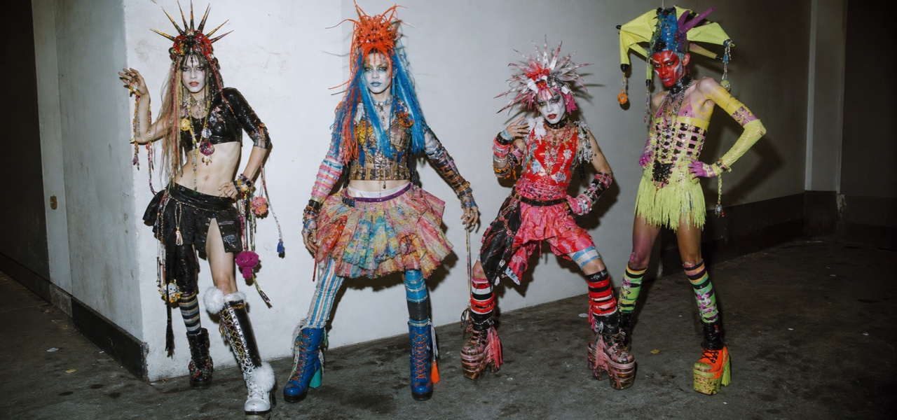
AI interpretation, not a reference
New York nightlife's Club Kids competed in extreme self-transformation rather than finished fashion, assembling body paint, huge hats, toys, scrap and couture into a one-night character whose entrance and photograph were themselves the work.
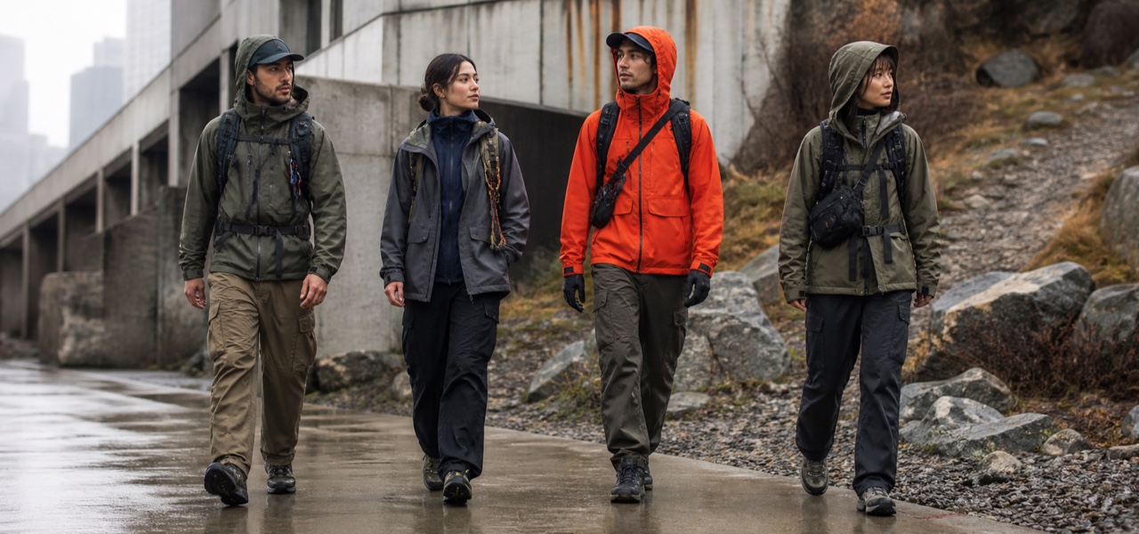
AI interpretation, not a reference
Gorpcore deliberately restyles technical hiking and camping clothes as urban dress, exposing the function of waterproof shells, fleece, cargo and trail footwear while layering earth tones with safety color into an always-ready-for-the-mountain silhouette.
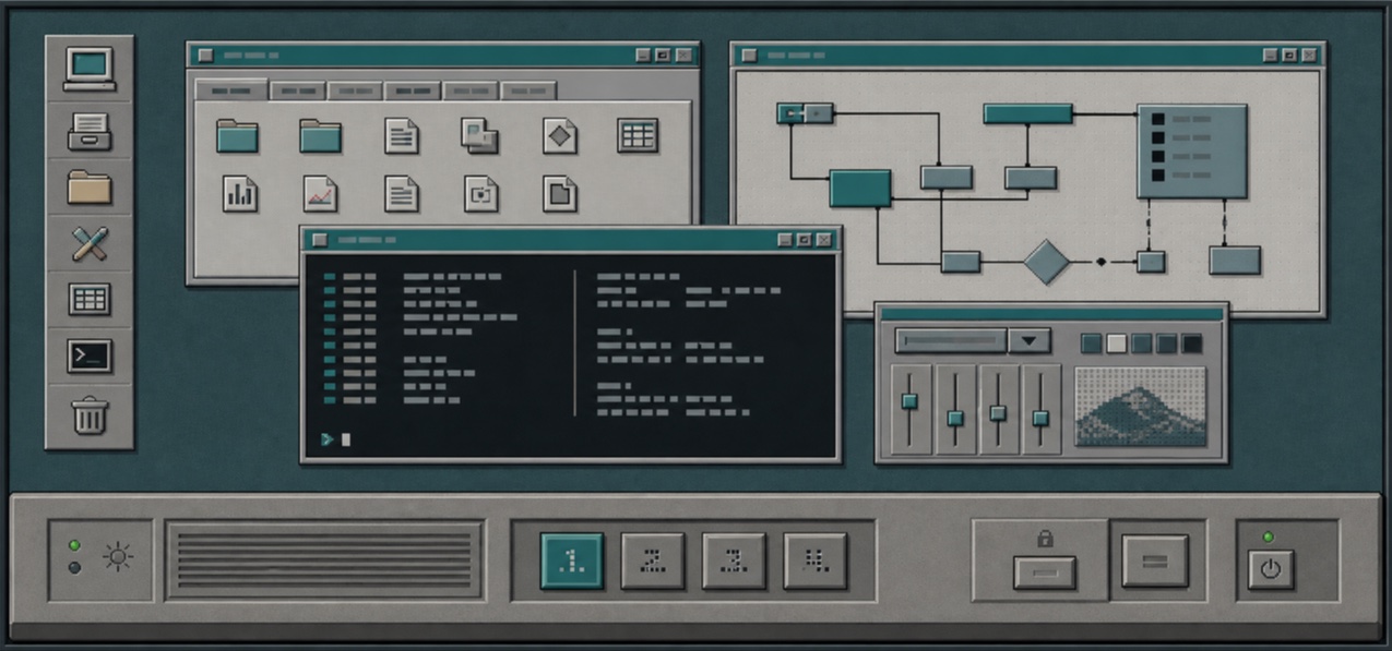
AI interpretation, not a reference
The Common Desktop Environment unified UNIX workstations through Motif-derived bevels, a persistent Front Panel, workspace switching and low-color icons, making different hardware feel like one workplace.
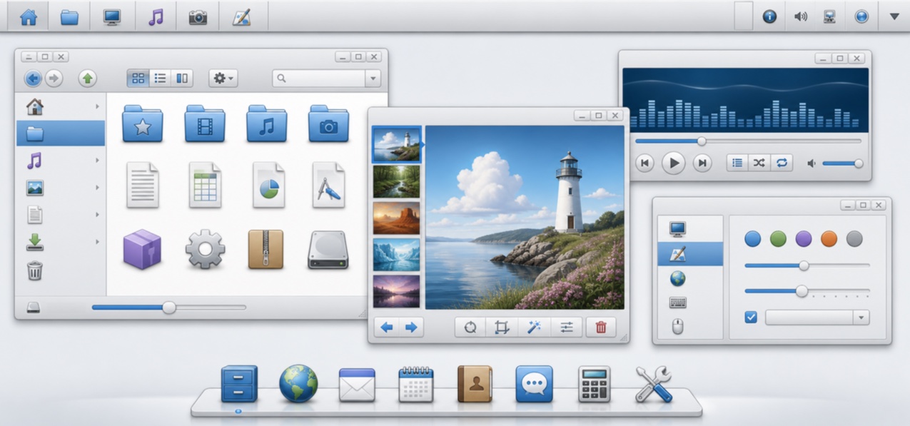
AI interpretation, not a reference
Oxygen unified KDE 4 applications, workspace and icons through clear blue, soft gray, fine outlines and icons that seem to rest on a shared shelf, bringing lightness to an information-dense desktop.
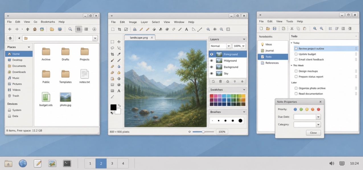
AI interpretation, not a reference
GNOME 2.12's standard theme made GTK applications friendly and simple through pale-gray windows, blue selection, restrained gloss and firm boundaries.
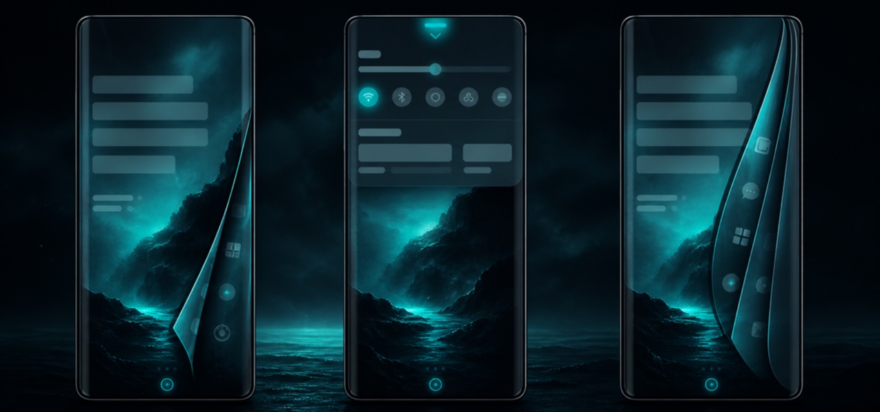
AI interpretation, not a reference
Sailfish OS's QML language centers the mobile experience on edge gestures and Ambience: wallpaper color runs through translucent type and highlights, while the screen edge itself becomes back, close and switch.
AI interpretation, not a reference
Halftone converts continuous tone into regularly spaced dots of changing size so it can be printed; from a distance they return to tone, while enlargement reveals the screen as material.
AI interpretation, not a reference
Dithering suggests unavailable intermediate colors by spatially mixing pixels from a limited palette; ordered matrices or error diffusion make both tone and a distinctive granular surface.
AI interpretation, not a reference
Scott Draves's Fractal Flame adds nonlinear variations, log-density display and structural coloring to iterated function systems, producing feathered, smoky and coral-like structures from probability and transformation history.
AI interpretation, not a reference
Cel shading quantizes continuous 3D lighting into a few flat bands and may add contours, retaining spatial movement while making the surface read like animation cels or printed illustration.
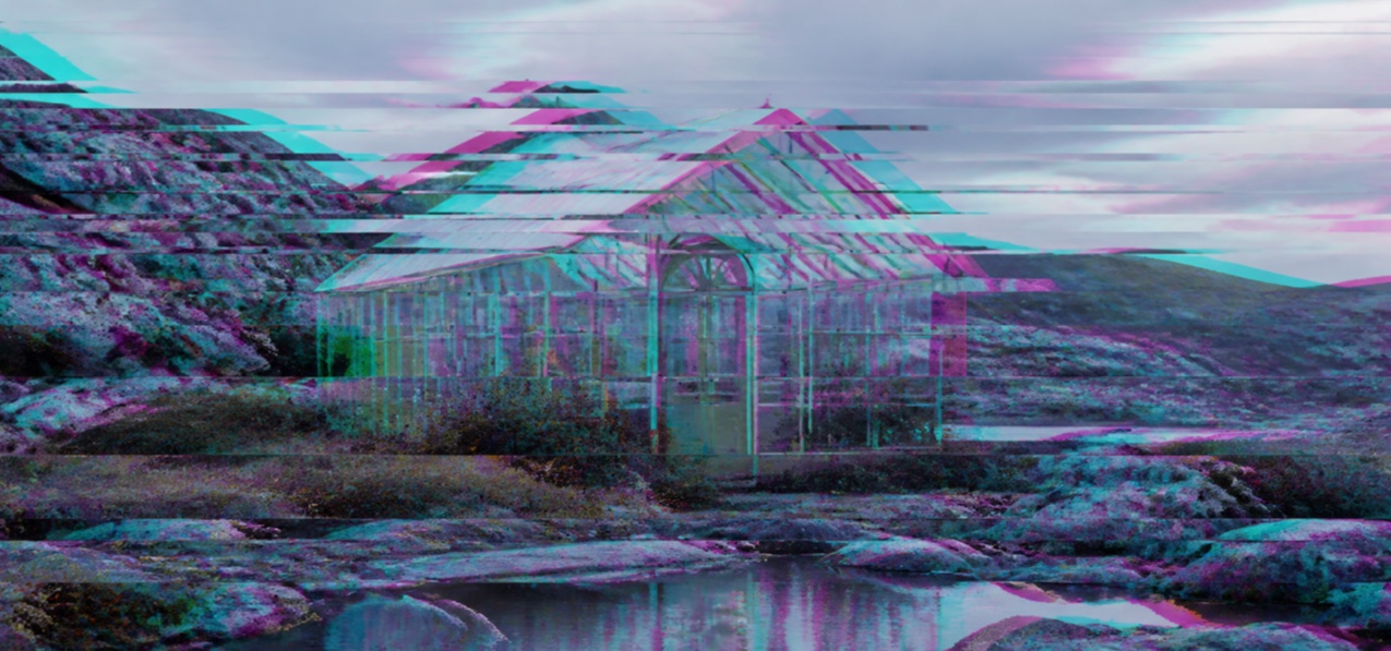
AI interpretation, not a reference
Databending edits image or sound files with tools not intended for their format, turning a decoder's misreading into the work; file structure, compression and edit position determine its bands and color shifts.
AI interpretation, not a reference
L-system graphics rewrite symbol strings in parallel and interpret them as drawing, turning a few rules into recursively growing plants, trees, mycelia and ornaments.
AI interpretation, not a reference
Reaction-diffusion simulation lets substances react locally while spreading at different rates, self-organizing small disturbances into spots, stripes, mazes and coral-like patterns.
AI interpretation, not a reference
Stippling builds light, volume and surface through the density and size of tiny dots; tone rises from sparse to dense without filling contours with lines.
AI interpretation, not a reference
Scratchboard removes black ink from a white clay-coated board, drawing light and contour out of darkness; blade width, crossing and retained black create fur, metal and nocturnal contrast.
AI interpretation, not a reference
Visual Kei is a Japanese rock and metal visual culture in which hair, makeup, costume, stage and photography construct a band persona as strongly as the music, crossing glam, gothic, punk, Kabuki and historic dress.
AI interpretation, not a reference
Grunge fashion grew from mismatched, layered secondhand and work clothing in the Pacific Northwest music scene before its early-1990s runway translation; flannel, worn knits, boots and displaced hems became an answer to polished luxury.
AI interpretation, not a reference
The image of Beat and Left Bank culture settled into black turtlenecks, narrow trousers, berets, flats and spare makeup, making an anti-consumer intellectual space of readings, jazz and cafés visible on the body.
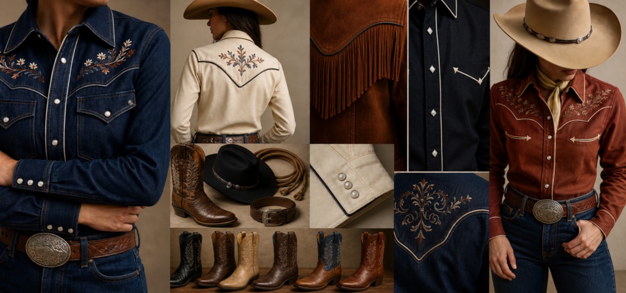
AI interpretation, not a reference
Western wear developed from ranch and riding utility into rodeo, film and country stage dress, adding embroidery, fringe, studs and emphatic color to functional yokes, snaps, boots and hats.
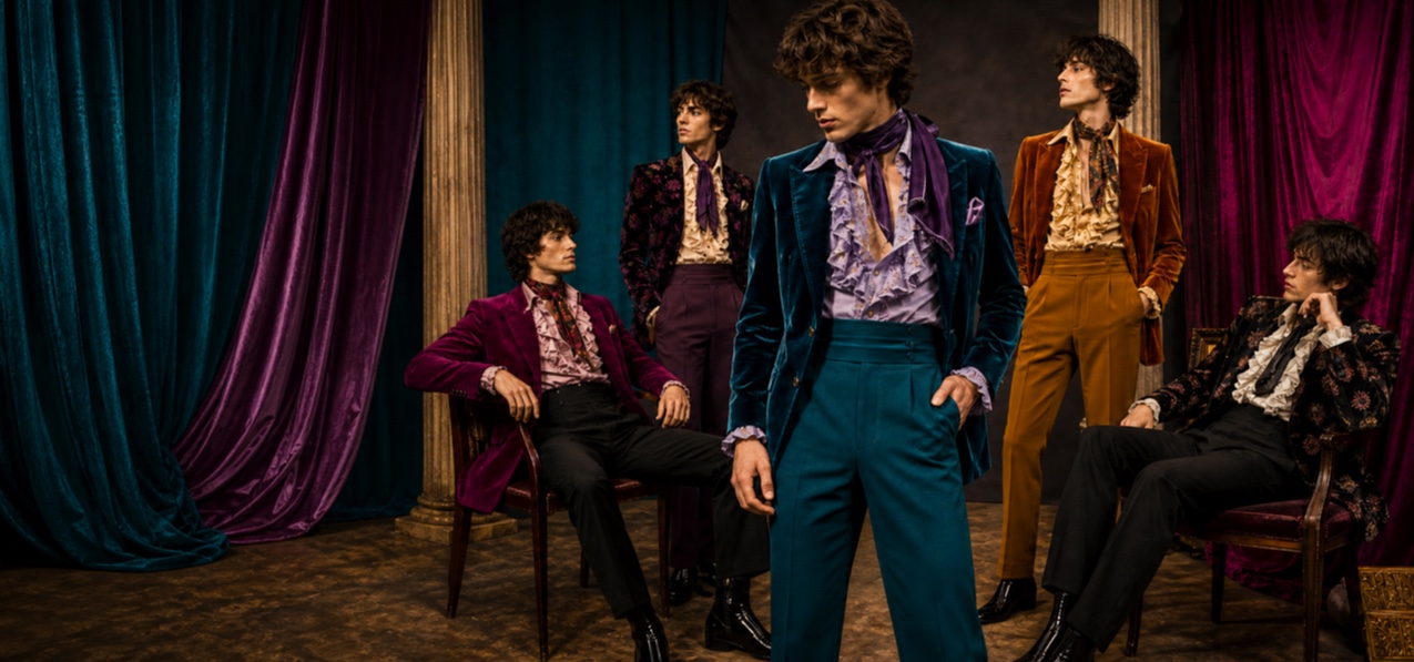
AI interpretation, not a reference
The Peacock Revolution released postwar menswear from the dark suit, spreading close tailoring, vivid color, velvet, frills and flowers into young men's street and stage dress while modern dandyism unsettled gender and class rules.
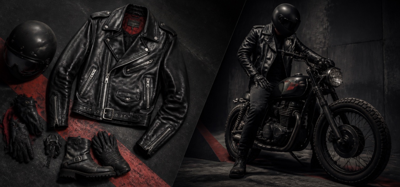
AI interpretation, not a reference
A protective riding jacket became a language of rebellion and belonging through motorcycle clubs, film, rock and punk; asymmetrical zip, wide lapels, belt, hardware and worn black leather retain both function and symbol.
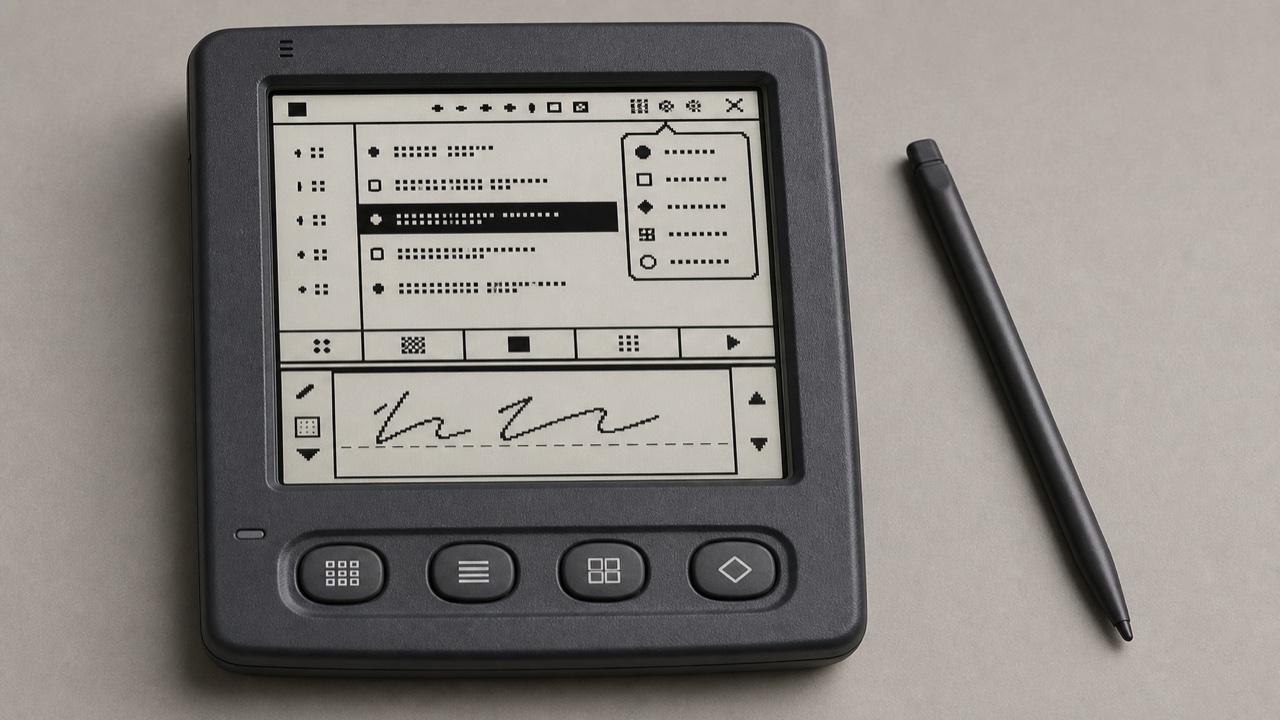
AI interpretation, not a reference
Palm OS turned a tiny monochrome screen, stylus and strict memory limits into a consistent pocket work tool through the Title, Category menu, Command Bar, hardware buttons and Graffiti writing area.
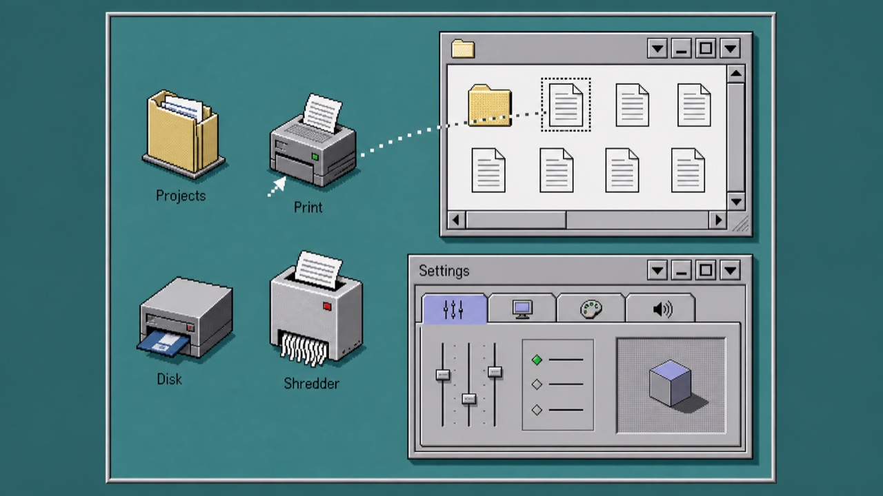
AI interpretation, not a reference
OS/2 treated folders, printers, drives and settings as operable objects rather than loose icons. Dimensional borders, shaded icons, Notebook settings and direct drag-and-drop made the whole desktop one object-oriented workplace.

AI interpretation, not a reference
Huawei's visual language reorganizes cards, spacing, arcs, variable type and translucent light materials across different screen sizes and connected devices, favoring continuity of information and action over one fixed screen.
Kinetic typography uses changes in position, speed, scale, form and timing to build tone of voice, emotion and attention along a timeline. Type is not a caption layer; its movement carries meaning.
Flash Gordon opening crawl, 1940 — Wikimedia Commons / Public domain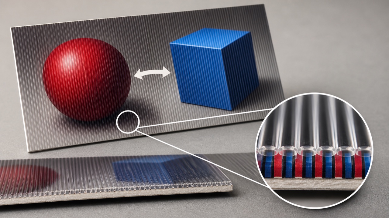
AI interpretation, not a reference
Lenticular printing interlaces multiple images into thin alternating strips and aligns them with parallel lenses so one print flips, animates or gains depth as the viewing angle changes.
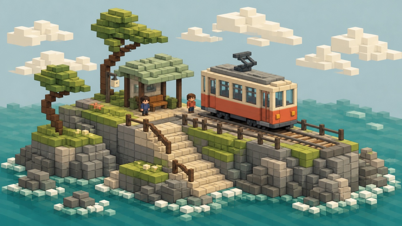
AI interpretation, not a reference
Voxel art divides three-dimensional space into equal volume elements and leaves those units visible as the smallest pieces of form and color, carrying pixel art's productive limits into volume.
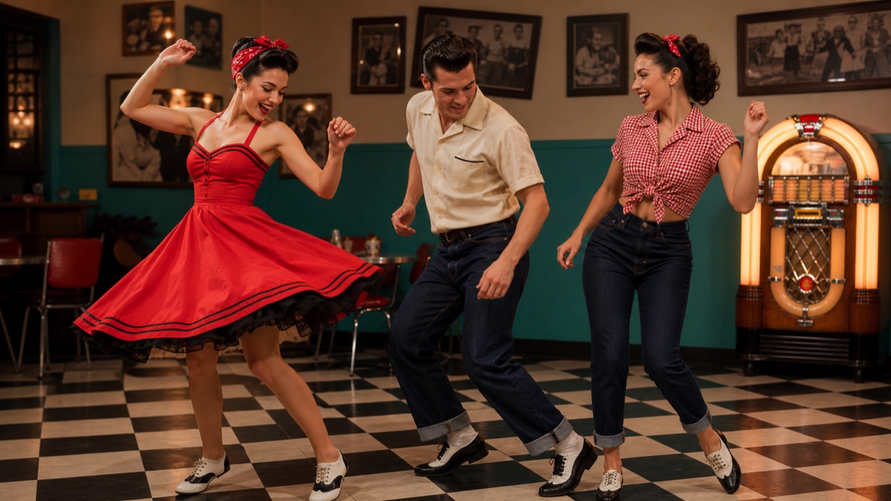
AI interpretation, not a reference
The music culture where country and rhythm and blues met in the American South appeared in pompadours, high-waisted wide trousers, loose jackets, dyed boots, skirts and denim, establishing rock and roll's cycle of audiences copying performers.
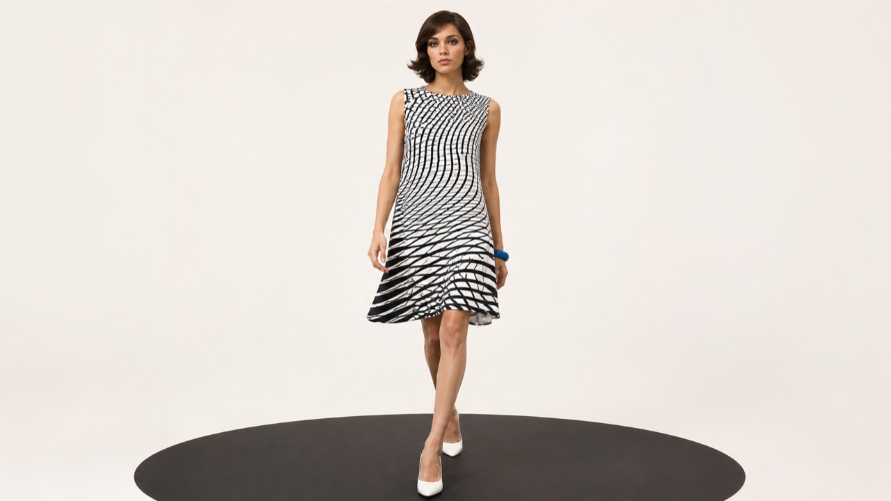
AI interpretation, not a reference
1960s Op Art fashion moved repeated lines, sharp black-and-white contrast and perceptual vibration into straight mini-dresses, knits and paper clothing, letting the pattern swell, flicker and turn as the body moves.
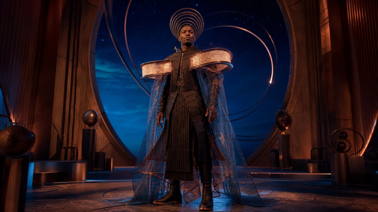
AI interpretation, not a reference
Afrofuturist fashion reimagines Black history, agency and liberation through space, technology, myth, music and stage dress, answering who gets to inhabit the future with a visible body and persona.
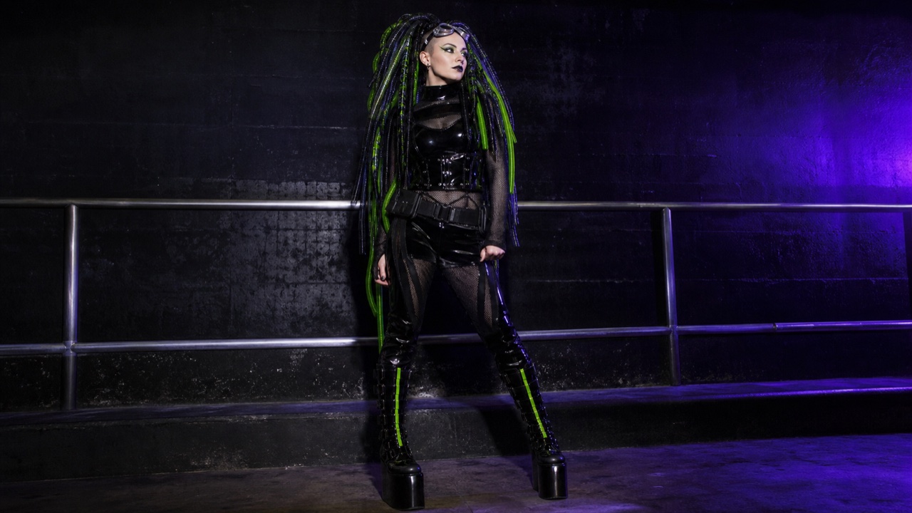
AI interpretation, not a reference
Cybergoth starts with the black of goth and industrial dress, then adds rave neon, reflective surfaces, synthetic plastics, goggles and tubular hair pieces, completing its silhouette under ultraviolet and strobe light.
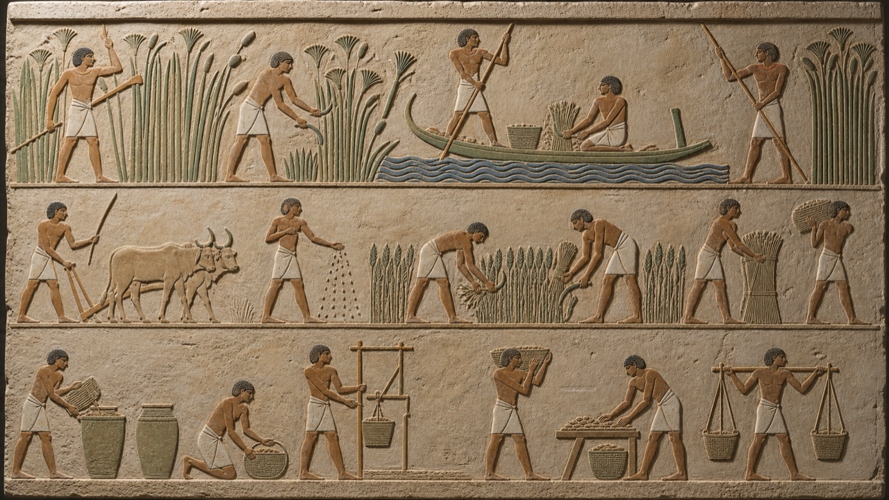
AI interpretation, not a reference
Ancient Egyptian art rendered kingship, divinity and the afterlife as a lasting order through hierarchical scale, composite-view figures, horizontal registers and highly repeatable poses.
AI interpretation, not a reference
Classical Greek art ordered observed bodies into ideal proportion and balance, using contrapposto, calm expression and controlled movement to present citizens, gods and heroes as harmonious norms.
Roman art absorbed Greek, Etruscan and provincial forms while joining individualized portraiture, continuous historical relief, architecture and wall painting to ancestry, civic life and imperial power.
アウグストゥス・プリマ・ポルタ像 — Wikimedia Commons / CC BY-SA 4.0 · © Justin BenttinenByzantine art separated sacred presence from everyday space through frontality, hierarchical scale, gold grounds, non-naturalistic light and repeatable icon types across churches, mosaics and panels.
サン・ヴィターレ聖堂 ユスティニアヌス帝モザイク — Wikimedia Commons / Public domain
AI interpretation, not a reference
Romanesque art joined pilgrimage and monastic culture to thick walls, round arches, barrel vaults and lucid masses, integrating elongated apocalyptic figures into church portals and capitals.
Mannerism mastered High Renaissance proportion, perspective and balance, then deliberately unsettled them through elongated bodies, complex twists, compressed depth and cool unnatural color.
パルミジャニーノ『長い首の聖母』— Wikimedia Commons / Public domainRomanticism pushed beyond reason and rule toward emotion, the sublime, overwhelming nature, revolution and exceptional events through dramatic light, diagonal force, turbulent brushwork and extreme scale.
カスパー・ダーヴィト・フリードリヒ『雲海の上の旅人』— Wikimedia Commons / Public domainNineteenth-century Realism replaced myth, idealization and heroic drama with contemporary workers, peasants, urban life and familiar places, changing which subjects could occupy serious large-scale art.
ギュスターヴ・クールベ『石割り人夫』— Wikimedia Commons / Public domain
AI interpretation, not a reference
Naturalism extended Realism's contemporaneity through close observation of how environment, heredity and working conditions shape bodies and behavior, often using outdoor light and causally legible detail.
AI interpretation, not a reference
Academic art joined institutional training in drawing, anatomy and the antique to a hierarchy of subjects, controlled contours, ideal bodies, legible historical narratives and polished surfaces that conceal the brush.
AI interpretation, not a reference
Social Realism used legible figures, public art, print and photography to expose contemporary labor, poverty, racism, migration and urban conditions. It is distinct from state-prescribed Socialist Realism.
AI interpretation, not a reference
Nineteenth-century Orientalism grouped North Africa, the Middle East and the eastern Mediterranean into a Western imagined East, combining travel, collected objects, fantasy interiors, sensuality, violence and antiquity within colonial power relations.
AI interpretation, not a reference
Pinscreen animation pushes and pulls a field of movable pins, photographing each state under side light. Pin height becomes a continuous range from white to deep black, so print-like grain and sculptural light transform over time.
AI interpretation, not a reference
Silhouette animation moves jointed black card figures one frame at a time on an underlit glass table. The films of Lotte Reiniger joined shadow play, cut paper and cinema into a language that tells through contour and gesture.
AI interpretation, not a reference
Paint-on-glass animation adds and removes slow-drying paint on one pane beneath a camera. It does not replace one finished drawing with another: brush marks, wiped traces and mixed color accumulate as a continuous history on the same surface.
AI interpretation, not a reference
Sand animation moves grains across a light table frame by frame. Thickness controls transmitted light from amber to black, and every contour continually breaks apart as its particles become the next image.
AI interpretation, not a reference
Pixilation treats live actors as stop-motion figures, photographing one held pose at a time. It turns walking into gliding and makes impossible movement or substitution while keeping real bodies and real places on screen.
AI interpretation, not a reference
From the mid-twentieth century, Hurufiyya transformed Arabic words, fragments and individual letters into elements of modern painting, sculpture and graphic composition rather than reproducing traditional calligraphy. Letters move among meaning, bodily mark, cultural identity and abstract form.
AI interpretation, not a reference
In late-1950s and 1960s Iran, Saqqakhaneh artists reworked street shrines, votive objects, talismanic seals, locks, beads, numbers and letters into modern repetition, accumulation and abstraction in painting and sculpture.
AI interpretation, not a reference
In post-independence Morocco, the Casablanca Art School challenged colonial art education by connecting abstraction to Amazigh rugs, jewelry, calligraphy and painted ceilings, then carrying the same language beyond framed painting into posters, magazines, street exhibitions and murals.
AI interpretation, not a reference
In post-independence Sudan, the fluid and contested Khartoum School recombined African, Islamic, Arab and Western references within modern art. Arabic calligraphic rhythm, simplified people and animals, local craft and narrative moved into abstraction.
AI interpretation, not a reference
Around the University of Nigeria, Nsukka, Uche Okeke and later artists extended the flowing lines of uli body and wall drawing and signs including nsibidi into contemporary work on paper, print, textile and sculpture. Fine line and open ground carry narrative and abstraction together.
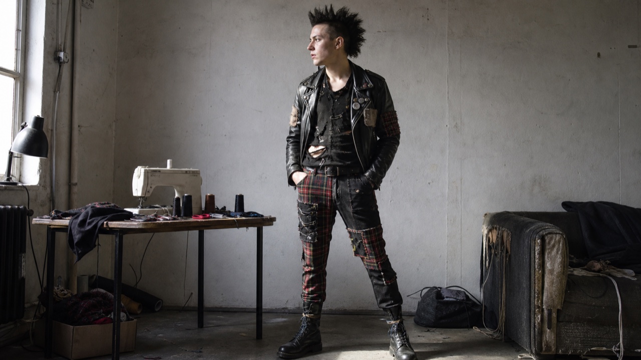
AI interpretation, not a reference
Punk fashion grew from 1970s music, shops and street culture, cutting, fastening and rewriting ready-made clothing into a confrontational message that included body and hair. DIY alteration, restraint hardware, metal and slogans made dress an editable medium rather than a finished commodity.

AI interpretation, not a reference
A commercial-illustration style that uses seamless airbrushed gradients to place realistic objects at impossible scales and positions. Gloss, space, lightning, and diagrammatic cutaways merge into images that look more perfect than photographs and stranger than reality.
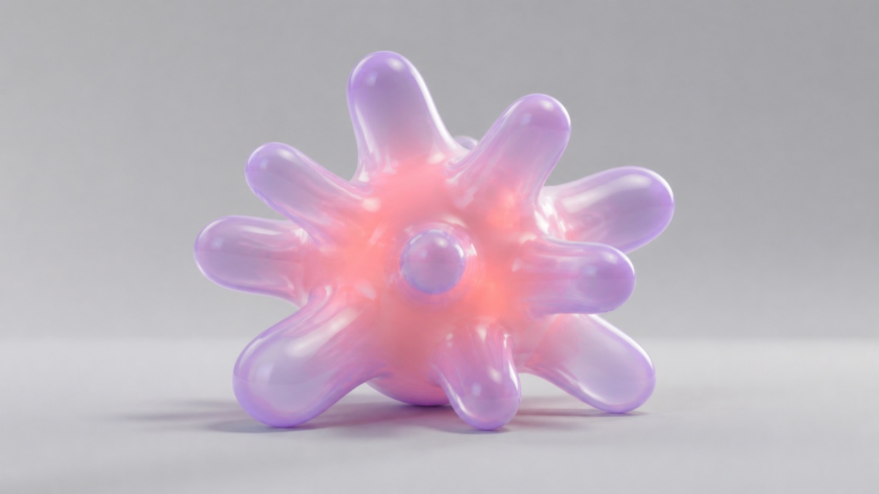
AI interpretation, not a reference
A 3D illustration and motion style built from meticulously rendered soft masses, membranes, hair, and fluids. It makes tactility legible before object identity, placing corporate and music imagery between playfulness and unease.
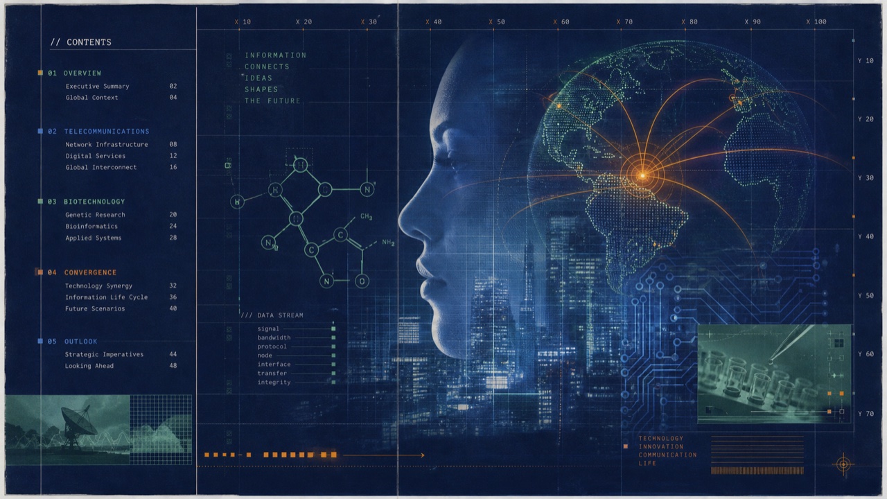
AI interpretation, not a reference
A 1990s commercial style that places the novelty of DTP, telecom, biotech, and multimedia between experimental typography and corporate order. Distortion and transparency appear without destroying the information structure.
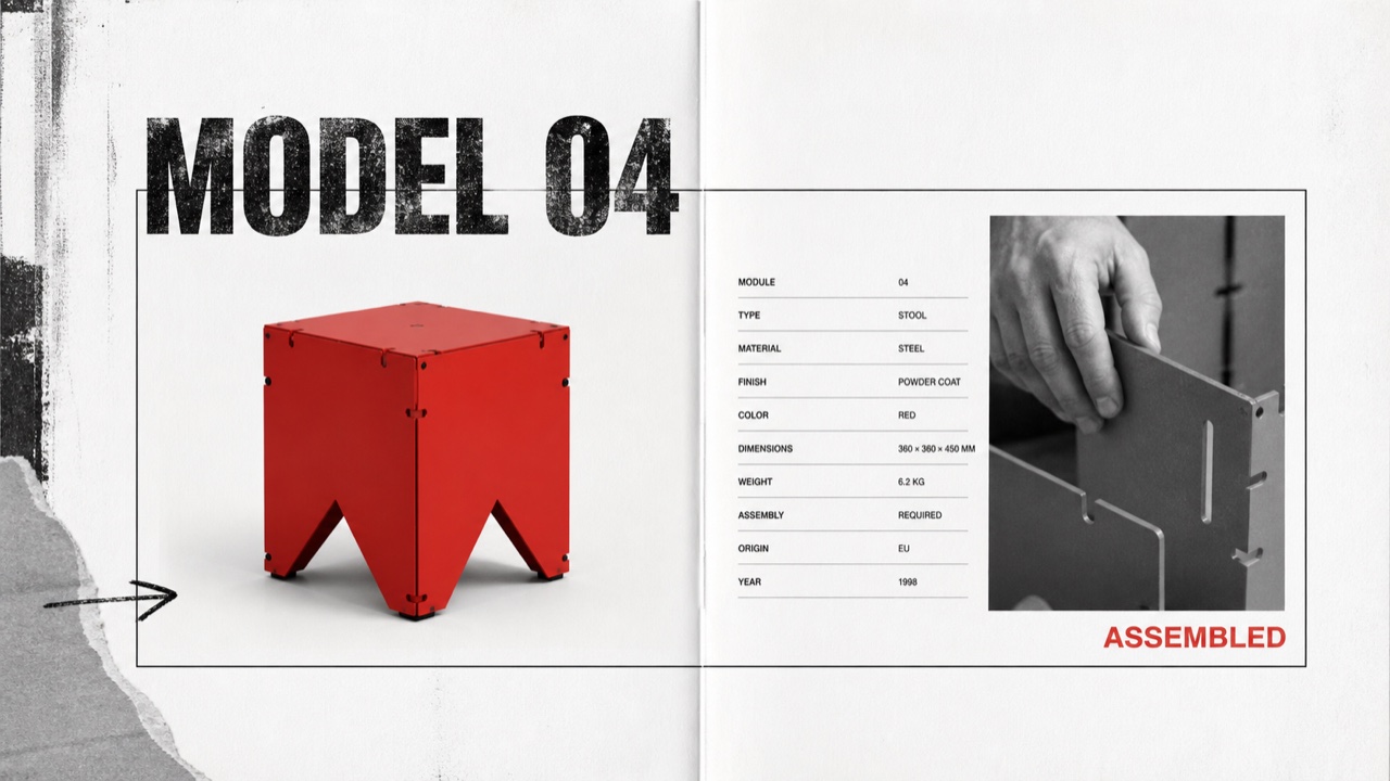
AI interpretation, not a reference
A controlled transfer of distressed type, rupture, and layering from music publishing into corporate advertising and product catalogues. Illegibility is not the goal; traces of rebellion sit around otherwise ordered product information.
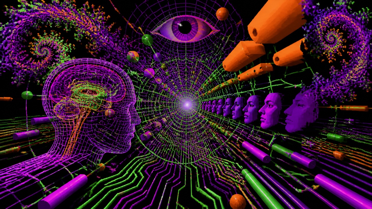
AI interpretation, not a reference
A style that imagines early cyberculture as psychedelic perceptual expansion rather than a cold terminal. Fractals, kaleidoscopes, acid color, and coarse 3D lettering connect rave, CD-ROM, and hacker-era futurism.
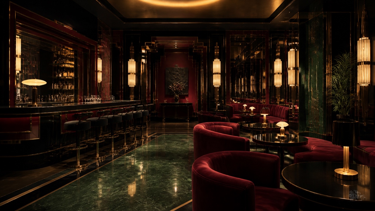
AI interpretation, not a reference
An 1980s revival that reconnects Art Deco and Streamline Moderne with wealth, finance, hotels, and nocturnal consumption. It is darker and glossier than its source period, using metal and mirrors to stage success itself.
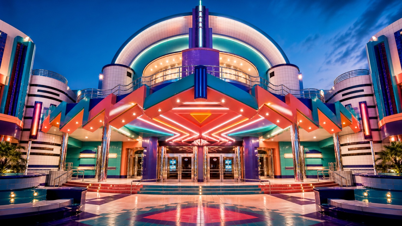
AI interpretation, not a reference
A third-wave Deco revival mixing Golden Age Hollywood, early aviation, and WPA mural memory into 1990s entertainment architecture and commercial graphics. It is brighter, more dimensional, and more narrative than Deco-Luxe.
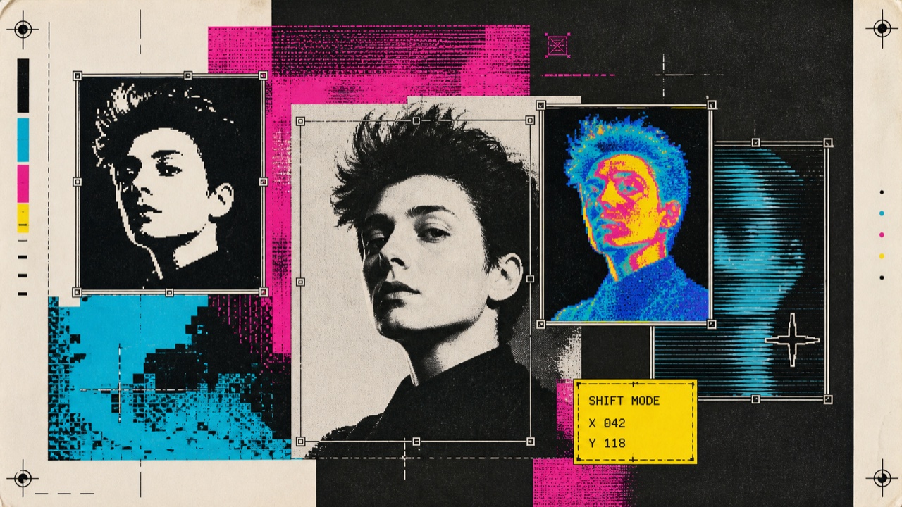
AI interpretation, not a reference
A visual language exposing the first shock of Macintosh and desktop publishing tools freely distorting text, photographs, thermal images, and pixels. Discovery matters more than finish, leaving screen and print boundaries visibly unstable.
AI interpretation, not a reference
An early-1990s consumer aesthetic that turns away from 1980s gloss through unbleached cloth, branches, pale wood, earth walls, and natural color. It is less raw nature than a staged appearance of restraint and environmental virtue.
AI interpretation, not a reference
A postmodern commercial-space style that simplifies old ports and markets into flags, balloons, carts, and painted signs, making walking itself festive. It edits the past as a stage for shopping and tourism rather than preserving it literally.
AI interpretation, not a reference
An early-1990s style that quiets grunge disruption for affluent, suburbanized adult publishing and advertising. Serif type, classical illustrations, and soft-focus photography are slightly displaced by underlines and overlap to stage an urbane life.
AI interpretation, not a reference
A commercial aesthetic combining early-internet global-village optimism with coffeehouse culture, environmentalism, and hand-drawn revival. Woodcut-like suns, hands, eyes, globes, and steam present technology as communal and human.
AI interpretation, not a reference
An aesthetic documenting the night of clubs, indie rock, and blog culture through direct flash, disheveled clothes, narrow silhouettes, and inexpensive digital cameras. Roughness works as proof of presence rather than failed fashion photography.
AI interpretation, not a reference
A 2000s consumer aesthetic gathering celebrity culture, mobile phones, logos, rhinestones, pink, and denim around visible wealth and immediate fun. Unlike Y2K futurism, it foregrounds present attention, brand display, and bodily decoration.
AI interpretation, not a reference
A US West Coast graphic style mixing punk, Swiss New Wave, Italian Radical design, and 1950s kitsch. Strict typography is deliberately derailed by diagonals, waves, neon color, and comic imagery.
AI interpretation, not a reference
A brand style that uses soft color, literary serif type, flat cut-paper illustration, and generous space to make everyday products resemble new independent-press books. Luxury comes from edited intimacy rather than gloss.
AI interpretation, not a reference
An early-2000s web style that densely draws cities, rooms, and landscapes as small isometric pixels, turning an entire site into an explorable world. Its defining feature is spatial navigation, not pixel art in isolation.
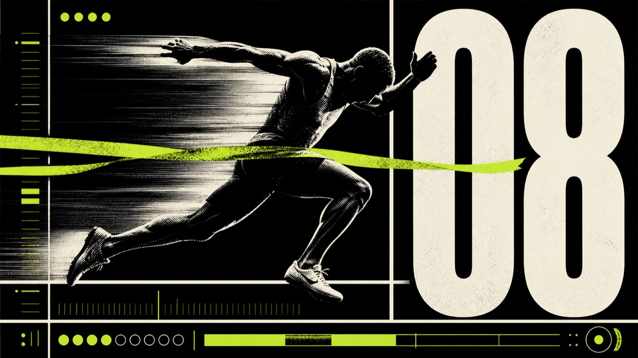
AI interpretation, not a reference
A sports-graphic style connecting brutalist grids, huge type, and exposed structure with competition, timing, bodies, and scores. Roughness communicates force and urgency rather than institutional refusal.
AI interpretation, not a reference
A graphic style compressing Y2K speed into sharp vector forms, industrial symbols, and high-contrast type. Flatter than Metalheart's heavy 3D chrome, it turns Swiss modern and machine-display order into aggressive bevelled angles.
AI interpretation, not a reference
A late-1980s and 1990s consumer aesthetic that adds moons, stars, suns, curved furniture, and jewel color to Gothic darkness, turning mystery into intimate fantasy rather than horror.
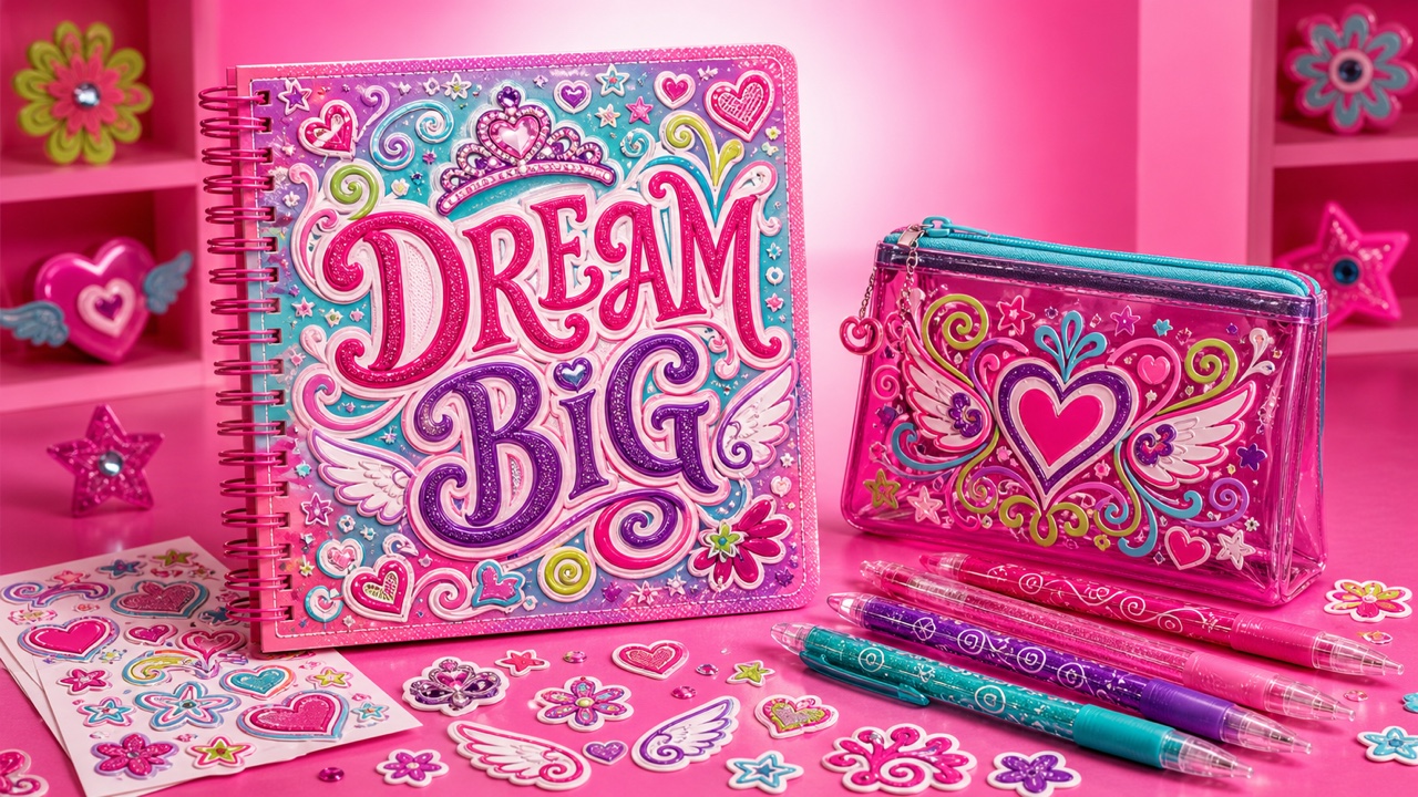
AI interpretation, not a reference
A turn-of-the-millennium consumer aesthetic that crowds girls’ retail, stationery, and interiors with curled serifs, swirls, hearts, wings, and tiaras. It softens McBling’s display of wealth into hand-drawn curves and playful self-performance.
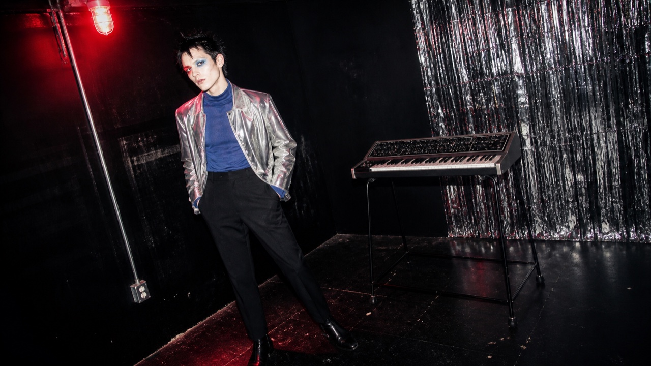
AI interpretation, not a reference
A late-1990s and early-2000s scene language joining analog synth revival, new wave, punk, and club decadence through hard flash, clashing makeup, androgynous dress, and rough digital type. It deliberately restages electronic history as cheap and abrasive rather than pristinely futuristic.
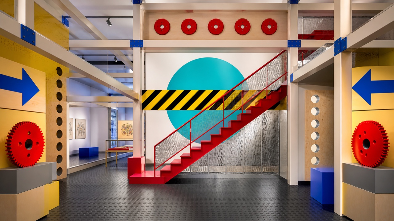
AI interpretation, not a reference
A brief late-1980s and early-1990s postmodern style that reassembled factory safety graphics, WPA, Constructivism, and Bauhaus through smooth CAD geometry and Memphis quotation. Industrial signs become bright information-age stage sets rather than preserved relics.
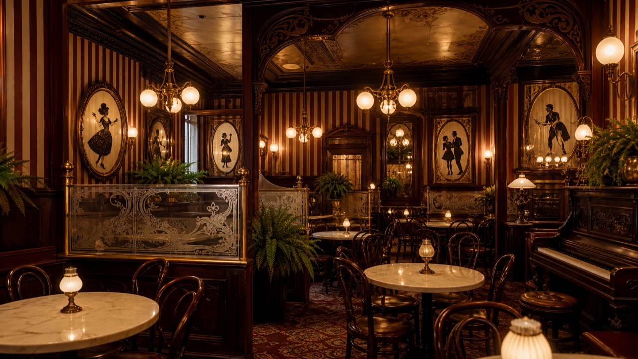
AI interpretation, not a reference
A late-1960s and 1970s revival of 1890s shops, rooms, and lettering as warm popular nostalgia. It is warmer than historical Victorian design, gathering brass, medium-dark wood, ferns, faux Tiffany glass, and old-fashioned lettering around food and entertainment.
AI interpretation, not a reference
A contemporary brand style that edits 1920s–50s American packaging, sign painting, and factory labels into regionally nonspecific authenticity. Wide space and premium materials turn an imagined old shop into a current upscale product.
AI interpretation, not a reference
An early-to-mid-1990s style relocating 1940s–60s American clip art, factory printing, and paper-sample graphics into new interiors and graphic systems. It is heavier than Factory Pomo, pairing old labor imagery with rusted beams, mesh, brick, and rough paper.
AI interpretation, not a reference
A dark industrial language that sinks factories, pipes, cables, and machine rooms into low light, black surfaces, peeling paint, and damp reflection. Its sublime unease comes from enormous unexplained machinery and human smallness, not historical Gothic ornament.
AI interpretation, not a reference
A late-1980s and 1990s revival of Art Nouveau, Catalan Modernisme, and organic architecture in restaurants, furniture, and lighting. Plant lines become bone-, shell-, cave-, and sea-creature-like structure rather than applied surface decoration.
AI interpretation, not a reference
A postmodern children’s-marketing style mixing Googie, Memphis, old cartoons, factory signs, and odd Victorian figures into exaggeration and mild bad taste. It cartoonizes everything until product and place resemble a giant invention machine.
AI interpretation, not a reference
A handmade style gathering the 1980s folk revival, collage, visual puns, and found objects into intimate art-fair fantasy. It exposes unlike materials and slightly strange stories instead of hiding craft in a uniform finish.
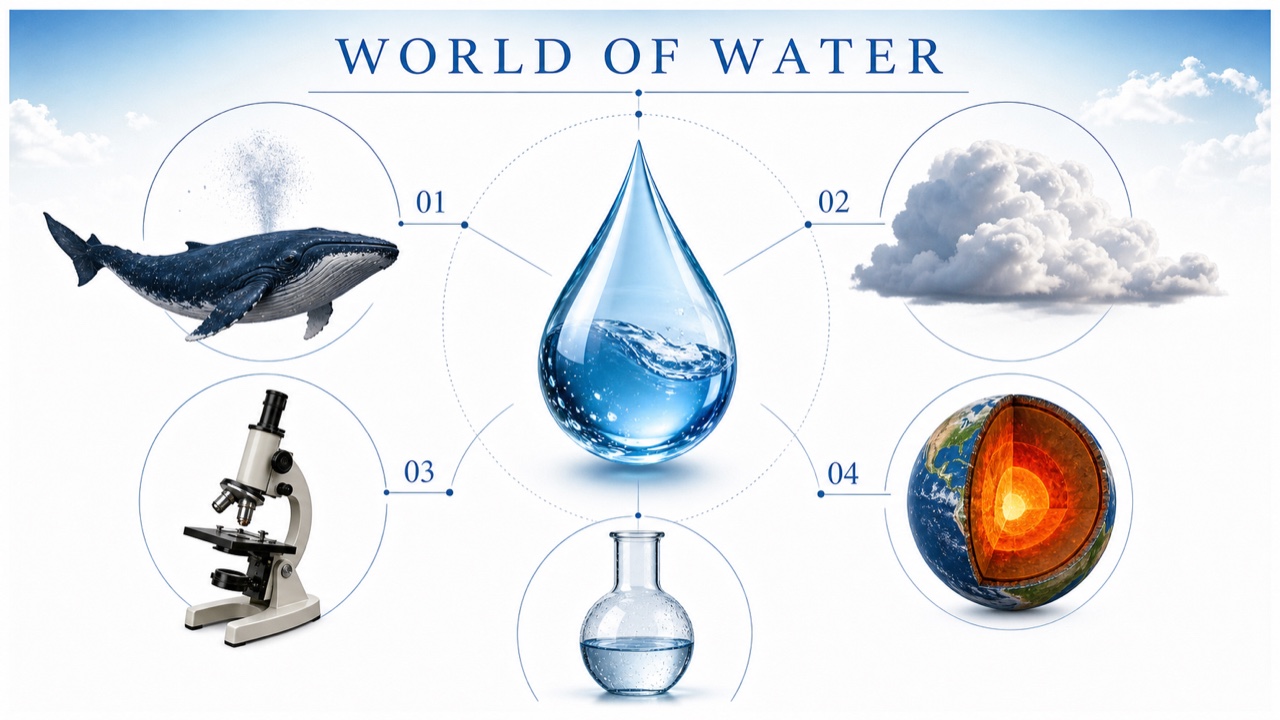
AI interpretation, not a reference
A 1990s editorial aesthetic in which encyclopedias, educational CD-ROMs, and science materials trust that the world’s knowledge can be made bright and complete. Classical serif type and specimen photography sit in clean DTP space, cut-out collage, diagrams, and idealized settings.
AI interpretation, not a reference
A late-1990s and early-2000s revival of 1970s supergraphics, white molded furniture, and Space Age curves in clubs, retail, and advertising. It adds digital finish and Millennium Disco gloss to Gen-X nostalgia.
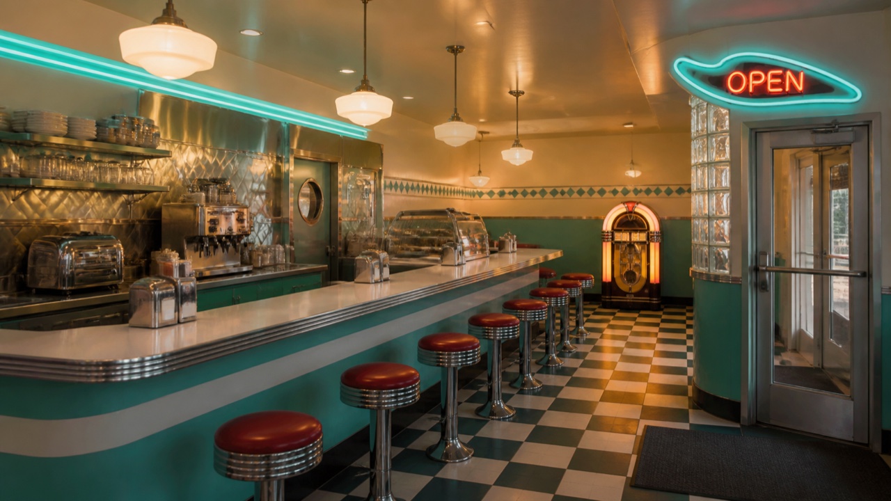
AI interpretation, not a reference
A post-1970s commercial revival compressing 1940s–50s diners, drive-ins, and malt shops into an ideal childhood memory. Chrome, jukeboxes, neon, cars, and rounded lettering matter more than faithful reconstruction of an actual restaurant.
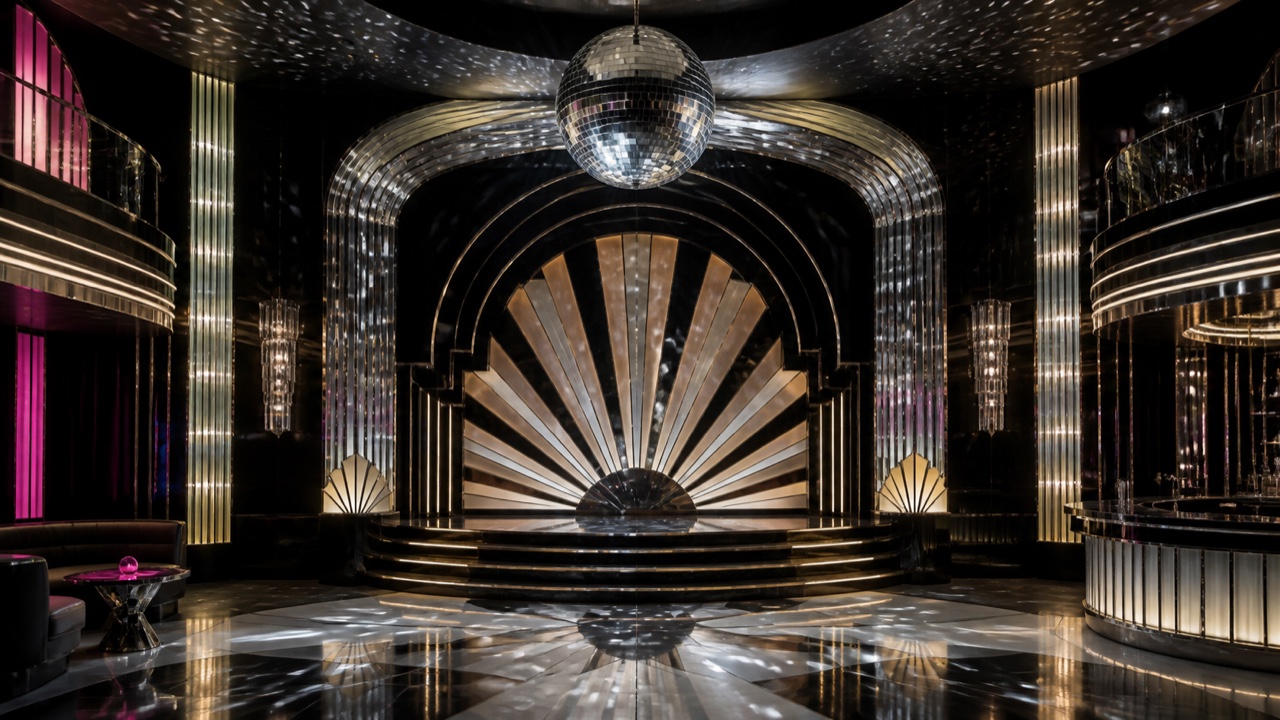
AI interpretation, not a reference
An Art Deco revival carrying fans, rays, geometry, and lettering into disco mirrors, saturated color, and psychedelic light. Historical Deco symmetry remains, but bodies and moving light keep its surfaces in motion.
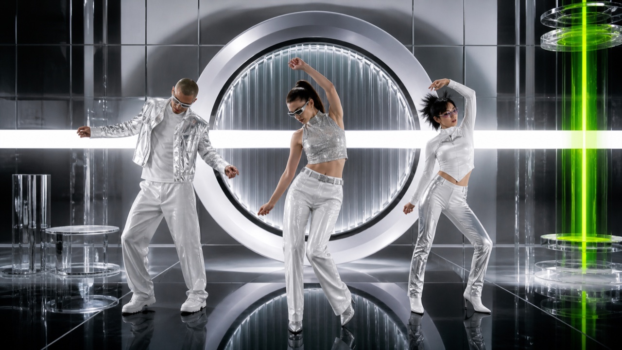
AI interpretation, not a reference
A turn-of-the-millennium Gen-X revival that recasts 1970s disco through Bauhaus-derived type, silver technical materials, and smooth photography. Whiter and more metallic than Disco Deco, it presents the dancing body like a new digital product.
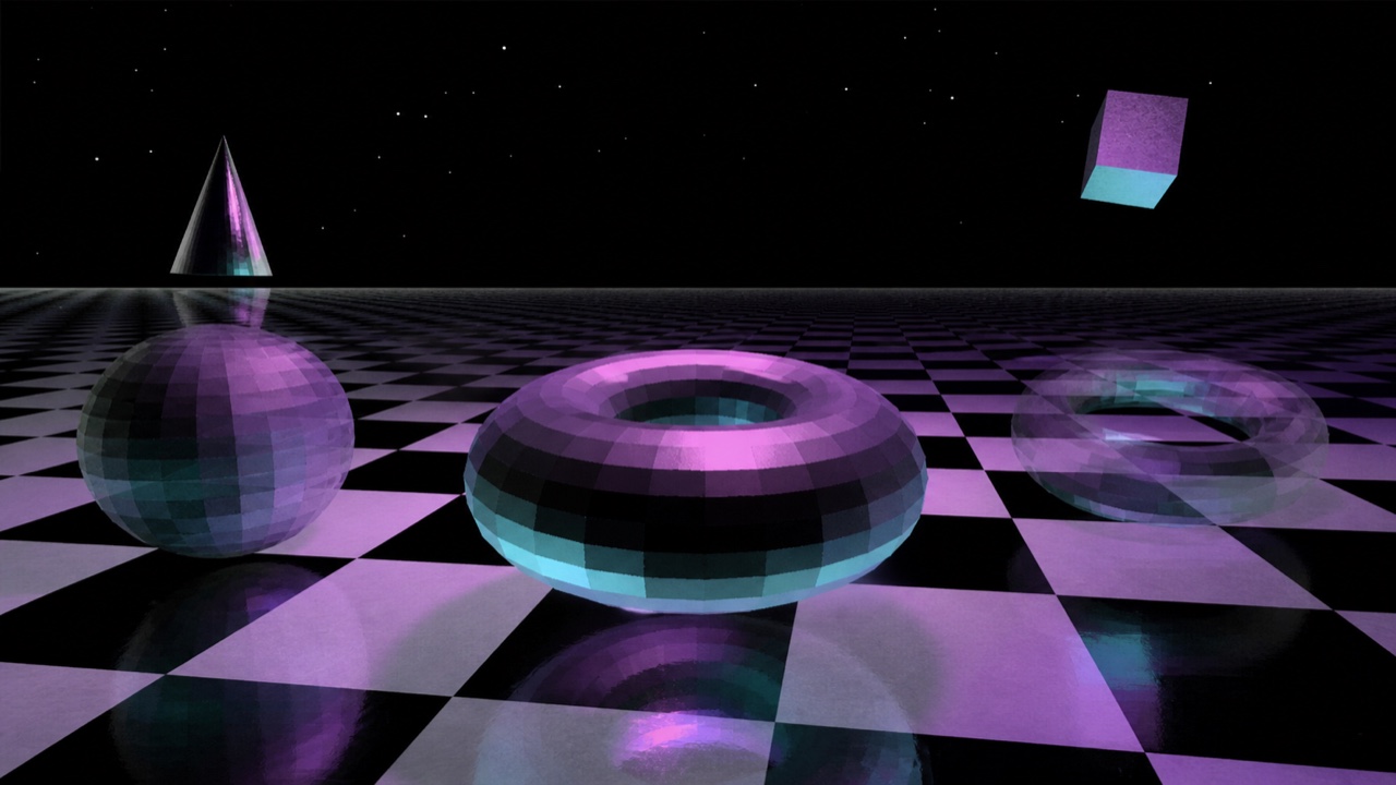
AI interpretation, not a reference
A surreal early-3D language in which transformation itself appears as discovery. Mirrored primitives, low polygon counts, infinite floors, morphing, and floating cameras create a space where the computer seems to dream.
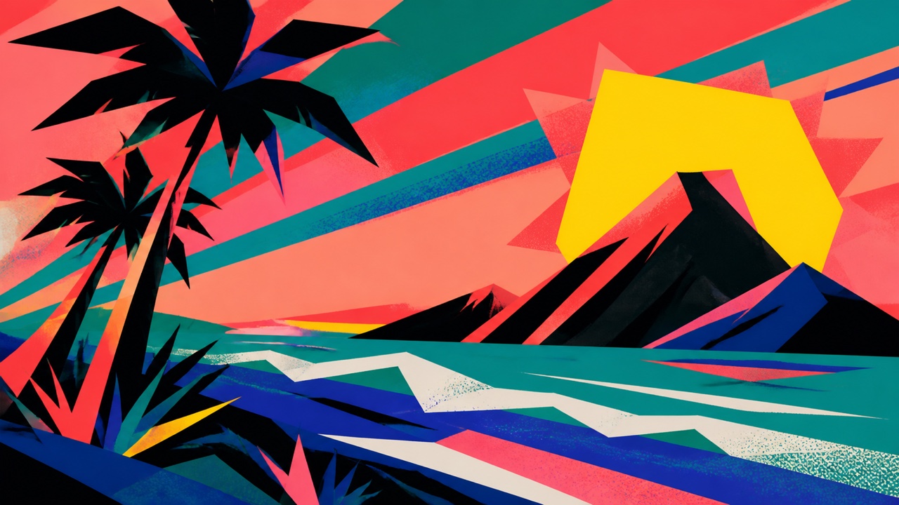
AI interpretation, not a reference
A commercial graphic style adding rainforests, hot color, and irregular cut-paper shapes to the free typography of Pacific Punk Wave. Leaves, birds, waves, and suns become large urban graphic fragments rather than realistic tropical scenes.
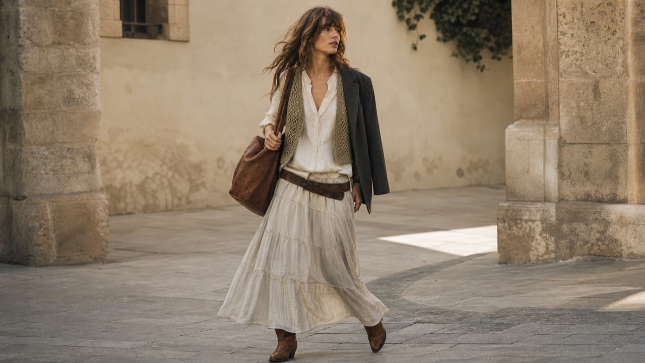
AI interpretation, not a reference
A fashion style in which 2000s celebrities, festivals, and high-street retail re-edited 1960s–70s hippie and bohemian dress into calculated effortlessness. Flowing cloth, layering, low waist emphasis, worn leather, crochet, and embroidery are balanced by one polished urban piece.
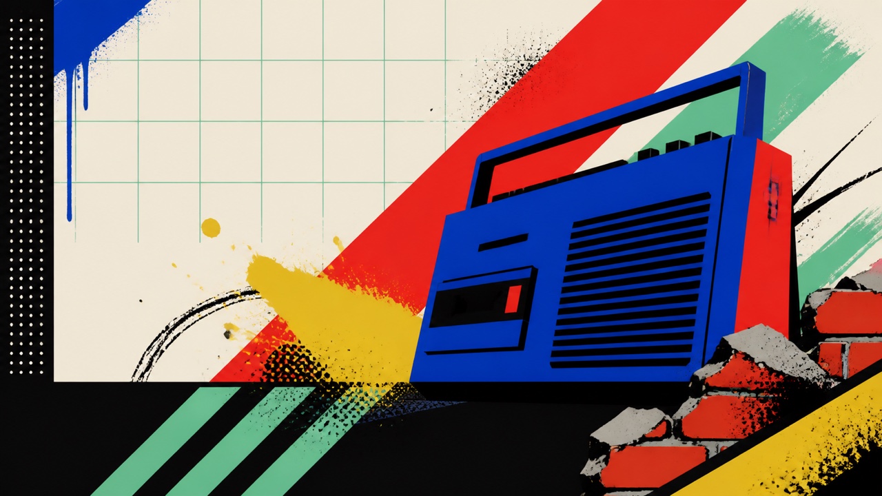
AI interpretation, not a reference
A 1980s–90s commercial style in which advertising, television, toys, and fashion turned graffiti and the contemporary street into a clean, readable urban stage. Separate from writers’ signature culture, it arranged spray lines, brick, chain-link, bins, and boomboxes behind Pop-like products.
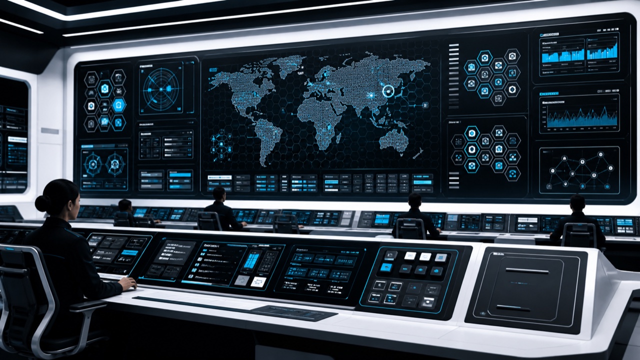
AI interpretation, not a reference
A 2010s future language crystallized around TRON: Legacy, using hexagonal grids, diagonals, blue light, holograms, and terminal-like interfaces. Harder in black and white than Synthwave and cleaner than Cyberpunk, it foregrounds angular technical ornament and complete systems.
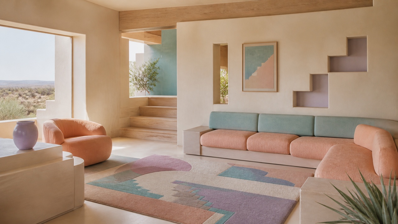
AI interpretation, not a reference
A consumer-interior style replacing dark 1970s Southwestern and Mission revival with 1980s–90s peach, pale blue, lilac, mint, and light wood. It translated desert light, adobe curves, heavy upholstery, and geometry into soft suburban homes and hospitality.
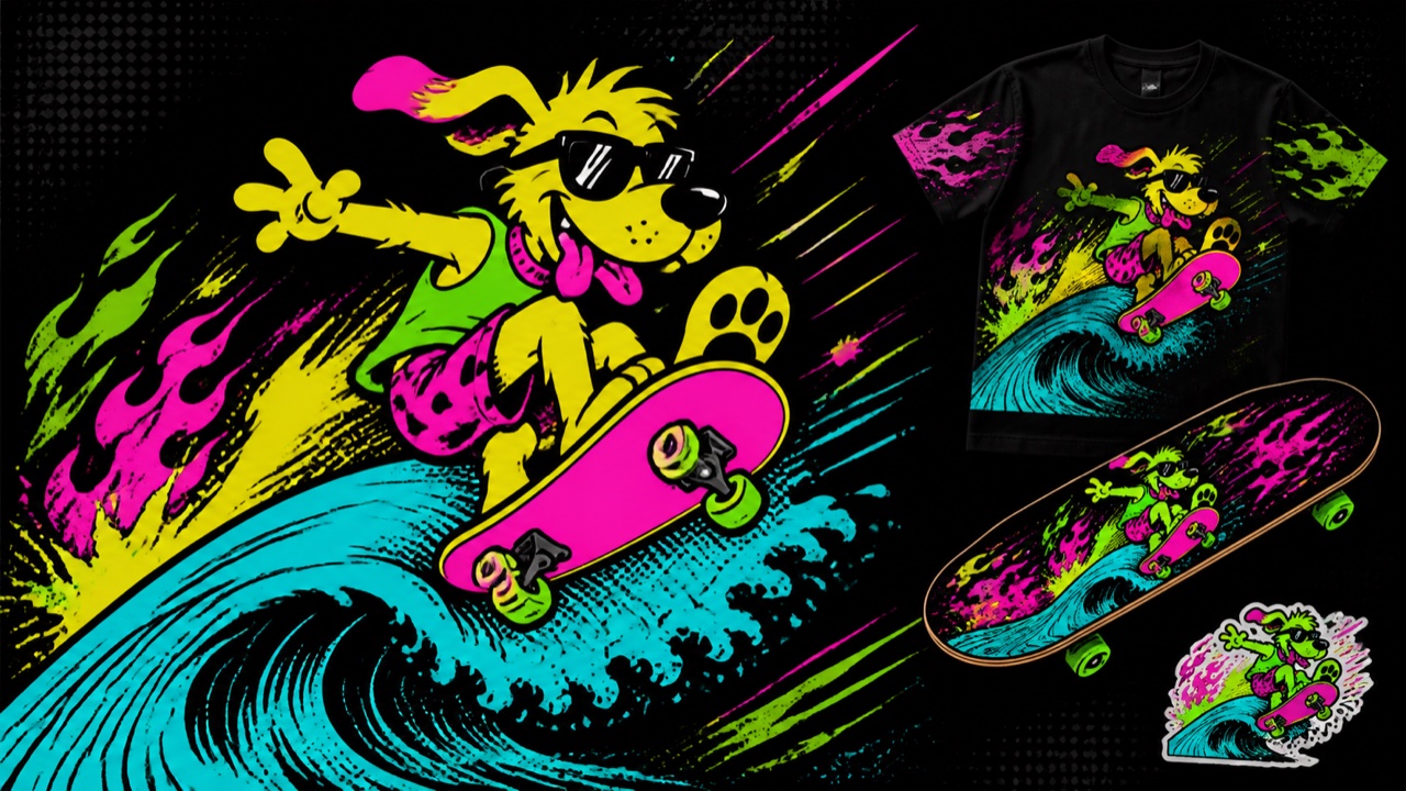
AI interpretation, not a reference
A late-1980s and early-1990s surf, skate, youth-apparel, and equipment style gathering fluorescent splatter, cartoon animals, waves, distorted type, and extreme Hypercolor. It prioritizes speed, mischief, and shelf visibility over natural ocean color.
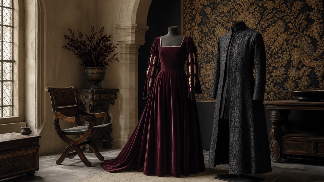
AI interpretation, not a reference
A 1990s revival in which Renaissance fairs, Shakespeare editions, fantasy films, runway styling, and formalwear restaged Renaissance, Elizabethan, medieval, and fairy-tale references with deliberate anachronism. It creates a rich past that present-day visitors can enter rather than reconstructing history faithfully.
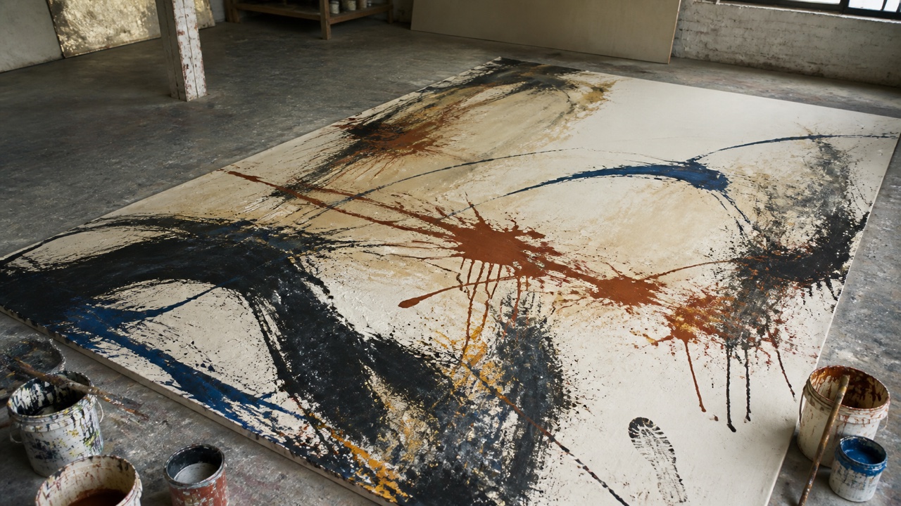
AI interpretation, not a reference
An abstract-painting style that treats the surface as a record of the body's passage rather than a container for a predetermined image. Drips, throws, scrapes, broad strokes, and repainting preserve speed, weight, pause, and sequence.
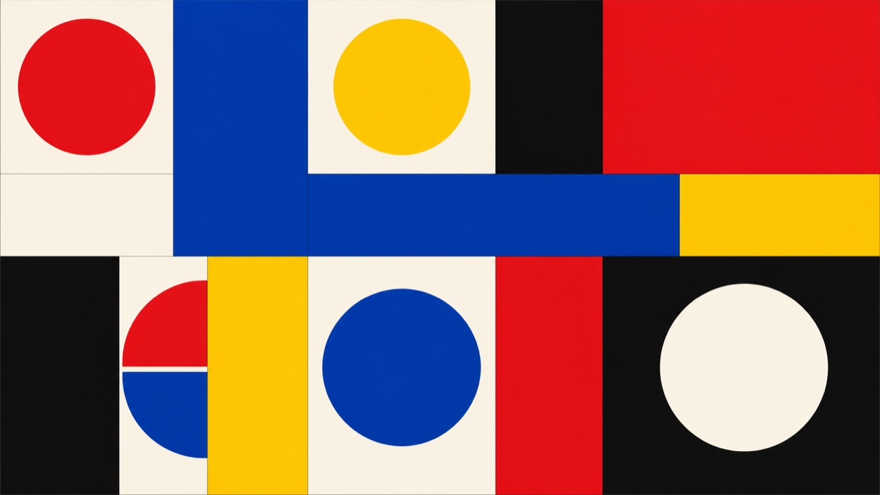
AI interpretation, not a reference
A movement constructing autonomous compositions only from line, plane, color, and proportion rather than abstracting nature or narrative. It suppresses chance and brushwork in favor of measurable relations and clear color fields across painting, print, object, and graphic design.
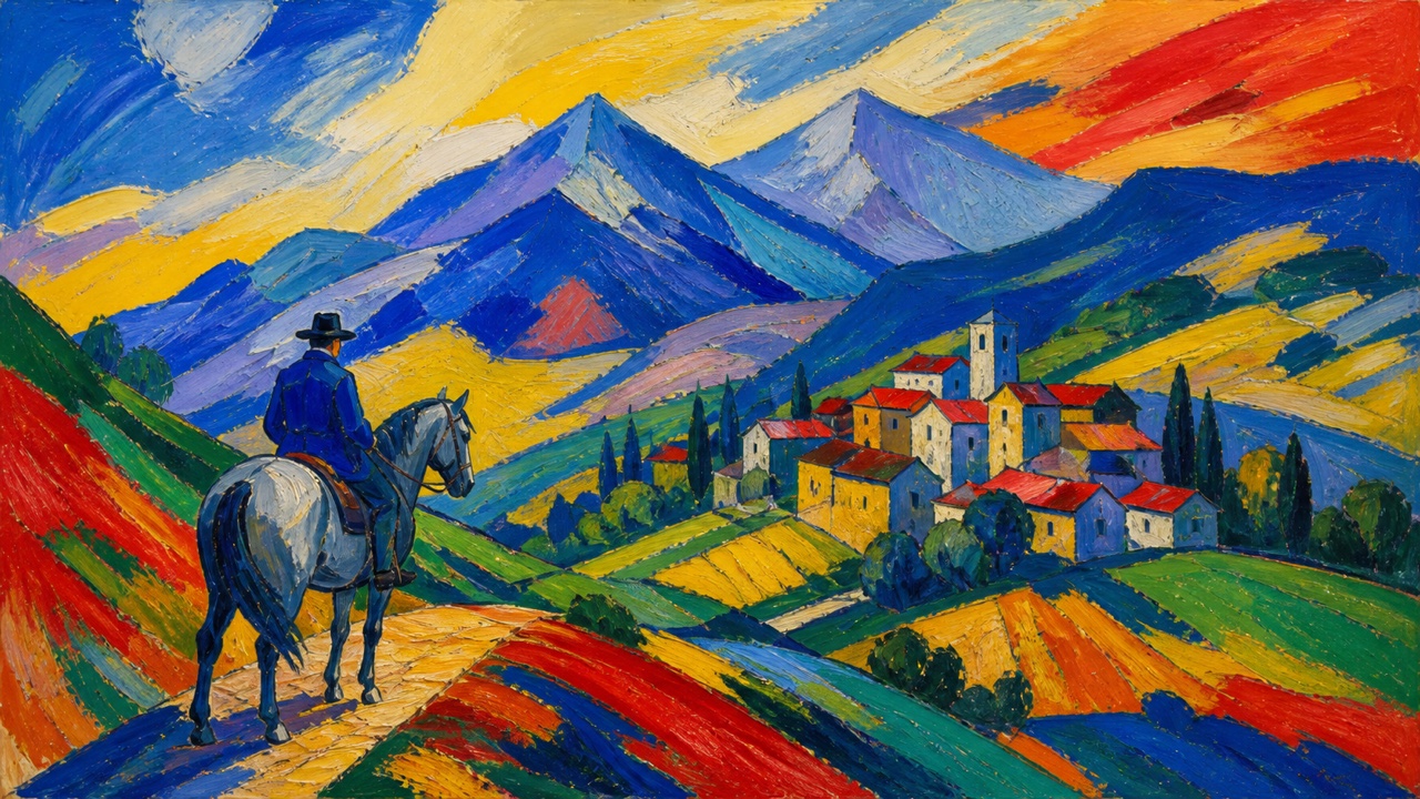
AI interpretation, not a reference
The Munich-based Expressionist group that prioritized the spiritual resonance of color and form over natural description. Strong blue, yellow, and red, animals and riders, musical repetition, and color released from contour bridge figuration and abstraction.
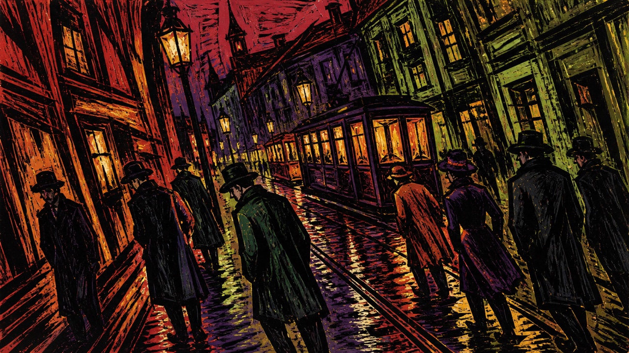
AI interpretation, not a reference
The Dresden group that compressed the city, nude figure, nature, and nightlife into sharp contour, rough woodcut, and non-natural color. Unlike the Blue Rider's spiritual abstraction, it foregrounds the urgent material contact of bodies, streets, and collective making.
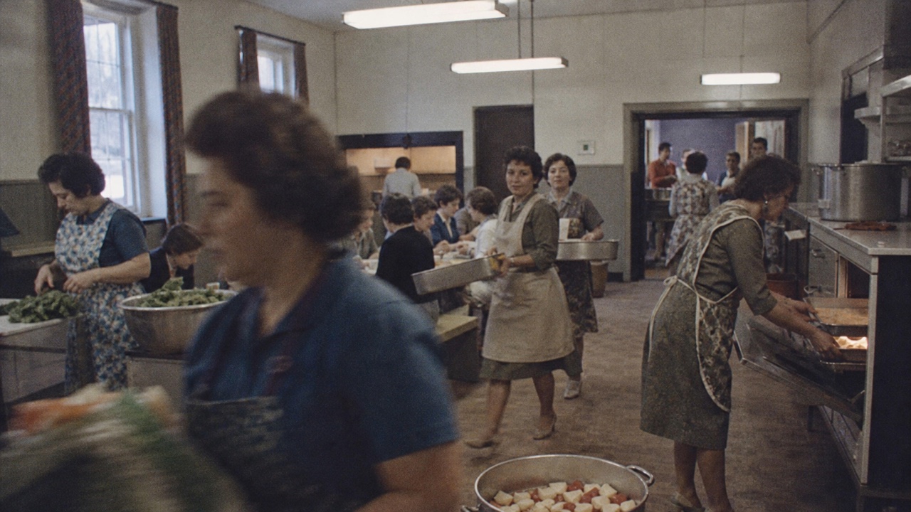
AI interpretation, not a reference
A documentary-film style using lightweight cameras, synchronous sound, and small crews to follow events with minimal intervention. It restrains explanatory narration, reenactment, and excessive lighting so handheld distance, location sound, and observation reveal relationships.
AI interpretation, not a reference
An abstract style composing with circles, rectangles, lines, grids, repetition, and proportion instead of depicting natural objects. It is an umbrella across De Stijl, Suprematism, Concrete Art, and Hard-Edge, united by geometry and clear boundaries rather than gesture.
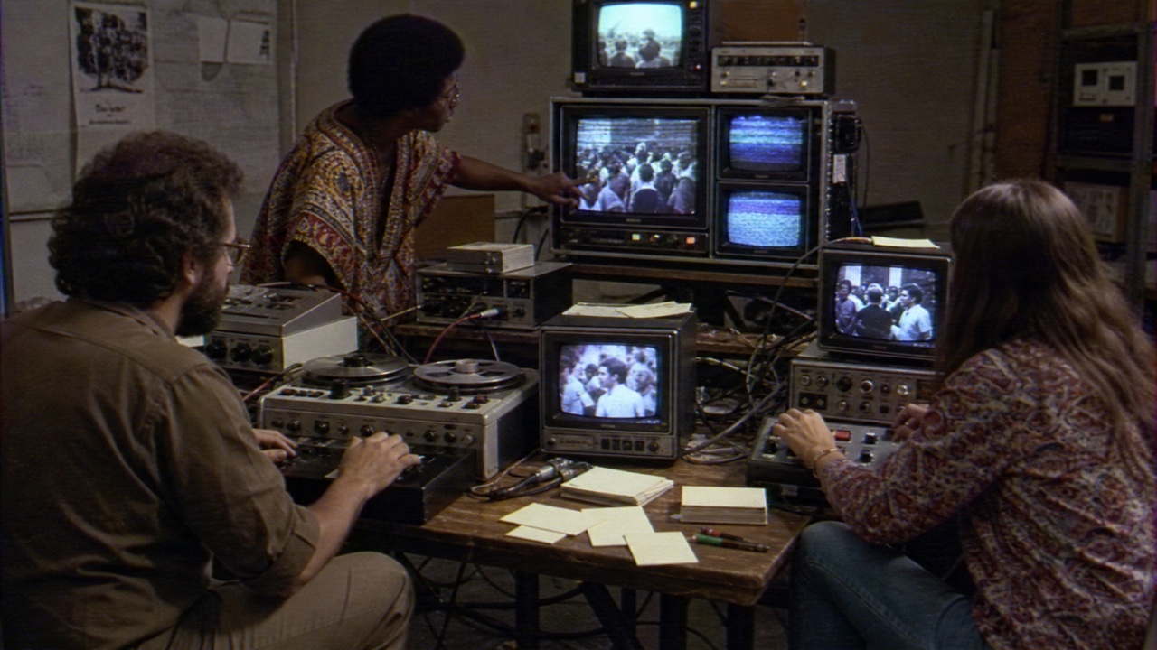
AI interpretation, not a reference
A media movement in which small collectives used portable video to oppose broadcast authority and one-way communication, recording demonstrations, communities, and institutions for rapid editing and alternative circulation. Low resolution, handheld access, feedback, direct titles, and multiple viewpoints became its language.
AI interpretation, not a reference
A network art practice that treats envelopes, postcards, stamps, rubber stamps, addresses, postmarks, and delivery time as compositional parts. The work is a system for reply, forwarding, addition, and arrival rather than one finished sheet.
AI interpretation, not a reference
A late-1970s and 1980s tendency that displaced already familiar advertising, film, magazine, and television images through rephotography, performance, cropping, and overlaid text, exposing systems of authorship, desire, gender, and consumption.
AI interpretation, not a reference
An international post-World War I tendency that stepped back from avant-garde fragmentation and speed toward classical contour, stable figures, still life, and legible space. It retained modern simplification while recovering weight and order rather than reconstructing the past literally.
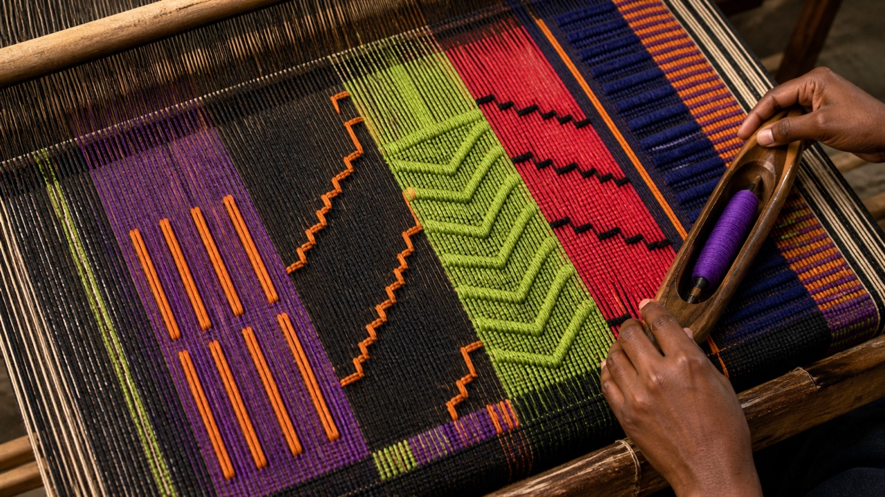
AI interpretation, not a reference
A textile developed by Igbo women in Akwete, southeastern Nigeria. Broad upright looms and supplementary weft build named chevrons, diamonds, animals, and apparent bands into dense fields of vivid color and occasional metallic thread.
AI interpretation, not a reference
A mid-nineteenth-century silhouette system that joins concentric steel hoops with tapes beneath a skirt, spreading the whole circumference into a bell or dome. The mass-produced structure replaced layers of heavy petticoats and changed both the dress outline and the space a wearer occupied.
AI interpretation, not a reference
A late-nineteenth-century silhouette system concentrating pads, horsehair, cages, springs, skirt volume, and trim behind the waist. Front and sides stay comparatively narrow while projection, drape, and train are staged at the back.
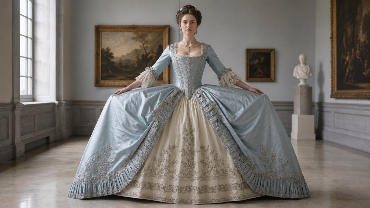
AI interpretation, not a reference
An eighteenth-century silhouette system suspending basket-like supports at both hips so width grows laterally while front and back remain flat. Court dress and the robe à la française used this horizontal field to display woven pattern, trim, and frontal gesture.
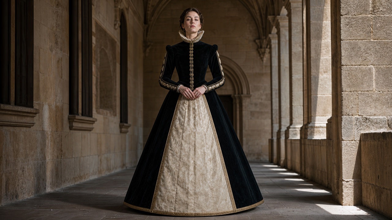
AI interpretation, not a reference
A Spanish court-dress silhouette formed by hoops increasing toward the floor, fixing the skirt into a rigid cone or triangle from waist to hem. It suppresses folds and joins an upright torso, narrow waist, and broad base into one geometry.
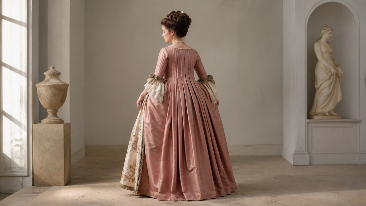
AI interpretation, not a reference
An eighteenth-century gown style combining a fitted front, triangular stomacher, open overskirt, and two deep box pleats falling unbroken from shoulders to floor. Pannier width and silk surface separate frontal decoration from the long flow of the back.
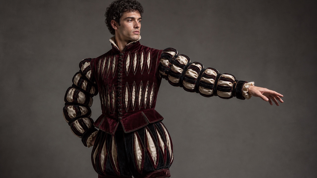
AI interpretation, not a reference
A decorative technique making regular cuts through an outer layer of clothing, hats, or shoes to reveal lining, undercloth, or pulled fabric beneath. Cut shape, spacing, direction, and contrasting color turn the surface into a controlled two-layer rhythm rather than random damage.
AI interpretation, not a reference
An early-twentieth-century New York urban realism that raised crowded streets, saloons, theaters, and working neighborhoods into major subjects through the speed of newspaper illustration and a dark, rough paint surface.
AI interpretation, not a reference
A nineteenth-century American landscape language that joined mountains, rivers, and forests to national grandeur, spirituality, and expansion through immense distance, precise detail, and theatrical light.
AI interpretation, not a reference
French landscape painting built from direct observation around Fontainebleau, treating trees, marsh, fields, livestock, weather, and labor as the subject rather than the background to a historical story.
AI interpretation, not a reference
A 1990s San Francisco DIY art language that mixed storefront signs, skating, comics, folk art, urban scrap, small drawings, and handmade installations to record life and change around the Mission District.
AI interpretation, not a reference
Bay Area painting that returned to figures, rooms, cities, and landscapes without abandoning Abstract Expressionism's broad marks and thick color fields; figure and ground carry the same painterly pressure.
AI interpretation, not a reference
Chicago painters who compressed comics, advertising, folk art, sideshows, and ornament into distorted bodies, hard contours, acidic color, and intensely personal hand-painted image worlds.
AI interpretation, not a reference
An international postwar network that restarted from a 'zero point,' replacing gestural painting with monochrome repetition, light, fire, air, and movement so physical phenomena and the viewer's motion become the work.
AI interpretation, not a reference
A Japanese tendency that placed stone, wood, glass, steel, and cotton with minimal transformation to expose relations among things, site, support, fracture, and gravity rather than constructing a finished shape.
AI interpretation, not a reference
Korean painting in which narrow fields of white, earth, and grey are joined to repeated acts of pressing, pulling, soaking, tearing, and marking; duration and resistance of the support create density beyond the monochrome look.
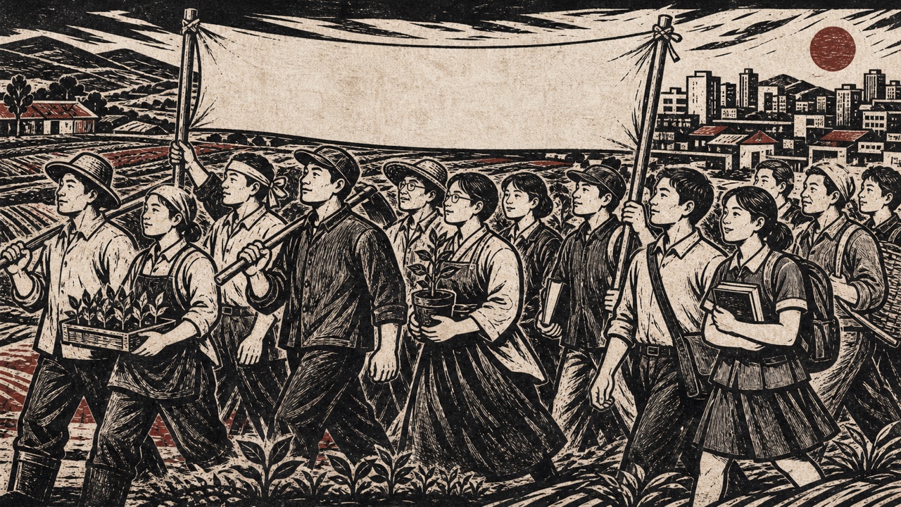
AI interpretation, not a reference
Art of South Korea's democratization era that joined labor, rural life, division, and collective action to woodcuts, banners, murals, hanging pictures, and comic-like public imagery made to circulate beyond the museum.
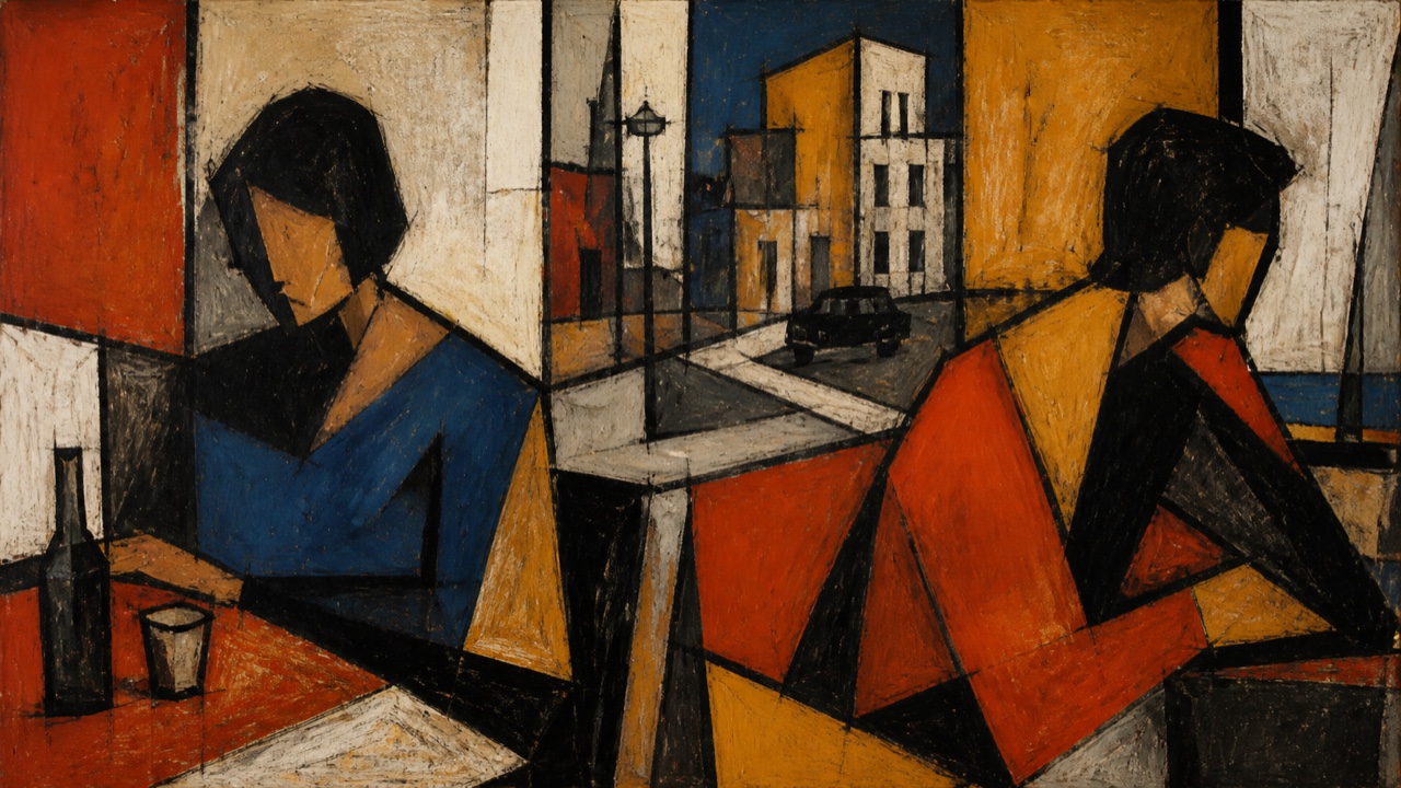
AI interpretation, not a reference
A post-independence Bombay group that rejected both colonial academism and nationalist revival, individually recombining Cubism, Expressionism, Indian cities, and religious imagery through strong color fields and distorted figuration.
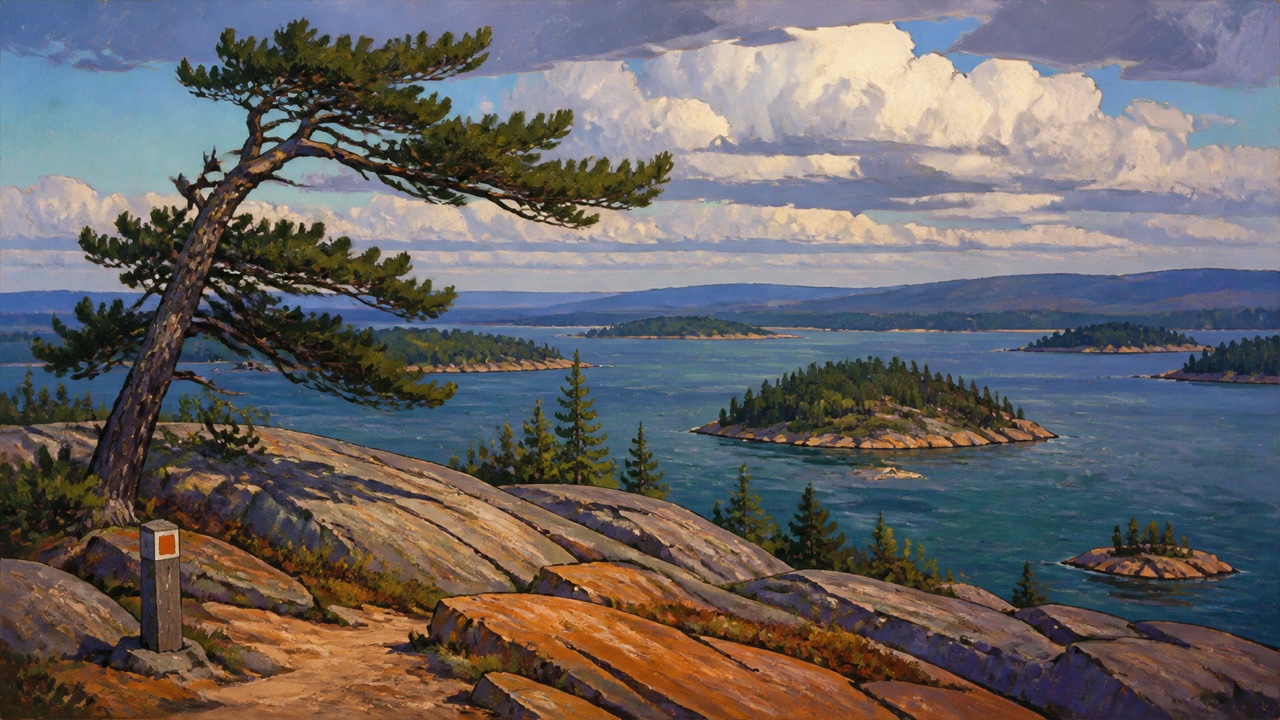
AI interpretation, not a reference
A Canadian group that simplified northern trees, exposed rock, lakes, and clouds into broad contours and non-natural color, enlarging fast outdoor oil sketches into national landscape statements.
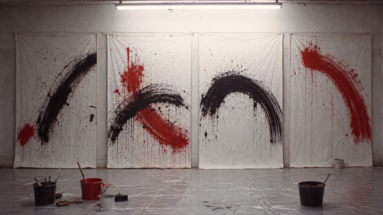
AI interpretation, not a reference
A postwar Austrian movement that expanded painterly gesture into ritualized actions with bodies, liquid, cloth, organic matter, photography, and film; repeated lines, splashes, binding, and documentation form its visual core.
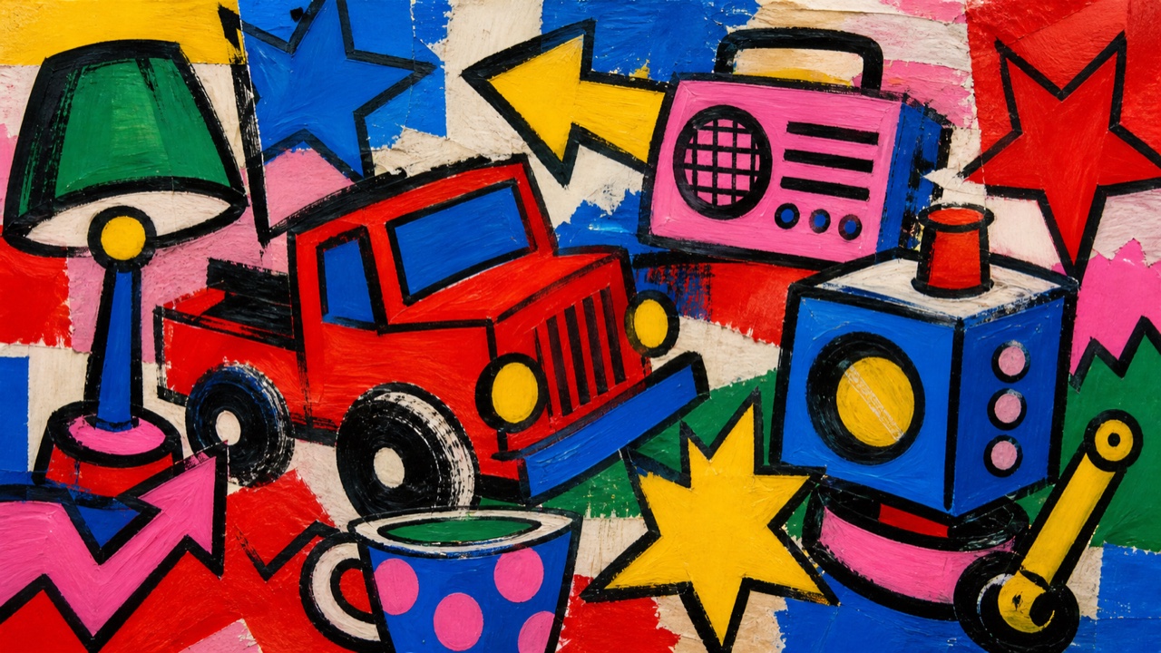
AI interpretation, not a reference
A 1980s French return to figuration that released comics, rock, television, advertising, and graffiti into fast contours, saturated flat color, painted stories, walls, and posters.
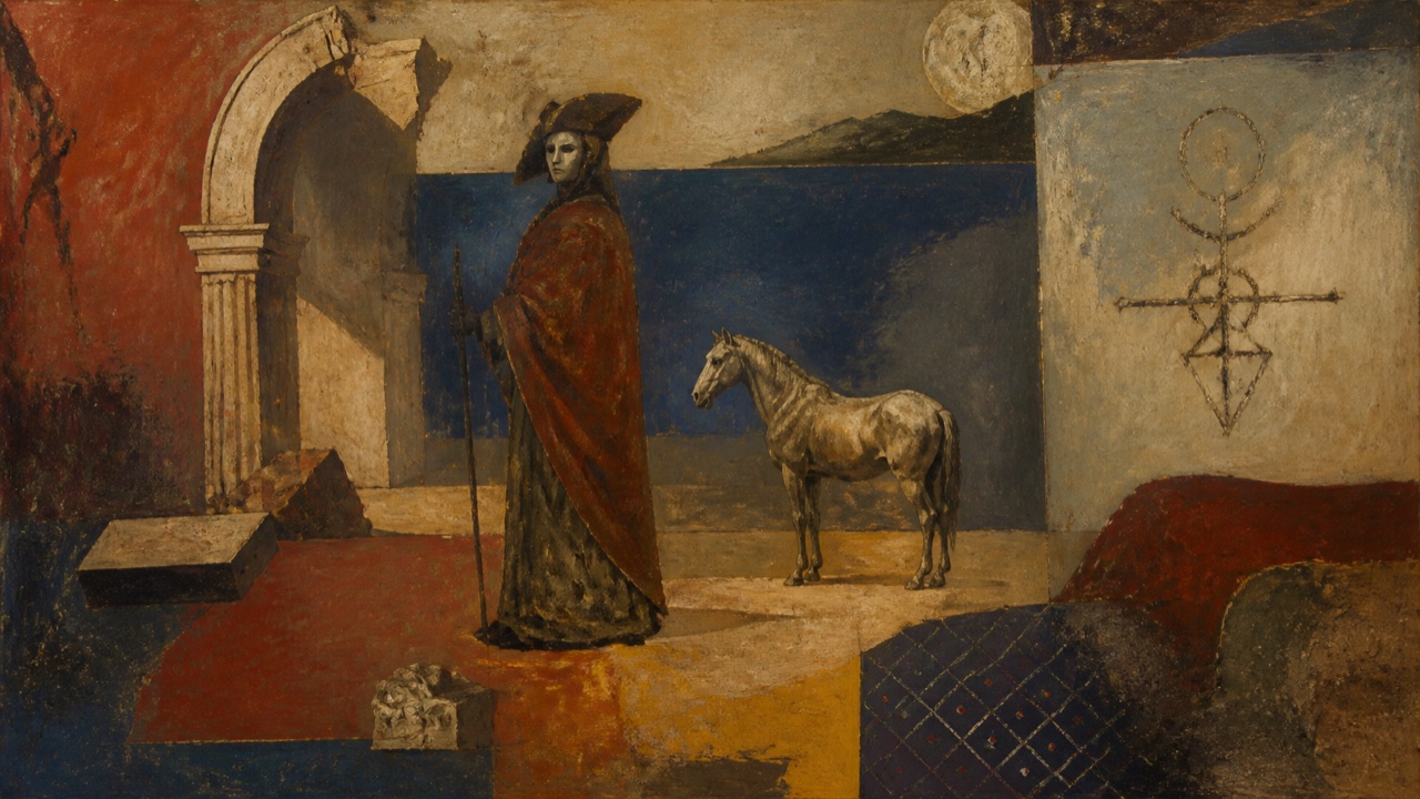
AI interpretation, not a reference
A late-1970s Italian return to painting that crossed myth, classicism, personal signs, and forceful brushwork after Conceptual art, treating history as a subjective field that can be entered from several eras at once.
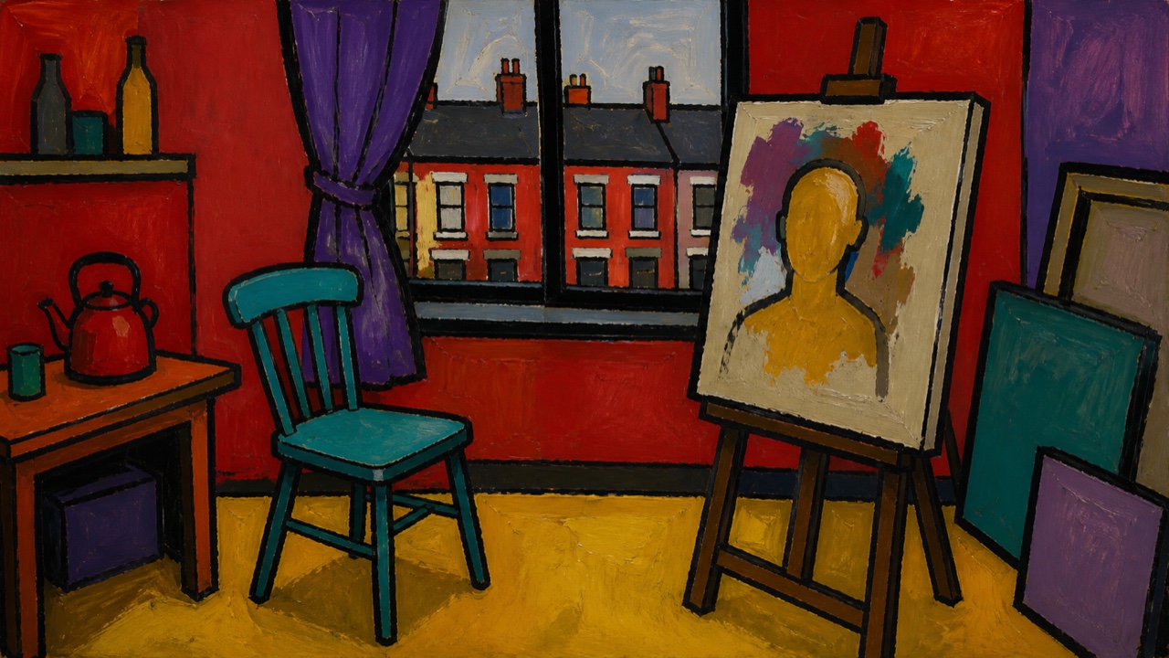
AI interpretation, not a reference
A movement founded in London in 1999 that opposed institutional Conceptual art by advocating figurative painting, manifestos, and public protest, often through self-portraiture, hard contour, flat non-natural color, and narrative rooms or streets.
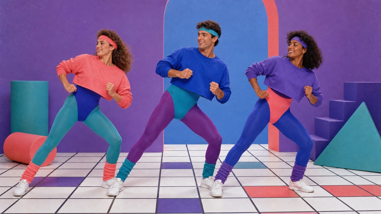
AI interpretation, not a reference
The aerobics and home-fitness boom turned leotards, leggings, leg warmers, high-top shoes, fluorescent layers, and a visibly high waist into a repeatable 1980s workout language that crossed into streetwear and advertising.
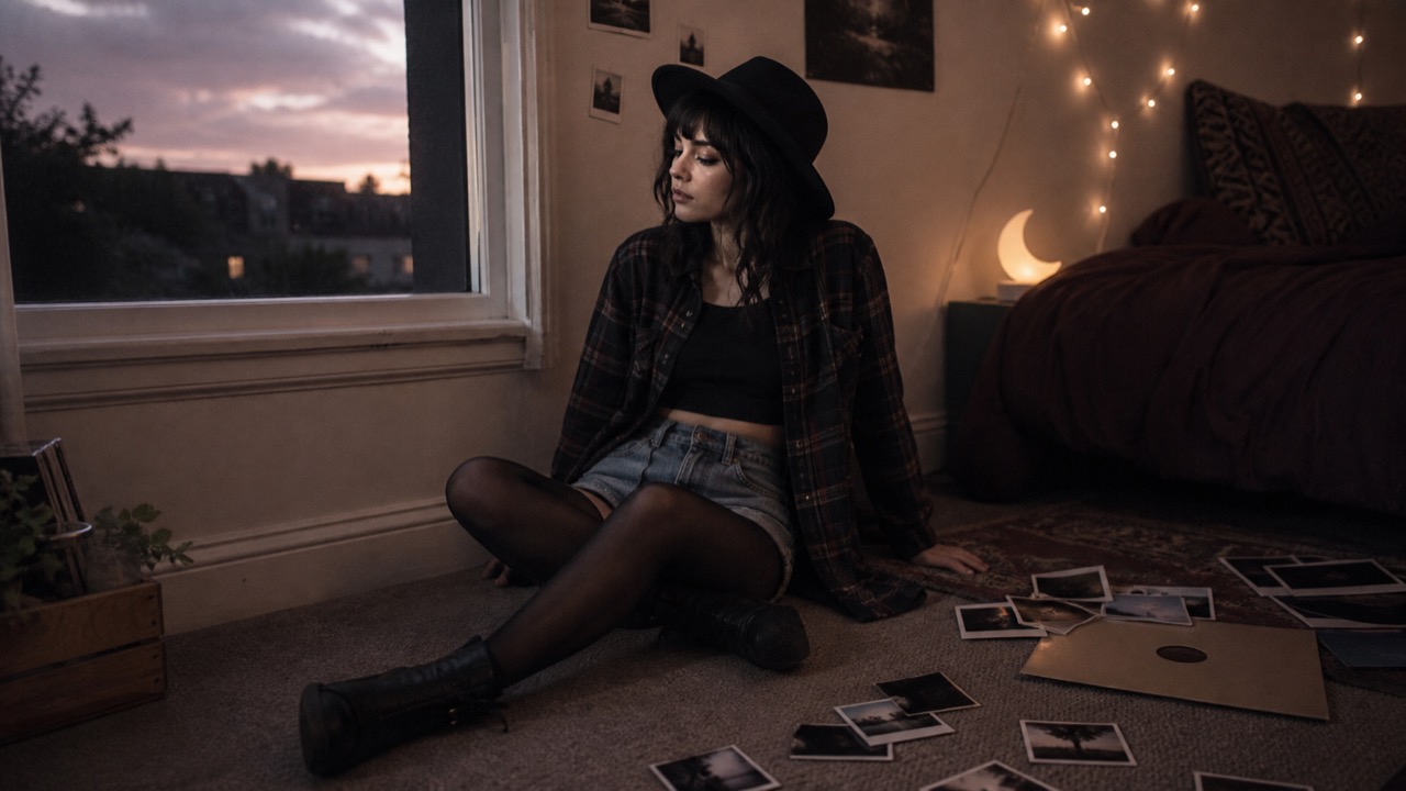
AI interpretation, not a reference
A 2010s internet style in which Tumblr's music, fashion, and image quotation converged on black skinny jeans, band shirts, chokers, dark lipstick, direct flash, desaturated filters, and a continuous feed edited into a persona.

AI interpretation, not a reference
A Korean online-retail and Gen Z style that keeps Y2K's slim, low-rise silhouette while muting it into grey, black, white, translucent layers, cropped tops, boleros, and asymmetric seams.
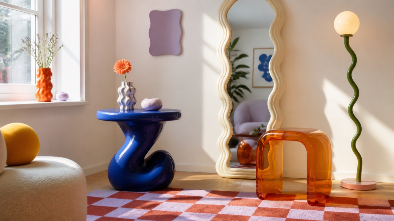
AI interpretation, not a reference
An Instagram-born postmodern interior aesthetic of wavy mirrors, blob furniture, checks, curves, flower-shaped objects, and strong pastel-primary color, often using one sculptural commodity to make a basic room appear instantly avant-garde.
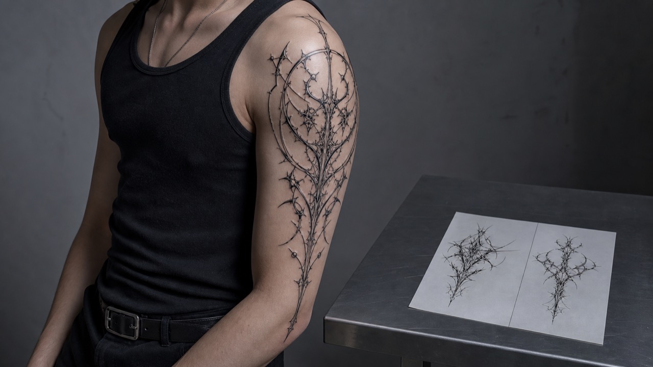
AI interpretation, not a reference
A contemporary tattoo and graphic language combining mirrored tribal curves, sharp metal-logotype thorns, and digital sigils in fine black line, spreading unreadable symbols like wings, flame, or biomechanical bone along the body's axes.

AI interpretation, not a reference
A TikTok-native style editing Emo, Scene, anime, skate, and K-pop into black layers, split-color hair, eye and cheek marks, close phone framing, and repeated performance—treated here as one gender-expansive system rather than a binary of e-girls and e-boys.
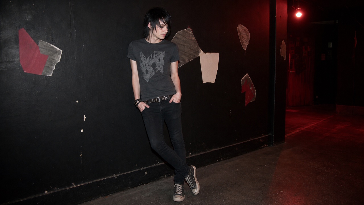
AI interpretation, not a reference
A subcultural fashion shaped by Emocore and later music scenes through black slim clothing, side-swept hair, band shirts, studs, intimate lyrics, and DIY self-photography, emphasizing vulnerability and inward expression more than Punk's outward destruction.
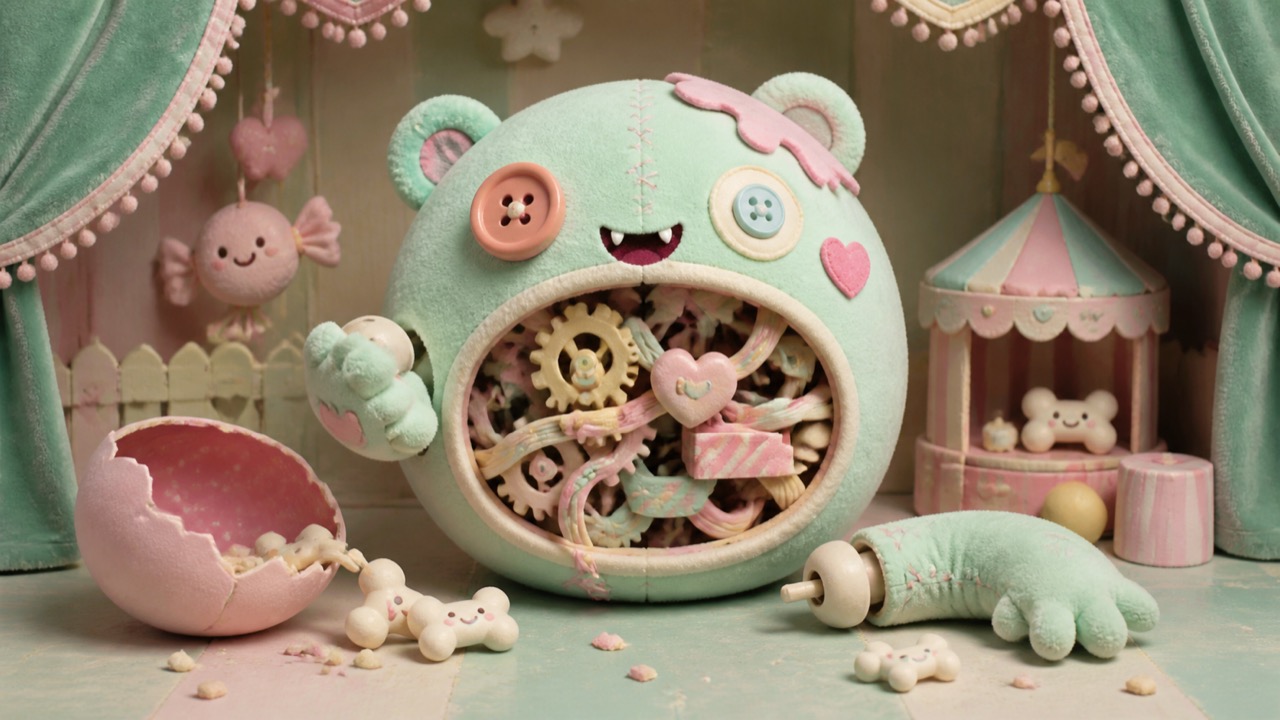
AI interpretation, not a reference
A Japanese grotesque-cute language that places wounds, eyes, bone, blood, or monsters inside kawaii outlines, pastels, and characters, letting cuteness and disturbance coexist on the same body or product surface.
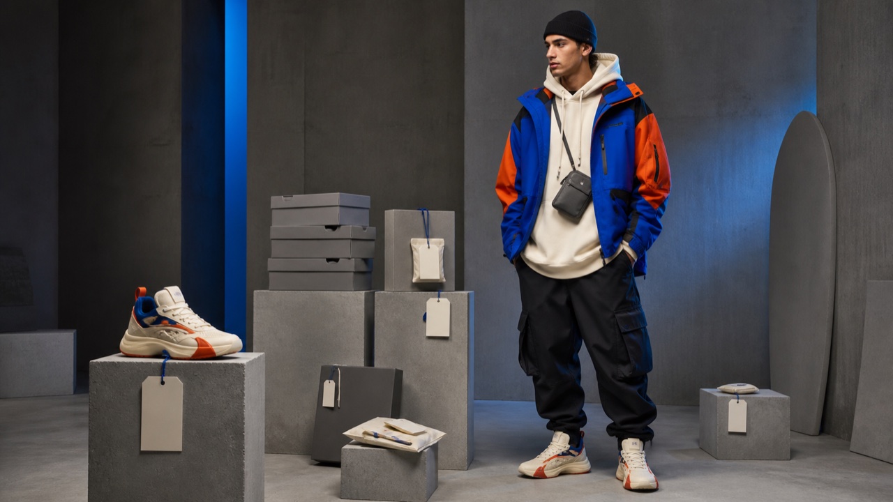
AI interpretation, not a reference
A streetwear display and consumption style in which limited drops, collaborations, sneaker collecting, and online information speed organize recognizable logos, rare items, packaging, and full-body styling into visible proof of access.
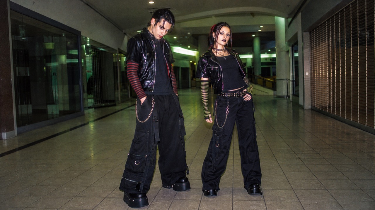
AI interpretation, not a reference
A late-1990s and 2000s mall-retail translation of Goth, Nu Metal, and skate signs into accessible youth outfits: wide black pants, chains, mesh, band shirts, heavy shoes, and mass-market accessories.
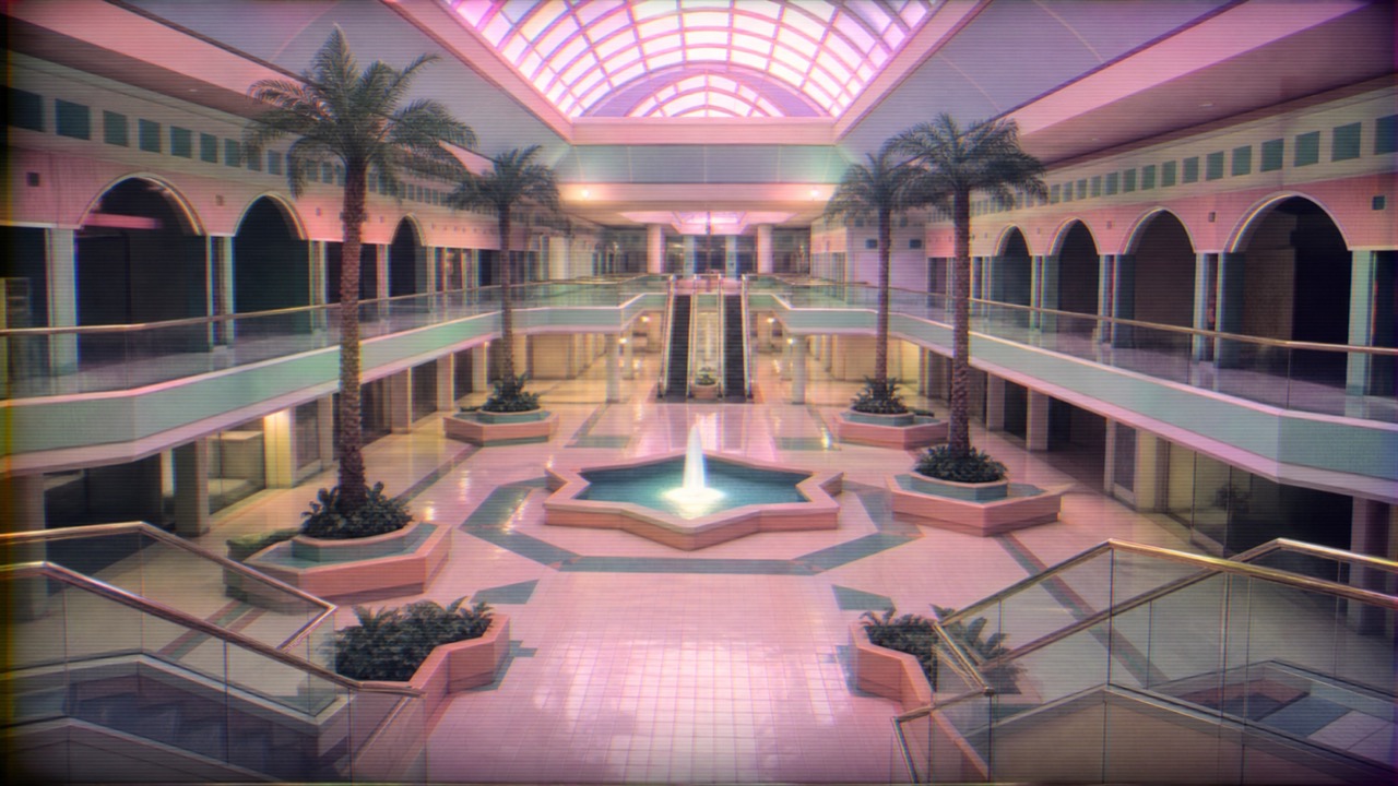
AI interpretation, not a reference
A Vaporwave offshoot that turns empty shopping malls, food courts, fountains, and public-address sound into reverberant music and low-resolution imagery where consumer memory, reassurance, and absence occupy the same long corridor.
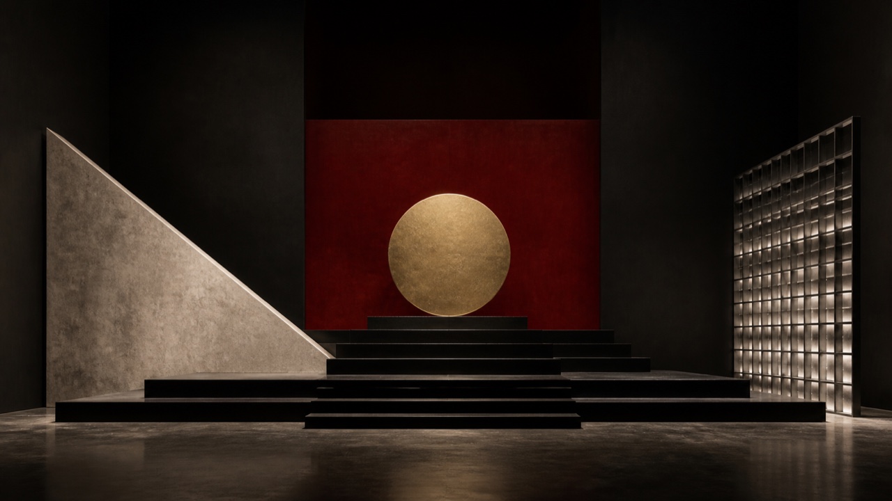
AI interpretation, not a reference
A Slovenian collective in former Yugoslavia whose music, painting, theater, and state-like documents critically reenacted totalitarian, religious, national, and avant-garde signs through over-identification and severe black-red-gold monumentality.
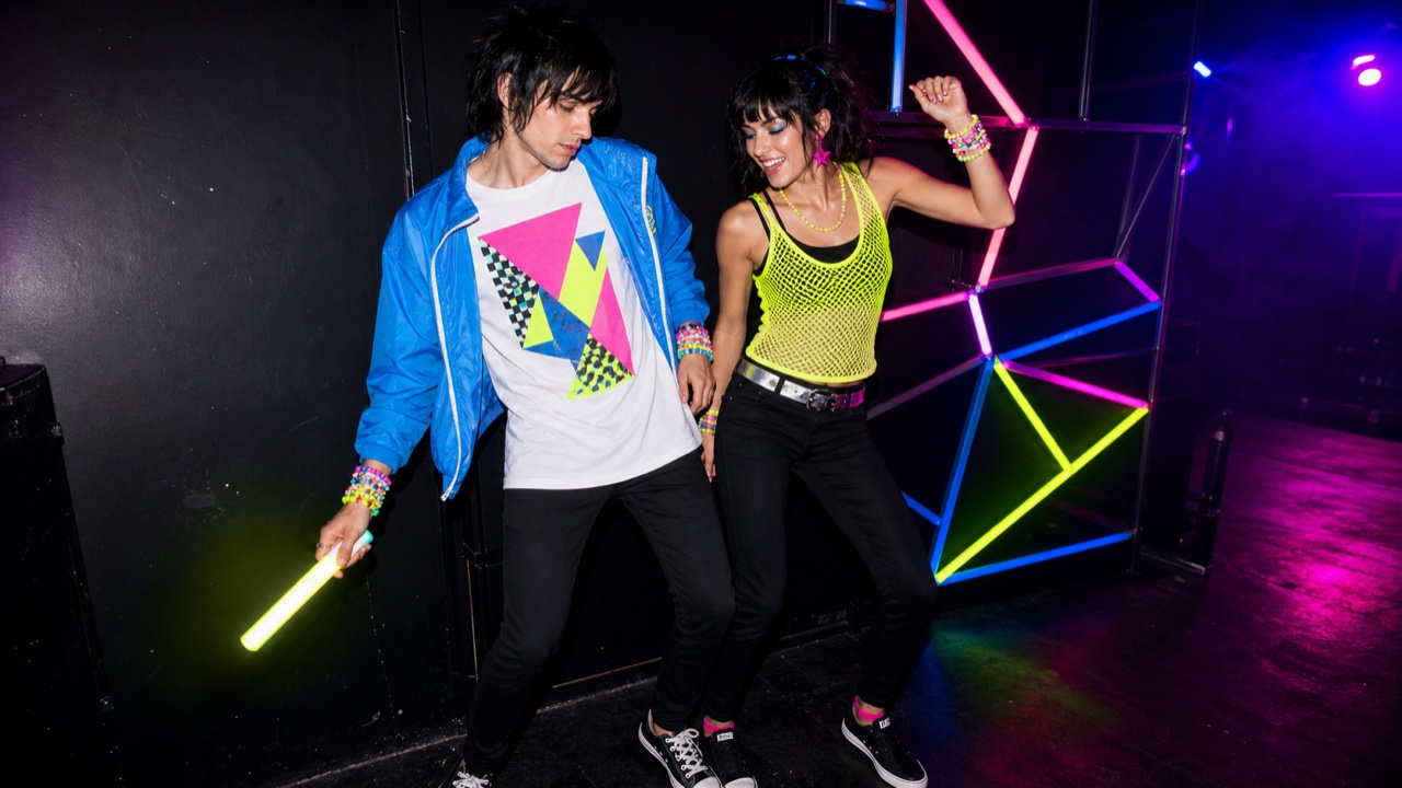
AI interpretation, not a reference
A brief but recognizable mid-2000s meeting of indie rock and rave revival that joined fluorescent color, geometry, sportswear, DIY accessories, and direct-flash club photography around a slim rock silhouette.
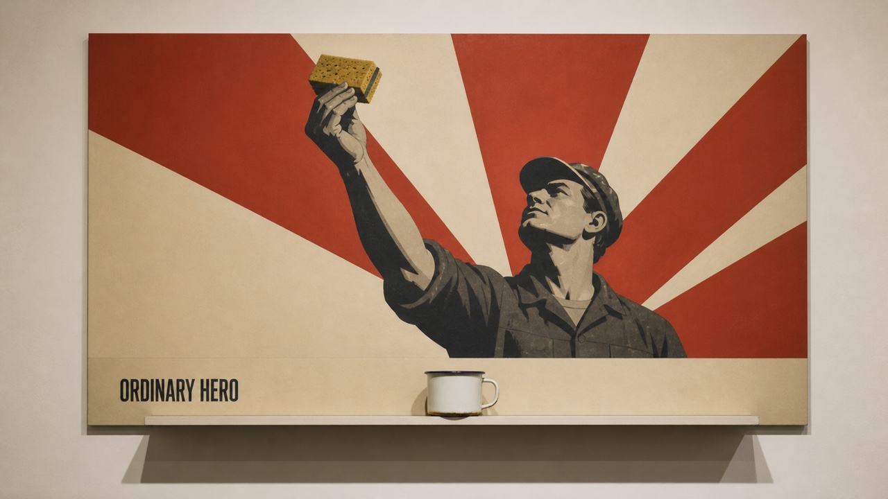
AI interpretation, not a reference
Unofficial Soviet art that dismantled Socialist Realism and propaganda through Pop-like quotation, repetition, and irony, precisely restaging heroes, flags, slogans, and advertising flatness before shifting one relation out of place.

AI interpretation, not a reference
A late-2010s teen internet aesthetic in which VSCO and short-form media standardized oversized shirts, shorts, scrunchies, shell necklaces, reusable bottles, and bright seaside color into a recognizable bundle of dress and objects.
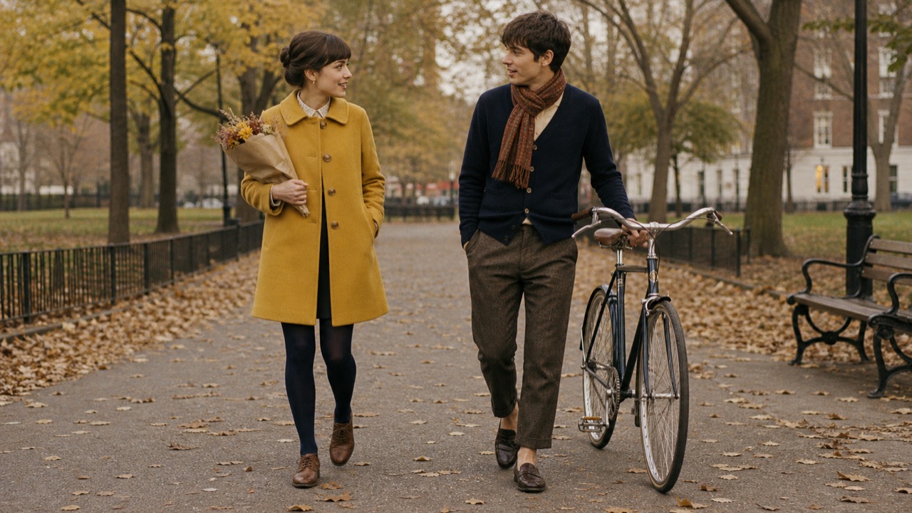
AI interpretation, not a reference
A mid-2000s indie-pop and vintage style joining Peter Pan collars, A-lines, colored tights, loafers, bangs, records, books, and analog props into a sweet, knowingly performed urban look later revived under names such as Whimsy Twee.
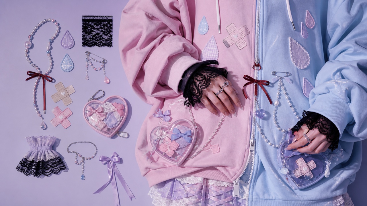
AI interpretation, not a reference
A Japanese fashion and illustration language combining kawaii pastel, round type, and characters with bandages, syringes, pills, tears, and words for distress, using cuteness as an opening for difficult mental-health communication rather than as a way to trivialize illness.
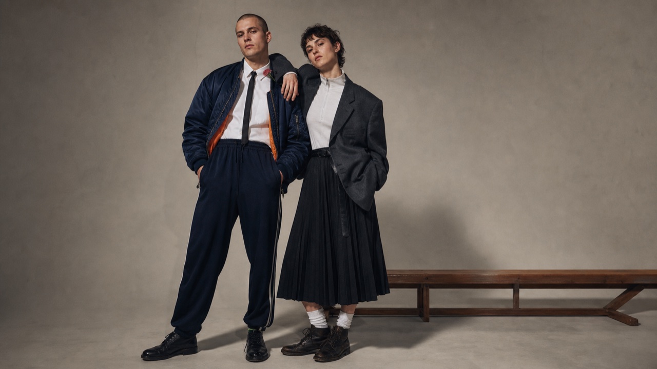
AI interpretation, not a reference
An authored 1980s London styling language developed around Ray Petri and the Buffalo collective, recombining sportswear, tailoring, military surplus and street dress through purposeful casting, fashion portraiture and challenges to fixed masculinity and high-low hierarchy.
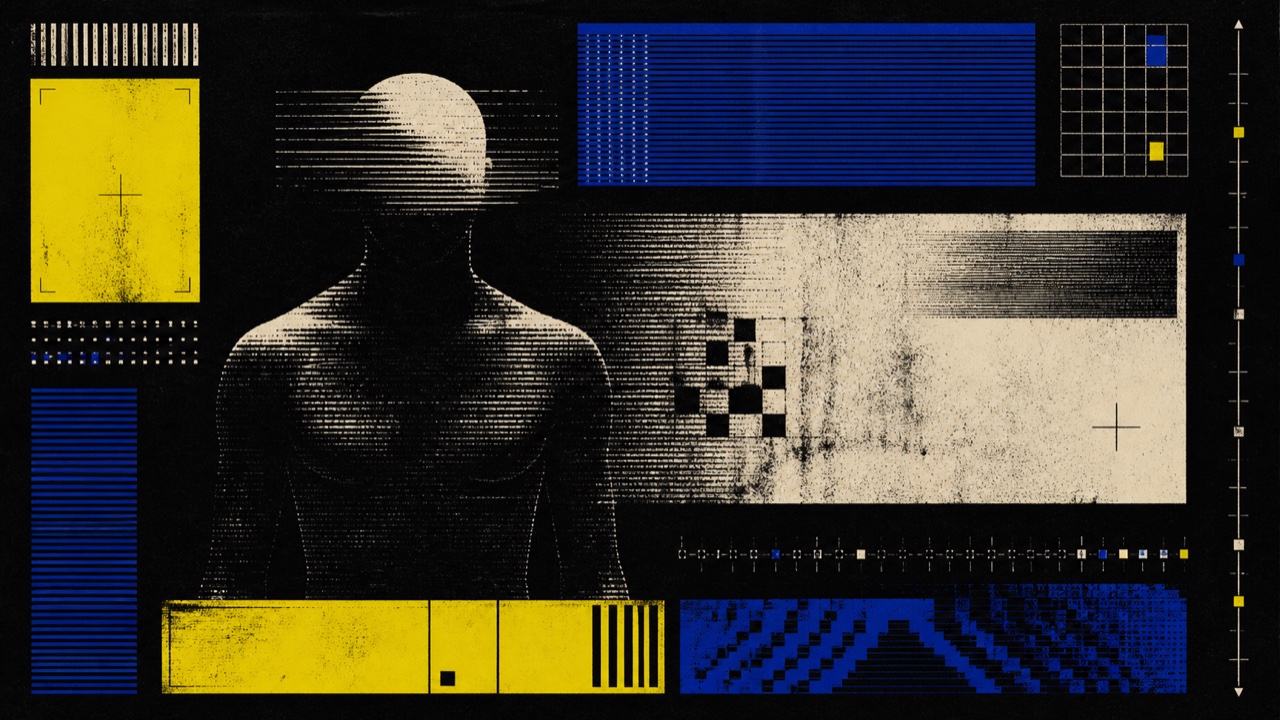
AI interpretation, not a reference
A late-1980s Belgian graphic lineage where New Beat's slow, heavy electronics met club print moving into early digital production, linking flyers, posters, records and label clothing through dark grounds, processed photography, primitive CG, short capitals and signal color.
AI interpretation, not a reference
A mid-1990s to early-2000s subcultural dress system translating the metal–hip-hop hybrid into extremely wide jeans, oversized sports layers, heavy skate shoes, chains, piercings and individualized band imagery, circulating through suburban retail and music television as a deliberately low, enlarged silhouette.
AI interpretation, not a reference
A 2009–2012 visual system that joined crushed night photography, treated found video, VHS decay and deliberately obstructed type into one Tumblr- and blog-circulated identity. Its form comes from digital obscurity and repetition, not from occult props alone.
AI interpretation, not a reference
A late-1980s and 1990s industrial-dance dress system that reduced military utility, punk disruption and workwear to a few club-ready parts. Black, gray and olive layers, cropped hair, cargo or BDU trousers, heavy boots and a short flight-jacket silhouette stay distinct from ornate Goth and fluorescent Cybergoth.
AI interpretation, not a reference
A cover-art system around dungeon synth, which emerged from the early-1990s black-metal milieu and gathers castles, ruins, forests, ancient kingdoms and chivalric imagery onto cassettes and small-scale releases. It does not reconstruct one historical period; it compresses a mixed pre-modern imaginary into a landscape and a physical object that opens onto the music's fictional world.
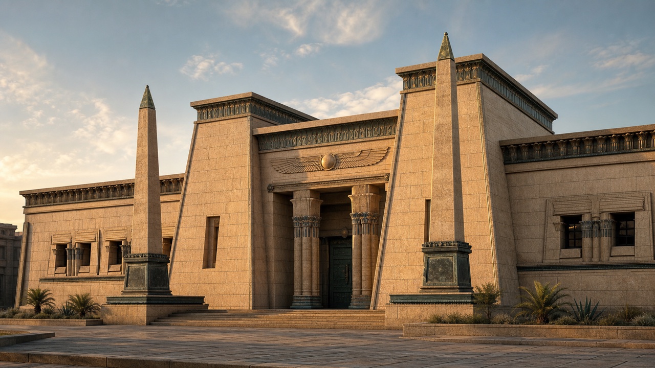
AI interpretation, not a reference
A revival style in late-eighteenth- and nineteenth-century Europe and the United States that transferred ancient Egyptian architecture and ornament to modern monuments, cemeteries, theatres and furniture. Obelisks, pylon-shaped entrances, papyrus and lotus capitals, and winged sun disks were organized into massive symmetrical compositions to project permanence, exoticism and the authority of discovery.
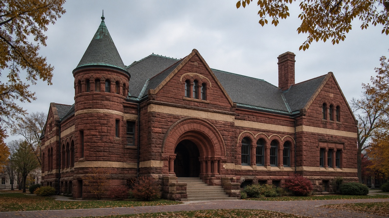
AI interpretation, not a reference
A late-nineteenth-century American architectural style in which H. H. Richardson recast medieval Romanesque round arches as rough masonry, deep openings, asymmetrical towers and low-spreading masses. Rather than surface decoration, stone weight, shadow depth and broad arches grouping entrances gave churches, libraries, courthouses and stations their public force.
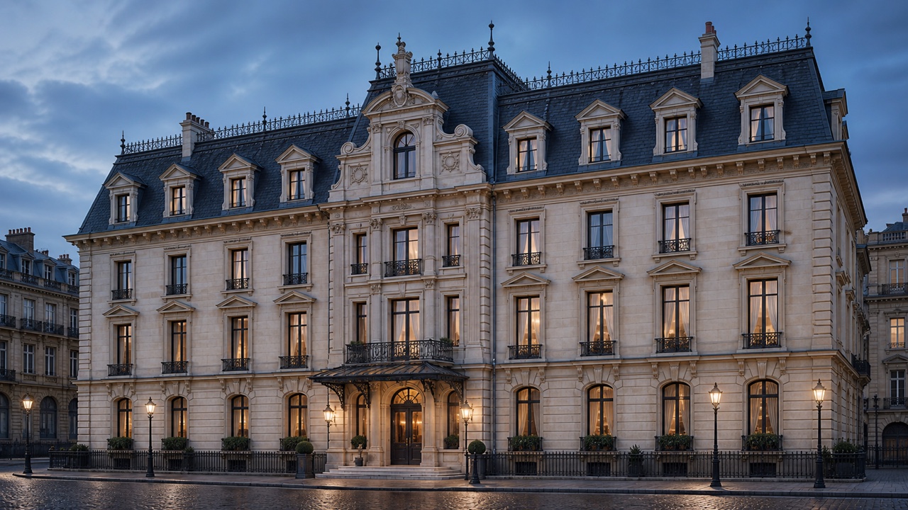
AI interpretation, not a reference
A nineteenth-century style originating in the opulent public architecture of France's Second Empire and spreading to civic buildings, hotels and houses in Europe and the United States. A mansard roof enclosed a useful upper story, while dormers, a central pavilion, bracketed cornices and quoins turned that added floor into urban prestige.
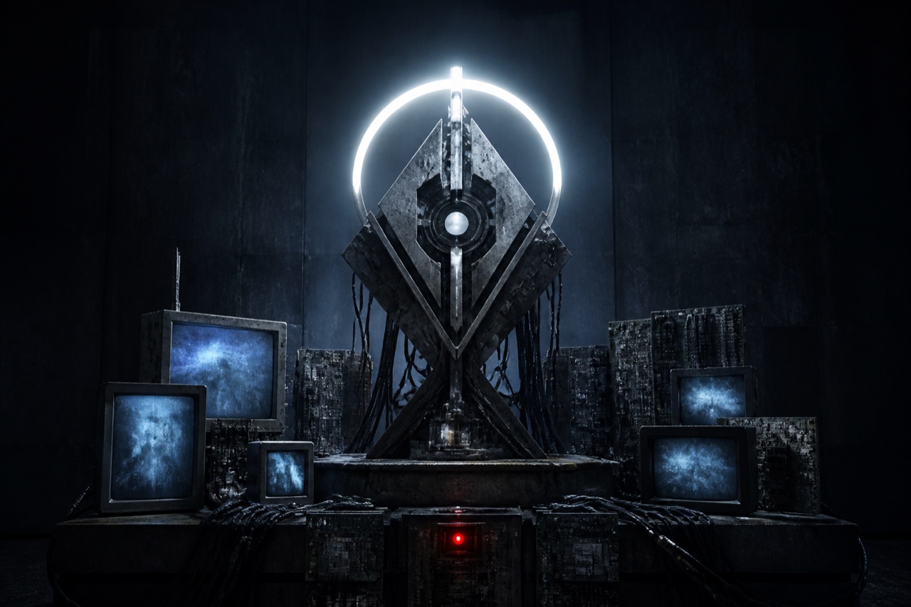
AI interpretation, not a reference
A visual system that connects religious iconography to circuit boards, communications equipment and medical devices, presenting machines not as convenient tools but as objects of awe, ritual and belief. It has a lineage in contemporary art since the 1990s and gained the name Divine Machinery online in the 2020s. Unlike Cyberpunk's city and resistance narratives, it searches for meaning and transcendence in failing technology.
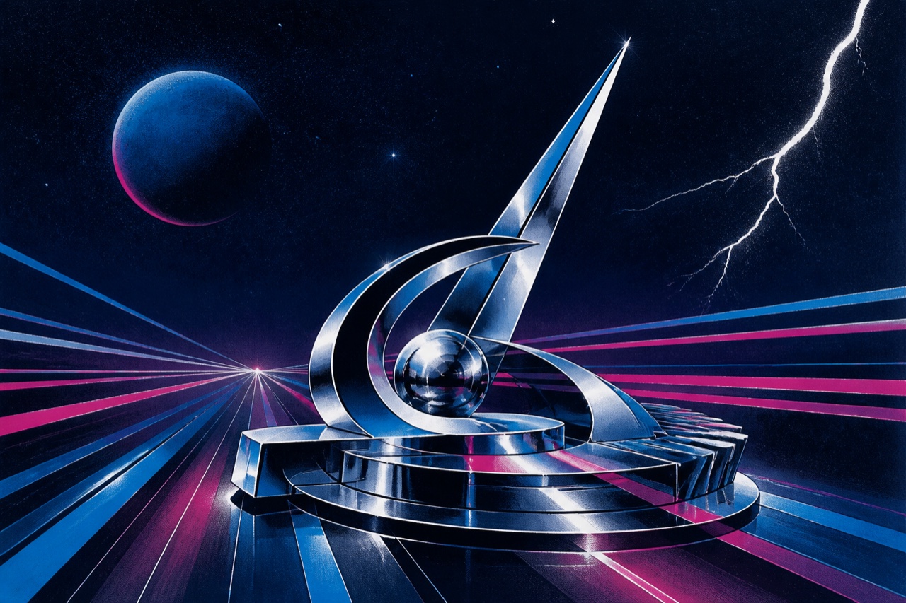
AI interpretation, not a reference
The sleeve system through which Italian-produced dance music of the late 1970s and 1980s compressed fantasies of space, speed, night and elsewhere into the square record cover. Smooth airbrushed bodies and machines, chrome, lightning, dark cosmic color and italic titles turned studio-made artificiality into a futuristic stage. Unlike later Synthwave, it belongs to the period's mixture of print, photography and hand-rendered illustration.
AI interpretation, not a reference
A highly visible Austrian youth club style that peaked from 2007 to 2009. Deep tans, carefully shaped hair, extremely slim jeans, white, gold or silver footwear and oversized trucker or neon Flash Caps were bound to the movement of Hardstyle and Jumpstyle. Its scope is a specific time, vocabulary and dance culture around Vienna, not generic 2000s neon.

AI interpretation, not a reference
A late-2000s Swedish youth look associated with Partille outside Gothenburg and Täby outside Stockholm. Bleached styled hair, slim jeans, visible belts or branded accessories and hair ribbons tied to jeans turned accessible retail clothing into signs of belonging. Because the name combines a place and a person-type, documentation must separate participants' self-understanding from outside ridicule.
AI interpretation, not a reference
A mid-2000s to early-2010s visual language that made flat vector graphics proliferate across advertising, music graphics and game interfaces. Vivid curves, flowers, birds, human silhouettes, speakers, splashes and gradient blocks spread outward from a center. It was named Vectordelia or Frutiger Metro retrospectively; it predates and is distinct from Microsoft's typographic Metro interface.