Aqua
アクア / 2000–2014 / Style / Apple UI
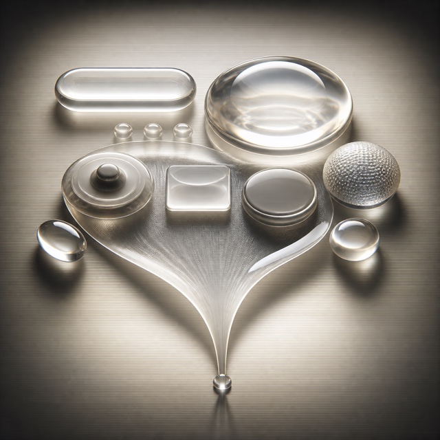
Mac OS X's design language of buttons you want to lick. Jelly gloss, pinstripes, deep shadows and the genie effect staged digital components as objects you could touch, and set the terms for UI throughout the 2000s. What the web made of it with images is Web 2.0 Gloss.


At a glance
Visual cues
- Gel-gloss buttons
- Pinstriped grounds
- Deep drop shadows
- Metaphors of water and light
Best used for
- Recreating 2000s digital culture with the texture it actually had
- Making what is clickable read at once as a pressable object
Use this style
Take the compact brief into a project or hand the structured version to an AI tool.
Detailed guidance and sourcesProduction rules, reference works, comparisons, research and citation formats
Dictionary entry
- Type
- No shadow on text, weighted to stay legible over gloss
- Composition
- Components evenly spaced, gaps left for shadows to fall into
- Material
- A hard white highlight above, reflection and deep shadow below
- Caution
- Gloss and shadow applied evenly to every component hides what is actually pressable, leaving texture where hierarchy should be.
- Further study
- the Mac OS X Public Beta, 2000 / Jobs's 'lick it' line / the return in Liquid Glass
Related entries
- Skeuomorphism (スキューモーフィズム)Shared effects: Intimacy.Compare Aqua and Skeuomorphism
- Liquid Glass (リキッドガラス)Same Apple UI lineage.Compare Aqua and Liquid Glass
More from Apple UI
Continue through styles in the same Apple UI family, prioritised by shared effects.
- visionOS Spatial Design (visionOS 空間デザイン)Shared effects: Futurity.
- Brushed Metal (ブラシドメタル)
- Platinum (プラチナ)
Cite this entry
The dictionary is meant to be linked to. Take whichever form fits where you are writing.
- Link
- https://indexstyle.org/styles/aqua
- Markdown
- [Aqua — IndexStyle](https://indexstyle.org/styles/aqua)
- HTML
- <a href="https://indexstyle.org/styles/aqua">Aqua — IndexStyle</a>