Talnemokkol (De-squared Hangul)
脱ネモ体 / 1980s- / Style / Type Classification
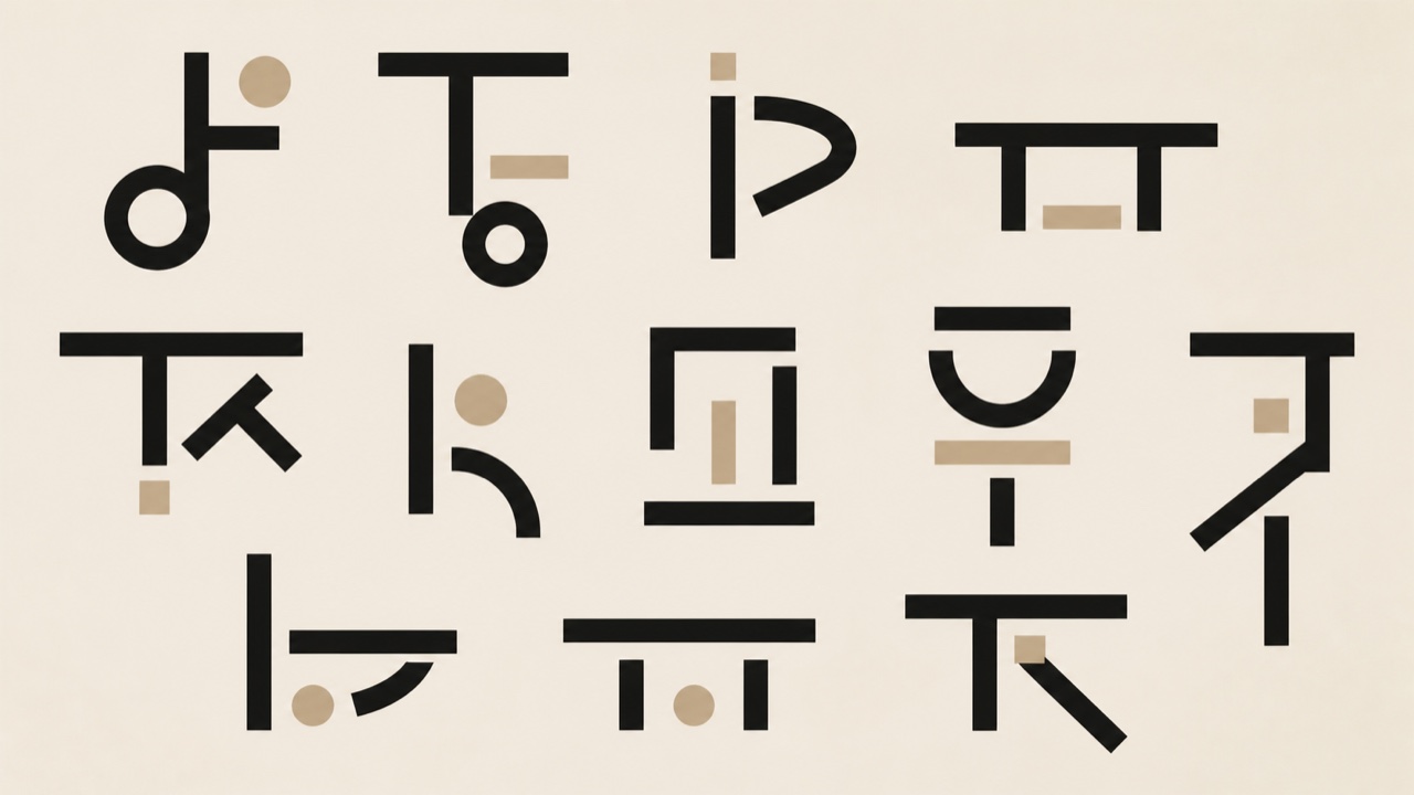
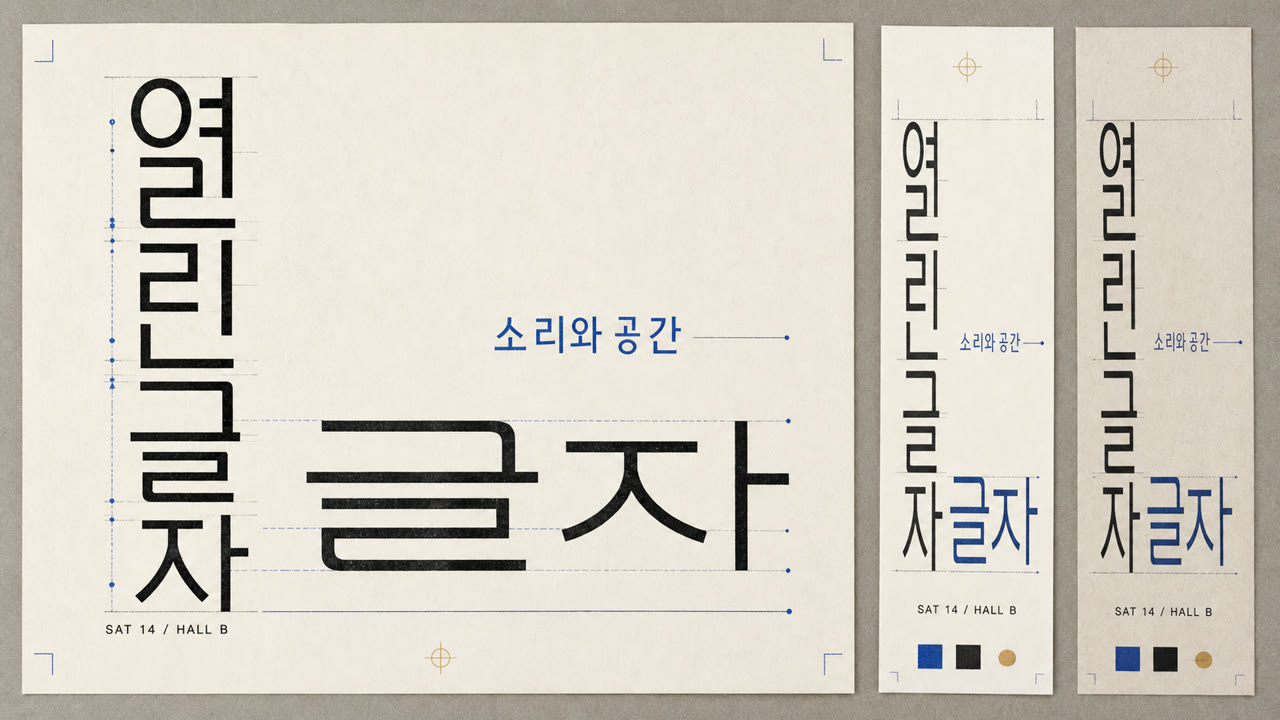
Hangul type that gives up fitting each syllable into a square and stacks consonant and vowel as fixed shapes, so height and width change from letter to letter. Ahn Sang-soo's typeface and posters carried the form to a wide audience.
At a glance
Visual cues
- Letter outlines breaking out of the square
- Height and width changing letter by letter
- Strokes of even weight, geometric in build
- Lines whose feet do not align
Best used for
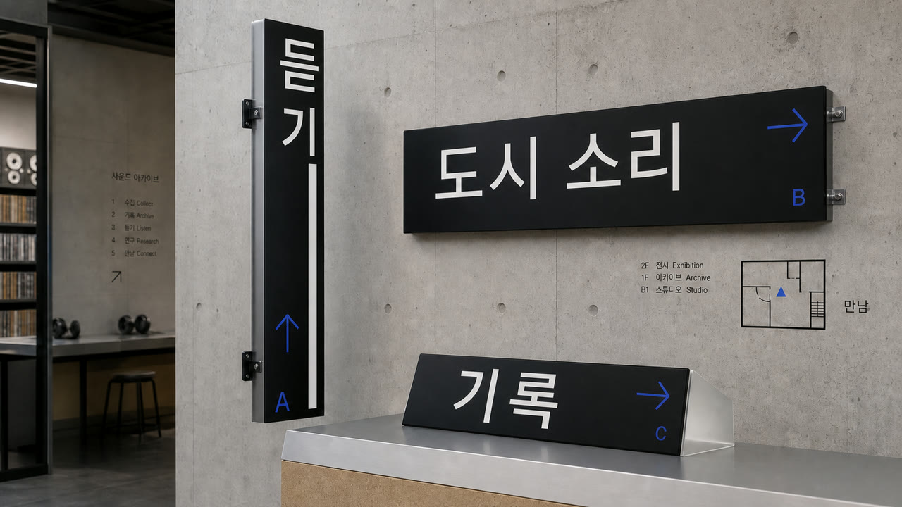
- Headlines and titling where the assembly of Hangul itself is meant to show
- Pages that step away from the default square setting to find another rhythm
Use this style
Take the compact brief into a project or hand the structured version to an AI tool.
Detailed guidance and sourcesProduction rules, reference works, comparisons, research and citation formats
Dictionary entry
- Type
- Fix the shapes of consonant and vowel and leave the height and width changing from letter to letter
- Composition
- Open the leading to absorb the uneven feet of the lines, and keep the measure short
- Material
- Assume large sizes, hold the stroke to one weight, and let the ragged outline show
- Caution
- At text size and over long passages, the uneven feet of the lines make them waver and reading slows. Keep it to headlines and other places where it is set large.
- Further study
- the design thinking of the Hunminjeongeum / Ahn Sang-soo's talnemokkol / Hangul lettering culture
Related entries
- Swiss (スイス・スタイル)Shared effects: Trust.Compare Talnemokkol (De-squared Hangul) and Swiss
- Swiss Punk Typography (スイス・パンク・タイポグラフィ)Shared effects: Rebellion / Technique.Compare Talnemokkol (De-squared Hangul) and Swiss Punk Typography
More from Type Classification
Continue through styles in the same Type Classification family, prioritised by shared effects.
- Slab Serif (スラブセリフ)Shared effects: Trust / Technique.
- Grotesque Sans (グロテスク・サンセリフ)Shared effects: Technique / Rebellion.
- Japanese Gothic (ゴシック体)Shared effects: Trust / Technique.
Browse all Type Classification entries
Cite this entry
The dictionary is meant to be linked to. Take whichever form fits where you are writing.
- Link
- https://indexstyle.org/styles/talnemokkol
- Markdown
- [Talnemokkol (De-squared Hangul) — IndexStyle](https://indexstyle.org/styles/talnemokkol)
- HTML
- <a href="https://indexstyle.org/styles/talnemokkol">Talnemokkol (De-squared Hangul) — IndexStyle</a>