Factory Pomo
ファクトリー・ポモ / late 1980s–early 1990s / Style / Industrial and Spatial Design
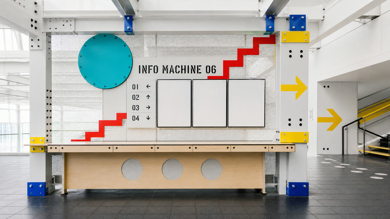
A brief late-1980s and early-1990s postmodern style that reassembled factory safety graphics, WPA, Constructivism, and Bauhaus through smooth CAD geometry and Memphis quotation. Industrial signs become bright information-age stage sets rather than preserved relics.


At a glance
Visual cues
- Gears, bolts, beams, and arrows reduced to geometry
- Black and safety yellow expanded with red, blue, and turquoise
- CAD-perfect circles and diagonals over old factory lettering
- Exposed structure converted into decorative repetition
Best used for
- Turning factory signs into optimistic information-age symbols in retail or exhibitions
- Showing early CAD’s influence across furniture, signage, and print
Use this style
Take the compact brief into a project or hand the structured version to an AI tool.
Detailed guidance and sourcesProduction rules, reference works, comparisons, research and citation formats
Dictionary entry
- Type
- Combine stencil and geometric type; use numbers and arrows as structural lines.
- Composition
- Build on horizontal and vertical beams, then collide one circle with one 45-degree line.
- Material
- Finish painted steel, perforated metal, rubber, and plywood in clean bright spot colors.
- Caution
- Rust and bare bulbs drift into later industrial interiors. Factory Pomo updates industrial quotation through bright CAD geometry and postmodern color.
- Further study
- late-1980s information-age interiors / industrial vernacular and postmodern quotation / early CAD geometry
Related entries
- Memphis (メンフィス)Shared effects: Play.Compare Factory Pomo and Memphis
- Corporate Cyberspace (コーポレート・サイバースペース)Shared effects: Futurity / Technique.Compare Factory Pomo and Corporate Cyberspace
More from Industrial and Spatial Design
Continue through styles in the same Industrial and Spatial Design family, prioritised by shared effects.
- Industrial Americana (インダストリアル・アメリカーナ)Shared effects: Technique.
Browse all Industrial and Spatial Design entries
Cite this entry
The dictionary is meant to be linked to. Take whichever form fits where you are writing.
- Link
- https://indexstyle.org/styles/factory-pomo
- Markdown
- [Factory Pomo — IndexStyle](https://indexstyle.org/styles/factory-pomo)
- HTML
- <a href="https://indexstyle.org/styles/factory-pomo">Factory Pomo — IndexStyle</a>