Corporate Grunge
コーポレート・グランジ / late 1980s–mid-1990s / Style / Contemporary Branding
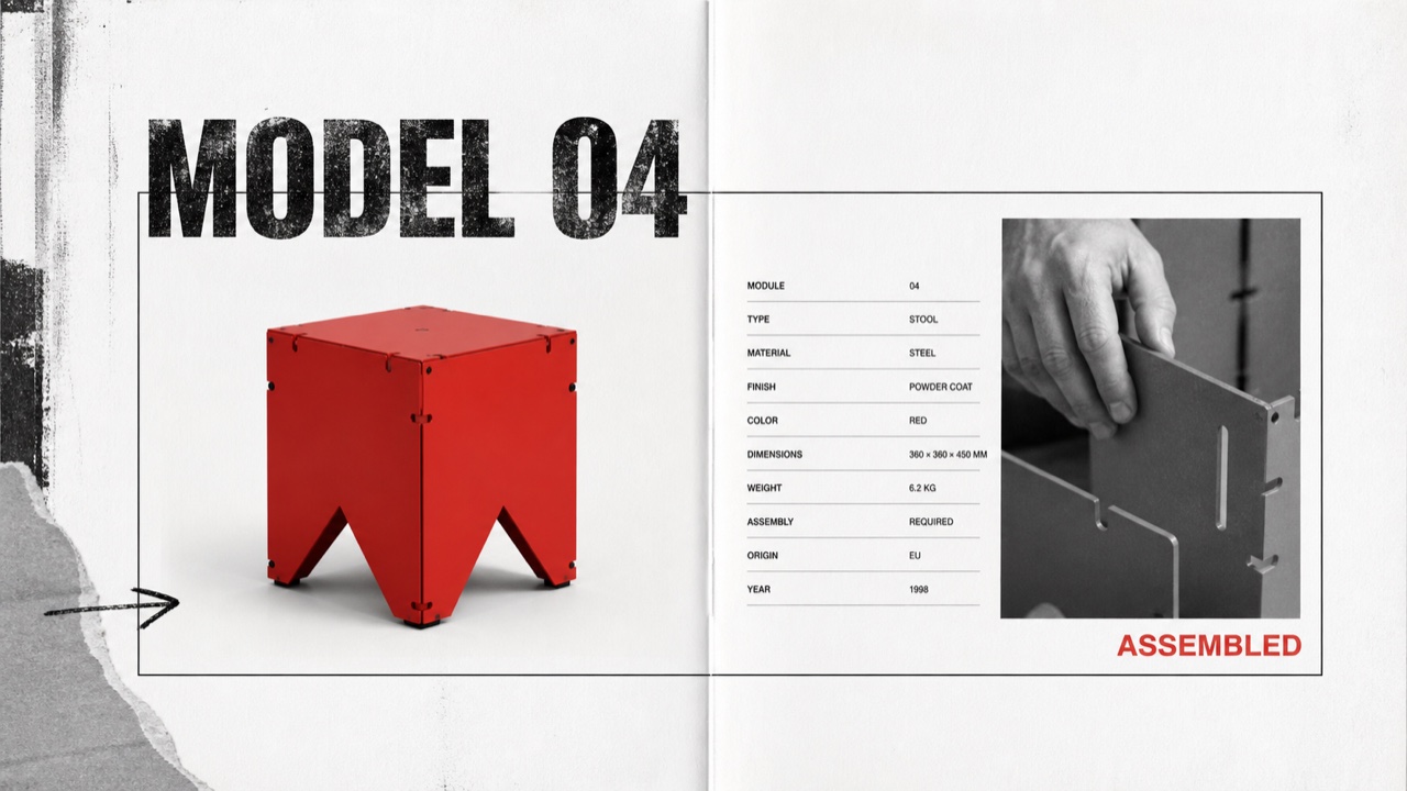
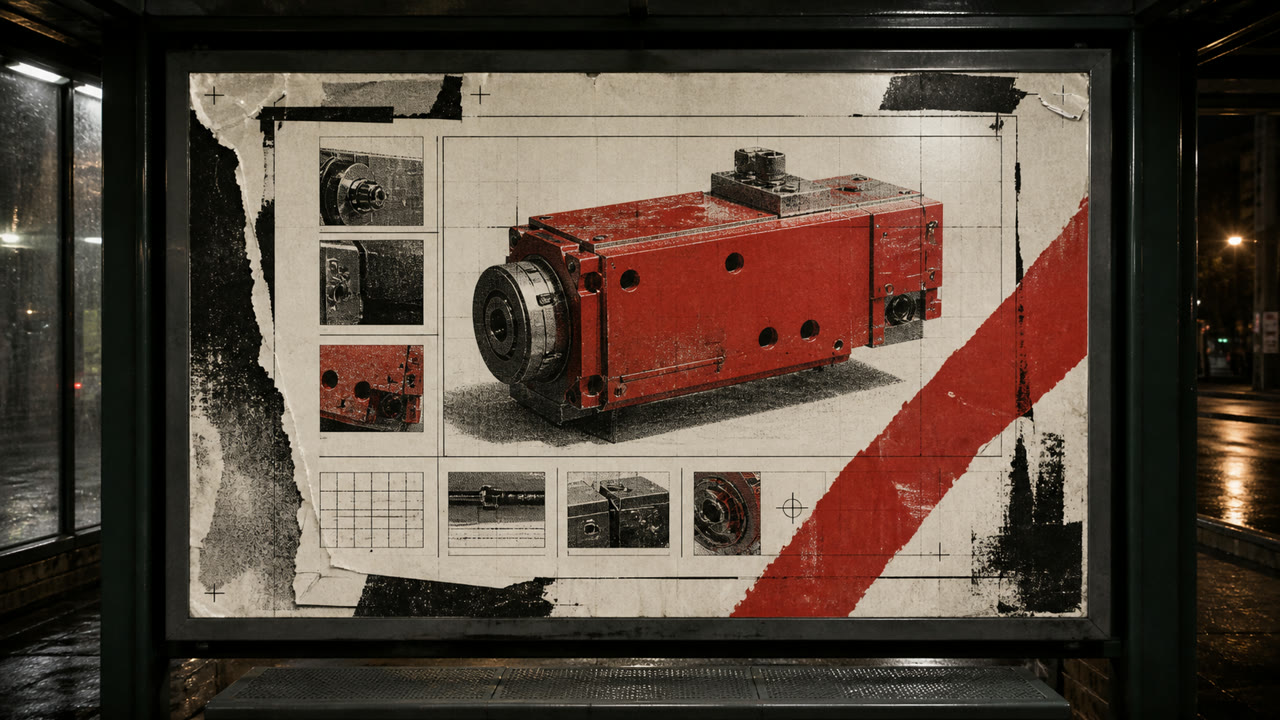
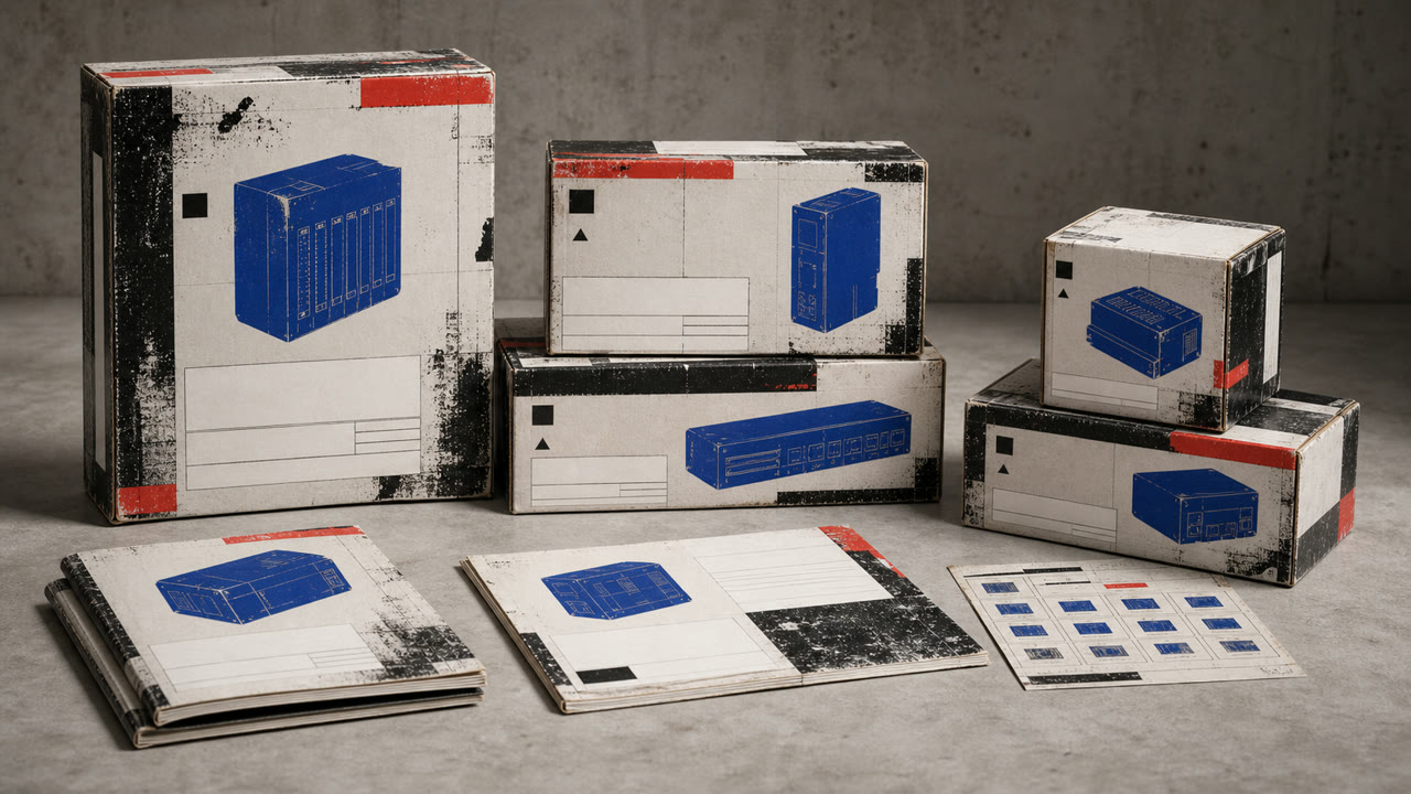
A controlled transfer of distressed type, rupture, and layering from music publishing into corporate advertising and product catalogues. Illegibility is not the goal; traces of rebellion sit around otherwise ordered product information.
At a glance
Visual cues
- Distressed or overprinted display headlines
- Tilted subheads alongside orderly body copy
- Rough monochrome photography with one red or yellow overprint
- Torn edges, hand marks, and copier noise used selectively
Best used for
- Youth, sports, and music advertising that needs resistance without sacrificing price or feature information
- Editorial work about the commercialization of 1990s underground culture
Use this style
Take the compact brief into a project or hand the structured version to an AI tool.
Detailed guidance and sourcesProduction rules, reference works, comparisons, research and citation formats
Dictionary entry
- Type
- Distress display type only, then restore body copy to one face, alignment, and line length.
- Composition
- Lock the product and required information in rectangles; collide cropped photos and drawn marks around them.
- Material
- Use crushed photocopy texture, worn paper, coarse halftones, and limited-color overprint locally.
- Caution
- When everything becomes unreadable, it is simply grunge. Corporate Grunge depends on destruction and legibility remaining visible on the same surface.
- Further study
- David Carson and Ray Gun / Emigre and experimental typography / commercial appropriation of grunge
Related entries
- Grunge (グランジ)Shared effects: Rebellion.Compare Corporate Grunge and Grunge
- Corporate Cyberspace (コーポレート・サイバースペース)Shared effects: Trust.Compare Corporate Grunge and Corporate Cyberspace
More from Contemporary Branding
Continue through styles in the same Contemporary Branding family, prioritised by shared effects.
- Sportsbrut (スポーツブルート)Shared effects: Exhilaration / Rebellion.
- Corporate Modernism (企業モダニズム)Shared effects: Trust.
- MUJI (無印良品)Shared effects: Trust.
Browse all Contemporary Branding entries
Cite this entry
The dictionary is meant to be linked to. Take whichever form fits where you are writing.
- Link
- https://indexstyle.org/styles/corporate-grunge
- Markdown
- [Corporate Grunge — IndexStyle](https://indexstyle.org/styles/corporate-grunge)
- HTML
- <a href="https://indexstyle.org/styles/corporate-grunge">Corporate Grunge — IndexStyle</a>