Stippling
スティップリング(点描陰影) / 16th century– / Technique / Hand-drawn
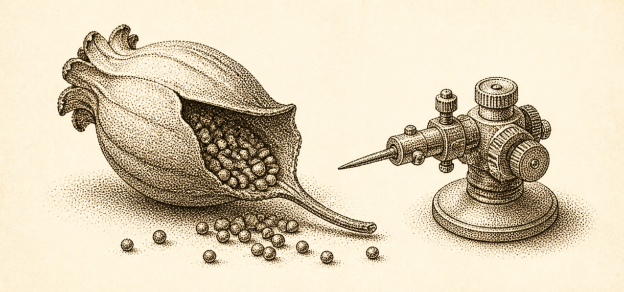
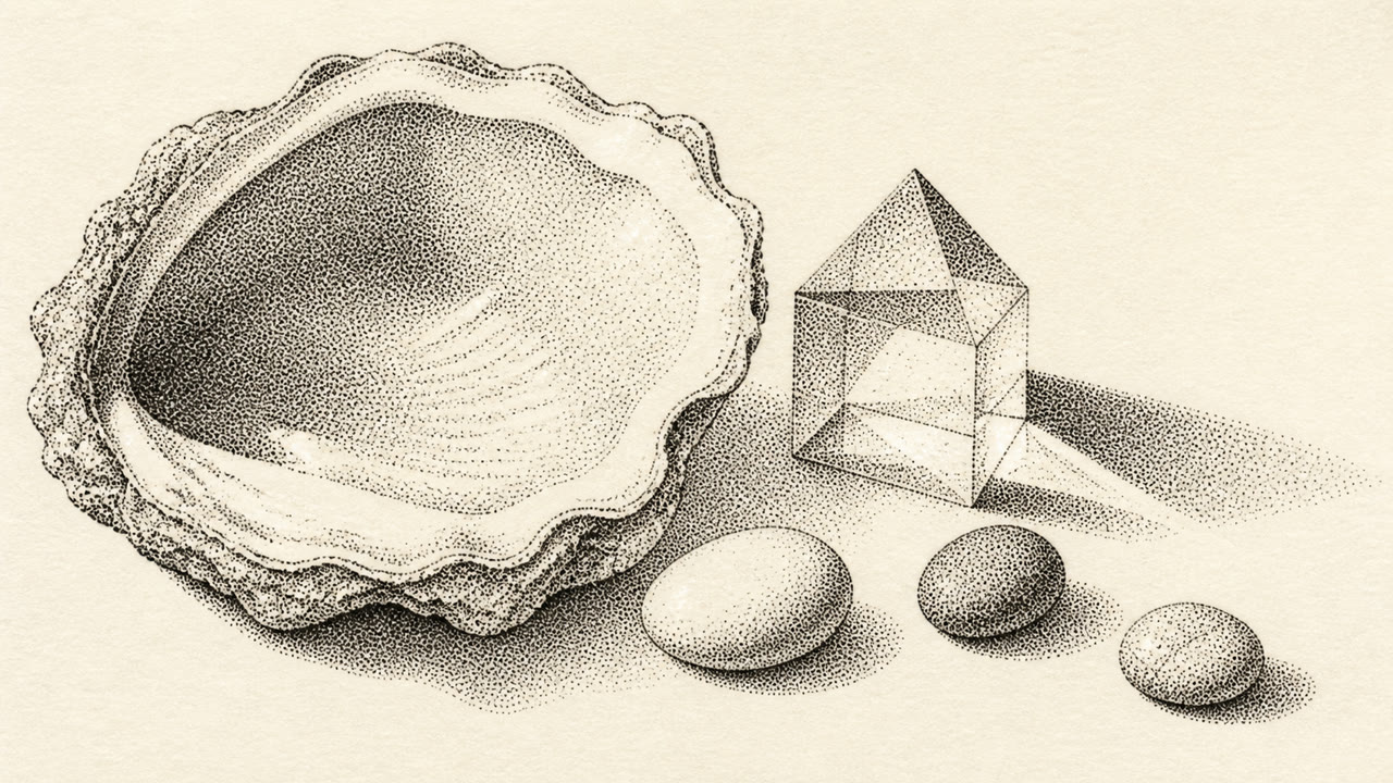
Stippling builds light, volume and surface through the density and size of tiny dots; tone rises from sparse to dense without filling contours with lines.

At a glance
Visual cues
- Countless small dots filling a contour
- Narrower spacing in darker areas
- Soft tone without hatched lines
- Grain up close and smooth volume at distance
Best used for
- Scientific illustration, natural history and portraiture with delicate volume
- Giving packaging and posters quiet hand-built grain
Use this style
Take the compact brief into a project or hand the structured version to an AI tool.
Detailed guidance and sourcesProduction rules, reference works, comparisons, research and citation formats
Dictionary entry
- Type
- Use a fine serif or small capitals with enough air from dotted fields.
- Composition
- Begin at the darkest point and build the subject by density rather than outline.
- Material
- Keep one nib size and vary spacing more than dot size to construct tone.
- Caution
- Random noise and halftone are different. Each dot's density must explain form and light.
- Further study
- Pen-and-ink stippling / Dot density and value / Stipple engraving
Related entries
- Mezzotint (メゾチント)Shared effects: Luxury / Calm.Compare Stippling and Mezzotint
- Halftone (ハーフトーン(網点))Shared effects: Technique.Compare Stippling and Halftone
More from Hand-drawn
Continue through styles in the same Hand-drawn family, prioritised by shared effects.
- Scratchboard (スクラッチボード)Shared effects: Luxury / Technique.
Cite this entry
The dictionary is meant to be linked to. Take whichever form fits where you are writing.
- Link
- https://indexstyle.org/styles/stippling
- Markdown
- [Stippling — IndexStyle](https://indexstyle.org/styles/stippling)
- HTML
- <a href="https://indexstyle.org/styles/stippling">Stippling — IndexStyle</a>