GNOME Clearlooks
GNOME Clearlooks / 2005–2011 / Style / Platform Screen Languages
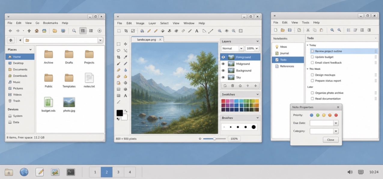
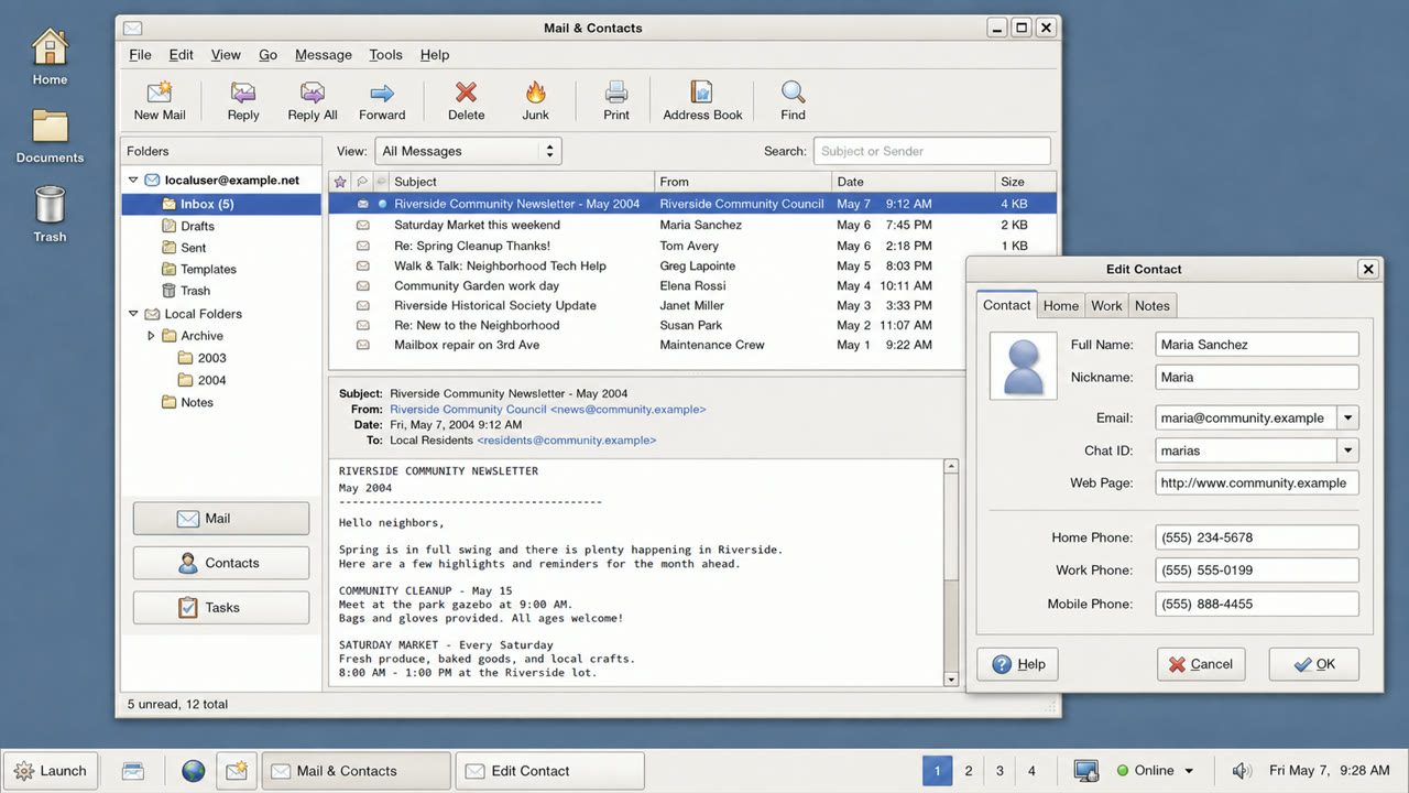
GNOME 2.12's standard theme made GTK applications friendly and simple through pale-gray windows, blue selection, restrained gloss and firm boundaries.

At a glance
Visual cues
- Pale-gray surfaces with blue selection bars
- A quiet highlight only along button tops
- Tabs and fields with restrained rounding
- Small GNOME icons and a concise two-level hierarchy
Best used for
- Aligning document, file and settings applications into one calm GTK environment
- Recreating a 2000s Linux desktop without loud brand color
Use this style
Take the compact brief into a project or hand the structured version to an AI tool.
Detailed guidance and sourcesProduction rules, reference works, comparisons, research and citation formats
Dictionary entry
- Type
- Use a small system sans and create hierarchy through label weight rather than added decoration.
- Composition
- Stack menu, toolbar, work area and status bar shallowly, without ornamental regions.
- Material
- Use one blue selection color over pale gray, a slight top highlight and one fine dark outer edge.
- Caution
- Old GTK widgets alone are not Clearlooks. State and hierarchy must be unified as a simple, friendly default surface.
- Further study
- GNOME 2.12 Clearlooks / GTK 2 theme engines / GNOME Human Interface Guidelines
Related entries
- Adwaita (アドワイタ)Same Platform Screen Languages lineage.Compare GNOME Clearlooks and Adwaita
- KDE Oxygen (KDE Oxygen)Same Platform Screen Languages lineage.Compare GNOME Clearlooks and KDE Oxygen
More from Platform Screen Languages
Continue through styles in the same Platform Screen Languages family, prioritised by shared effects.
- One UI (ワンUI)Shared effects: Calm / Intimacy / Trust.
- GOV.UK Design System (GOV.UK デザインシステム)Shared effects: Trust / Calm.
- Breeze (ブリーズ)Shared effects: Calm / Trust.
Browse all Platform Screen Languages entries
Cite this entry
The dictionary is meant to be linked to. Take whichever form fits where you are writing.
- Link
- https://indexstyle.org/styles/gnome-clearlooks
- Markdown
- [GNOME Clearlooks — IndexStyle](https://indexstyle.org/styles/gnome-clearlooks)
- HTML
- <a href="https://indexstyle.org/styles/gnome-clearlooks">GNOME Clearlooks — IndexStyle</a>