Frasurbane
フラサーバン / late 1980s–mid-1990s / Style / Publishing and Editing
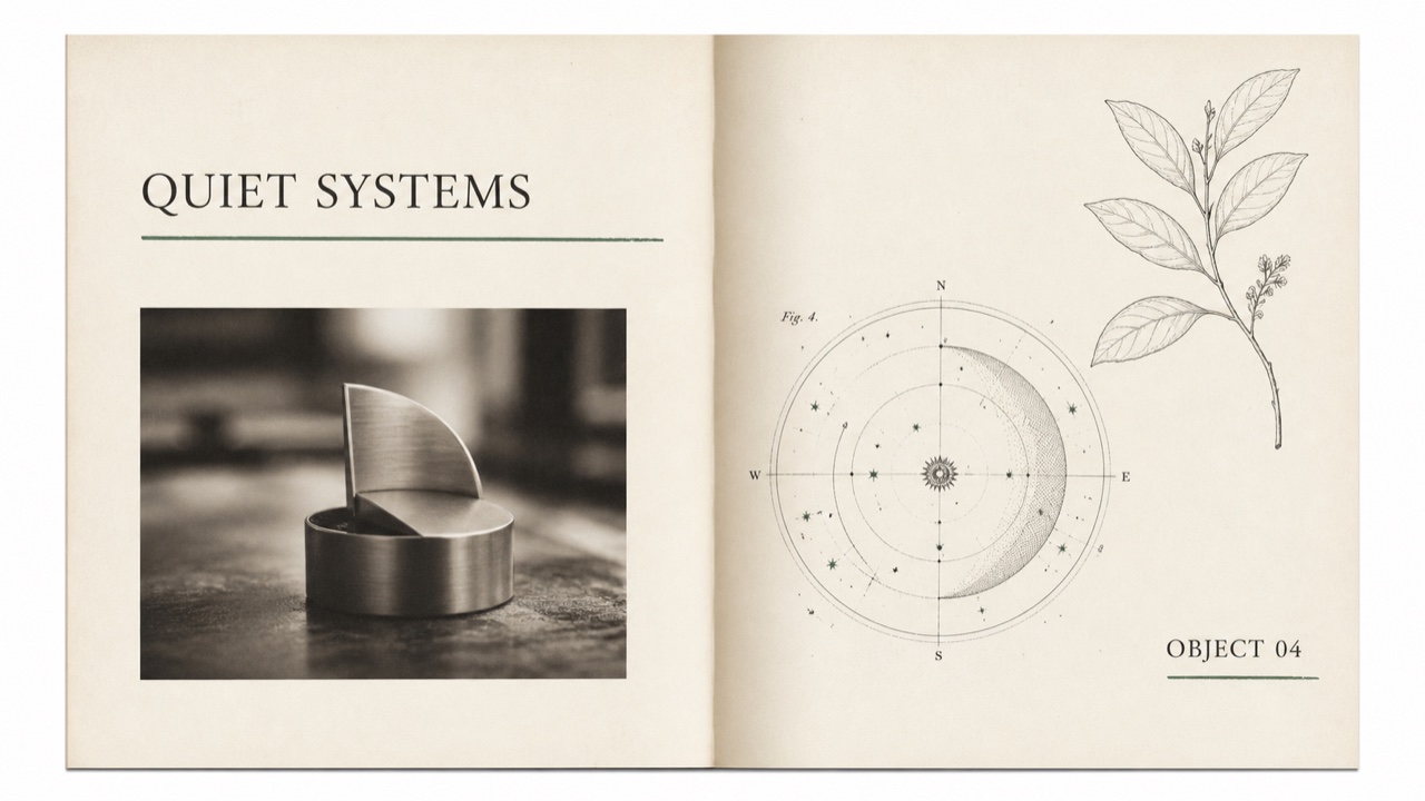
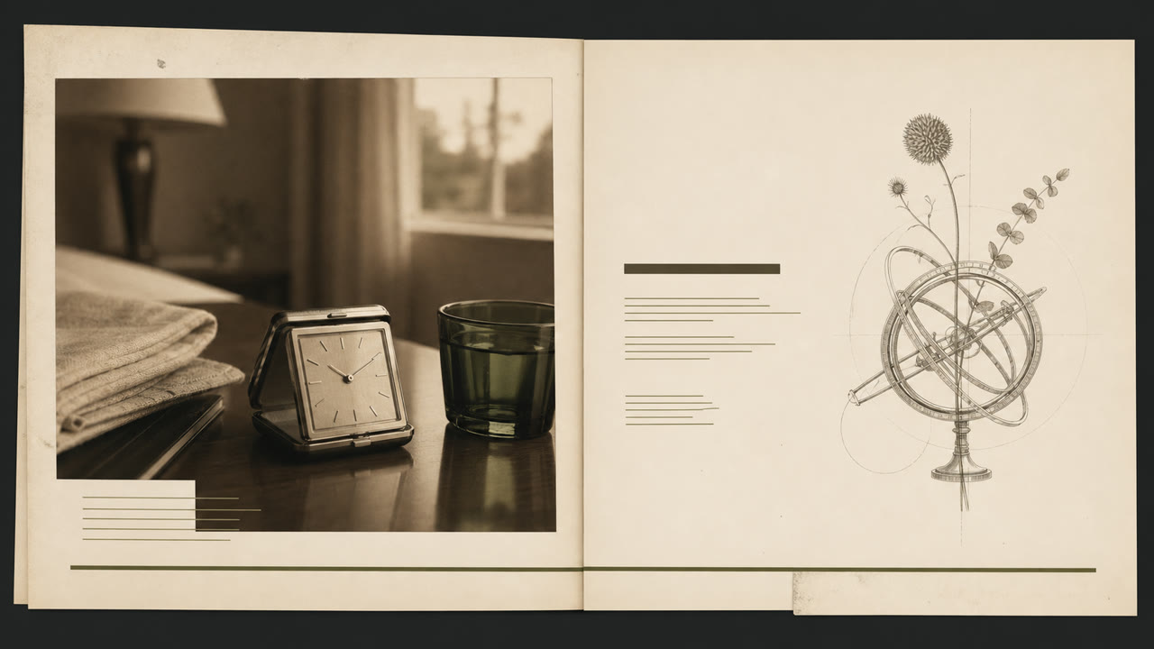
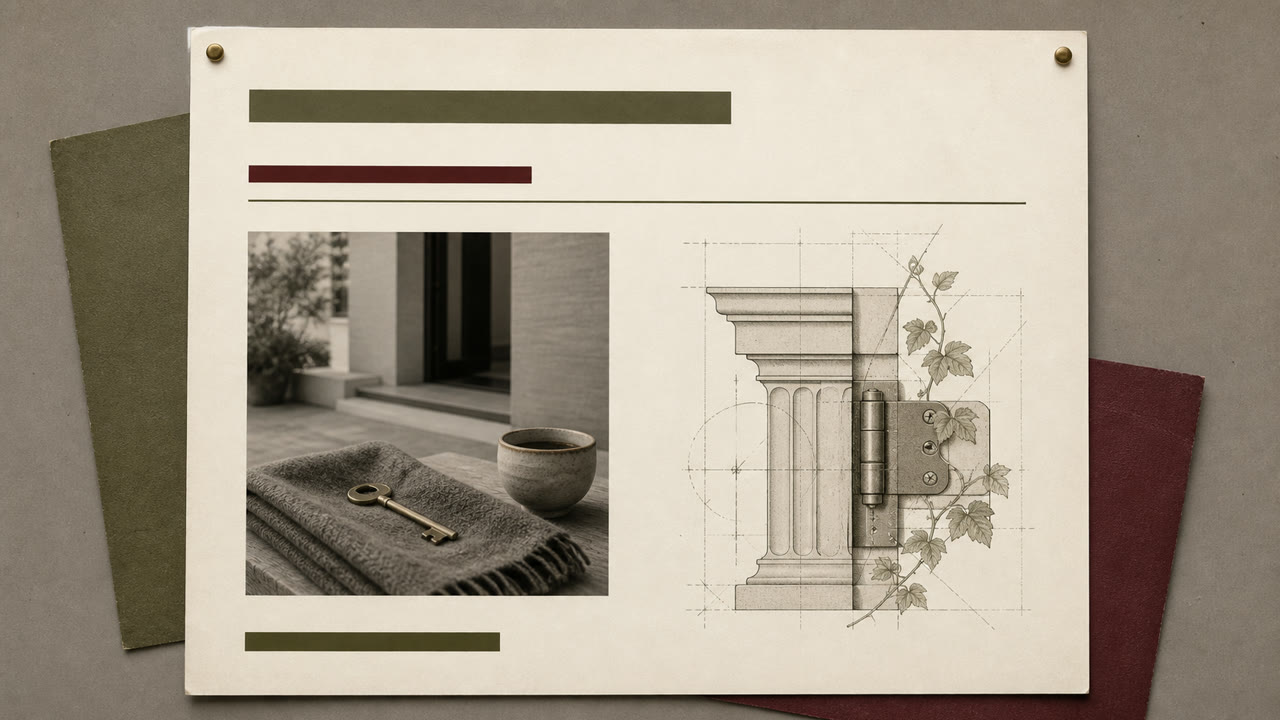
An early-1990s style that quiets grunge disruption for affluent, suburbanized adult publishing and advertising. Serif type, classical illustrations, and soft-focus photography are slightly displaced by underlines and overlap to stage an urbane life.
At a glance
Visual cues
- Mixed-weight and italic serif type with long underlines
- Classical sculpture, armillary spheres, botanical plates, and old machinery
- Sepia or monochrome soft-focus product photography
- Textured paper and wide whitespace with small misalignments
Best used for
- 1990s food, travel, home, and finance advertising built around intellectual lifestyle
- Editorial work using classical imagery without pretending to be a historical reproduction
Use this style
Take the compact brief into a project or hand the structured version to an AI tool.
Detailed guidance and sourcesProduction rules, reference works, comparisons, research and citation formats
Dictionary entry
- Type
- Use no more than two serif faces, switching weight and italic, with one long underline as structure.
- Composition
- Separate photographs and classical plates in large fields of whitespace, mixing periods only through partial overlap.
- Material
- Combine ecru paper, sepia imagery, hairline rules, and one muted green or red accent.
- Caution
- Classical plates alone make generic vintage editorial. Retain a slight grunge-derived displacement and a restrained suburban polish.
- Further study
- 1990s urbane lifestyle publishing / serif typography after grunge / classical imagery and staged photography
Related entries
- Gen X Soft Club (ジェネレーションX ソフトクラブ)Shared effects: Nostalgia.Compare Frasurbane and Gen X Soft Club
- Corporate Grunge (コーポレート・グランジ)Editorially linked for a useful contrast.Compare Frasurbane and Corporate Grunge
More from Publishing and Editing
Continue through styles in the same Publishing and Editing family, prioritised by shared effects.
- Illuminated Manuscript (彩飾写本)Shared effects: Luxury / Calm / Nostalgia.
- The Face (ザ・フェイス)Shared effects: Luxury / Calm.
- Private Press (プライベート・プレス)Shared effects: Luxury / Nostalgia.
Browse all Publishing and Editing entries
Cite this entry
The dictionary is meant to be linked to. Take whichever form fits where you are writing.
- Link
- https://indexstyle.org/styles/frasurbane
- Markdown
- [Frasurbane — IndexStyle](https://indexstyle.org/styles/frasurbane)
- HTML
- <a href="https://indexstyle.org/styles/frasurbane">Frasurbane — IndexStyle</a>