1

Swiss
スイス・スタイル / 1950s– / Style / Functionalism
Puts order front and center and makes the information itself the protagonist.
Strict grid / Sans-serif type / Asymmetry / Objective photography
A dictionary of design styles, written from the works themselves.
It is plain HTML. It opens on any browser and any device, with no app and no account, and machines read the same page.
| Terms | 776 |
|---|
Search by style name or describe what you are making. Name matches come first; purpose, desired effect and medium add relevant alternatives.
TryBauhausa premium recruiting websitea trustworthy finance app
1
スイス・スタイル / 1950s– / Style / Functionalism
Puts order front and center and makes the information itself the protagonist.
Strict grid / Sans-serif type / Asymmetry / Objective photography
2

バウハウス / 1919–1933 / Style / Functionalism
Makes function and play coexist through the circle, triangle and square.
Elementary shapes / Primary colors / Functional beauty / Visible structure
3

構成主義 / 1910s–1930s / Style / Avant-garde
Turns a message into motion with diagonals and hard contrast.
Red, black and white / Diagonal axis / Photomontage / Imperative lettering
4

アール・デコ / 1920s–1930s / Style / Historical Styles
Stages urban luxury with repeating geometry and a metallic sheen.
Symmetry / Radiating lines / Stepped motifs / Gold and black
5

アール・ヌーヴォー / 1890s–1910s / Style / Historical Styles
Joins letters, figures and ornament into one flowing, plant-like line.
Botanical curves / Ornamental frames / Female figures / Muted natural colors
6

モダニズム / 1920s–1970s / Style / Functionalism
Replaces ornament with reasoned form and aims at universality. The particular answers stand as their own entries, and Bauhaus, Swiss, Minimalism and Streamline Moderne are all separate solutions arrived at from this one stance.
Simplification / Clear hierarchy / Function first / Universal forms
7
%201%E2%80%935%20(1987)%2C%20Tate%20Modern%2C%20London%2C%20UK.jpg)
ミニマリズム / 1960s– / Style / Functionalism
Removes elements to maximize the meaning and tension of what remains.
Vast white space / Few elements / Quiet color / Precise spacing
8
ウェブ・ブルータリズム / 2014– / Style / UI Expression
Puts the browser's default rendering straight on screen and refuses the finished look of templates. The bare structure of the HTML becomes the style itself.
Default headings and links / Blue underlined links / Extreme jumps in size / Rules and white space without ornament
9

ミッドセンチュリー・モダン / 1940s–1960s / Style / Retro
Adds hand-felt curves and warmth to rational geometry.
Organic shapes / Calm warm colors / Succinct illustration / Diagonal movement
10

70年代レトロ / 1970s / Style / Retro
Builds cheerful nostalgia from thick round shapes and earthy warm color.
Fat curves / Wave forms / Orange and brown / Repeating stripes
11
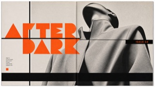
ザ・フェイス / 1980s / Style / Publishing and Editing
Redraws its headline letters and section marks issue by issue, then sets them into a page of heavy rules and black bars with the same weight as the photographs.
Extra bold headline letters drawn on geometry / Heavy rules and black bars dividing the page / Section marks that change shape issue by issue / Large type laid over the photograph
12

パンク / 1970s–1980s / Style / Counterculture
A DIY objection to the authority of the tidy, made by cutting, pasting and dirtying.
Cut-and-paste letters / Photocopier noise / Handwriting / Ragged placement
13

ポスト・モダニズム / 1970s–1990s / Style / Avant-garde
Doubts the single right answer and mixes quotation, irony and ornament as play. The answers per field stand as their own entries, with Memphis in furniture, Postmodern Architecture in building, and New Wave on the page.
Mixed styles / Irony / Ornament reclaimed / Unexpected color
14

脱構築主義 / 1980s– / Style / Avant-garde
Dismantles an achieved order and makes tension and instability the new structure.
Fragmentation / Tilt / Colliding layers / Unstable contours
15
.jpg)
サイケデリック / 1960s–1970s / Style / Counterculture
Melts contour and color until reality itself starts to sway.
Swirling curves / Complementary colors / Melting letters / Kaleidoscope patterns
16
.jpg)
シンセウェーブ / 1980s imagined future / Style / Digital Retro
Replays the future the 1980s imagined, in neon and horizon lines.
Neon / Perspective grid / Sunset / Black sky
17

ニュー・ウェーブ / 1970s–1980s / Style / Counterculture
Keeps punk's freedom while re-editing color and grid with urban polish.
Irregular grid / Dots / High chroma / Rotated type
18
.jpg)
19

20
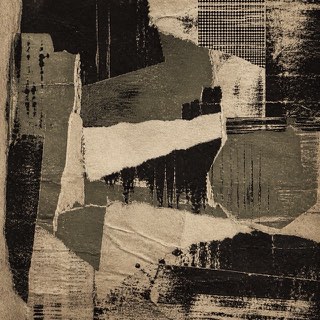
グランジ / 1990s / Style / Counterculture
Uses dirt, tears and wear as resistance to the neatly managed screen.
Scuffing / Tears / Disordered type / Low-quality copies
21

ウェブ1.0 / 1990s / Style / Digital Retro
Reuses the naivety of the constrained early web as directness and charm. In the 2020s it came back as a movement to take the personal site back, gathering under names like Neocities and Yesterweb.
Blue links / Low-res GIFs / System fonts / Plain buttons
22

ワイツーケー / late 1990s–2000s / Style / Digital Retro
Expresses optimism for the new millennium in translucent plastic and rounded futures. Its shine comes from resin and metal you could hold rather than from a screen, which separates it from the interface gloss of the same years.
Translucent plastic / Silver / Bubble forms / Cyber brightness
23

ウェブ2.0グロス / 2000s / Style / Digital Retro
Explains digital interaction as something touchable through gloss, roundness and reflection. It names what the web made when it tried to reproduce the texture of Aqua with images and CSS.
Glossy buttons / Strong gradients / Reflections / Rounded corners
24

スキューモーフィズム / 2000s–2010s / Style / UI Expression
Borrows cues from real materials and tools to make unknown interactions understandable. It names the principle, so Aqua and Brushed Metal are what the principle looked like when one company shipped it.
Leather, metal, paper / Dimensional shadows / Real-world metaphors / Fine textures
IndexStyle is not a list of every term used around design. An independent entry must describe a visual language that can be recognised, reproduced and distinguished from its neighbours. Editorial standard