HarmonyOS Design
HarmonyOSデザイン / 2019– / Style / Platform Screen Languages
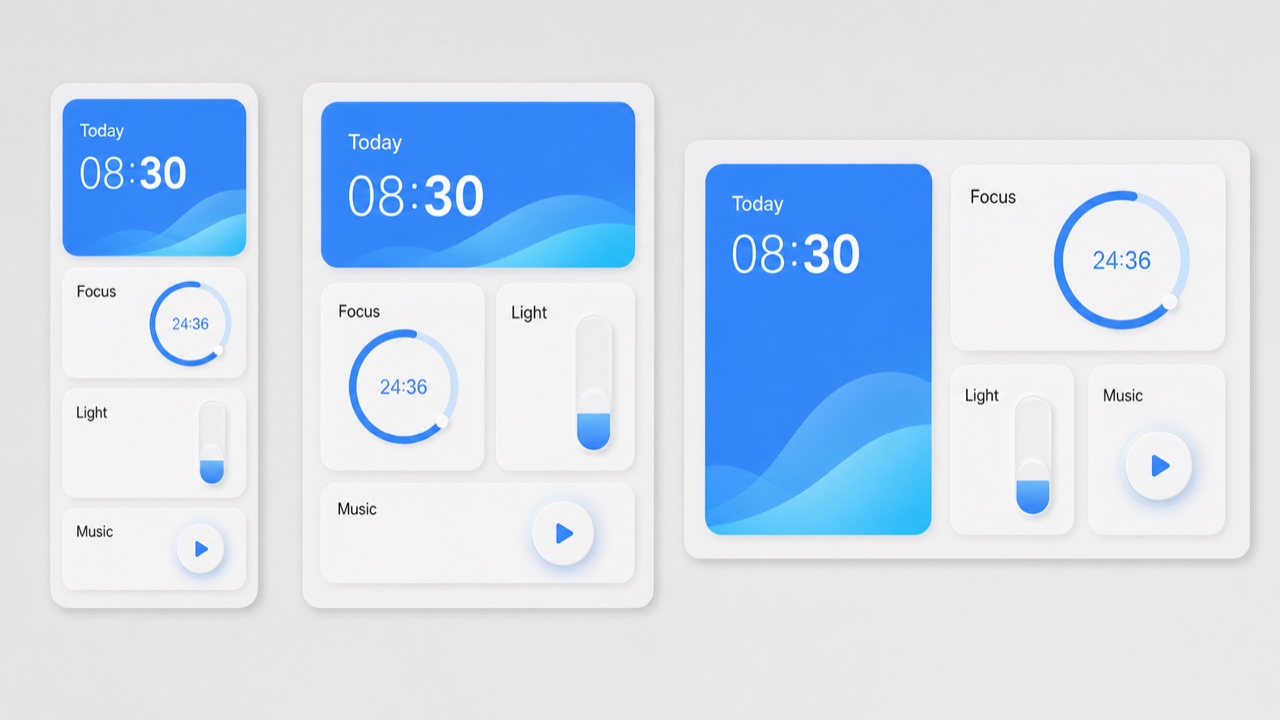
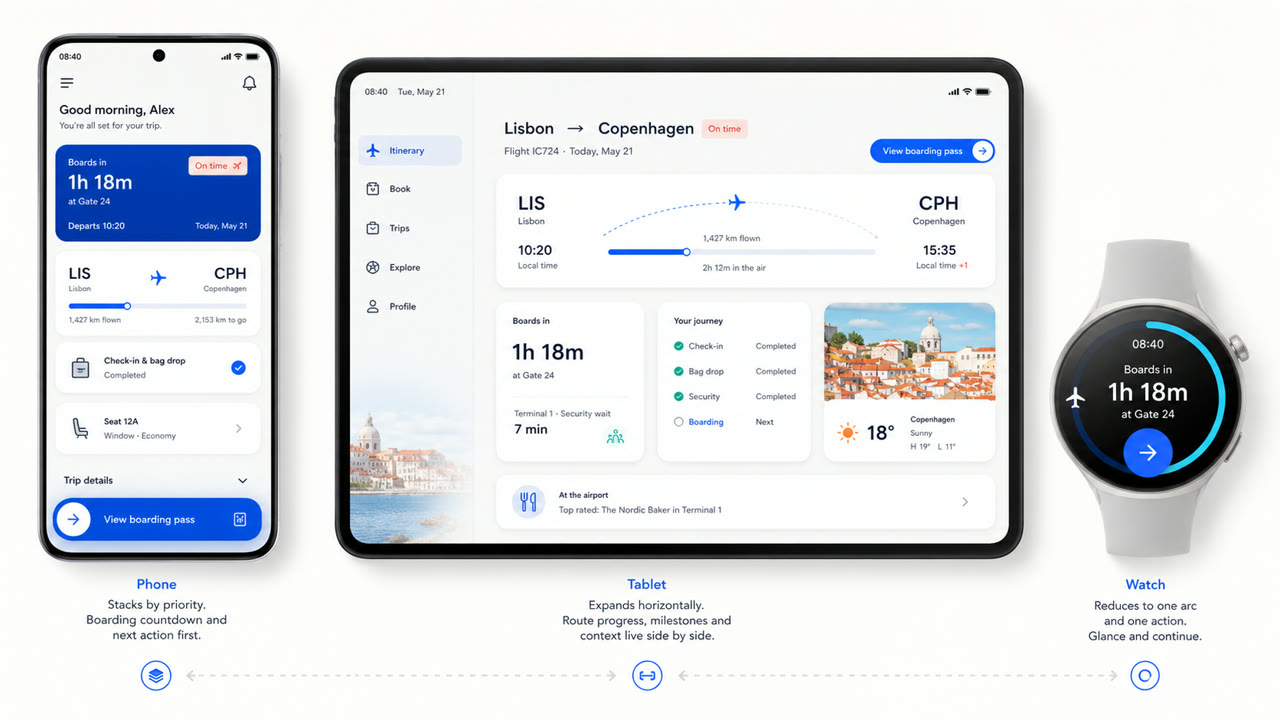
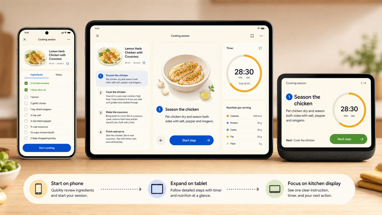
Huawei's visual language reorganizes cards, spacing, arcs, variable type and translucent light materials across different screen sizes and connected devices, favoring continuity of information and action over one fixed screen.
At a glance
Visual cues
- Large rounded cards grouping information by function
- Wide space on light fields with a few saturated accents
- Arcs, concentric circles and gentle scaling for operation states
- Cards and variable type recomposed to suit device size
Best used for
- Recomposing the same information across phones, tablets, vehicles and wearables
- Explaining continuity across devices through shared cards, motion and hierarchy
Use this style
Take the compact brief into a project or hand the structured version to an AI tool.
Detailed guidance and sourcesProduction rules, reference works, comparisons, research and citation formats
Dictionary entry
- Type
- Adapt the weight and width of a variable sans to the display and enlarge short headings and numbers.
- Composition
- Group by function; spread cards sideways on wide screens and stack them by importance on small ones.
- Material
- Start with bright neutrals, reserve diffusion and translucency for the control layer, and keep one accent family.
- Caution
- Rounded cards alone are not HarmonyOS. Information priority and action continuity must survive the move between devices.
- Further study
- HarmonyOS design principles / Multi-device adaptive layout / Cards, variable type and light material
Related entries
- Material You (Material You)Shared effects: Intimacy / Technique.Compare HarmonyOS Design and Material You
- Liquid Glass (リキッドガラス)Shared effects: Futurity / Technique.Compare HarmonyOS Design and Liquid Glass
More from Platform Screen Languages
Continue through styles in the same Platform Screen Languages family, prioritised by shared effects.
- KDE Oxygen (KDE Oxygen)Shared effects: Technique / Intimacy / Futurity.
- BeOS Interface (BeOS インターフェース)Shared effects: Technique / Futurity.
- Xerox Star Interface (ゼロックス・スター・インターフェース)Shared effects: Technique / Futurity.
Browse all Platform Screen Languages entries
Cite this entry
The dictionary is meant to be linked to. Take whichever form fits where you are writing.
- Link
- https://indexstyle.org/styles/harmonyos
- Markdown
- [HarmonyOS Design — IndexStyle](https://indexstyle.org/styles/harmonyos)
- HTML
- <a href="https://indexstyle.org/styles/harmonyos">HarmonyOS Design — IndexStyle</a>