GitHub Primer
GitHub Primer / 2017– / Style / Platform Screen Languages
GitHub's design system for turning dense development workflows into shared rules for color, type, icons, spacing and components. It favors flow over decoration, keeping many states and actions in a small area without giving up accessibility or responsive behavior.


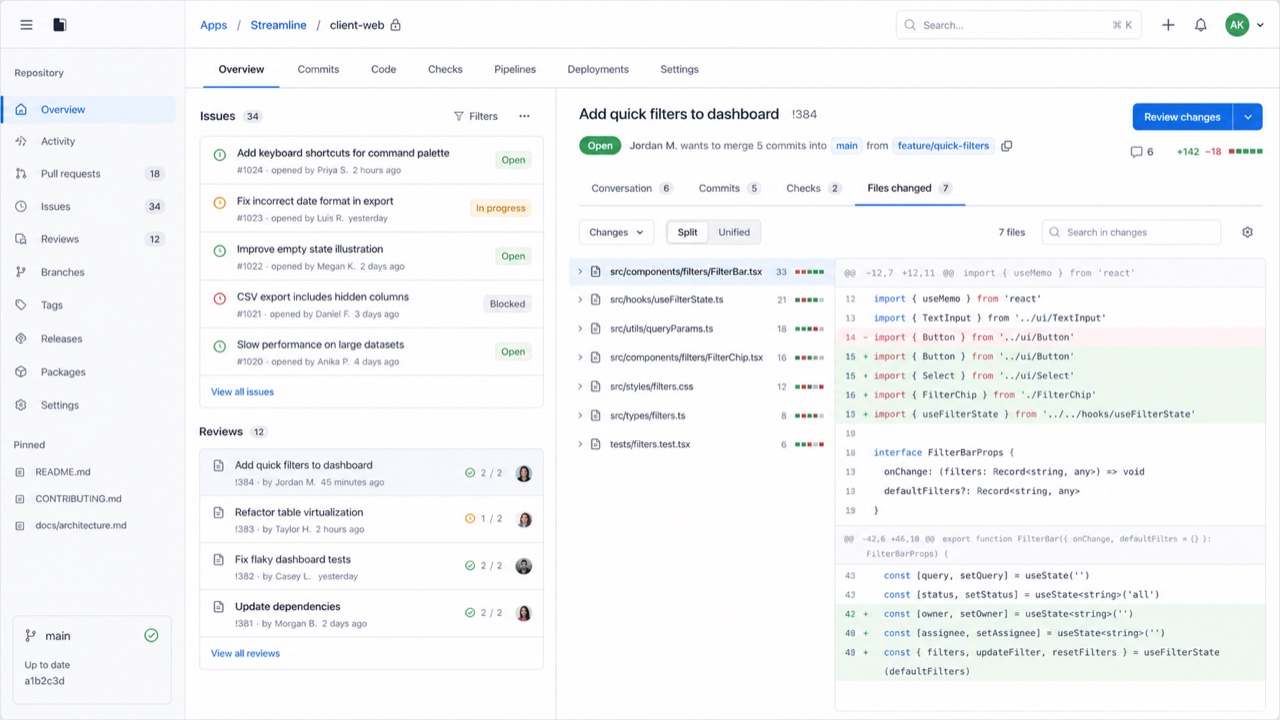
At a glance
Visual cues
- Neutral surfaces with blue links and restrained status colors
- Octicons paired with short action labels
- Thin borders separating lists, tabs and sidebars
- Consistent steps of type and spacing even at high density
Best used for
- Developer SaaS and admin tools that must hold many states and actions on one screen
- Keeping information density and accessibility consistent across product teams
Use this style
Take the compact brief into a project or hand the structured version to an AI tool.
Detailed guidance and sourcesProduction rules, reference works, comparisons, research and citation formats
Dictionary entry
- Type
- Use one plain sans for body and labels; build hierarchy through weight and color.
- Composition
- Separate lists, tabs and sidebars with fine rules and hold spacing to a small token set.
- Material
- Start from neutrals; reserve blue for links and semantic colors for success, warning and danger.
- Caution
- Adding borders and tiny controls to look like GitHub only creates a cramped admin screen when the work has no clear priority.
- Further study
- Primer product principles / Octicons and semantic meaning / Responsive design at high density
Related entries
- Swiss (スイス・スタイル)Shared effects: Trust / Calm.Compare GitHub Primer and Swiss
- GOV.UK Design System (GOV.UK デザインシステム)Same Platform Screen Languages lineage.Compare GitHub Primer and GOV.UK Design System
More from Platform Screen Languages
Continue through styles in the same Platform Screen Languages family, prioritised by shared effects.
- Adwaita (アドワイタ)Shared effects: Technique / Calm / Trust.
- Breeze (ブリーズ)Shared effects: Technique / Calm / Trust.
- Adobe Spectrum (Adobe Spectrum)Shared effects: Technique / Trust / Calm.
Browse all Platform Screen Languages entries
Cite this entry
The dictionary is meant to be linked to. Take whichever form fits where you are writing.
- Link
- https://indexstyle.org/styles/github-primer
- Markdown
- [GitHub Primer — IndexStyle](https://indexstyle.org/styles/github-primer)
- HTML
- <a href="https://indexstyle.org/styles/github-primer">GitHub Primer — IndexStyle</a>