Wacky Pomo
ワッキー・ポモ / early 1990s–early 2000s / Style / Illustration Styles
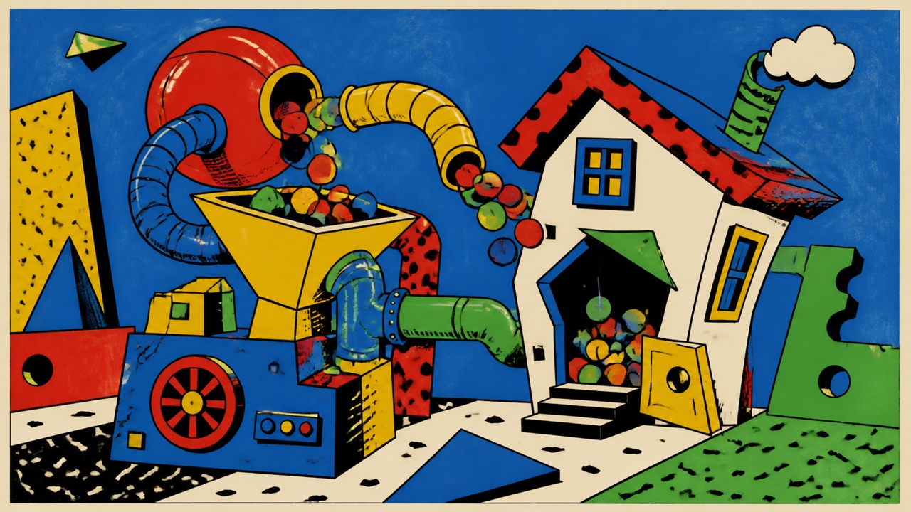
A postmodern children’s-marketing style mixing Googie, Memphis, old cartoons, factory signs, and odd Victorian figures into exaggeration and mild bad taste. It cartoonizes everything until product and place resemble a giant invention machine.
At a glance
Visual cues
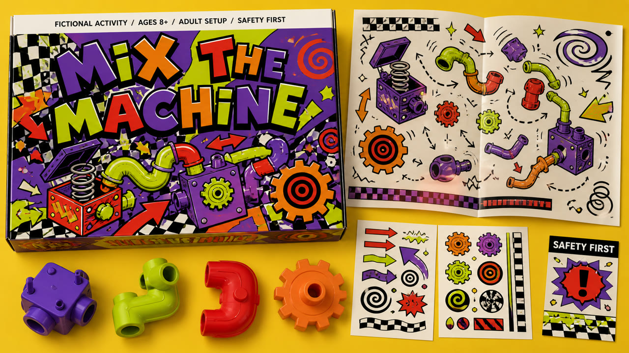
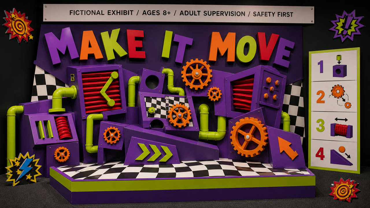
- Distorted checks, spirals, zigzags, and bursting arrows
- Cartoon gears, pipes, eyes, tongues, and strange machines
- Violet, lime, orange, and red with black outlines
- Heavy headlines whose letters change shape and angle
Best used for
- Making toys, sweets, games, or attractions behave like one giant cartoon machine
- Studying 1990s children’s advertising through both visual language and promotion ethics
Use this style
Take the compact brief into a project or hand the structured version to an AI tool.
Detailed guidance and sourcesProduction rules, reference works, comparisons, research and citation formats
Dictionary entry
- Type
- Tilt heavy display letters individually and use no more than two layers of shadow, outline, or dots.
- Composition
- Extend spirals and pipes from the central product and stage one small event in each corner.
- Material
- Unify flat spot color, rough cartoon lines, molded plastic, and painted metal at high saturation.
- Caution
- Do not use density merely to seize children’s attention. Keep age, advertising disclosure, and safety information above decoration in the hierarchy.
- Further study
- 1990s children’s marketing / postmodern cartoon industrial vernacular / gross-out humor and visual overload
Related entries
- Memphis (メンフィス)Shared effects: Play / Exhilaration.Compare Wacky Pomo and Memphis
- Decoplex (デコプレックス)Shared effects: Exhilaration / Play.Compare Wacky Pomo and Decoplex
More from Illustration Styles
Continue through styles in the same Illustration Styles family, prioritised by shared effects.
- Powell Peralta Deck Graphics (パウエル・ペラルタのデッキ図像)Shared effects: Rebellion / Play / Exhilaration.
- New Wave Tropical (ニューウェーブ・トロピカル)Shared effects: Exhilaration / Play / Rebellion.
- Graffiti Pop (グラフィティ・ポップ)Shared effects: Exhilaration / Rebellion / Play.
Browse all Illustration Styles entries
Cite this entry
The dictionary is meant to be linked to. Take whichever form fits where you are writing.
- Link
- https://indexstyle.org/styles/wacky-pomo
- Markdown
- [Wacky Pomo — IndexStyle](https://indexstyle.org/styles/wacky-pomo)
- HTML
- <a href="https://indexstyle.org/styles/wacky-pomo">Wacky Pomo — IndexStyle</a>