Shopify Polaris
Shopify Polaris / 2017– / Style / Platform Screen Languages
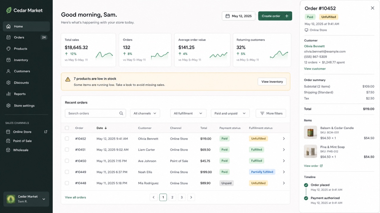
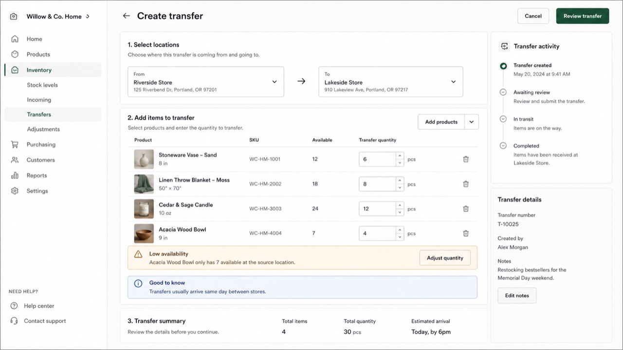
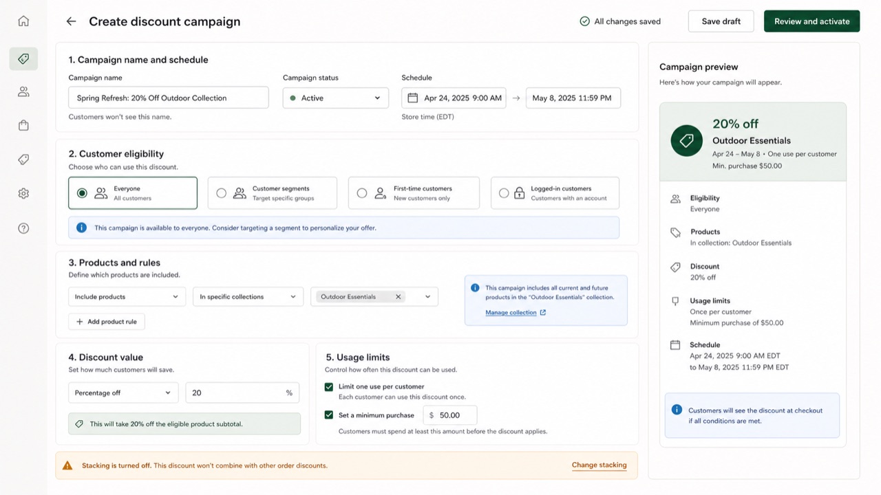
Shopify's UI framework for giving products, orders, payments and customers one commerce language. Cards and sections separate decisions, while short status and action language helps a merchant keep the store moving.
At a glance
Visual cues
- White cards stacked on a pale ground
- Green used as success or forward motion
- Title, status and primary action gathered at the top
- Compact badges for product, order and payment states
Best used for
- Management screens that connect order status to the next operational action
- Giving business tools a calm, humane voice without losing rigor
Use this style
Take the compact brief into a project or hand the structured version to an AI tool.
Detailed guidance and sourcesProduction rules, reference works, comparisons, research and citation formats
Dictionary entry
- Type
- Lead with the page title and primary action; split status and explanation into badge and body text.
- Composition
- Stack white cards on a pale ground, with one business decision per card.
- Material
- Use neutrals as the base, green for success and progress, and red only for danger.
- Caution
- Putting everything in a card removes the order of the page. Define the workflow and primary action outside the cards first.
- Further study
- Shopify admin page structure / Commerce status labels / Polaris as Web Components
Related entries
- Atlassian Design System (Atlassian Design System)Same Platform Screen Languages lineage.Compare Shopify Polaris and Atlassian Design System
- Bento Grid (ベントーグリッド)Shared effects: Trust / Intimacy / Technique.Compare Shopify Polaris and Bento Grid
More from Platform Screen Languages
Continue through styles in the same Platform Screen Languages family, prioritised by shared effects.
- Salesforce Lightning Design System (Salesforce Lightning)Shared effects: Trust / Technique / Intimacy.
- Ubuntu Yaru (Ubuntu Yaru)Shared effects: Technique / Intimacy / Trust.
- Motif (モチーフ)Shared effects: Technique / Trust.
Browse all Platform Screen Languages entries
Cite this entry
The dictionary is meant to be linked to. Take whichever form fits where you are writing.
- Link
- https://indexstyle.org/styles/shopify-polaris
- Markdown
- [Shopify Polaris — IndexStyle](https://indexstyle.org/styles/shopify-polaris)
- HTML
- <a href="https://indexstyle.org/styles/shopify-polaris">Shopify Polaris — IndexStyle</a>