Atlassian Design System
Atlassian Design System / 2012– / Style / Platform Screen Languages
A system that translates the complexity of Jira and Confluence into shared tokens, content rules, spacing, grids and components. Consistency builds trust while keeping large sets of issues, documents and states navigable.
At a glance
Visual cues
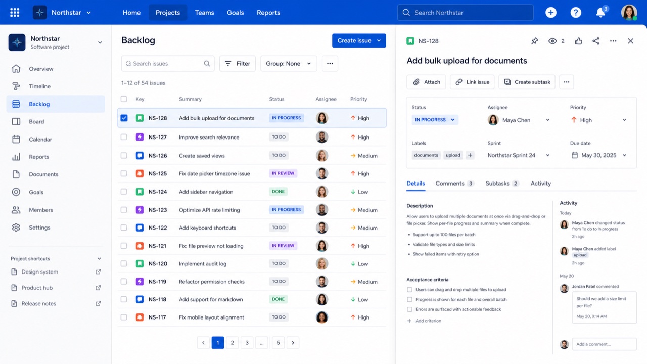
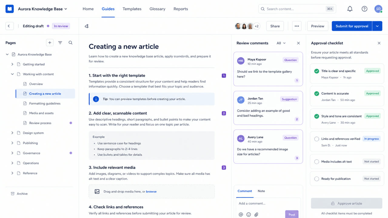
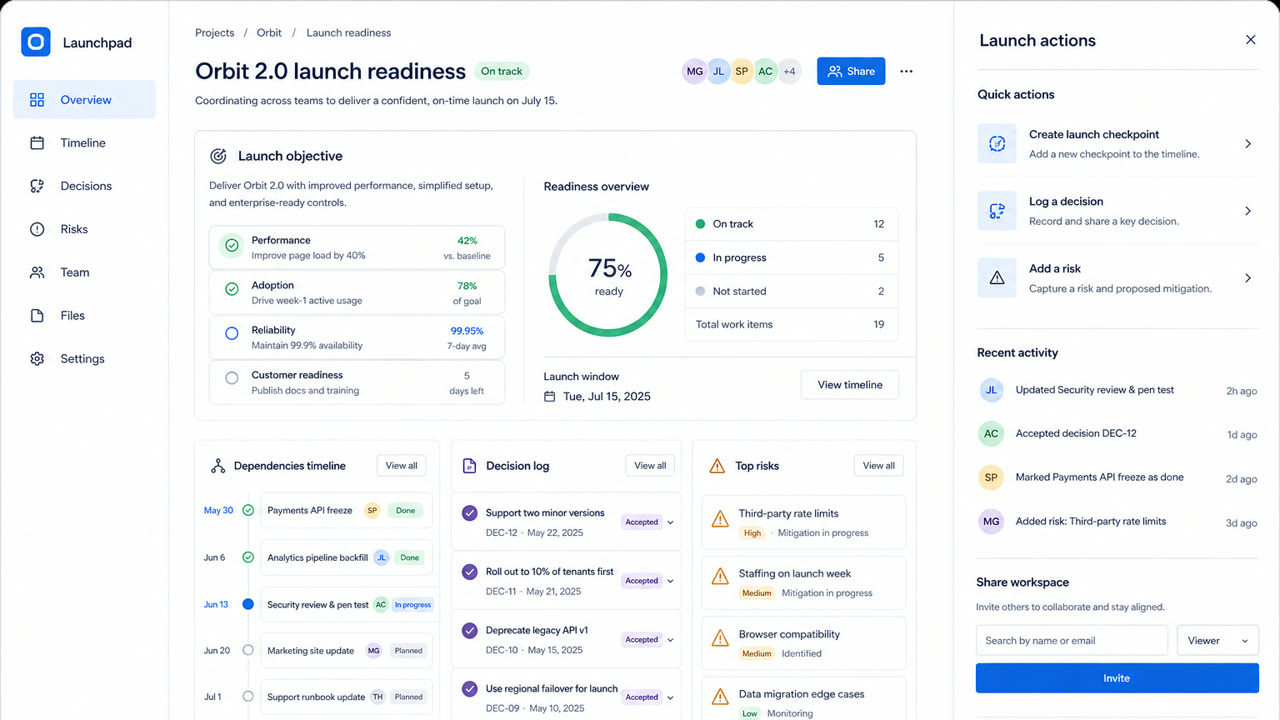
- White and pale gray layers with blue primary actions
- Rounded cards and lozenge-shaped status labels
- Clear divisions among sidebar, table and detail pane
- Color, spacing, radius and elevation controlled by tokens
Best used for
- Work-management products where people move repeatedly between lists and details
- Keeping a trusted family resemblance across products without hiding their complexity
Use this style
Take the compact brief into a project or hand the structured version to an AI tool.
Detailed guidance and sourcesProduction rules, reference works, comparisons, research and citation formats
Dictionary entry
- Type
- Fix the steps for headings, body and labels; keep status names short inside lozenges.
- Composition
- Keep navigation, list and detail roles stable; use token multiples for spacing.
- Material
- Use white and pale gray as the base, blue for primary actions and one semantic meaning per status color.
- Caution
- Too many cards and status labels give every component equal force and hide the work that matters next.
- Further study
- Atlassian design principles / Status lozenges / Spacing, radius and elevation tokens
Related entries
- GitHub Primer (GitHub Primer)Same Platform Screen Languages lineage.Compare Atlassian Design System and GitHub Primer
- Corporate Memphis (コーポレート・メンフィス)Shared effects: Intimacy / Trust.Compare Atlassian Design System and Corporate Memphis
More from Platform Screen Languages
Continue through styles in the same Platform Screen Languages family, prioritised by shared effects.
- Shopify Polaris (Shopify Polaris)Shared effects: Trust / Intimacy / Technique.
- Salesforce Lightning Design System (Salesforce Lightning)Shared effects: Trust / Technique / Intimacy.
- Ubuntu Yaru (Ubuntu Yaru)Shared effects: Technique / Intimacy / Trust.
Browse all Platform Screen Languages entries
Cite this entry
The dictionary is meant to be linked to. Take whichever form fits where you are writing.
- Link
- https://indexstyle.org/styles/atlassian-design-system
- Markdown
- [Atlassian Design System — IndexStyle](https://indexstyle.org/styles/atlassian-design-system)
- HTML
- <a href="https://indexstyle.org/styles/atlassian-design-system">Atlassian Design System — IndexStyle</a>