Sportsbrut
スポーツブルート / late 2010s– / Style / Contemporary Branding
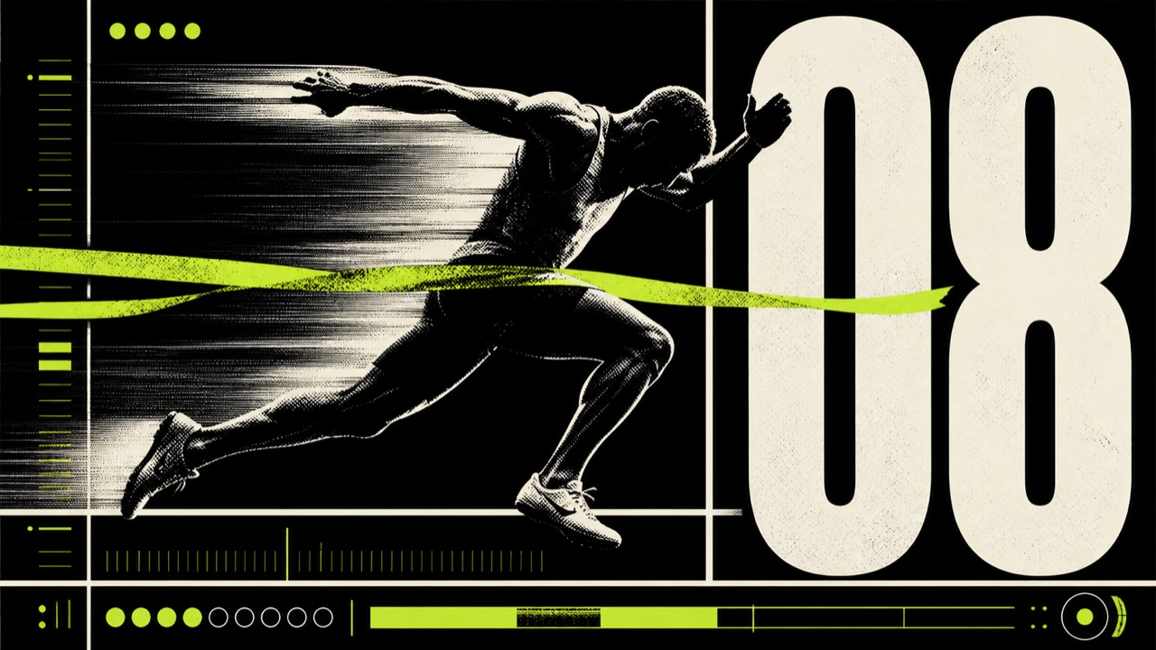
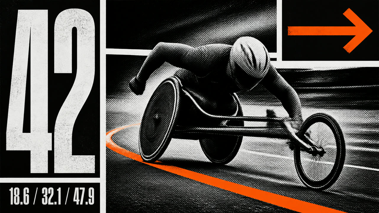
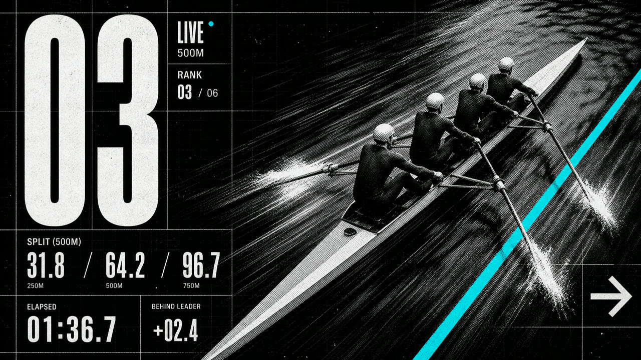
A sports-graphic style connecting brutalist grids, huge type, and exposed structure with competition, timing, bodies, and scores. Roughness communicates force and urgency rather than institutional refusal.
At a glance
Visual cues
- Huge condensed type and jersey numbers cutting across the frame
- Coarse halftones, cut-out athletes, and directional blur
- Black and white plus one fluorescent or team color
- Exposed scores, times, and rankings in heavy ruled grids
Best used for
- Match promotion, player profiles, and results systems that need immediate force and speed
- Sports branding that favors bodies and competition over polished luxury
Use this style
Take the compact brief into a project or hand the structured version to an AI tool.
Detailed guidance and sourcesProduction rules, reference works, comparisons, research and citation formats
Dictionary entry
- Type
- Expand ultra-bold condensed type to frame width and elevate numbers to the headline level.
- Composition
- Lock photos, records, and names to a heavy orthogonal grid; introduce blur or diagonals in only one direction.
- Material
- Move between print and screen using coarse halftones, hard cutouts, monochrome, and one fluorescent or team color.
- Caution
- Bold black type alone becomes web Neubrutalism. Athletes, competitive data, and time pressure must drive the composition itself.
- Further study
- late-2010s sports identity / brutalist grids and condensed type / score data as graphic material
Related entries
- Neubrutalism (ニューブルータリズム)Shared effects: Rebellion.Compare Sportsbrut and Neubrutalism
- Grunge (グランジ)Shared effects: Rebellion.Compare Sportsbrut and Grunge
More from Contemporary Branding
Continue through styles in the same Contemporary Branding family, prioritised by shared effects.
- Corporate Grunge (コーポレート・グランジ)Shared effects: Rebellion / Exhilaration.
- Corporate Modernism (企業モダニズム)Shared effects: Technique.
- MUJI (無印良品)
Browse all Contemporary Branding entries
Cite this entry
The dictionary is meant to be linked to. Take whichever form fits where you are writing.
- Link
- https://indexstyle.org/styles/sportsbrut
- Markdown
- [Sportsbrut — IndexStyle](https://indexstyle.org/styles/sportsbrut)
- HTML
- <a href="https://indexstyle.org/styles/sportsbrut">Sportsbrut — IndexStyle</a>