Genericana
ジェネリカーナ / mid-1980s–early 2010s / Style / Contemporary Branding
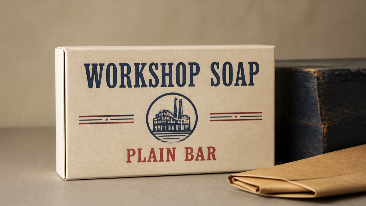
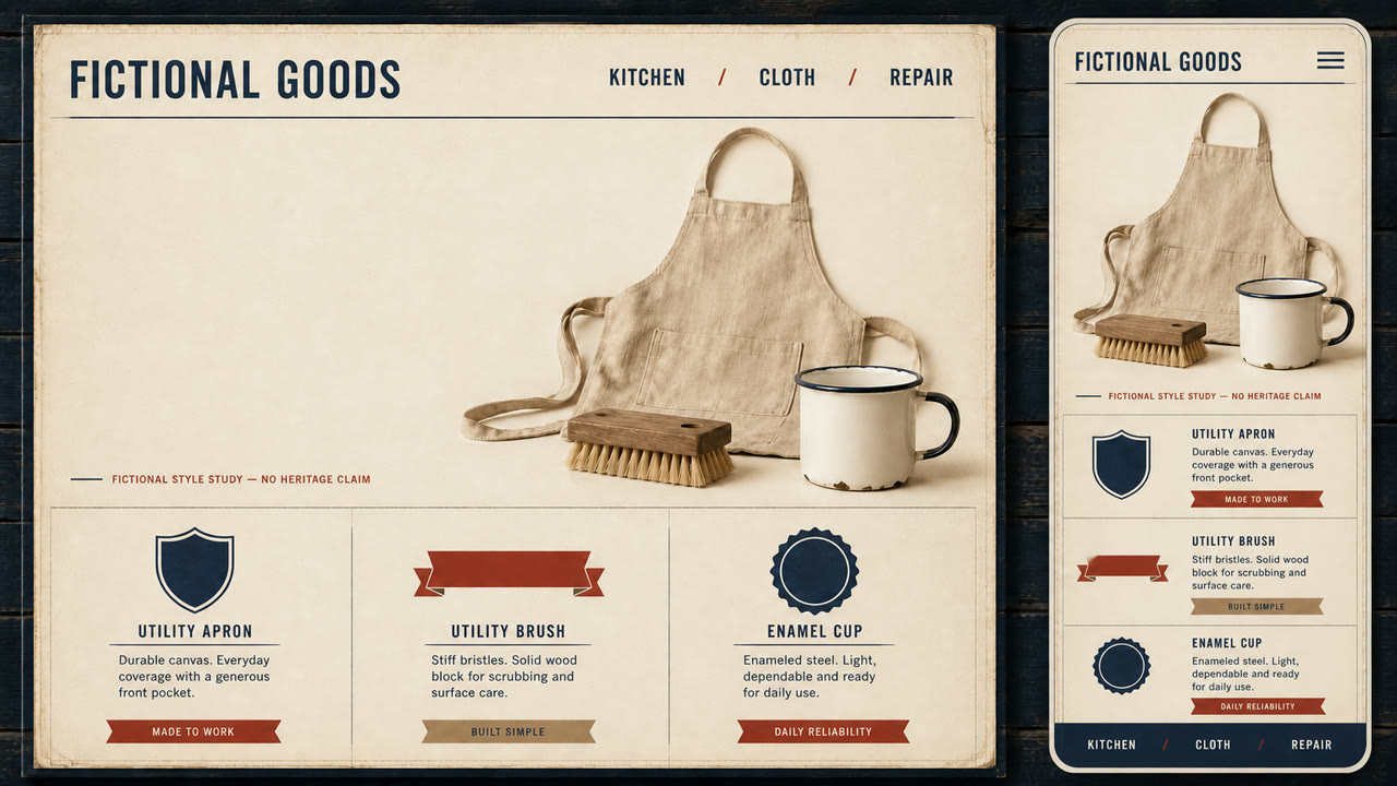
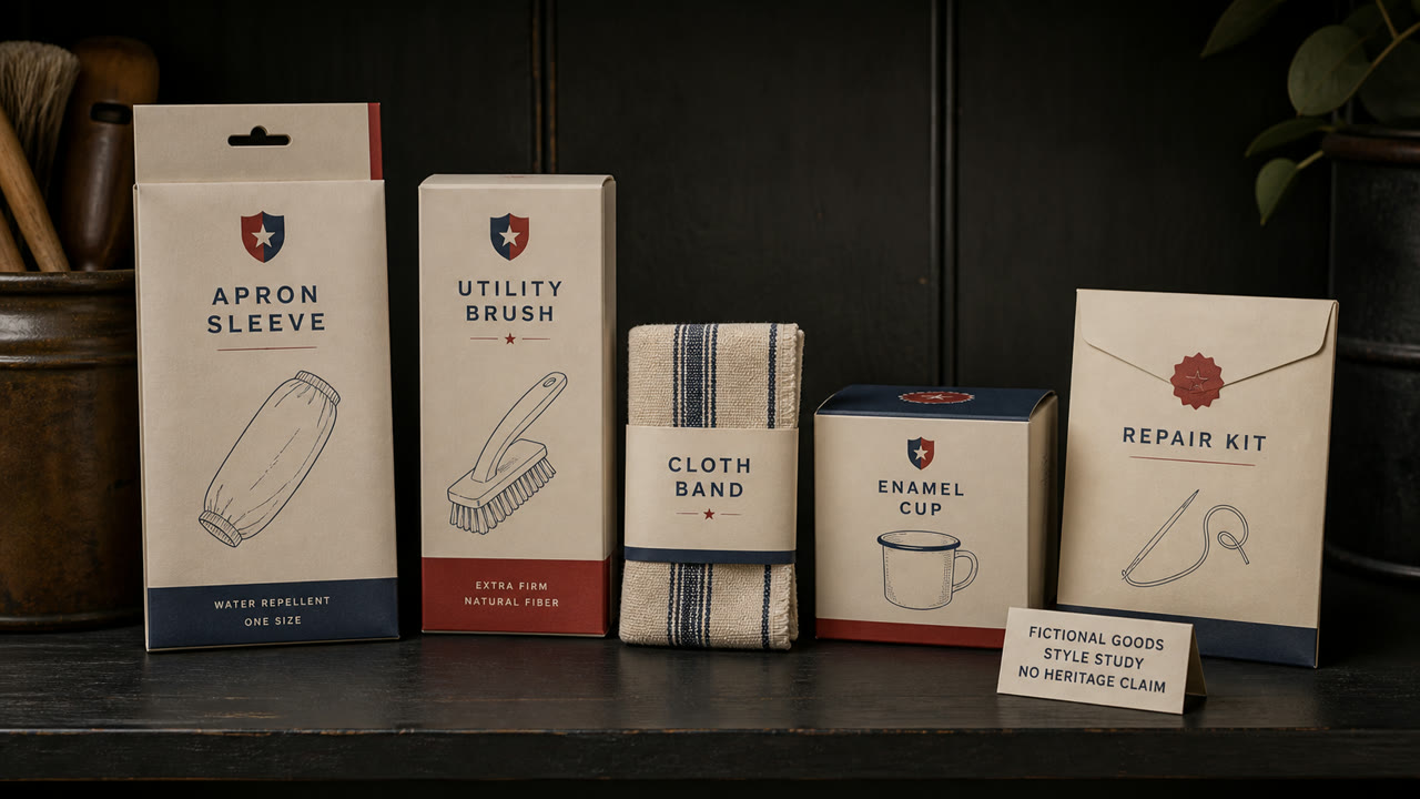
A contemporary brand style that edits 1920s–50s American packaging, sign painting, and factory labels into regionally nonspecific authenticity. Wide space and premium materials turn an imagined old shop into a current upscale product.
At a glance
Visual cues
- Heavy sign-painted type and small origin-like labels
- Simplified shields, ribbons, stars, and factory seals
- Ecru, navy, red, and kraft-brown limited palettes
- One vintage packaging image isolated in broad space
Best used for
- Giving food, clothing, or household goods an old-shop sense of trust
- Unifying packaging and signs as an imagined historic main street
Use this style
Take the compact brief into a project or hand the structured version to an AI tool.
Detailed guidance and sourcesProduction rules, reference works, comparisons, research and citation formats
Dictionary entry
- Type
- Set the main name in a heavy hand-painted roman or script and surround it with small capitals for place, date, and variety.
- Composition
- Center one emblem or product image and stack short information symmetrically above and below.
- Material
- Use uncoated paper, embossing, two spot colors, and dark painted wood; confine distressing to edges.
- Caution
- Do not invent a founding year or origin as fact. Separate stylistic quotation from a brand’s documented history.
- Further study
- American packaging and sign vernacular / premium authenticity branding / the difference between provenance and generic nostalgia
Related entries
- Sign Painting (サインペインティング)Shared effects: Nostalgia.Compare Genericana and Sign Painting
- Minimalism (ミニマリズム)Shared effects: Trust.Compare Genericana and Minimalism
More from Contemporary Branding
Continue through styles in the same Contemporary Branding family, prioritised by shared effects.
- Corporate Modernism (企業モダニズム)Shared effects: Trust / Luxury.
- MUJI (無印良品)Shared effects: Trust.
- Corporate Grunge (コーポレート・グランジ)Shared effects: Trust.
Browse all Contemporary Branding entries
Cite this entry
The dictionary is meant to be linked to. Take whichever form fits where you are writing.
- Link
- https://indexstyle.org/styles/genericana
- Markdown
- [Genericana — IndexStyle](https://indexstyle.org/styles/genericana)
- HTML
- <a href="https://indexstyle.org/styles/genericana">Genericana — IndexStyle</a>