The Face
ザ・フェイス / 1980s / Style / Publishing and Editing
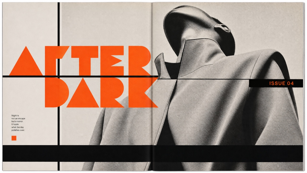
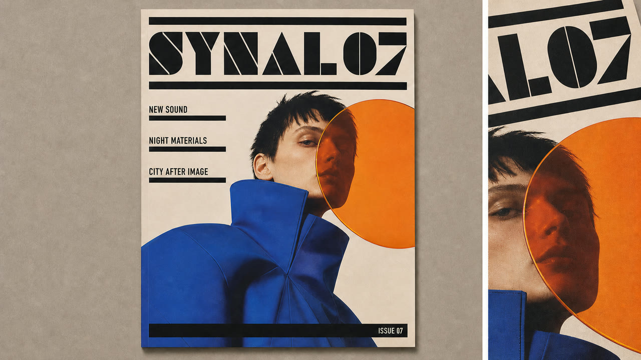
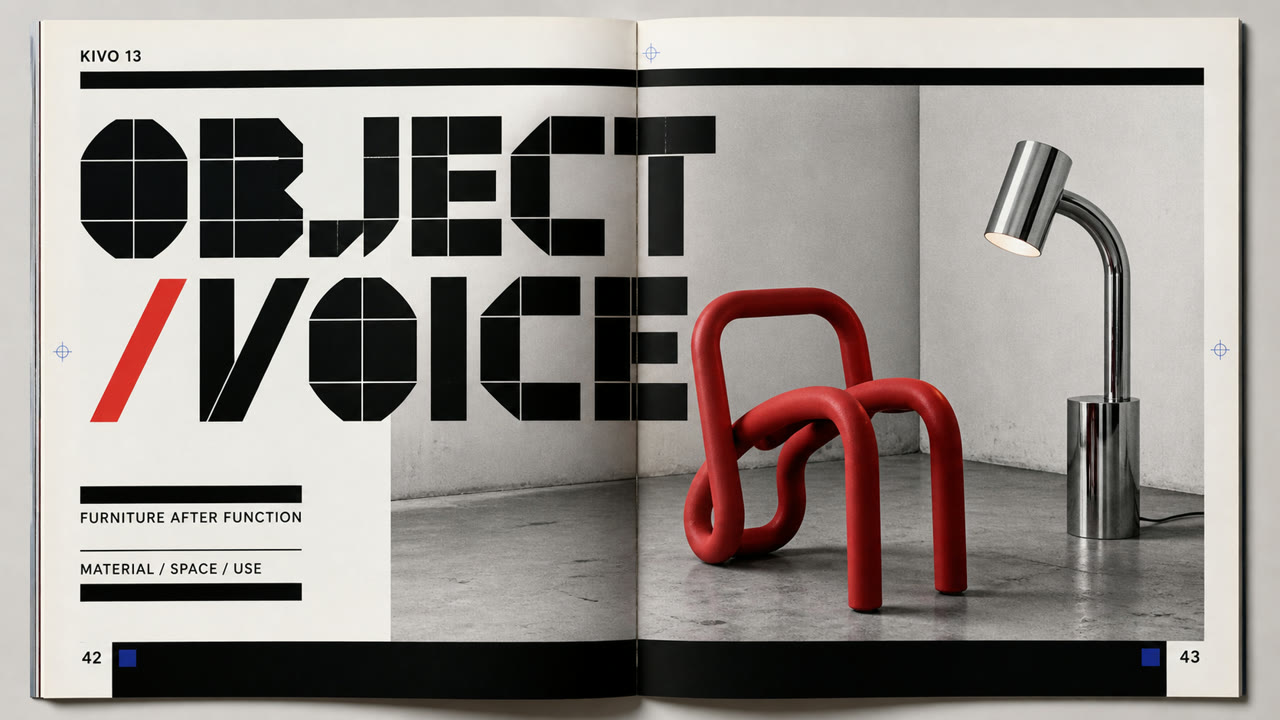
Redraws its headline letters and section marks issue by issue, then sets them into a page of heavy rules and black bars with the same weight as the photographs.
At a glance
Visual cues
- Extra bold headline letters drawn on geometry
- Heavy rules and black bars dividing the page
- Section marks that change shape issue by issue
- Large type laid over the photograph
Best used for
- Music and fashion magazines where the type is meant to carry as much of the page as the photographs
- Publishing where the headline letters are redrawn issue by issue and the change is shown to the reader
Use this style
Take the compact brief into a project or hand the structured version to an AI tool.
Detailed guidance and sourcesProduction rules, reference works, comparisons, research and citation formats
Dictionary entry
- Type
- Draw the headline weight from geometry as extra bold, and hold the text in a small sans
- Composition
- Divide the page with heavy rules and black bars, and lay large type over the photograph
- Material
- Keep a set of section marks that change shape each issue, working in black areas and reversed white
- Caution
- When redrawing the letterforms every issue becomes the aim in itself, the marks stop working as signposts for the reader and every issue looks equally loud.
- Further study
- Fabien Baron / Neville Brody
Related entries
- New Wave (ニュー・ウェーブ)Editorially linked for a useful contrast.Compare The Face and New Wave
- Minimalism (ミニマリズム)Shared effects: Calm.Compare The Face and Minimalism
More from Publishing and Editing
Continue through styles in the same Publishing and Editing family, prioritised by shared effects.
- Illuminated Manuscript (彩飾写本)Shared effects: Luxury / Calm.
- Modern American Book Jacket (アメリカ近代ブックジャケット)Shared effects: Luxury / Calm.
- Onchi Kōshirō Book Design (恩地孝四郎の装幀)Shared effects: Luxury / Calm.
Browse all Publishing and Editing entries
Cite this entry
The dictionary is meant to be linked to. Take whichever form fits where you are writing.
- Link
- https://indexstyle.org/styles/the-face
- Markdown
- [The Face — IndexStyle](https://indexstyle.org/styles/the-face)
- HTML
- <a href="https://indexstyle.org/styles/the-face">The Face — IndexStyle</a>