Paperback Chic
ペーパーバック・シック / late 2010s– / Style / Publishing and Editing
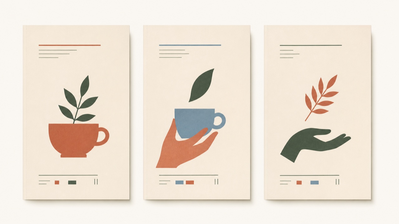
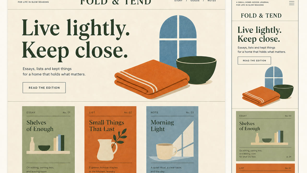
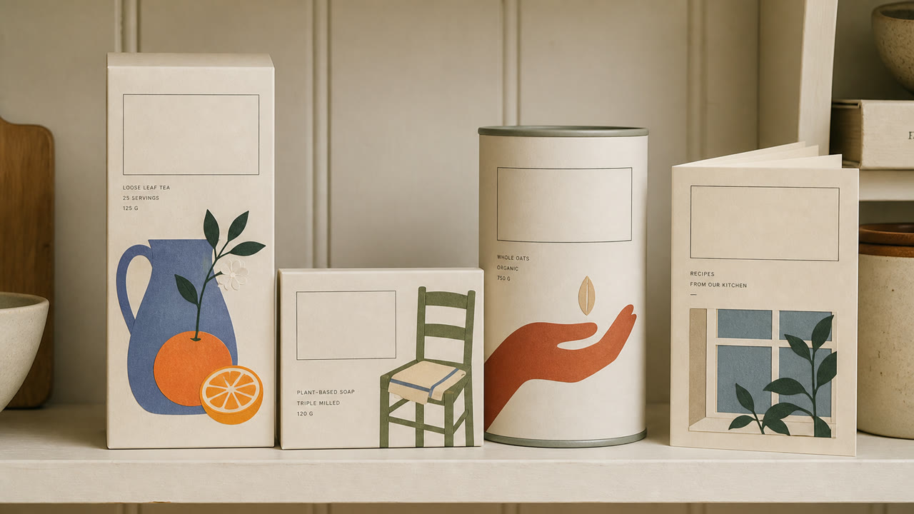
A brand style that uses soft color, literary serif type, flat cut-paper illustration, and generous space to make everyday products resemble new independent-press books. Luxury comes from edited intimacy rather than gloss.
At a glance
Visual cues
- Didone or retro serif display type
- Soft cream, muted orange, green, and blue fields
- Flat plant and figure illustrations resembling cut paper or printmaking
- Vertical cover-like whitespace and small explanatory text
Best used for
- Food, cosmetics, and household products sold through editorial story rather than technical explanation
- Aligning packaging and web for small brands that need an intimate but adult voice
Use this style
Take the compact brief into a project or hand the structured version to an AI tool.
Detailed guidance and sourcesProduction rules, reference works, comparisons, research and citation formats
Dictionary entry
- Type
- Pair a large serif headline with small sans-serif explanation, building hierarchy from the contrast alone.
- Composition
- Stack elements like a book cover, offset the illustration from center, and place small information within the whitespace.
- Material
- Use uncoated stock, matte spot color, and flat cut-paper forms while avoiding shadow and gloss.
- Caution
- Pastels and plants alone become generic natural packaging. The type hierarchy must feel like publishing and the product needs a specific story.
- Further study
- late-2010s editorial branding / the influence of independent publishing / soft illustration and literary typography
Related entries
- Minimalism (ミニマリズム)Shared effects: Calm.Compare Paperback Chic and Minimalism
- Corporate Memphis (コーポレート・メンフィス)Shared effects: Intimacy.Compare Paperback Chic and Corporate Memphis
More from Publishing and Editing
Continue through styles in the same Publishing and Editing family, prioritised by shared effects.
- Onchi Kōshirō Book Design (恩地孝四郎の装幀)Shared effects: Luxury / Intimacy / Calm.
- The Face (ザ・フェイス)Shared effects: Luxury / Calm.
- Illuminated Manuscript (彩飾写本)Shared effects: Luxury / Calm.
Browse all Publishing and Editing entries
Cite this entry
The dictionary is meant to be linked to. Take whichever form fits where you are writing.
- Link
- https://indexstyle.org/styles/paperback-chic
- Markdown
- [Paperback Chic — IndexStyle](https://indexstyle.org/styles/paperback-chic)
- HTML
- <a href="https://indexstyle.org/styles/paperback-chic">Paperback Chic — IndexStyle</a>