IndexStyle

A dictionary of design styles, written from the works themselves.

It is plain HTML. It opens on any browser and any device, with no app and no account, and machines read the same page.

Terms776

Dictionary

Search by style name or describe what you are making. Name matches come first; purpose, desired effect and medium add relevant alternatives.

TryBauhausa premium recruiting websitea trustworthy finance app

24/776 shown

121

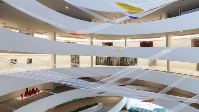
Gutai — 『Gutai: Splendid Playground』展示風景(© Solomon R. Guggenheim Foundation、同館より引用)

Gutai

具体美術協会 / 1954–1972 / Style / Japanese Postwar Avant-garde

Acts directly on body, mud, paper, water, smoke and light bulbs, making the work an event in which spirit does not master material and each exposes the nature of the other.

Body colliding with material / Outdoor exhibitions / Tearing, throwing, treading / Participation and play

design.mdimage prompt

122

Rinpa — Tawaraya Sōtatsu, Fūjin Raijin-zu byōbu (Wind and Thunder Gods), 17th century — Wikimedia Commons / Public domain

Rinpa

琳派 / early 17th century– / Style / East Asian Painting

Gold and silver grounds, mineral pigment, simplified nature, empty space, repetition and tarashikomi run across its work, pulling painting, craft and calligraphy into one bold, flat composition.

Gold and silver grounds / Boldly abbreviated nature / Repetition and emptiness / Tarashikomi pooling

design.mdimage prompt

123

Scandinavian Modern — Aalto Vase (CC BY 4.0) · © Unknown author Unknown author

Scandinavian Modern

スカンジナビアン・モダン / late 1940s–1960s / Style / Scandinavian Design

Joins function and mass production to the warmth of natural materials, curves that follow the body, and clear usable form.

Lucid function / Natural materials / Body-following curves / Restrained color

design.mdimage prompt

124

Abstract Expressionism — Franz Kline, Sabra (Berardo Collection) — Wikimedia Commons / CC BY 2.0 · © Pedro Ribeiro Simões from Lisboa, Portugal

Abstract Expressionism

抽象表現主義 / 1940s–1950s / Style / Postwar American Art

On huge canvases, with bodily strokes, drips, stains and broad fields of color, what stays on the surface is the act of painting and strong inner feeling rather than a depicted subject.

Vast canvases / Bodily brushwork / All-over composition / Drips and stains

design.mdimage prompt

125

Color Field Painting — Interior of the Rothko Chapel (CC BY-SA 4.0) · © Alan Islas

Color Field Painting

カラーフィールド・ペインティング / late 1940s–1960s / Style / Postwar Abstract Painting

Large continuous fields, soaked edges and few forms build a space of color that fills the entire surface and asks to be looked at for a long time.

Vast color fields / Soaked contours / Few forms / Immersive scale

design.mdimage prompt

126

Conceptual Art — Kosuth, One and Three Chairs, installation view(CC BY 2.0) · © Gautier Poupeau

Conceptual Art

コンセプチュアル・アート / mid-1960s–1970s / Style / Postwar American Art

Puts the idea at the center of the work and presents it through words, definitions, rules, documentation and placement, caring little for finish as an object.

Words and definitions / Instructions and rules / Documentary photographs / Dematerialization

design.mdimage prompt

127

Earthwork / Land Art — Smithson, Spiral Jetty 1970(CC BY-SA 4.0) · © Netherzone

Earthwork / Land Art

アースワーク/ランドアート / late 1960s–1970s / Style / Postwar American Art

Shapes the landscape itself with earth, stone, branches, terrain and machinery, folding place, time, erosion and documentation into the work.

Intervention in terrain / Earth and stone / Vast scale / Erosion and time

design.mdimage prompt

128

Neo-Concrete Art — Lygia Clark, Bicho(CC BY-SA 4.0)

Neo-Concrete Art

ネオ・コンクリート・アート / 1959–1966 / Style / Brazilian Avant-garde

Releases geometric abstraction from a fixed visual order and opens the work to touching, moving and entering, so that it becomes an experience that changes as the body takes part.

Movable geometry / Bodily participation / Folds and hinges / Sensuous color and space

design.mdimage prompt

129

Tropicália — Oiticica, Penetrável (Inhotim)(CC BY 2.0) · © Marcelo Costa

Tropicália

トロピカリア / mid-1960s– / Style / Brazilian Avant-garde

Mixes vivid color, music, sand, plants, temporary structures and audience participation to criticize both the repression of military rule and the outsider's image of a 'tropical paradise.'

Blazing hybridity / Participatory space / Music and costume / The tropical image inverted

design.mdimage prompt

130

Screenprint — WPA screenprint poster, 1930s — Wikimedia Commons / Public domain

Screenprint

スクリーンプリント/シルクスクリーン / 20th century– / Technique / Stencil Printing

Parts of a mesh screen are blocked and parts left open, and a squeegee forces ink through, printing hard contours and flat, strong color one layer at a time.

Hard contours / Flat color planes / Layer-by-layer overlap / Slight misregistration

design.mdimage prompt

131

Lithography — Daumier, Rue Transnonain 1834 — Wikimedia Commons / CC0

Lithography

石版画/リトグラフ / 1796– / Technique / Planographic Printing

Uses the repulsion of oil and water to reproduce crayon and tusche drawing from stone or plate, keeping all the softness of the hand.

Greasy crayon / Stone or metal plate / Painterly tone / Multicolor overprinting

design.mdimage prompt

132

Intaglio — Dürer, Melencolia I 1514 — Wikimedia Commons / Public domain

Intaglio

凹版印刷 / 15th century– / Technique / Intaglio Printing

Ink is left in lines and hollows cut below the surface of a metal plate, and heavy pressure drives damp paper into them, picking up precise lines and the trace of the plate's edge. How the plate is lowered gives each technique its name, so a plate bitten with acid is an etching and a plate roughened then burnished is a mezzotint.

Sunken lines / Plate marks / Damp paper / High-pressure press

design.mdimage prompt

133

Mezzotint — Mezzotint by John Martin — Wikimedia Commons / CC0

Mezzotint

メゾチント / 1640s– / Technique / Intaglio Printing

The whole plate is roughened to hold a deep black, then burnished back to raise the lights, so that the image emerges from soft velvet darkness instead of from lines.

Velvet blacks / From dark to light / Soft gradation / Burnished light

design.mdimage prompt

134

Etching — Rembrandt, The Hundred Guilder Print c. 1649 — Wikimedia Commons / Public domain

Etching

エッチング/腐食銅版画 / 16th century– / Technique / Intaglio Printing

A needle draws through the acid-resistant ground and the acid bites the metal it exposes, cutting lines into the plate that are thin, fluid and close to handwriting.

Thin flowing lines / Depth by biting / Cross-hatching / Plate marks

design.mdimage prompt

135

Roman Square Capitals — Inscription on Trajan's Column 113(CC BY-SA 2.0) · © MumblerJamie

Roman Square Capitals

ローマン・キャピタル / 1st–2nd century / Style / Type Classification

Capitals cut for stone, with geometric proportions and serifs, became the skeleton of the Latin alphabet and the archetype of authority for two thousand years.

Geometric proportions / Chiseled serifs / All-capital setting / Monumental letterspacing

design.mdimage prompt

136

Blackletter — Gutenberg 42-line Bible, Genesis c. 1455 — Wikimedia Commons / Public domain

Blackletter

ブラックレター / 12th century– / Style / Type Classification

The manuscript hand compressed into dense black verticals, filling the page with an even darkness like woven cloth. It was also the first typeface of printing.

Dense vertical strokes / Curves replaced by breaks / Heavy blackness / Ornamental capitals

design.mdimage prompt

137

Old Style Serif — Garamond type in the Plantin specimen c. 1585 — Wikimedia Commons / Public domain

Old Style Serif

オールドスタイル・ローマン / 15th–16th century– / Style / Type Classification

Set the standard for text faces that read without fatigue: the pen's oblique axis and gentle stroke contrast.

Oblique stress / Gentle contrast / Bracketed serifs / Modest x-height

design.mdimage prompt

138

Italic — Aldine Virgil 1501 — Wikimedia Commons / CC0

Italic

イタリック / 1501– / Style / Type Classification

The humanist cursive cast in type: slanted letters that made pocket books possible, later becoming the second voice beside roman.

Rightward slant / Cursive continuity / Narrow width / Contrast with roman

design.mdimage prompt

139

Transitional Serif — John Baskerville, Virgil, title page — higher-resolution photograph of a historical printing — Catsmeat — Wikimedia Commons / CC BY-SA 3.0

Transitional Serif

トランジショナル / 18th century / Style / Type Classification

Raising the axis toward vertical, sharpening the contrast between strokes and designing paper and ink along with the letter moved type past handwriting into an object made in its own right.

Near-vertical axis / Strengthened contrast / Sharp horizontal serifs / Designed with polished paper

design.mdimage prompt

140

Didone — Bodoni, Manuale Tipografico 1818 — Wikimedia Commons / Public domain

Didone

ディドーネ / late 18th century– / Style / Type Classification

A constructed roman that pushes the contrast of hairline and thick vertical stem to its limit, standing at once as the terminus of the Age of Reason and as a sign of luxury.

Extreme contrast / Vertical stress / Hairline serifs / Mathematical construction

design.mdimage prompt

141

Fat Face — Fat face in the Caslon specimen book 1841 — Wikimedia Commons / Public domain

Fat Face

ファットフェイス / c. 1803– / Style / Type Classification

Advertising swelled the didone's stems to extremes. The result was the earliest display type, built to shout across the street.

Swollen stems / Hairline horizontals / Tight spacing / Poster scale

design.mdimage prompt

142

Slab Serif — Caslon slab serif specimen 1841 — Wikimedia Commons / Public domain

Slab Serif

スラブセリフ / 1815– / Style / Type Classification

Square serifs as thick as the strokes turned letters into machine structures. Industrial society's advertising and notices found their sturdy voice.

Slab serifs / Even strokes / Sturdy letterforms / Mechanical repetition

design.mdimage prompt

143

Grotesque Sans — The first sans serif type specimen c. 1816 — Wikimedia Commons / Public domain

Grotesque Sans

グロテスク・サンセリフ / 1816– / Style / Type Classification

When the letter dropped its serifs it was at first called grotesque, but its odd evenness became the new voice of notices and headlines.

No serifs / Tight apertures / Quirky uneven widths / Headline blackness

design.mdimage prompt

144

Neo-grotesque Sans — Helvetica signage in the New York subway(CC BY-SA 4.0) · © DanTD

Neo-grotesque Sans

ネオ・グロテスク / 1957– / Style / Type Classification

The grotesque had its quirks removed and neutrality set in their place as the design goal. What came out became the voice of postwar rationalism and the global corporation.

Even, closed letterforms / Low contrast / Large x-height / A voice that performs neutrality

design.mdimage prompt

Editorial policy

IndexStyle is not a list of every term used around design. An independent entry must describe a visual language that can be recognised, reproduced and distinguished from its neighbours. Editorial standard

Back to top