IndexStyle

A dictionary of design styles, written from the works themselves.

It is plain HTML. It opens on any browser and any device, with no app and no account, and machines read the same page.

Terms776

Dictionary

Search by style name or describe what you are making. Name matches come first; purpose, desired effect and medium add relevant alternatives.

TryBauhausa premium recruiting websitea trustworthy finance app

24/776 shown

289

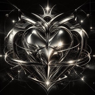
Metalheart — AI-generated interpretation
AI interpretation, not a reference

Metalheart

メタルハート / 1995–2004 / Style / UI Expression

Early 3D software gave this fin-de-millénaire style its chrome, liquid metal, aggressive bevels and lens flare. Dressed in techno and science-fiction imagery, it ruled rave flyers and games magazines around Y2K.

Liquid-metal chrome / Aggressive bevels / Lens flares / Techno and sci-fi typography

design.mdimage prompt

290

Surrealism — Max Ernst, Habakuk, Düsseldorf — Wikimedia Commons / CC BY-SA 3.0 · © Hans Peter Schaefer

Surrealism

シュルレアリスム / 1924–1950s / Style / Avant-garde

The movement that forced reality's objects into impossible meetings under the logic of dream and the unconscious. Dépaysement spread from painting into photography, film and advertising as the grammar of impossible adjacency.

Dépaysement / Dream perspective / Objects transformed / Precision serving absurdity

design.mdimage prompt

291

Soviet Film Poster — Battleship Potemkin poster, 1925 — Wikimedia Commons / Public domain

Soviet Film Poster

ソ連映画ポスター / 1924–1932 / Style / Regional Graphics

The revolutionary-era film posters the Stenberg brothers built in lithography: photomontage-like giant faces, careening letters and violently exaggerated perspective translating cinematic motion onto a sheet of paper.

Giant faces / Careening lettering / Exaggerated perspective / Flat lithographic color

design.mdimage prompt

292

Atelier Populaire — La lutte continue, 1968 (CC0)

Atelier Populaire

アトリエ・ポピュレール / May–June 1968 / Style / Printmaking and Social Movements

In the Paris uprising of May '68 students occupied the art school and ran its print workshop. One-color silkscreens, simple figures and declarative slogans came off the press nightly under rules of anonymity, no sale and street posting, which became the prototype of protest graphics.

One-color silkscreen / Simplified figures / Declarative slogans / Anonymous mass production

design.mdimage prompt

293

Devětsil — Karel Teige, Pozdrav z cesty, 1923 — Wikimedia Commons / Public domain

Devětsil

デヴィェトシル / 1920–1931 / Style / Publishing and Editing

Teige gave the Czech avant-garde group its picture poem. Setting photograph, type and sign together as verse, the group's lyrical strain of constructivism turned interwar Prague into a laboratory of book design.

Picture poems / Photographs fused with type / Geometry used lyrically / Constructivist bookbinding

design.mdimage prompt

294

Golden Age Travel Poster — PLM, Oasis of Nefta, 1925 — Wikimedia Commons / Public domain

Golden Age Travel Poster

旅行ポスターの黄金期 / 1890s–1930s / Style / Advertising Posters

The lithographed tourism posters railways and shipping lines competed with: idealized destination landscapes, ornamental lettering and proud route names inventing travel itself as an image of desire.

Idealized landscapes / Flat lithographic color / Ornamental lettering / Railway and line insignia

design.mdimage prompt

295

Pulp Magazine Cover — Weird Tales, August 1930 issue — Wikimedia Commons / Public domain

Pulp Magazine Cover

パルプ雑誌の表紙 / 1920s–1950s / Style / Publishing and Editing

Fiction magazines printed on cheap pulp paper competed on sensational covers. Melodramatic oil painting, the instant of peril and screaming logotypes cast the visual language of science fiction, horror and crime, which flowed on into paperbacks and comics.

Melodramatic oil painting / The instant of peril / Screaming logotypes / Primary-color sensation

design.mdimage prompt

296

Penguin Cover System — Penguin Books, The Tanker Derbent, 1944 — Wikimedia Commons / Public domain

Penguin Cover System

ペンギン・ブックスの表紙 / 1935– / Style / Publishing and Editing

From the tripartite color bands of the first covers through Tschichold's composition rules to Marber's ruled grid, Penguin kept reinventing the cover as a design system. The paperback became a textbook of modern design.

Color-coded bands / Rigorous composition rules / The Marber grid / Consistency as a series

design.mdimage prompt

297

Festival of Britain Style — Skylon, 1951 (CC BY-SA 4.0) · © Heresy0uk

Festival of Britain Style

フェスティバル様式 / 1951–1950s / Style / Public Design

Postwar Britain's bright modernism spreading from the 1951 festival site: thin legs, molecular patterns and light script faces turning post-austerity optimism into a national visual language.

Thin legs, light structures / Molecule and crystal patterns / Light script lettering / Festive color

design.mdimage prompt

298

Corporate Modernism — Paul Rand, IBM eight-bar logo, 1972 — Wikimedia Commons / Public domain

Corporate Modernism

企業モダニズム / 1950s–1970s / Style / Contemporary Branding

The golden age of corporate identity established by Rand, Chermayeff and their peers: geometric marks, gridded standards manuals and disciplined application speaking for corporations in modernism's abstract language.

Abstract geometric marks / Standards manuals / Gridded application discipline / Single-color strength

design.mdimage prompt

299

ITC Style — ITC Avant Garde and Avant Garde Nouveau — contemporary type specimen by Esinconis, 2023 — Wikimedia Commons / CC0

ITC Style

ITC様式 / 1970s–1980s / Style / Type Classification

New York in the phototype era produced a style of huge x-heights and tightly packed settings. Lubalin's conceptual typography and U&lc magazine staged letters as pictures and gave the period its face.

Huge x-heights / Tight-not-touching settings / Swashes and ligatures on stage / Letters as image

design.mdimage prompt

300

Mexico 68 Identity — Mexico 68 emblem — Wikimedia Commons / Public domain

Mexico 68 Identity

メキシコ68 / 1966–1968 / Style / Public Design

The Olympic identity Wyman built for Mexico City: concentric lines radiating from the logotype into venues, uniforms and stamps, fusing Op art with folk art and wrapping a whole city in pulsing imagery.

Radiating concentric lines / Op-art vibration / Fusion with folk art / City-scale deployment

design.mdimage prompt

301

Blue Note Style — Reid Miles (photograph by Francis Wolff), John Coltrane / Blue Train, 1957 — Wikimedia Commons / Public domain

Blue Note Style

ブルーノート・スタイル / 1955–1967 / Style / Music Graphics

Reid Miles turned out sleeve after sleeve for the jazz label with monochrome photography, two-color printing and boldly cropped type. Improvisation inside constraint became the graphic translation of jazz itself.

Grainy monochrome photographs / Two-color economy / Bold cropping / Improvised type layouts

design.mdimage prompt

302

Factory Records Style — Peter Saville, Power, Corruption & Lies, 1983 — Wikimedia Commons / Public domain

Factory Records Style

ファクトリー・レコーズ / 1978–1992 / Style / Music Graphics

At the Manchester label Saville made sleeves that refuse to explain the music. Borrowed industrial color charts, classical paintings and waveform diagrams turned post-punk's intelligent void into a style.

Refusal to explain / Borrowed imagery from other fields / Restrained typography / Catalogue numbers as institution

design.mdimage prompt

303

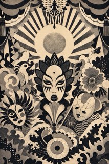
Angura Poster — AI-generated interpretation
AI interpretation, not a reference

Angura Poster

アングラ演劇ポスター / 1965–1975 / Style / Regional Graphics

Yokoo Tadanori and his peers printed the posters for Situation Theatre and Tenjō Sajiki. Ukiyo-e, kitsch and psychedelia collide there in an excess that the world discovered as a revolt against modernism.

Ukiyo-e colliding with kitsch / Fluorescent silkscreen / Rising suns and Shōwa imagery détourned / The aesthetics of excess

design.mdimage prompt

304

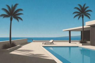
City Pop Illustration — AI-generated interpretation
AI interpretation, not a reference

City Pop Illustration

シティポップのイラスト / 1979–1989 / 2010s revival / Style / Music Graphics

Hiroshi Nagai and Eizin Suzuki gave record sleeves a cloudless sky, a swimming pool, palm trees and a flat horizon. Vaporwave later carried this urban-resort landscape of pre-bubble longing out into the world's shared imagery.

Cloudless blue and pools / Palms and horizons / Flat airbrushed surfaces / The absence of people

design.mdimage prompt

305

ACT UP Graphics — SILENCE=DEATH badge — Wikimedia Commons / Public domain

ACT UP Graphics

ACT UPのグラフィック / 1987–1990s / Style / Printmaking and Social Movements

The visual strategy of the AIDS-crisis direct-action movement. The pink triangle of SILENCE=DEATH, a clarity seized from advertising's own grammar and the principle of free reproduction forged activist graphics as strong as the ads they stood against.

The pink triangle inverted / Advertising grammar seized / Declarative typography / Free reproduction

design.mdimage prompt

306

Airbrush Illustration — Fabiosaurusrex, airbrush illustration (Ford advertisement), 2016 — Wikimedia Commons / CC BY-SA 4.0

Airbrush Illustration

エアブラシ・イラストレーション / 1970s–1980s / Technique / Illustration Styles

Compressed air lays down gradients with no visible join, and commercial illustration's golden age was built on them, rendering chrome reflections, wet gloss and idealized skin. Before digital, this was what a perfect surface meant.

Seamless gradients / Chrome and reflections / Starburst highlights / Idealized smoothness

design.mdimage prompt

307

Isometric Pixel Art — Peterson Freitas, Curitiba, 2004 — Wikimedia Commons / CC BY-SA 4.0 · © Propeterson

Isometric Pixel Art

アイソメトリック・ピクセルアート / 1994– / Style / Digital Image Techniques

Endless pixel cities in vanishing-point-free oblique view. eBoy's pixoramas established the mode, exporting games' isometric projection into print and advertising as a graphic language.

Isometric aerial view / No vanishing point / Modular buildings / Screen-filling density

design.mdimage prompt

308

Cracktro — Jovis, pixel art from the Atari ST demoscene, 1989–1994 — Wikimedia Commons / CC BY-SA 4.0 · © Dpla-fr

Cracktro

クラックトロ / 1980s-1990s / Style / Digital Art

A short screen bolted to the front of cracked software as a group's calling card. An oversized group name, text scrolling without end and a run of greetings turned the home computer display into a stage.

Text scrolling endlessly across the screen / Bands of color running behind it / An oversized group name held at the center / A run of greetings naming other groups

design.mdimage prompt

309

Vector Scan Graphics — Atari, screen from Bradley Trainer, 1981 (the military version of Battlezone) — Wikimedia Commons / Public domain

Vector Scan Graphics

ベクタースキャン / 1979–1985 / Style / Technical Expression

Game imagery drawn stroke by stroke as an electron beam traces bright lines across a vector monitor. Glowing wireframes hanging in black void carried a tension that defined how the early arcade pictured the future.

Glowing wireframes / Black void / Uniform luminous lines / Geometric tension

design.mdimage prompt

310

Flash Era Web Animation — Bennett Foddy, QWOP, 2008 — Wikimedia Commons / CC0

Flash Era Web Animation

Flash黄金期のウェブ / 1998–2010 / Style / Internet Aesthetics

Thick vector outlines, tweened morphs and splash-page cursor play: the decade in which Flash gave individuals expressive power and turned the web into one animated artwork.

Thick vector outlines / Tweened transformation / Splash pages / Cursor-following play

design.mdimage prompt

311

LCD Game Graphics — Game & Watch Turtle Bridge, 1982 (CC BY-SA 2.0) · © Joe Haupt from USA

LCD Game Graphics

LCDゲームの様式 / 1980–1991 / Style / Digital Retro

The fixed-segment LCD screens of Game & Watch and its kin. Movement had to be told through a handful of poses etched in advance, and this art of frames, layered over a printed background, produced a picture unlike any other.

Fixed-segment figures / Two layers over printed backgrounds / Frame-step motion / Silver shells and the cross key

design.mdimage prompt

312

ANSI Art (BBS Scene) — Example of ANSI art — Wikimedia Commons / Public domain

ANSI Art (BBS Scene)

ANSIアート / 1985–1997 / Style / Lettering

Login screens and group art packs drawn in the 16-color text mode of the BBS age. Block-character shading and inter-group competition made the summit of pre-web screen decoration.

16-color text mode / Shaded block characters / Art-group signatures / The login-screen format

design.mdimage prompt

Editorial policy

IndexStyle is not a list of every term used around design. An independent entry must describe a visual language that can be recognised, reproduced and distinguished from its neighbours. Editorial standard

Back to top