IndexStyle

A dictionary of design styles, written from the works themselves.

It is plain HTML. It opens on any browser and any device, with no app and no account, and machines read the same page.

Terms598

Dictionary

Search by style name or describe what you are making. Name matches come first; purpose, desired effect and medium add relevant alternatives.

TryBauhausa premium recruiting websitea trustworthy finance app

48/48 shown

Interpreted asTrustWeb / UIFinance

539

Skeleton Screen — AI-generated interpretation
AI interpretation, not a reference

Skeleton Screen

スケルトン・スクリーン / 2013– / Technique / UI Expression

Why it is closeTrustWeb / UIFinanceTechnique

A loading treatment that drops the spinner and shows a blank version of the page instead, then fills information into it as the data arrives. Luke Wroblewski named the technique in 2013, writing about his own app Polar, where a spinner had made testers report that the app felt slower than the previous version. The aim is to show advance toward the goal rather than the act of waiting.

No spinner and no progress bar while the screen loads / Blank fields already standing where text and images will land, at the size they will occupy / A layout committed before the data arrives, so nothing shifts when it does / Regions filling in one after another instead of the whole screen appearing at once

design.mdimage prompt

ChatGPTClaudeGoogle AI

494

GOV.UK Design System

GOV.UK デザインシステム / 2012– / Style / Platform Screen Languages

Why it is closeTrustWeb / UIFinanceTechnique

The design language the UK government's Government Digital Service publishes and maintains for public services. Everything runs in one undecorated left aligned column set in GDS Transport, and the green button keeps square corners while carrying a darker green band along its bottom edge, dropping by exactly that depth when pressed. Whatever holds keyboard focus turns yellow with a black rule under it.

One undecorated left aligned column, with almost no boxes and no shadows / A green button with square corners and a darker green band along its bottom edge, which drops by that exact depth when pressed / Whatever holds keyboard focus turns yellow with a black rule drawn beneath it / Type sizes step coarsely through 48, 36, 24, 19 and 16px with nothing in between

design.mdimage prompt

ChatGPTClaudeGoogle AI

118

Fluent 2

フルーエント2 / 2022– / Style / Microsoft UI

Why it is closeTrustWeb / UIFinanceTechnique

Tokenizes color, type, spacing, radius and depth, deploying Solid, Acrylic, Mica and Smoke materials by role across Microsoft products.

Mica and Acrylic / Neutral tonal hierarchy / Soft corner radii / Tokenized depth

design.mdimage prompt

ChatGPTClaudeGoogle AI

538

Solarized

ソラライズド / 2011– / Style / UI Expression

Why it is closeTrustWeb / UIFinanceTechnique

Solarized is a sixteen colour scheme for terminal and GUI applications published by Ethan Schoonover with every value in the open, eight monotones and eight accents. The monotones hold symmetric CIELAB lightness differences, so moving between the light and the dark background keeps the same perceived contrast. It lowers brightness contrast on purpose and lets hue relations, not brightness, separate one token from the next.

Backgrounds that are neither pure black nor pure white, one leaning teal and one leaning cream / A small lightness gap between body text and ground, softer than black on white / Eight accents at close to equal lightness, told apart by hue alone / The same accent holding the same role after the background is flipped from dark to light

design.mdimage prompt

ChatGPTClaudeGoogle AI

42

Bento Grid

ベントーグリッド / 2020s / Layout / Information Design

Why it is closeTrustWeb / UIFinanceTechnique

Divides different kinds of information into independent boxes, giving the whole picture at a glance.

Cards large and small / Aligned gutters / One-screen summary / Modules

design.mdimage prompt

ChatGPTClaudeGoogle AI

1

Swiss

スイス・スタイル / 1950s– / Style / Functionalism

Why it is closeTrustWeb / UIFinanceCalm

Puts order front and center and makes the information itself the protagonist.

Strict grid / Sans-serif type / Asymmetry / Objective photography

design.mdimage prompt

ChatGPTClaudeGoogle AI

554

Carbon Design System

Carbon Design System / 2015– / Style / Platform Screen Languages

Why it is closeTrustWeb / UIFinanceTechnique

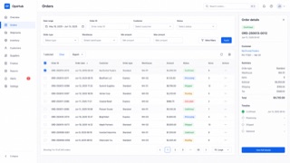
IBM's system for data-heavy enterprise products, combining a strict grid, IBM Plex type and compact components so complex work remains legible.

IBM Plex and strong type hierarchy / White or deep-gray work surfaces / Dense tables, filters and side navigation / Blue reserved for action and focus

design.mdimage prompt

ChatGPTClaudeGoogle AI

472

Material Design

マテリアルデザイン / 2014– / Style / Google UI

Why it is closeTrustWeb / UIFinanceTechnique

A design system that reduces the physical metaphor of paper and ink to rules of shadow and overlap. Elements are given elevation, shadow states the hierarchy, and motion carries physical cause and effect. It became the model for UI design being distributed as a system. The 2021 revision added colour derived from the device wallpaper, so the palette differs from one user to the next.

Hierarchy and shadow expressed by elevation / Surfaces overlapping like sheets of paper / Motion that shows cause and effect / A standardized unit of spacing

design.mdimage prompt

ChatGPTClaudeGoogle AI

326

Banknote Guilloche

紙幣のギヨシェ / 18th century– / Technique / Public Design

Why it is closeTrustWeb / UIFinanceTechnique

The banknote style in which lathe-cut guilloche curves and engraved portraits refuse forgery while making credit visible. America's 1896 Educational Series raised the banknote to allegorical masterpiece.

Continuous guilloche curves / Engraved intaglio portraits / Fine background lathework / Hierarchies of denomination

design.mdimage prompt

ChatGPTClaudeGoogle AI

568

GitLab Pajamas — AI-generated interpretation
AI interpretation, not a reference

GitLab Pajamas

GitLab Pajamas / 2018– / Style / Platform Screen Languages

Why it is closeTrustWeb / UIFinanceTechnique

GitLab's screen language connects code, issues, review, CI/CD and security inside one DevSecOps product through GitLab Sans and Mono, persistent navigation, dense lists and a purple-inflected neutral palette.

GitLab Sans paired with GitLab Mono for code / Layered structure built from left navigation and application chrome / Dense issue, merge-request and pipeline lists / White or charcoal surfaces with purple as brand focus

design.mdimage prompt

ChatGPTClaudeGoogle AI

534

Breeze

ブリーズ / 2014– / Style / Platform Screen Languages

Why it is closeTrustWeb / UIFinanceTechnique

The default visual style KDE introduced with Plasma 5, described in its own announcement as a high contrast, flat theme for the workspace. Graphics assets are simpler and more monochromatic, and layouts lean on typography rather than ornament so elements stay recognisable. Light and dark variants shipped as a matched pair from the beginning.

Flat surfaces with no modelled shading, where edges are carried by contrast alone / Icons and graphic assets reduced toward monochrome, with a tight colour count / Type contrast doing the work ornament would otherwise do, so layout reads through text / The same assets existing as a matched light and dark pair

design.mdimage prompt

ChatGPTClaudeGoogle AI

571

Canonical Vanilla — AI-generated interpretation
AI interpretation, not a reference

Canonical Vanilla

Canonical Vanilla / 2013– / Style / Platform Screen Languages

Why it is closeTrustWeb / UIFinanceTechnique

Canonical's CSS-based screen language unifies Ubuntu, MAAS, Juju and related sites and applications through Ubuntu type, split grids, ruled sections and generous space, optimized for scanning long technical content.

Thin large headings paired with bold smaller headings in Ubuntu type / Asymmetric 25/75 and 50/50 splits / Fine rules above sections and generous vertical space / White surfaces, dark text and orange or aubergine focus

design.mdimage prompt

ChatGPTClaudeGoogle AI

566

PatternFly — AI-generated interpretation
AI interpretation, not a reference

PatternFly

PatternFly / 2012– / Style / Platform Screen Languages

Why it is closeTrustWeb / UIFinanceTechnique

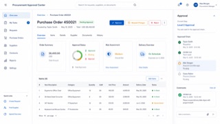
Red Hat's open-source screen language for enterprise products keeps complex infrastructure manageable through dense navigation, data views and tightly controlled status color.

Dark masthead and left navigation / Dense tables and forms on white or pale-gray work surfaces / Blue for primary action and red, orange or green for status / List, detail and action shown in coordinated panes

design.mdimage prompt

ChatGPTClaudeGoogle AI

556

SAP Fiori

SAP Fiori / 2013– / Style / Platform Screen Languages

Why it is closeTrustWeb / UIFinanceTechnique

SAP's role-based design language reduces enterprise processes to the information and actions each person needs, then carries them consistently across devices.

Role-based launchpad tiles / Shell bar and object pages / Compact tables and semantic status / Calm blue on pale work surfaces

design.mdimage prompt

ChatGPTClaudeGoogle AI

543

GitHub Primer

GitHub Primer / 2017– / Style / Platform Screen Languages

Why it is closeTrustWeb / UIFinanceTechnique

GitHub's design system for turning dense development workflows into shared rules for color, type, icons, spacing and components. It favors flow over decoration, keeping many states and actions in a small area without giving up accessibility or responsive behavior.

Neutral surfaces with blue links and restrained status colors / Octicons paired with short action labels / Thin borders separating lists, tabs and sidebars / Consistent steps of type and spacing even at high density

design.mdimage prompt

ChatGPTClaudeGoogle AI

544

Adobe Spectrum

Adobe Spectrum / 2013– / Style / Platform Screen Languages

Why it is closeTrustWeb / UIFinanceTechnique

Adobe's cross-application design system. Under the principles Rational, Human and Focused, it changes density between desktop and mobile while keeping tool-heavy interfaces from pulling attention away from the work itself.

Neutral surfaces with vivid color reserved for selection / Icons, type and borders scaling together / Toolbars and property panels joined by fine divisions / The creative work stays stronger than the interface

design.mdimage prompt

ChatGPTClaudeGoogle AI

489

Adwaita

アドワイタ / 2011– / Style / Platform Screen Languages

Why it is closeTrustWeb / UIFinanceTechnique

Adwaita is the name GNOME gives its default visual style, defined in the project's Human Interface Guidelines. One set of components has to carry a light style, a dark style and a high contrast style, so colour arrives as named variables that switch rather than as fixed values. A header bar crosses the top of every window holding buttons drawn with no background and no border, and interface icons are monochrome symbolics built on a 16 by 16 pixel grid.

A single header bar across the top of the window, laid out on three alignment points with the window heading in the centre / Header bar buttons carry no background and no border, leaving only the symbol and the label on the surface / Monochrome symbolic icons drawn at 16 by 16 pixels with 2 pixel strokes and no perspective / A published palette of five steps per hue, including Blue 3 at #3584e4

design.mdimage prompt

ChatGPTClaudeGoogle AI

229

Schematic Transit Diagram

スキーマティック路線図 / 1933– / Layout / Information Design

Why it is closeTrustWeb / UIFinanceTechnique

Discards geographic accuracy for horizontal, vertical and 45-degree lines with evenly spaced stations. Beck's 1933 London Underground diagram established it as the common language of transit maps worldwide.

Lines limited to 45 degrees / Evenly spaced stations / Color-coded lines / Independence from geography

design.mdimage prompt

ChatGPTClaudeGoogle AI

480

Apple Desktop Interface

アップル・デスクトップ・インターフェース / 1984–1997 / Style / Apple UI

Why it is closeName matchTrustWeb / UIFinance

This is the design language Apple named itself, in the 1987 guidelines book whose subtitle reads The Apple Desktop Interface. Working with one bit of black and white, it wrote down a house style: halftone dot patterns standing in for gray, rounded window corners, a title bar of stacked horizontal rules, and a heavy bitmap face.

Two tones only, black and white, with gray faked by a checkerboard of black dots / Window corners are rounded and the title bar carries several thin horizontal rules / A menu bar pinned to the top edge of the screen, the Apple mark sitting at its left end / Chicago, a heavy bitmap face whose letters are packed into a cell of 9 by 7 dots

design.mdimage prompt

ChatGPTClaudeGoogle AI

546

Ant Design

Ant Design / 2015– / Style / Platform Screen Languages

Why it is closeTrustWeb / UIFinanceTechnique

A design system that keeps enterprise web applications at low entropy through reusable components and page patterns. Its values — Natural, Certain, Meaningful and Growing — systematize tables, forms, hierarchy and state without reducing information density.

Dense tables set in small type and fine rules / Blue primary actions with explicit semantic colors / Consistent forms, pagination, trees and tables / Readability achieved through alignment and repetition, not generous space

design.mdimage prompt

ChatGPTClaudeGoogle AI

557

U.S. Web Design System

米国Webデザインシステム / 2015– / Style / Public Design

Why it is closeTrustWeb / UIFinanceCalm

A shared system for accessible, mobile-friendly and trustworthy U.S. federal web services, built from tested public-service patterns.

White, navy and restrained federal red / Large plain headings and readable body text / Official-site banner / Clear forms, alerts and step indicators

design.mdimage prompt

ChatGPTClaudeGoogle AI

558

NHS Design System

NHSデザインシステム / 2016– / Style / Public Design

Why it is closeTrustWeb / UIFinanceCalm

The NHS system makes urgent health information and services calm, direct and consistent through plain language, strong focus states and tested clinical patterns.

NHS blue and generous white space / Large headings and short paragraphs / Callouts for warning and care advice / Visible focus and simple forms

design.mdimage prompt

ChatGPTClaudeGoogle AI

580

CDE Interface — AI-generated interpretation
AI interpretation, not a reference

CDE Interface

CDEインターフェース / 1993–2000s / Style / Platform Screen Languages

Why it is closeTrustWeb / UIFinanceTechnique

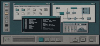
The Common Desktop Environment unified UNIX workstations through Motif-derived bevels, a persistent Front Panel, workspace switching and low-color icons, making different hardware feel like one workplace.

Box-like Front Panel along the lower edge / Raised buttons and recessed fields made from paired light and dark borders / Low-color pixel icons with dark outlines / Persistent buttons for switching among workspaces

design.mdimage prompt

ChatGPTClaudeGoogle AI

484

Motif

モチーフ / 1989– / Style / Platform Screen Languages

Why it is closeTrustWeb / UIFinanceTechnique

Motif is the interface language of UNIX workstations, maintained by The Open Group, standardized as IEEE 1295 and shipped on more than two hundred platforms. Its own data sheet calls the look a distinctive 3D beveled appearance, meaning every part sits on a gray face edged with one light line and one dark line.

A gray face lit along its top and left edges and darkened along its bottom and right, so every part appears raised / While a control is held down the two edge colors swap and the part sinks / A thin rectangular ring is drawn around whichever control currently takes keyboard input / Scroll bars are square cornered rectangles with a triangular arrow button at each end

design.mdimage prompt

ChatGPTClaudeGoogle AI

582

GNOME Clearlooks — AI-generated interpretation
AI interpretation, not a reference

GNOME Clearlooks

GNOME Clearlooks / 2005–2011 / Style / Platform Screen Languages

Why it is closeTrustWeb / UIFinanceCalm

GNOME 2.12's standard theme made GTK applications friendly and simple through pale-gray windows, blue selection, restrained gloss and firm boundaries.

Pale-gray surfaces with blue selection bars / A quiet highlight only along button tops / Tabs and fields with restrained rounding / Small GNOME icons and a concise two-level hierarchy

design.mdimage prompt

ChatGPTClaudeGoogle AI

532

Xerox Star Interface

ゼロックス・スター・インターフェース / 1981–1990s / Style / Platform Screen Languages

Why it is closeTrustWeb / UIFinanceTechnique

The screen language set by the Xerox 8010 of 1981. Labelled iconographic symbols stood for folders, in and out baskets, file drawers and other office accessories, which the brochure of that year said amounted to an electronic desk top. Objects on the screen could be moved, copied and deleted with the hand held pointer that the same brochure still had to gloss as a mouse.

Every symbol on screen carries a text label, so meaning never rests on the picture alone / The symbols stand for things found on an office desk: folders, in and out baskets, file drawers / Objects are grabbed with the pointer, and moving, copying and deleting form one family of gestures / The spreadsheet appears as a grid of rows and columns, with a menu of tools that act on the matrix

design.mdimage prompt

ChatGPTClaudeGoogle AI

490

Metal (Java Look and Feel)

メタル(Java ルック&フィール) / 1998– / Style / Platform Screen Languages

Why it is closeTrustWeb / UIFinanceTechnique

Sun's default look and feel for Swing, built so that a program looks the same on every operating system. Metal was Sun's internal project name for it and stuck as the public one. Blue violet fills, thin straight borders, and a flat refusal to imitate the host platform are its signature.

Internal window title bars laid as a deep blue violet band over a pale blue violet field / A fine texture of dots and diagonal ticks stamped into title bars and dividers / Rectangular buttons with no corner radius, ringed by a one pixel deep blue violet line / The host system draws the outer window frame while everything inside it follows a different visual language

design.mdimage prompt

ChatGPTClaudeGoogle AI

485

OPEN LOOK

オープンルック / 1988–1990s / Style / Platform Screen Languages

Why it is closeTrustWeb / UIFinanceTechnique

A screen language for Unix workstations, specified by Sun Microsystems in a functional specification published by Addison-Wesley in 1989. The book defines two parallel designs, one black and white for monochrome displays and one three dimensional for grayscale and colour, sets a single sans serif variable width face for every common element, and tells implementers that restraint is the key to colour. Each pop-up window carries a pushpin at the left of its header, and pinning it leaves the window on the workspace.

A pushpin at the left end of a pop-up window's header, which pins the window to the workspace instead of dismissing it / Three dots after a label announce a window, an outlined triangle announces a menu / Scrollbars split into an elevator, a cable and top and bottom cable anchors, with the dark part of the cable showing how much is in view / The workspace is a 50 percent dither pattern and menu drop shadows are a 75 percent pattern

design.mdimage prompt

ChatGPTClaudeGoogle AI

561

Elastic UI

Elastic UI / 2017– / Style / Platform Screen Languages

Why it is closeTrustWeb / UIFinanceTechnique

Elastic's interface system is made for searching, filtering and diagnosing large data sets without losing operational density.

Fixed header and left navigation / Persistent query, filter and time controls / Tables and time-series charts in shared panels / Bright series colors limited to data

design.mdimage prompt

ChatGPTClaudeGoogle AI

570

Ubuntu Yaru — AI-generated interpretation
AI interpretation, not a reference

Ubuntu Yaru

Ubuntu Yaru / 2018– / Style / Platform Screen Languages

Why it is closeTrustWeb / UIFinanceTechnique

Ubuntu's community-built default theme overlays Adwaita-based GTK and GNOME Shell with Ubuntu orange, dark header bars and Suru-derived icons, distributing windows, shell, icons, cursors and sound as one suite.

Light window body contrasted with a dark header bar / Ubuntu orange for selection and focus / Suru-derived icons based on circles, squares and vertical or horizontal oblongs / One-pixel icon edge, restrained gradient and lower shadow

design.mdimage prompt

ChatGPTClaudeGoogle AI

545

Atlassian Design System

Atlassian Design System / 2012– / Style / Platform Screen Languages

Why it is closeTrustWeb / UIFinanceTechnique

A system that translates the complexity of Jira and Confluence into shared tokens, content rules, spacing, grids and components. Consistency builds trust while keeping large sets of issues, documents and states navigable.

White and pale gray layers with blue primary actions / Rounded cards and lozenge-shaped status labels / Clear divisions among sidebar, table and detail pane / Color, spacing, radius and elevation controlled by tokens

design.mdimage prompt

ChatGPTClaudeGoogle AI

555

Salesforce Lightning Design System

Salesforce Lightning / 2015– / Style / Platform Screen Languages

Why it is closeTrustWeb / UIFinanceTechnique

Salesforce's interface language for record-centered business work, organizing objects, actions and status into repeatable workspace patterns.

Object headers with compact metadata / Tabs, cards and activity timelines / Cloud blue with semantic status colors / Dense forms and record tables

design.mdimage prompt

ChatGPTClaudeGoogle AI

559

BBC Global Experience Language

BBC GEL / 2010– / Style / Platform Screen Languages

Why it is closeTrustWeb / UIFinanceTechnique

BBC's global experience language unifies news, video, audio and children's products through readable hierarchy, accessible media controls and reusable editorial components.

Black header over white content / Short bold headlines / News cards with consistent image ratios / Highly visible focus, captions and playback controls

design.mdimage prompt

ChatGPTClaudeGoogle AI

547

Shopify Polaris

Shopify Polaris / 2017– / Style / Platform Screen Languages

Why it is closeTrustWeb / UIFinanceTechnique

Shopify's UI framework for giving products, orders, payments and customers one commerce language. Cards and sections separate decisions, while short status and action language helps a merchant keep the store moving.

White cards stacked on a pale ground / Green used as success or forward motion / Title, status and primary action gathered at the top / Compact badges for product, order and payment states

design.mdimage prompt

ChatGPTClaudeGoogle AI

59

Isotype

アイソタイプ / 1920s–1940s / Layout / Information Design

Why it is closeTrustWeb / UIFinanceTechnique

Translates quantity into repeated same-size symbols, making comparison readable before language.

Unified pictograms / Repetition of signs / Axes of comparison / Restricted color

design.mdimage prompt

ChatGPTClaudeGoogle AI

230

Pictogram System

案内用ピクトグラム / 1964– / Style / Information Design

Why it is closeTrustWeb / UIFinanceTechnique

Unified symbol systems that name facilities and actions without language. Tokyo 1964 systematized sport and wayfinding symbols; the AIGA/DOT transportation set became the public-domain world standard.

Geometrized human figures / Uniform stroke weight / Consistency as a system / Independence from language

design.mdimage prompt

ChatGPTClaudeGoogle AI

560

Mozilla Protocol

Mozilla Protocol / 2017– / Style / Platform Screen Languages

Why it is closeTrustWeb / UIFinanceTechnique

Mozilla's flexible web system puts content and global accessibility ahead of decoration while retaining a vivid open-web personality.

Bold black headings and broad white space / Large fields of vivid color / Flexible billboards and cards / Short copy and explicit calls to action

design.mdimage prompt

ChatGPTClaudeGoogle AI

6

Modernism

モダニズム / 1920s–1970s / Style / Functionalism

Why it is closeTrustWeb / UIFinanceCalm

Replaces ornament with reasoned form and aims at universality. The particular answers stand as their own entries, and Bauhaus, Swiss, Minimalism and Streamline Moderne are all separate solutions arrived at from this one stance.

Simplification / Clear hierarchy / Function first / Universal forms

design.mdimage prompt

ChatGPTClaudeGoogle AI

491

One UI

ワンUI / 2018– / Style / Platform Screen Languages

Why it is closeTrustWeb / UIFinanceCalm

Samsung's design language for Galaxy devices. It cuts the screen at the height a thumb reaches most easily and calls the part above that the viewing area and the part below the interaction area, so titles sit high while buttons, tabs and dialogs are gathered low. Content is collected into containers with heavily rounded corners, the ground is either white or true black, and a single blue carries every accent.

The upper part of the screen holds nothing but a title and open space, with no touchable control in it / Text and images are collected into card shaped containers with strongly rounded corners / The title bar has only two states, expanded and collapsed, and never rests anywhere in between / In the dark theme the ground goes to true black and only the blue accent sits on top of it

design.mdimage prompt

ChatGPTClaudeGoogle AI

24

Skeuomorphism

スキューモーフィズム / 2000s–2010s / Style / UI Expression

Why it is closeTrustWeb / UIFinanceText match

Borrows cues from real materials and tools to make unknown interactions understandable. It names the principle, so Aqua and Brushed Metal are what the principle looked like when one company shipped it.

Leather, metal, paper / Dimensional shadows / Real-world metaphors / Fine textures

design.mdimage prompt

ChatGPTClaudeGoogle AI

8

Web Brutalism — AI-generated interpretation
AI interpretation, not a reference

Web Brutalism

ウェブ・ブルータリズム / 2014– / Style / UI Expression

Why it is closeTrustWeb / UIFinance

Puts the browser's default rendering straight on screen and refuses the finished look of templates. The bare structure of the HTML becomes the style itself.

Default headings and links / Blue underlined links / Extreme jumps in size / Rules and white space without ornament

design.mdimage prompt

ChatGPTClaudeGoogle AI

58

WPA Poster

WPAポスター / 1935–1943 / Style / Public Design

Why it is closeTrustWeb / UIFinance

Carries a public purpose broadly and forcefully through simple imagery and few printed colors.

Simplified landscapes / Bold sans-serifs / Screenprint color / A clear call to action

design.mdimage prompt

ChatGPTClaudeGoogle AI

31

Neubrutalism — AI-generated interpretation
AI interpretation, not a reference

Neubrutalism

ニューブルータリズム / 2010s– / Style / UI Expression

Why it is closeTrustWeb / UIFinance

Rebels warmly against the over-polished web with thick borders and blunt color.

Thick black borders / Hard shadows / Vivid color / Flat components

design.mdimage prompt

ChatGPTClaudeGoogle AI

2

Bauhaus

バウハウス / 1919–1933 / Style / Functionalism

Why it is closeTrustWeb / UIFinance

Makes function and play coexist through the circle, triangle and square.

Elementary shapes / Primary colors / Functional beauty / Visible structure

design.mdimage prompt

ChatGPTClaudeGoogle AI

344

Typology Photography

タイポロジー写真 / 1959– / Style / Photography Movements

Why it is closeTrustWeb / UIFinanceTechnique

The Bechers' method of shooting one kind of structure under identical conditions and hanging the results in a grid. Repetition under overcast light, dead-on and without people, turns individuals into types, and by way of the Düsseldorf school it became a grammar of contemporary photography.

Grid presentation / Even overcast light / Strict frontality / Typification through repetition

design.mdimage prompt

ChatGPTClaudeGoogle AI

157

Flapper

フラッパー / 1920s / Style / Fashion History

Why it is closeName matchWeb / UI

The 1920s woman who made the body's liberation visible in a straight silhouette, a short hem and bobbed hair, wearing the same period spirit that Art Deco gave to geometry.

Straight shift dresses / Bobbed hair / Dropped waists / Beads and fringe

design.mdimage prompt

ChatGPTClaudeGoogle AI

Editorial policy

IndexStyle is not a list of every term used around design. An independent entry must describe a visual language that can be recognised, reproduced and distinguished from its neighbours. Editorial standard

Back to top