IndexStyle

A dictionary of design styles, written from the works themselves.

It is plain HTML. It opens on any browser and any device, with no app and no account, and machines read the same page.

Terms776

Dictionary

Search by style name or describe what you are making. Name matches come first; purpose, desired effect and medium add relevant alternatives.

TryBauhausa premium recruiting websitea trustworthy finance app

24/48 shown

Interpreted asTrustWeb / UIFinance

484

Motif — Default screen of the Motif Window Manager (mwm), 2014 — Wikimedia Commons / CC0

Motif

モチーフ / 1989– / Style / Platform Screen Languages

Why it is closeTrustWeb / UIFinanceTechnique

Motif is the interface language of UNIX workstations, maintained by The Open Group, standardized as IEEE 1295 and shipped on more than two hundred platforms. Its own data sheet calls the look a distinctive 3D beveled appearance, meaning every part sits on a gray face edged with one light line and one dark line.

A gray face lit along its top and left edges and darkened along its bottom and right, so every part appears raised / While a control is held down the two edge colors swap and the part sinks / A thin rectangular ring is drawn around whichever control currently takes keyboard input / Scroll bars are square cornered rectangles with a triangular arrow button at each end

design.mdimage prompt

582

GNOME Clearlooks — Clearlooks 2.20, Nautilus and gedit interface — screenshot: KiddoKiddo (historical software example) — Wikimedia Commons / CC0

GNOME Clearlooks

GNOME Clearlooks / 2005–2011 / Style / Platform Screen Languages

Why it is closeTrustWeb / UIFinanceCalm

GNOME 2.12's standard theme made GTK applications friendly and simple through pale-gray windows, blue selection, restrained gloss and firm boundaries.

Pale-gray surfaces with blue selection bars / A quiet highlight only along button tops / Tabs and fields with restrained rounding / Small GNOME icons and a concise two-level hierarchy

design.mdimage prompt

684

Return to Order — Georg Schrimpf, Staffelsee, 1934 — Wikimedia Commons / Public domain

Return to Order

秩序への回帰 / 1918–1930s / Style / Figurative Painting

Why it is closeName matchTrustWeb / UIFinance

An international post-World War I tendency that stepped back from avant-garde fragmentation and speed toward classical contour, stable figures, still life, and legible space. It retained modern simplification while recovering weight and order rather than reconstructing the past literally.

Large stable figures and still lifes with clear contour / Triangles, horizontals, and frontal balance / Restrained earth, blue, and lime-gray fields / Avant-garde simplification retained while fragments return to bodies and objects

design.mdimage prompt

532

Xerox Star Interface — Desktop and icons of the Xerox 8010 Star (ViewPoint) — Wikimedia Commons / CC BY 2.0 · © J R

Xerox Star Interface

ゼロックス・スター・インターフェース / 1981–1990s / Style / Platform Screen Languages

Why it is closeTrustWeb / UIFinanceTechnique

The screen language set by the Xerox 8010 of 1981. Labelled iconographic symbols stood for folders, in and out baskets, file drawers and other office accessories, which the brochure of that year said amounted to an electronic desk top. Objects on the screen could be moved, copied and deleted with the hand held pointer that the same brochure still had to gloss as a mouse.

Every symbol on screen carries a text label, so meaning never rests on the picture alone / The symbols stand for things found on an office desk: folders, in and out baskets, file drawers / Objects are grabbed with the pointer, and moving, copying and deleting form one family of gestures / The spreadsheet appears as a grid of rows and columns, with a menu of tools that act on the matrix

design.mdimage prompt

599

Palm OS Interface — AI-generated interpretation
AI interpretation, not a reference

Palm OS Interface

Palm OSインターフェース / 1996–2009 / Style / Platform Screen Languages

Why it is closeTrustWeb / UIFinanceTechnique

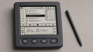
Palm OS turned a tiny monochrome screen, stylus and strict memory limits into a consistent pocket work tool through the Title, Category menu, Command Bar, hardware buttons and Graffiti writing area.

A roughly 160 by 160 low-resolution monochrome screen / Title at upper left and Category pop-up at upper right / A Command Bar rising from the lower edge and four application buttons / Thin one-bit icons, rules and the Graffiti input area

design.mdimage prompt

490

Metal (Java Look and Feel) — DavidL, Metal look and feel in Swing, 2020 — Wikimedia Commons / CC BY-SA 4.0

Metal (Java Look and Feel)

メタル(Java ルック&フィール) / 1998– / Style / Platform Screen Languages

Why it is closeTrustWeb / UIFinanceTechnique

Sun's default look and feel for Swing, built so that a program looks the same on every operating system. Metal was Sun's internal project name for it and stuck as the public one. Blue violet fills, thin straight borders, and a flat refusal to imitate the host platform are its signature.

Internal window title bars laid as a deep blue violet band over a pale blue violet field / A fine texture of dots and diagonal ticks stamped into title bars and dividers / Rectangular buttons with no corner radius, ringed by a one pixel deep blue violet line / The host system draws the outer window frame while everything inside it follows a different visual language

design.mdimage prompt

485

OPEN LOOK — OPEN LOOK style windows and window menu (olvwm), 2016 — Wikimedia Commons / CC BY-SA 4.0 · © Amacbride

OPEN LOOK

オープンルック / 1988–1990s / Style / Platform Screen Languages

Why it is closeTrustWeb / UIFinanceTechnique

A screen language for Unix workstations, specified by Sun Microsystems in a functional specification published by Addison-Wesley in 1989. The book defines two parallel designs, one black and white for monochrome displays and one three dimensional for grayscale and colour, sets a single sans serif variable width face for every common element, and tells implementers that restraint is the key to colour. Each pop-up window carries a pushpin at the left of its header, and pinning it leaves the window on the workspace.

A pushpin at the left end of a pop-up window's header, which pins the window to the workspace instead of dismissing it / Three dots after a label announce a window, an outlined triangle announces a menu / Scrollbars split into an elevator, a cable and top and bottom cable anchors, with the dark part of the cable showing how much is in view / The workspace is a 50 percent dither pattern and menu drop shadows are a 75 percent pattern

design.mdimage prompt

600

OS/2 Workplace Shell — AI-generated interpretation
AI interpretation, not a reference

OS/2 Workplace Shell

OS/2 Workplace Shell / 1992–2001 / Style / Platform Screen Languages

Why it is closeTrustWeb / UIFinanceTechnique

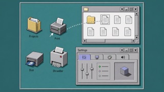
OS/2 treated folders, printers, drives and settings as operable objects rather than loose icons. Dimensional borders, shaded icons, Notebook settings and direct drag-and-drop made the whole desktop one object-oriented workplace.

Pale gray surfaces with double light and dark dimensional edges / Low-color object icons drawn from an oblique view / Notebook settings with stacked edge tabs / Direct dragging among folders, shredder and drives

design.mdimage prompt

561

Elastic UI — AI-generated interpretation
AI interpretation, not a reference

Elastic UI

Elastic UI / 2017– / Style / Platform Screen Languages

Why it is closeTrustWeb / UIFinanceTechnique

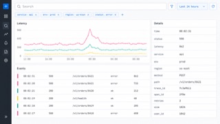
Elastic's interface system is made for searching, filtering and diagnosing large data sets without losing operational density.

Fixed header and left navigation / Persistent query, filter and time controls / Tables and time-series charts in shared panels / Bright series colors limited to data

design.mdimage prompt

570

Ubuntu Yaru — AI-generated interpretation
AI interpretation, not a reference

Ubuntu Yaru

Ubuntu Yaru / 2018– / Style / Platform Screen Languages

Why it is closeTrustWeb / UIFinanceTechnique

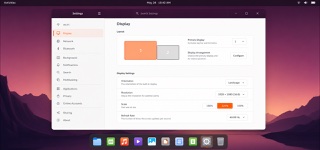
Ubuntu's community-built default theme overlays Adwaita-based GTK and GNOME Shell with Ubuntu orange, dark header bars and Suru-derived icons, distributing windows, shell, icons, cursors and sound as one suite.

Light window body contrasted with a dark header bar / Ubuntu orange for selection and focus / Suru-derived icons based on circles, squares and vertical or horizontal oblongs / One-pixel icon edge, restrained gradient and lower shadow

design.mdimage prompt

545

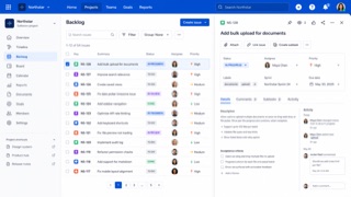
Atlassian Design System — AI-generated interpretation
AI interpretation, not a reference

Atlassian Design System

Atlassian Design System / 2012– / Style / Platform Screen Languages

Why it is closeTrustWeb / UIFinanceTechnique

A system that translates the complexity of Jira and Confluence into shared tokens, content rules, spacing, grids and components. Consistency builds trust while keeping large sets of issues, documents and states navigable.

White and pale gray layers with blue primary actions / Rounded cards and lozenge-shaped status labels / Clear divisions among sidebar, table and detail pane / Color, spacing, radius and elevation controlled by tokens

design.mdimage prompt

555

Salesforce Lightning Design System — Salesforce Lightning Design System — official previewer documentation image, unmodified — Copyright (c) 2015-present, Salesforce.com, Inc. / CC BY-ND 4.0

Salesforce Lightning Design System

Salesforce Lightning / 2015– / Style / Platform Screen Languages

Why it is closeTrustWeb / UIFinanceTechnique

Salesforce's interface language for record-centered business work, organizing objects, actions and status into repeatable workspace patterns.

Object headers with compact metadata / Tabs, cards and activity timelines / Cloud blue with semantic status colors / Dense forms and record tables

design.mdimage prompt

559

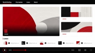
BBC Global Experience Language — AI-generated interpretation
AI interpretation, not a reference

BBC Global Experience Language

BBC GEL / 2010– / Style / Platform Screen Languages

Why it is closeTrustWeb / UIFinanceTechnique

BBC's global experience language unifies news, video, audio and children's products through readable hierarchy, accessible media controls and reusable editorial components.

Black header over white content / Short bold headlines / News cards with consistent image ratios / Highly visible focus, captions and playback controls

design.mdimage prompt

547

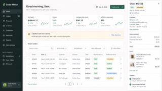
Shopify Polaris — AI-generated interpretation
AI interpretation, not a reference

Shopify Polaris

Shopify Polaris / 2017– / Style / Platform Screen Languages

Why it is closeTrustWeb / UIFinanceTechnique

Shopify's UI framework for giving products, orders, payments and customers one commerce language. Cards and sections separate decisions, while short status and action language helps a merchant keep the store moving.

White cards stacked on a pale ground / Green used as success or forward motion / Title, status and primary action gathered at the top / Compact badges for product, order and payment states

design.mdimage prompt

59

Isotype — Otto Neurath & Gerd Arntz, Gesellschaft und Wirtschaft, 1930 — via gerdarntz.org

Isotype

アイソタイプ / 1920s–1940s / Layout / Information Design

Why it is closeTrustWeb / UIFinanceTechnique

Translates quantity into repeated same-size symbols, making comparison readable before language.

Unified pictograms / Repetition of signs / Axes of comparison / Restricted color

design.mdimage prompt

230

Pictogram System — AIGA/DOT symbol "Restaurant" — Wikimedia Commons / Public domain

Pictogram System

案内用ピクトグラム / 1964– / Style / Information Design

Why it is closeTrustWeb / UIFinanceTechnique

Unified symbol systems that name facilities and actions without language. Tokyo 1964 systematized sport and wayfinding symbols; the AIGA/DOT transportation set became the public-domain world standard.

Geometrized human figures / Uniform stroke weight / Consistency as a system / Independence from language

design.mdimage prompt

560

Mozilla Protocol — AI-generated interpretation
AI interpretation, not a reference

Mozilla Protocol

Mozilla Protocol / 2017– / Style / Platform Screen Languages

Why it is closeTrustWeb / UIFinanceTechnique

Mozilla's flexible web system puts content and global accessibility ahead of decoration while retaining a vivid open-web personality.

Bold black headings and broad white space / Large fields of vivid color / Flexible billboards and cards / Short copy and explicit calls to action

design.mdimage prompt

6

Modernism — Mies van der Rohe, Barcelona Chair and the Barcelona Pavilion — Wikimedia Commons / CC BY-SA 4.0 · © Cl3phact0

Modernism

モダニズム / 1920s–1970s / Style / Functionalism

Why it is closeTrustWeb / UIFinanceCalm

Replaces ornament with reasoned form and aims at universality. The particular answers stand as their own entries, and Bauhaus, Swiss, Minimalism and Streamline Moderne are all separate solutions arrived at from this one stance.

Simplification / Clear hierarchy / Function first / Universal forms

design.mdimage prompt

491

One UI — Armen777444, One UI 7 Device care screen, 2025 — Wikimedia Commons / CC BY 4.0

One UI

ワンUI / 2018– / Style / Platform Screen Languages

Why it is closeTrustWeb / UIFinanceCalm

Samsung's design language for Galaxy devices. It cuts the screen at the height a thumb reaches most easily and calls the part above that the viewing area and the part below the interaction area, so titles sit high while buttons, tabs and dialogs are gathered low. Content is collected into containers with heavily rounded corners, the ground is either white or true black, and a single blue carries every accent.

The upper part of the screen holds nothing but a title and open space, with no touchable control in it / Text and images are collected into card shaped containers with strongly rounded corners / The title bar has only two states, expanded and collapsed, and never rests anywhere in between / In the dark theme the ground goes to true black and only the blue accent sits on top of it

design.mdimage prompt

32

Flat Design / Vector Minimalism — Google, Material Design UI components, 2015 — Wikimedia Commons / Public domain

Flat Design / Vector Minimalism

フラットデザイン / ベクターミニマリズム / 2010s– / Style / UI Expression

Why it is closeTrustWeb / UIFinance

Reduces information to plain planes and color, portable across screens and media.

Uniform planes / Simple shapes / Few shadows / Clear color

design.mdimage prompt

683

Pictures Generation — AI-generated interpretation
AI interpretation, not a reference

Pictures Generation

ピクチャーズ・ジェネレーション / late 1970s–1980s / Style / Postwar American Art

Why it is closeName matchTrustWeb / UIFinance

A late-1970s and 1980s tendency that displaced already familiar advertising, film, magazine, and television images through rephotography, performance, cropping, and overlaid text, exposing systems of authorship, desire, gender, and consumption.

Rephotographed or reenacted images with advertising or film familiarity / Aggressive cropping that removes source context / Short declarative copy over monochrome or limited-color photography / Repeated figures, poses, or commodities whose differences emerge as a series

design.mdimage prompt

24

Skeuomorphism — Flachatmer, guitar amp skeuomorphic UI, Guitarix 0.35.0, 2016 — Wikimedia Commons / CC BY-SA 4.0

Skeuomorphism

スキューモーフィズム / 2000s–2010s / Style / UI Expression

Why it is closeTrustWeb / UIFinanceText match

Borrows cues from real materials and tools to make unknown interactions understandable. It names the principle, so Aqua and Brushed Metal are what the principle looked like when one company shipped it.

Leather, metal, paper / Dimensional shadows / Real-world metaphors / Fine textures

design.mdimage prompt

8

Web Brutalism — AI-generated interpretation
AI interpretation, not a reference

Web Brutalism

ウェブ・ブルータリズム / 2014– / Style / UI Expression

Why it is closeTrustWeb / UIFinance

Puts the browser's default rendering straight on screen and refuses the finished look of templates. The bare structure of the HTML becomes the style itself.

Default headings and links / Blue underlined links / Extreme jumps in size / Rules and white space without ornament

design.mdimage prompt

58

WPA Poster — Harry Herzog / Federal Art Project, See America, 1936–40 — Library of Congress / No known restrictions on publication

WPA Poster

WPAポスター / 1935–1943 / Style / Public Design

Why it is closeTrustWeb / UIFinance

Carries a public purpose broadly and forcefully through simple imagery and few printed colors.

Simplified landscapes / Bold sans-serifs / Screenprint color / A clear call to action

design.mdimage prompt

Editorial policy

IndexStyle is not a list of every term used around design. An independent entry must describe a visual language that can be recognised, reproduced and distinguished from its neighbours. Editorial standard

Back to top