IndexStyle

작품 자체에서 써 내려간 디자인 양식 사전.

순수한 HTML이다.어떤 브라우저에서도 어떤 기기에서도앱이나 계정 없이 열리고,기계도 같은 페이지를 그대로 읽는다.

항목598

사전

스타일 이름이나 만들고 싶은 것을 검색하세요. 이름 일치를 우선하고 용도, 인상, 매체로 가까운 대안을 더합니다.

예시바우하우스고급스러운 채용 사이트신뢰할 수 있는 금융 앱

48/48건 표시

이렇게 해석했습니다Trust금융

494

GOV.UK Design System

GOV.UK デザインシステム / 2012– / 양식 / 플랫폼 화면 언어

가까운 이유Trust금융TechniqueCalm

영국 정부의 Government Digital Service가 공공 서비스를 위해 공개하고 유지하는 설계 언어다. 모든 것을 장식 없는 왼쪽 정렬 한 단으로 GDS Transport에 짜고, 모서리를 굴리지 않은 초록 버튼은 아래 변의 짙은 초록 띠로 두께를 얻어 누르면 그만큼 가라앉는다. 키보드 초점이 놓인 요소는 노란 바탕과 검은 밑줄로 나타낸다.

장식이 없는 한 단의 왼쪽 정렬이고 테두리도 그림자도 거의 쓰지 않는다 / 모서리를 굴리지 않은 초록 버튼의 아래 변에 짙은 초록 띠가 깔리고 누르면 그 두께만큼 가라앉는다 / 초점이 놓인 요소만 노란 바탕으로 바뀌고 그 아래에 검은 선이 그어진다 / 글자 크기는 48, 36, 24, 19, 16px이라는 성긴 단계만 있고 중간 크기가 없다
design.md이미지 프롬프트

ChatGPTClaudeGoogle AI

539

Skeleton Screen — AI가 생성한 해석 이미지
AI 해석 이미지(참고 작품 아님)

Skeleton Screen

スケルトン・スクリーン / 2013– / 기법 / UI 스타일

가까운 이유Trust금융TechniqueCalm

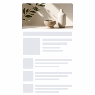
읽어 들이는 동안 회전 표시를 내지 않고 내용이 들어오기 전의 빈 화면을 먼저 보여 준 뒤 거기에 정보를 조금씩 흘려 넣는 방법이다. Luke Wroblewski가 2013년에 자신이 만든 앱 Polar에서 얻은 반성으로 이 이름을 붙여 소개했다. 기다리게 하고 있다는 사실이 아니라 진행되고 있다는 것을 보여 준다.

읽어 들이는 동안 회전 표시도 진행 막대도 나오지 않는다 / 본문과 이미지가 들어갈 자리에 같은 치수의 민무늬 면이 먼저 놓여 있다 / 내용이 오기 전에 배치가 확정되어 있어 도착해도 요소가 움직이지 않는다 / 정보가 한꺼번에 나오지 않고 영역별로 차례차례 채워진다

design.md이미지 프롬프트

ChatGPTClaudeGoogle AI

538

Solarized

ソラライズド / 2011– / 양식 / UI 스타일

가까운 이유Trust금융TechniqueCalm

Ethan Schoonover가 값까지 함께 공개한, 터미널과 편집기를 위한 16색이다. 여덟 개의 바탕색과 여덟 개의 강조색으로 이루어지고 바탕색의 CIELAB 명도 차를 대칭으로 잡아 두어 밝은 바탕과 어두운 바탕을 바꿔도 읽는 결이 달라지지 않는다. 밝기 차이를 낮추고 색상의 차이로 낱말을 구별한다.

바탕색이 순수한 검정도 흰색도 아니어서 하나는 청록으로, 하나는 노랑 쪽으로 기운다 / 본문과 바탕의 명도 차가 작아 흰 바탕에 검정보다 약한 힘으로 읽게 한다 / 여덟 강조색의 밝기가 거의 고르고 색상의 차이만으로 구별된다 / 밝은 바탕과 어두운 바탕을 바꿔도 같은 강조색이 같은 역할로 나온다

design.md이미지 프롬프트

ChatGPTClaudeGoogle AI

326

Banknote Guilloche

紙幣のギヨシェ / 18th century– / 기법 / 공공 디자인

가까운 이유Trust금융Technique

선반으로 깎아낸 기요셰 곡선과 요판 초상이 위조를 거부하는 동시에 신용을 눈에 보이게 만드는 지폐 양식. 1896년 미국의 에듀케이셔널 시리즈는 지폐를 우의화의 걸작으로 끌어올렸다.

끊이지 않는 기요셰 곡선 / 요판으로 새긴 초상 / 섬세한 바탕 선반 세공 / 액면의 위계

design.md이미지 프롬프트

ChatGPTClaudeGoogle AI

118

Fluent 2

フルーエント2 / 2022– / 양식 / 마이크로소프트 UI

가까운 이유Trust금융TechniqueCalm

색과 서체, 여백과 모서리와 깊이를 토큰화하고 Solid·Acrylic·Mica·Smoke 머티리얼을 역할에 따라 마이크로소프트 제품 전반에 배치한다.

Mica와 Acrylic / 중성 톤의 위계 / 부드러운 모서리 / 토큰화된 깊이

design.md이미지 프롬프트

ChatGPTClaudeGoogle AI

554

Carbon Design System

Carbon Design System / 2015– / 양식 / 플랫폼 화면 언어

가까운 이유Trust금융TechniqueCalm

IBM's system for data-heavy enterprise products, combining a strict grid, IBM Plex type and compact components so complex work remains legible.

IBM Plex and strong type hierarchy / White or deep-gray work surfaces / Dense tables, filters and side navigation / Blue reserved for action and focus

design.md이미지 프롬프트

ChatGPTClaudeGoogle AI

472

Material Design

マテリアルデザイン / 2014– / 양식 / 구글 UI

가까운 이유Trust금융Technique

종이와 잉크라는 물리의 비유를 그림자와 겹침의 규칙으로 옮겨 놓은 설계 체계. 요소에 높이를 주고 그림자로 위계를 보이며 움직임에 물리적 인과를 담는다. 이후 UI 설계가 「체계로 배포된다」는 것의 본보기가 되었다.

높이로 나타내는 위계와 그림자 / 종이처럼 겹치는 면 / 인과를 보여 주는 모션 / 규격화된 여백의 단위

design.md이미지 프롬프트

ChatGPTClaudeGoogle AI

489

Adwaita

アドワイタ / 2011– / 양식 / 플랫폼 화면 언어

가까운 이유Trust금융TechniqueCalm

GNOME이 자신의 기본 모습에 붙인 이름이며, 지침서는 밝은 판과 어두운 판과 고대비 판을 같은 부품으로 성립시킨다고 정한다. 창의 위쪽 끝을 헤더 바가 한 줄 가로지르고, 거기 놓이는 버튼은 배경도 테두리도 그리지 않는다. 아이콘은 16x16px 단색 심볼릭으로 통일된다.

창의 위쪽 끝을 가로지르는 헤더 바 한 줄. 왼쪽과 가운데와 오른쪽 세 지점에 붙이고, 가운데에 창의 제목이 앉는다 / 헤더 바의 버튼은 배경도 테두리도 없고, 기호와 글자만 면 위에 뜬다 / 16x16px로 그린 단색 심볼릭 아이콘. 주요 선은 2px 굵기이고 원근을 주지 않은 정면 형태다 / Blue 3의 #3584e4를 포함해 색상마다 다섯 단계를 갖춘 공개 팔레트

design.md이미지 프롬프트

ChatGPTClaudeGoogle AI

229

Schematic Transit Diagram

スキーマティック路線図 / 1933– / 레이아웃 / 정보 디자인

가까운 이유Trust금융TechniqueCalm

지리적 정확성을 버리고 수평·수직·45도의 선과 균등한 역 간격을 택한다. 1933년 벡의 런던 지하철 다이어그램이 이를 확립해 전 세계 노선도의 공용어로 만들었다.

45도로 제한된 선 / 균등한 역 간격 / 색으로 구분된 노선 / 지리로부터의 독립

design.md이미지 프롬프트

ChatGPTClaudeGoogle AI

543

GitHub Primer

GitHub Primer / 2017– / 양식 / 플랫폼 화면 언어

가까운 이유Trust금융TechniqueCalm

GitHub's design system for turning dense development workflows into shared rules for color, type, icons, spacing and components. It favors flow over decoration, keeping many states and actions in a small area without giving up accessibility or responsive behavior.

Neutral surfaces with blue links and restrained status colors / Octicons paired with short action labels / Thin borders separating lists, tabs and sidebars / Consistent steps of type and spacing even at high density

design.md이미지 프롬프트

ChatGPTClaudeGoogle AI

534

Breeze

ブリーズ / 2014– / 양식 / 플랫폼 화면 언어

가까운 이유Trust금융TechniqueCalm

KDE가 Plasma 5와 함께 도입한 기본 시각 양식이다. 발표문은 스스로 고대비의 평면적인 테마라고 설명하며, 그림을 단순하고 단색에 가깝게 정리한다. 장식 대신 글자 짜임에 기대어 요소를 구별하게 하고, 밝은 판과 어두운 판을 처음부터 짝으로 갖춘다.

음영이 없는 평면이고 요소의 경계는 색 차이와 대비만으로 드러난다 / 아이콘과 그림이 단색에 가깝게 정리되어 쓰는 색 수가 적다 / 제목과 본문의 대비가 장식을 대신하고 글자 짜임이 화면의 뼈대가 된다 / 같은 그림 그대로 밝은 판과 어두운 판이 짝으로 존재한다

design.md이미지 프롬프트

ChatGPTClaudeGoogle AI

568

GitLab Pajamas — AI가 생성한 해석 이미지
AI 해석 이미지(참고 작품 아님)

GitLab Pajamas

GitLab Pajamas / 2018– / 양식 / 플랫폼 화면 언어

가까운 이유Trust금융TechniqueCalm

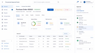
GitLab's screen language connects code, issues, review, CI/CD and security inside one DevSecOps product through GitLab Sans and Mono, persistent navigation, dense lists and a purple-inflected neutral palette.

GitLab Sans paired with GitLab Mono for code / Layered structure built from left navigation and application chrome / Dense issue, merge-request and pipeline lists / White or charcoal surfaces with purple as brand focus

design.md이미지 프롬프트

ChatGPTClaudeGoogle AI

556

SAP Fiori

SAP Fiori / 2013– / 양식 / 플랫폼 화면 언어

가까운 이유Trust금융TechniqueCalm

SAP's role-based design language reduces enterprise processes to the information and actions each person needs, then carries them consistently across devices.

Role-based launchpad tiles / Shell bar and object pages / Compact tables and semantic status / Calm blue on pale work surfaces

design.md이미지 프롬프트

ChatGPTClaudeGoogle AI

566

PatternFly — AI가 생성한 해석 이미지
AI 해석 이미지(참고 작품 아님)

PatternFly

PatternFly / 2012– / 양식 / 플랫폼 화면 언어

가까운 이유Trust금융TechniqueCalm

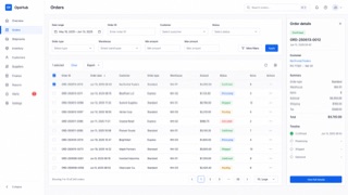
Red Hat's open-source screen language for enterprise products keeps complex infrastructure manageable through dense navigation, data views and tightly controlled status color.

Dark masthead and left navigation / Dense tables and forms on white or pale-gray work surfaces / Blue for primary action and red, orange or green for status / List, detail and action shown in coordinated panes

design.md이미지 프롬프트

ChatGPTClaudeGoogle AI

571

Canonical Vanilla — AI가 생성한 해석 이미지
AI 해석 이미지(참고 작품 아님)

Canonical Vanilla

Canonical Vanilla / 2013– / 양식 / 플랫폼 화면 언어

가까운 이유Trust금융TechniqueCalm

Canonical's CSS-based screen language unifies Ubuntu, MAAS, Juju and related sites and applications through Ubuntu type, split grids, ruled sections and generous space, optimized for scanning long technical content.

Thin large headings paired with bold smaller headings in Ubuntu type / Asymmetric 25/75 and 50/50 splits / Fine rules above sections and generous vertical space / White surfaces, dark text and orange or aubergine focus

design.md이미지 프롬프트

ChatGPTClaudeGoogle AI

59

Isotype

アイソタイプ / 1920s–1940s / 레이아웃 / 정보 디자인

가까운 이유Trust금융Technique본문 일치

수량을 같은 크기의 기호 반복으로 옮겨, 언어보다 먼저 비교를 읽히게 한다.

통일된 픽토그램 / 기호의 반복 / 비교의 축 / 제한된 색

design.md이미지 프롬프트

ChatGPTClaudeGoogle AI

544

Adobe Spectrum

Adobe Spectrum / 2013– / 양식 / 플랫폼 화면 언어

가까운 이유Trust금융TechniqueCalm

Adobe's cross-application design system. Under the principles Rational, Human and Focused, it changes density between desktop and mobile while keeping tool-heavy interfaces from pulling attention away from the work itself.

Neutral surfaces with vivid color reserved for selection / Icons, type and borders scaling together / Toolbars and property panels joined by fine divisions / The creative work stays stronger than the interface

design.md이미지 프롬프트

ChatGPTClaudeGoogle AI

484

Motif

モチーフ / 1989– / 양식 / 플랫폼 화면 언어

가까운 이유Trust금융Technique본문 일치

The Open Group이 유지하는 UNIX 워크스테이션용 화면 언어로, IEEE 1295로 규격화되어 200종이 넘는 기종에 실렸다. 공식 자료가 스스로 3D 베벨 외관이라고 부르는 그대로, 회색 면의 가장자리에 밝고 어두운 두 색을 두어 모든 부품을 밀어 올려 보여 준다.

회색 면의 위쪽과 왼쪽이 밝고 아래쪽과 오른쪽이 어두운 테두리여서 부품이 모두 떠 보인다 / 누르고 있는 동안에만 명암이 뒤바뀌어 부품이 가라앉아 보인다 / 입력을 받고 있는 부품의 바깥을 가는 사각 테두리가 빙 둘러싼다 / 스크롤 막대는 모서리가 각진 사각형이고 양 끝에 삼각형 화살표 버튼이 붙는다

design.md이미지 프롬프트

ChatGPTClaudeGoogle AI

485

OPEN LOOK

オープンルック / 1988–1990s / 양식 / 플랫폼 화면 언어

가까운 이유Trust금융Technique본문 일치

Sun Microsystems가 규격서로 펴낸 UNIX 워크스테이션용 화면 언어다. 흑백 표시용 판과 입체 표시용 판을 동시에 정하고, 공통 요소는 모두 한 종류의 산세리프로 짜며, 색은 절제해서 쓴다고 정했다. 팝업 창의 왼쪽 어깨에는 압정이 있어서 꽂으면 창이 작업 면에 남는다.

팝업 창 머리말 왼쪽 끝에 있는 압정. 꽂은 창은 닫히지 않고 작업 면에 남는다 / 레이블 뒤에 이어지는 점 세 개는 다른 창을, 윤곽만 있는 삼각형은 메뉴를 예고한다 / 스크롤 막대는 엘리베이터와 케이블과 위아래 케이블 앵커로 나뉘고, 케이블의 짙은 부분이 보이는 비율을 나타낸다 / 작업 면은 50퍼센트, 메뉴의 그림자는 75퍼센트 망점으로 만들어진다

design.md이미지 프롬프트

ChatGPTClaudeGoogle AI

491

One UI

ワンUI / 2018– / 양식 / 플랫폼 화면 언어

가까운 이유Trust금융Calm본문 일치

삼성이 Galaxy를 위해 정한 설계 언어다. 엄지가 가장 쉽게 닿는 높이에서 화면을 갈라 위쪽을 보기만 하는 영역, 아래쪽을 만지는 영역으로 삼고, 제목은 위에 두고 버튼과 탭과 대화 상자는 아래로 모은다. 내용은 모서리를 크게 굴린 상자에 담고, 바탕은 흰색 아니면 순수한 검정, 강조는 파랑 하나로 좁힌다.

화면 위쪽은 제목과 여백만으로 채워지고 만질 수 있는 부품이 하나도 놓이지 않는다 / 모서리를 크게 굴린 카드 모양 상자에 글과 이미지가 한 덩어리씩 담긴다 / 위쪽 제목은 펼친 상태와 접힌 상태 둘만 가지며 중간 높이에서 멈추지 않는다 / 어두운 주제에서는 바탕이 순수한 검정이 되고 그 위에 파란 강조만 얹힌다

design.md이미지 프롬프트

ChatGPTClaudeGoogle AI

532

Xerox Star Interface

ゼロックス・スター・インターフェース / 1981–1990s / 양식 / 플랫폼 화면 언어

가까운 이유Trust금융Technique본문 일치

1981년 Xerox 8010의 화면이 정한 설계 언어다. 폴더, 수발신 바구니, 파일 서랍 같은 사무용품을 이름표가 붙은 그림으로 늘어놓았고, 당시 안내 책자는 그것을 전자 책상 위라고 불렀다. 화면 속 물건은 마우스로 자유롭게 옮기고 복제하고 버릴 수 있다.

화면의 그림에는 반드시 글자 이름표가 붙어 그림 하나에만 의미를 맡기지 않는다 / 그림은 폴더, 수발신 바구니, 파일 서랍처럼 사무 책상 위에 있는 물건을 옮겨 놓은 것이다 / 물건을 마우스로 집어 옮길 수 있고 이동과 복제와 삭제가 같은 조작의 계열을 이룬다 / 표 계산은 행과 열의 격자로 나타나고 격자를 다루는 명령이 메뉴에 모인다

design.md이미지 프롬프트

ChatGPTClaudeGoogle AI

561

Elastic UI

Elastic UI / 2017– / 양식 / 플랫폼 화면 언어

가까운 이유Trust금융Technique

Elastic's interface system is made for searching, filtering and diagnosing large data sets without losing operational density.

Fixed header and left navigation / Persistent query, filter and time controls / Tables and time-series charts in shared panels / Bright series colors limited to data

design.md이미지 프롬프트

ChatGPTClaudeGoogle AI

545

Atlassian Design System

Atlassian Design System / 2012– / 양식 / 플랫폼 화면 언어

가까운 이유Trust금융Technique

A system that translates the complexity of Jira and Confluence into shared tokens, content rules, spacing, grids and components. Consistency builds trust while keeping large sets of issues, documents and states navigable.

White and pale gray layers with blue primary actions / Rounded cards and lozenge-shaped status labels / Clear divisions among sidebar, table and detail pane / Color, spacing, radius and elevation controlled by tokens

design.md이미지 프롬프트

ChatGPTClaudeGoogle AI

546

Ant Design

Ant Design / 2015– / 양식 / 플랫폼 화면 언어

가까운 이유Trust금융Technique

A design system that keeps enterprise web applications at low entropy through reusable components and page patterns. Its values — Natural, Certain, Meaningful and Growing — systematize tables, forms, hierarchy and state without reducing information density.

Dense tables set in small type and fine rules / Blue primary actions with explicit semantic colors / Consistent forms, pagination, trees and tables / Readability achieved through alignment and repetition, not generous space

design.md이미지 프롬프트

ChatGPTClaudeGoogle AI

555

Salesforce Lightning Design System

Salesforce Lightning / 2015– / 양식 / 플랫폼 화면 언어

가까운 이유Trust금융Technique

Salesforce's interface language for record-centered business work, organizing objects, actions and status into repeatable workspace patterns.

Object headers with compact metadata / Tabs, cards and activity timelines / Cloud blue with semantic status colors / Dense forms and record tables

design.md이미지 프롬프트

ChatGPTClaudeGoogle AI

557

U.S. Web Design System

米国Webデザインシステム / 2015– / 양식 / 공공 디자인

가까운 이유Trust금융Calm

A shared system for accessible, mobile-friendly and trustworthy U.S. federal web services, built from tested public-service patterns.

White, navy and restrained federal red / Large plain headings and readable body text / Official-site banner / Clear forms, alerts and step indicators

design.md이미지 프롬프트

ChatGPTClaudeGoogle AI

230

Pictogram System

案内用ピクトグラム / 1964– / 양식 / 정보 디자인

가까운 이유Trust금융Technique

언어 없이 시설과 행위를 지시하는 통일된 기호 체계. 1964년 도쿄가 경기와 안내 기호를 체계화했고, AIGA/DOT의 교통 기호 세트는 퍼블릭 도메인의 세계 표준이 되었다.

기하학화된 인체 / 일정한 획 굵기 / 시스템으로서의 일관성 / 언어로부터의 독립

design.md이미지 프롬프트

ChatGPTClaudeGoogle AI

490

Metal (Java Look and Feel)

メタル(Java ルック&フィール) / 1998– / 양식 / 플랫폼 화면 언어

가까운 이유Trust금융Technique

Sun이 Swing의 기본 외관으로 만든 설계 언어로, 어떤 운영체제 위에서도 프로그램이 똑같이 보이도록 하는 것을 노렸다. Metal은 Sun 내부의 프로젝트 이름이 그대로 공식 명칭이 된 것이다. 푸른 보라의 면과 1픽셀의 곧은 테두리를 지니며, 바탕이 되는 플랫폼의 양식을 전혀 물려받지 않는다.

옅은 푸른 보라 바탕 위에 짙은 푸른 보라 띠로 놓인 내부 창의 제목 표시줄 / 제목 표시줄과 구분선에 새겨진 잔 점과 빗금의 질감 / 모서리를 굴리지 않은 사각형 버튼과 그 둘레를 두른 1픽셀의 짙은 푸른 보라 선 / 바깥 창틀은 운영체제가 그리는데 그 안쪽만 다른 양식으로 그려진 이중 구조

design.md이미지 프롬프트

ChatGPTClaudeGoogle AI

547

Shopify Polaris

Shopify Polaris / 2017– / 양식 / 플랫폼 화면 언어

가까운 이유Trust금융Technique

Shopify's UI framework for giving products, orders, payments and customers one commerce language. Cards and sections separate decisions, while short status and action language helps a merchant keep the store moving.

White cards stacked on a pale ground / Green used as success or forward motion / Title, status and primary action gathered at the top / Compact badges for product, order and payment states

design.md이미지 프롬프트

ChatGPTClaudeGoogle AI

558

NHS Design System

NHSデザインシステム / 2016– / 양식 / 공공 디자인

가까운 이유Trust금융Calm

The NHS system makes urgent health information and services calm, direct and consistent through plain language, strong focus states and tested clinical patterns.

NHS blue and generous white space / Large headings and short paragraphs / Callouts for warning and care advice / Visible focus and simple forms

design.md이미지 프롬프트

ChatGPTClaudeGoogle AI

559

BBC Global Experience Language

BBC GEL / 2010– / 양식 / 플랫폼 화면 언어

가까운 이유Trust금융Technique

BBC's global experience language unifies news, video, audio and children's products through readable hierarchy, accessible media controls and reusable editorial components.

Black header over white content / Short bold headlines / News cards with consistent image ratios / Highly visible focus, captions and playback controls

design.md이미지 프롬프트

ChatGPTClaudeGoogle AI

580

CDE Interface — AI가 생성한 해석 이미지
AI 해석 이미지(참고 작품 아님)

CDE Interface

CDEインターフェース / 1993–2000s / 양식 / 플랫폼 화면 언어

가까운 이유Trust금융Technique

The Common Desktop Environment unified UNIX workstations through Motif-derived bevels, a persistent Front Panel, workspace switching and low-color icons, making different hardware feel like one workplace.

Box-like Front Panel along the lower edge / Raised buttons and recessed fields made from paired light and dark borders / Low-color pixel icons with dark outlines / Persistent buttons for switching among workspaces

design.md이미지 프롬프트

ChatGPTClaudeGoogle AI

582

GNOME Clearlooks — AI가 생성한 해석 이미지
AI 해석 이미지(참고 작품 아님)

GNOME Clearlooks

GNOME Clearlooks / 2005–2011 / 양식 / 플랫폼 화면 언어

가까운 이유Trust금융Calm

GNOME 2.12's standard theme made GTK applications friendly and simple through pale-gray windows, blue selection, restrained gloss and firm boundaries.

Pale-gray surfaces with blue selection bars / A quiet highlight only along button tops / Tabs and fields with restrained rounding / Small GNOME icons and a concise two-level hierarchy

design.md이미지 프롬프트

ChatGPTClaudeGoogle AI

560

Mozilla Protocol

Mozilla Protocol / 2017– / 양식 / 플랫폼 화면 언어

가까운 이유Trust금융Technique

Mozilla's flexible web system puts content and global accessibility ahead of decoration while retaining a vivid open-web personality.

Bold black headings and broad white space / Large fields of vivid color / Flexible billboards and cards / Short copy and explicit calls to action

design.md이미지 프롬프트

ChatGPTClaudeGoogle AI

570

Ubuntu Yaru — AI가 생성한 해석 이미지
AI 해석 이미지(참고 작품 아님)

Ubuntu Yaru

Ubuntu Yaru / 2018– / 양식 / 플랫폼 화면 언어

가까운 이유Trust금융Technique

Ubuntu's community-built default theme overlays Adwaita-based GTK and GNOME Shell with Ubuntu orange, dark header bars and Suru-derived icons, distributing windows, shell, icons, cursors and sound as one suite.

Light window body contrasted with a dark header bar / Ubuntu orange for selection and focus / Suru-derived icons based on circles, squares and vertical or horizontal oblongs / One-pixel icon edge, restrained gradient and lower shadow

design.md이미지 프롬프트

ChatGPTClaudeGoogle AI

8

Web Brutalism — AI가 생성한 해석 이미지
AI 해석 이미지(참고 작품 아님)

Web Brutalism

ウェブ・ブルータリズム / 2014– / 양식 / UI 스타일

가까운 이유Trust금융

브라우저의 기본 표시를 그대로 내보내며 다듬어진 템플릿의 외양을 거부한다.

기본 제목과 링크 / 밑줄 친 파란 링크 / 극단적인 크기 차이 / 장식 없는 선과 여백

design.md이미지 프롬프트

ChatGPTClaudeGoogle AI

31

Neubrutalism — AI가 생성한 해석 이미지
AI 해석 이미지(참고 작품 아님)

Neubrutalism

ニューブルータリズム / 2010s– / 양식 / UI 스타일

가까운 이유Trust금융

두꺼운 테두리와 투박한 색으로 지나치게 매끈해진 웹에 따뜻하게 반기를 든다.

두꺼운 검은 테두리 / 딱딱한 그림자 / 선명한 색 / 납작한 컴포넌트

design.md이미지 프롬프트

ChatGPTClaudeGoogle AI

24

Skeuomorphism

スキューモーフィズム / 2000s–2010s / 양식 / UI 스타일

가까운 이유Trust금융

실제 재료와 도구의 단서를 빌려 낯선 상호작용을 이해할 수 있게 만든다. 원리를 가리키는 이름이므로 아쿠아도 브러시드 메탈도 이 원리가 특정 제품에서 구현된 모습에 해당한다.

가죽·금속·종이 / 입체적인 그림자 / 현실 세계의 은유 / 섬세한 질감

design.md이미지 프롬프트

ChatGPTClaudeGoogle AI

55

De Stijl

デ・ステイル / 1917–1931 / 양식 / 기하 추상

가까운 이유Trust금융TechniqueCalm

어휘를 수직과 수평, 원색으로 제한하고 균형에서 보편적 질서를 세운다.

수직과 수평 / 빨강, 파랑, 노랑 / 흰 면 / 비대칭의 균형

design.md이미지 프롬프트

ChatGPTClaudeGoogle AI

381

Staff Notation

五線譜 / 11th century– / 양식 / 기보 체계

가까운 이유Trust금융TechniqueCalm

귀도의 선에서 오선보에 이르기까지, 음의 높이를 좌표에 고정한 기보법이다. 시간을 왼쪽에서 오른쪽으로, 높이를 위아래로 옮기는 이 평면 설계는 천 년을 이어 쓰이는 정보 디자인 최장수 포맷이다.

다섯 줄의 좌표계 / 왼쪽에서 오른쪽으로 흐르는 시간 / 음자리표와 조표 / 시간을 나누는 마디줄

design.md이미지 프롬프트

ChatGPTClaudeGoogle AI

편집 방침

IndexStyle은 디자인 주변의 모든 용어를 싣지 않습니다. 독립 항목은 알아볼 수 있고 재현할 수 있으며 이웃 양식과 구별되는 시각 언어여야 합니다. 수록 기준

맨 위로