GitHub Primer
GitHub Primer / 2017– / 양식 / 플랫폼 화면 언어
GitHub의 디자인 시스템은 빽빽한 개발 흐름을 색, 글자, 아이콘, 간격, 컴포넌트의 공통 규칙으로 바꾼다. 장식보다 작업의 흐름을 앞세워 좁은 면에 많은 상태와 행동을 담으면서도 접근성과 반응형 동작을 포기하지 않는다.


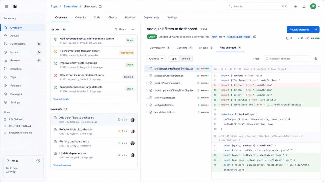
한눈에 판단
시각적 특징
- 중립적인 면과 파란 링크, 절제된 상태색
- 짧은 행동 이름과 함께 쓰는 Octicon
- 목록, 탭, 사이드바를 나누는 가는 테두리
- 정보가 빽빽해도 일정한 글자와 간격 단계
적합한 용도
- Developer SaaS and admin tools that must hold many states and actions on one screen
- Keeping information density and accessibility consistent across product teams
이 양식 사용하기
짧은 지침을 프로젝트에 적용하거나 구조화된 사양을 AI 도구에 넘길 수 있습니다.
자세한 제작법과 출처제작 규칙, 실제 사례, 비교, 연구, 인용 형식
사전 항목
- 타이포그래피
- Use one plain sans for body and labels; build hierarchy through weight and color.
- 구성
- Separate lists, tabs and sidebars with fine rules and hold spacing to a small token set.
- 재료
- Start from neutrals; reserve blue for links and semantic colors for success, warning and danger.
- 주의
- Adding borders and tiny controls to look like GitHub only creates a cramped admin screen when the work has no clear priority.
- 더 읽을거리
- Primer product principles / Octicons and semantic meaning / Responsive design at high density
관련 항목
- Swiss (スイス・スタイル)공통 인상: Trust / Calm.GitHub Primer와 Swiss 비교
- GOV.UK Design System (GOV.UK デザインシステム)같은 계열: 플랫폼 화면 언어.GitHub Primer와 GOV.UK Design System 비교
플랫폼 화면 언어 더 보기
플랫폼 화면 언어에서 공통 인상이 많은 항목을 우선해 골랐습니다.
- Adwaita (アドワイタ)공통 인상: Technique / Calm / Trust.
- Breeze (ブリーズ)공통 인상: Technique / Calm / Trust.
- Adobe Spectrum (Adobe Spectrum)공통 인상: Technique / Trust / Calm.
이 항목을 인용하기
사전은 링크되기 위해 있다. 글을 쓰는 자리에 맞는 형식을 그대로 가져가면 된다.
- Link
- https://indexstyle.org/ko/styles/github-primer
- Markdown
- [GitHub Primer — IndexStyle](https://indexstyle.org/ko/styles/github-primer)
- HTML
- <a href="https://indexstyle.org/ko/styles/github-primer">GitHub Primer — IndexStyle</a>