Minimalism vs Paperback Chic
ミニマリズム / ペーパーバック・シック
Minimalism comes from Functionalism and Paperback Chic from Publishing and Editing. They are reached for with some of the same intent, which is where they get confused.
Minimalism
%201%E2%80%935%20(1987)%2C%20Tate%20Modern%2C%20London%2C%20UK.jpg)
Removes elements to maximize the meaning and tension of what remains.
Paperback Chic
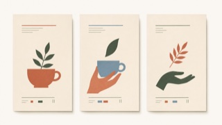
A brand style that uses soft color, literary serif type, flat cut-paper illustration, and generous space to make everyday products resemble new independent-press books. Luxury comes from edited intimacy rather than gloss.
| Minimalism | Paperback Chic | |
|---|---|---|
| Era | 1960s– | late 2010s– |
| Family | Functionalism | Publishing and Editing |
| Kind | Style | Style |
| Cues | Vast white space / Few elements / Quiet color / Precise spacing | Didone or retro serif display type / Soft cream, muted orange, green, and blue fields / Flat plant and figure illustrations resembling cut paper or printmaking / Vertical cover-like whitespace and small explanatory text |
| Best used for | Focusing attention on a single value · Letting quality speak quietly | Food, cosmetics, and household products sold through editorial story rather than technical explanation · Aligning packaging and web for small brands that need an intimate but adult voice |
| Type | A light sans-serif or a well-cut serif | Pair a large serif headline with small sans-serif explanation, building hierarchy from the contrast alone. |
| Composition | One message, one focal point, wide margins | Stack elements like a book cover, offset the illustration from center, and place small information within the whitespace. |
| Material | Nearly achromatic; texture in exactly one place | Use uncoated stock, matte spot color, and flat cut-paper forms while avoiding shadow and gloss. |
| Caution | Missing information is not minimal. Decide priorities before you cut. | Pastels and plants alone become generic natural packaging. The type hierarchy must feel like publishing and the product needs a specific story. |