Corporate Memphis vs Paperback Chic
コーポレート・メンフィス / ペーパーバック・シック
Corporate Memphis comes from Illustration Styles and Paperback Chic from Publishing and Editing. They are reached for with some of the same intent, which is where they get confused.
Corporate Memphis
.png)

Explains digital services as safe and friendly through simplified figures, geometry and soft color.
Paperback Chic
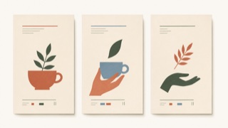
A brand style that uses soft color, literary serif type, flat cut-paper illustration, and generous space to make everyday products resemble new independent-press books. Luxury comes from edited intimacy rather than gloss.
| Corporate Memphis | Paperback Chic | |
|---|---|---|
| Era | mid-2010s– | late 2010s– |
| Family | Illustration Styles | Publishing and Editing |
| Kind | Style | Style |
| Cues | Exaggerated body ratios / Flat color / Geometric plants / White grounds | Didone or retro serif display type / Soft cream, muted orange, green, and blue fields / Flat plant and figure illustrations resembling cut paper or printmaking / Vertical cover-like whitespace and small explanatory text |
| Best used for | Explaining how a new service works in a short space on screen · Giving hiring and benefits pages one relaxed and consistent tone | Food, cosmetics, and household products sold through editorial story rather than technical explanation · Aligning packaging and web for small brands that need an intimate but adult voice |
| Type | Geometric sans at light weight, headlines kept to one line | Pair a large serif headline with small sans-serif explanation, building hierarchy from the contrast alone. |
| Composition | Keep the white ground open and set figures diagonally toward the text | Stack elements like a book cover, offset the illustration from center, and place small information within the whitespace. |
| Material | Flat color without outlines, held to two or three muted hues | Use uncoated stock, matte spot color, and flat cut-paper forms while avoiding shadow and gloss. |
| Caution | Reducing everything to shapes anyone could draw leaves images indistinguishable from competitors, flattens the people into symbols of diversity, and tells the viewer nothing about what the company does. | Pastels and plants alone become generic natural packaging. The type hierarchy must feel like publishing and the product needs a specific story. |