Paperback Chic
ペーパーバック・シック / late 2010s– / 양식 / 출판과 편집
일상적인 제품이 새로운 독립 출판 서적처럼 보이도록 부드러운 색상, 문학적인 세리프 폰트, 평면 재단 종일 그림, 충분한 공간을 사용하는 브랜드 스타일입니다. 고급스러움은 글라스를 넘어 편집된 친밀함에서 나옵니다.
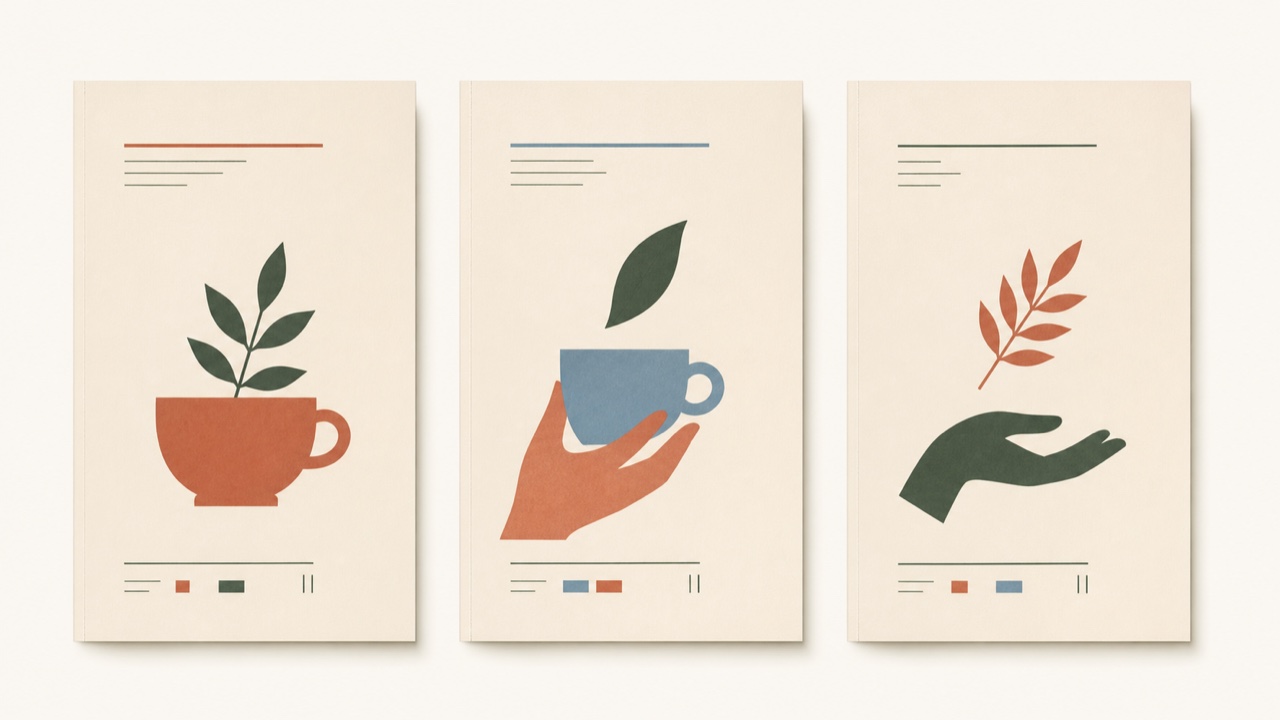
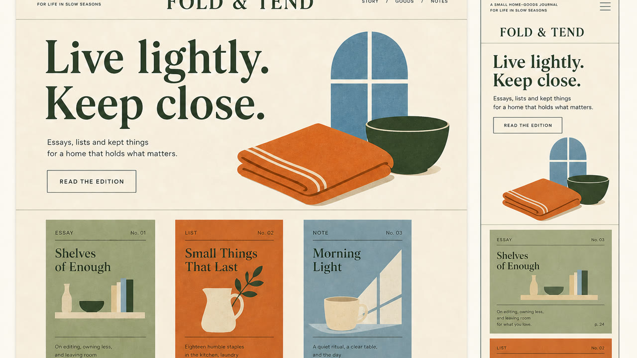
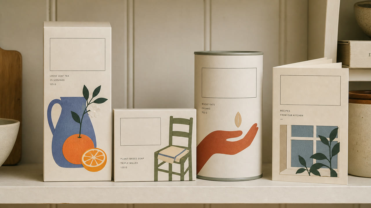
한눈에 판단
시각적 특징
- Didone 또는 복고풍 세리프 표시 폰트
- 부드러운 크림색, 흐릿한 오렌지색, 녹색, 파란색 필드
- 잘린 종이 또는 인쇄와 유사한 식물 및 인물 그림
- 수직 커버와 같은 공백과 작은 설명 텍스트
적합한 용도
- Food, cosmetics, and household products sold through editorial story rather than technical explanation
- Aligning packaging and web for small brands that need an intimate but adult voice
이 양식 사용하기
짧은 지침을 프로젝트에 적용하거나 구조화된 사양을 AI 도구에 넘길 수 있습니다.
자세한 제작법과 출처제작 규칙, 실제 사례, 비교, 연구, 인용 형식
사전 항목
- 타이포그래피
- Pair a large serif headline with small sans-serif explanation, building hierarchy from the contrast alone.
- 구성
- Stack elements like a book cover, offset the illustration from center, and place small information within the whitespace.
- 재료
- Use uncoated stock, matte spot color, and flat cut-paper forms while avoiding shadow and gloss.
- 주의
- Pastels and plants alone become generic natural packaging. The type hierarchy must feel like publishing and the product needs a specific story.
- 더 읽을거리
- late-2010s editorial branding / the influence of independent publishing / soft illustration and literary typography
관련 항목
- Minimalism (ミニマリズム)공통 인상: Calm.Paperback Chic와 Minimalism 비교
- Corporate Memphis (コーポレート・メンフィス)공통 인상: Intimacy.Paperback Chic와 Corporate Memphis 비교
출판과 편집 더 보기
출판과 편집에서 공통 인상이 많은 항목을 우선해 골랐습니다.
- Onchi Kōshirō Book Design (恩地孝四郎の装幀)공통 인상: Luxury / Intimacy / Calm.
- The Face (ザ・フェイス)공통 인상: Luxury / Calm.
- Illuminated Manuscript (彩飾写本)공통 인상: Luxury / Calm.
이 항목을 인용하기
사전은 링크되기 위해 있다. 글을 쓰는 자리에 맞는 형식을 그대로 가져가면 된다.
- Link
- https://indexstyle.org/ko/styles/paperback-chic
- Markdown
- [Paperback Chic — IndexStyle](https://indexstyle.org/ko/styles/paperback-chic)
- HTML
- <a href="https://indexstyle.org/ko/styles/paperback-chic">Paperback Chic — IndexStyle</a>