Paperback Chic
ペーパーバック・シック / late 2010s– / 风格 / 出版与编辑
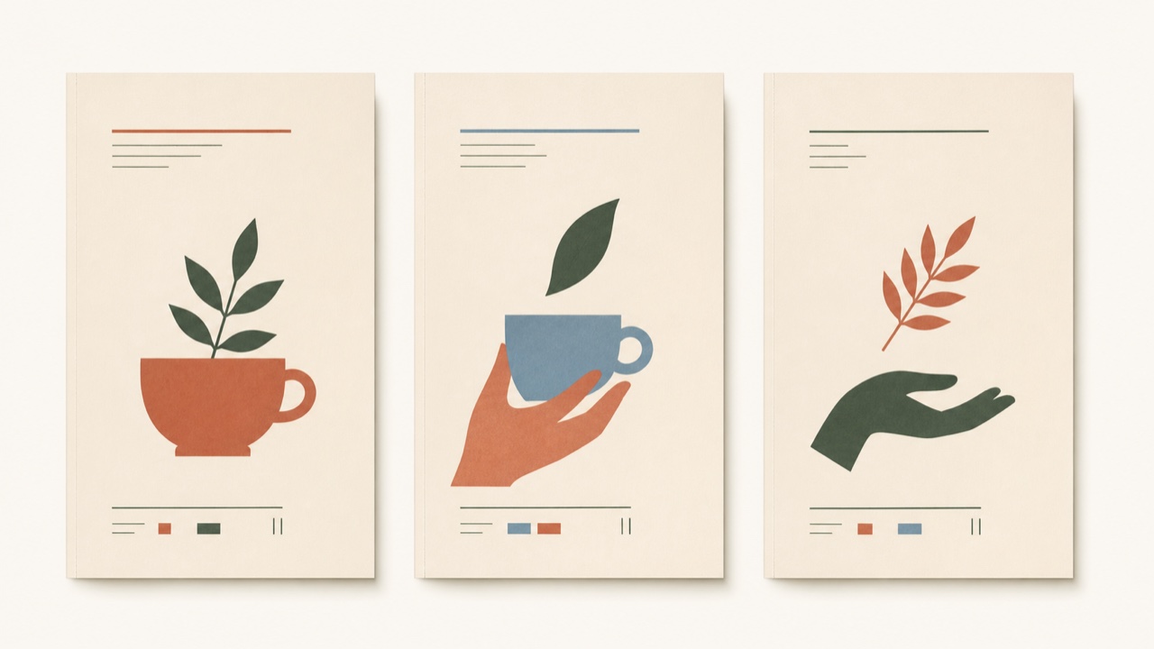
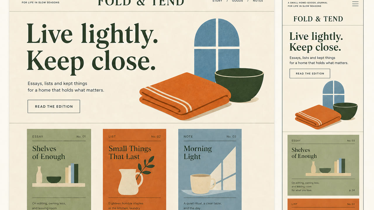
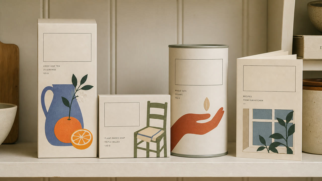
一种品牌风格,使用柔和的颜色、文学衬线字体、平面的剪纸插图和宽敞的空间,使日常产品看起来像新出版的独立书籍。奢华来自于精心的亲密关系,而不是光鲜亮丽。
快速判断
视觉特征
- Didone 或复古衬线显示字体
- 柔和的奶油色、柔和的橙色、绿色和蓝色背景
- 扁平的植物和人物插图,类似于剪纸或版画
- 垂直的封面般的空白空间和小型的说明性文本
适用场景
- Food, cosmetics, and household products sold through editorial story rather than technical explanation
- Aligning packaging and web for small brands that need an intimate but adult voice
使用这一风格
把简短指引带入项目,或将结构化规格交给AI工具。
详细方法与出处制作规则、真实案例、比较、研究与引用格式
辞典词条
- 字体
- Pair a large serif headline with small sans-serif explanation, building hierarchy from the contrast alone.
- 版面
- Stack elements like a book cover, offset the illustration from center, and place small information within the whitespace.
- 材料
- Use uncoated stock, matte spot color, and flat cut-paper forms while avoiding shadow and gloss.
- 注意
- Pastels and plants alone become generic natural packaging. The type hierarchy must feel like publishing and the product needs a specific story.
- 延伸阅读
- late-2010s editorial branding / the influence of independent publishing / soft illustration and literary typography
相关词条
- Minimalism (ミニマリズム)共同感受:Calm。比较Paperback Chic与Minimalism
- Corporate Memphis (コーポレート・メンフィス)共同感受:Intimacy。比较Paperback Chic与Corporate Memphis
继续浏览出版与编辑
从出版与编辑中按共同感受优先推荐以下词条。
- Onchi Kōshirō Book Design (恩地孝四郎の装幀)共同感受:Luxury / Intimacy / Calm。
- The Face (ザ・フェイス)共同感受:Luxury / Calm。
- Illuminated Manuscript (彩飾写本)共同感受:Luxury / Calm。
引用此条目
这部辞典就是用来被链接的。请取用适合你写作场合的那一种形式。
- Link
- https://indexstyle.org/zh/styles/paperback-chic
- Markdown
- [Paperback Chic — IndexStyle](https://indexstyle.org/zh/styles/paperback-chic)
- HTML
- <a href="https://indexstyle.org/zh/styles/paperback-chic">Paperback Chic — IndexStyle</a>