Corporate Cyberspace vs Corporate Grunge
コーポレート・サイバースペース / コーポレート・グランジ
Corporate Cyberspace comes from Digital Retro and Corporate Grunge from Contemporary Branding. They are reached for with some of the same intent, which is where they get confused.
Corporate Cyberspace

A 1990s commercial style that places the novelty of DTP, telecom, biotech, and multimedia between experimental typography and corporate order. Distortion and transparency appear without destroying the information structure.
Corporate Grunge
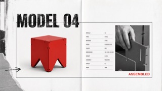
A controlled transfer of distressed type, rupture, and layering from music publishing into corporate advertising and product catalogues. Illegibility is not the goal; traces of rebellion sit around otherwise ordered product information.
| Corporate Cyberspace | Corporate Grunge | |
|---|---|---|
| Era | early–late 1990s | late 1980s–mid-1990s |
| Family | Digital Retro | Contemporary Branding |
| Kind | Style | Style |
| Cues | Thin sans-serif type stretched, blurred, or made translucent / Digital collages of people, circuits, molecules, and cities / Blue-violet, green, and orange glowing on dark grounds / Corporate order retained through hairlines, numbers, and coordinates | Distressed or overprinted display headlines / Tilted subheads alongside orderly body copy / Rough monochrome photography with one red or yellow overprint / Torn edges, hand marks, and copier noise used selectively |
| Best used for | Historical presentations of telecom, research, or software as period visions of the future · Anniversary publications and films that need a specific 1990s digital optimism | Youth, sports, and music advertising that needs resistance without sacrificing price or feature information · Editorial work about the commercialization of 1990s underground culture |
| Type | Use a thin humanist sans and alter underline, width, or opacity only in selected places. | Distress display type only, then restore body copy to one face, alignment, and line length. |
| Composition | Retain a grid while layering photographs and text in only two or three translucent planes. | Lock the product and required information in rectangles; collide cropped photos and drawn marks around them. |
| Material | Combine scans, early CGI, blurred photography, and fine vector lines without erasing low-resolution boundaries. | Use crushed photocopy texture, worn paper, coarse halftones, and limited-color overprint locally. |
| Caution | Glitching the whole surface removes its corporate restraint and drifts toward Early Cyber or rave flyers. Separate the broken layer from the readable one. | When everything becomes unreadable, it is simply grunge. Corporate Grunge depends on destruction and legibility remaining visible on the same surface. |