Corporate Grunge vs Grunge
コーポレート・グランジ / グランジ
Corporate Grunge comes from Contemporary Branding and Grunge from Counterculture. They are reached for with some of the same intent, which is where they get confused.
Corporate Grunge
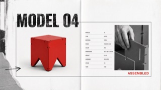
A controlled transfer of distressed type, rupture, and layering from music publishing into corporate advertising and product catalogues. Illegibility is not the goal; traces of rebellion sit around otherwise ordered product information.
Grunge
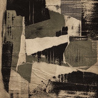
Uses dirt, tears and wear as resistance to the neatly managed screen.
| Corporate Grunge | Grunge | |
|---|---|---|
| Era | late 1980s–mid-1990s | 1990s |
| Family | Contemporary Branding | Counterculture |
| Kind | Style | Style |
| Cues | Distressed or overprinted display headlines / Tilted subheads alongside orderly body copy / Rough monochrome photography with one red or yellow overprint / Torn edges, hand marks, and copier noise used selectively | Scuffing / Tears / Disordered type / Low-quality copies |
| Best used for | Youth, sports, and music advertising that needs resistance without sacrificing price or feature information · Editorial work about the commercialization of 1990s underground culture | Body heat for music and street culture · Deliberately breaking the look of a finished product |
| Type | Distress display type only, then restore body copy to one face, alignment, and line length. | Decayed sans, typewriter faces |
| Composition | Lock the product and required information in rectangles; collide cropped photos and drawn marks around them. | Overlap and crop; keep alignment only in places |
| Material | Use crushed photocopy texture, worn paper, coarse halftones, and limited-color overprint locally. | Dirty paper, grain, low chroma plus one accent |
| Caution | When everything becomes unreadable, it is simply grunge. Corporate Grunge depends on destruction and legibility remaining visible on the same surface. | Texture overlays alone feel dated. Run the logic of wear through photo, type and margin alike. |