Corporate Grunge
コーポレート・グランジ / late 1980s–mid-1990s / 양식 / 현대 브랜딩
음악 출판에서 비롯된 손상된 글꼴, 찢김 및 레이어를 제어하여 기업 광고 및 제품 카탈로그에 적용합니다. 가독성은 목표가 아닙니다. 다른 방식으로 정돈된 제품 정보 주변에 반항의 흔적이 있습니다.
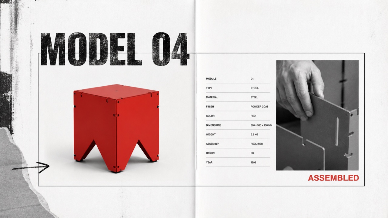
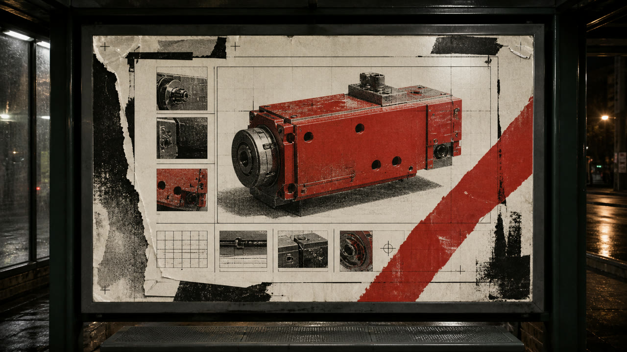
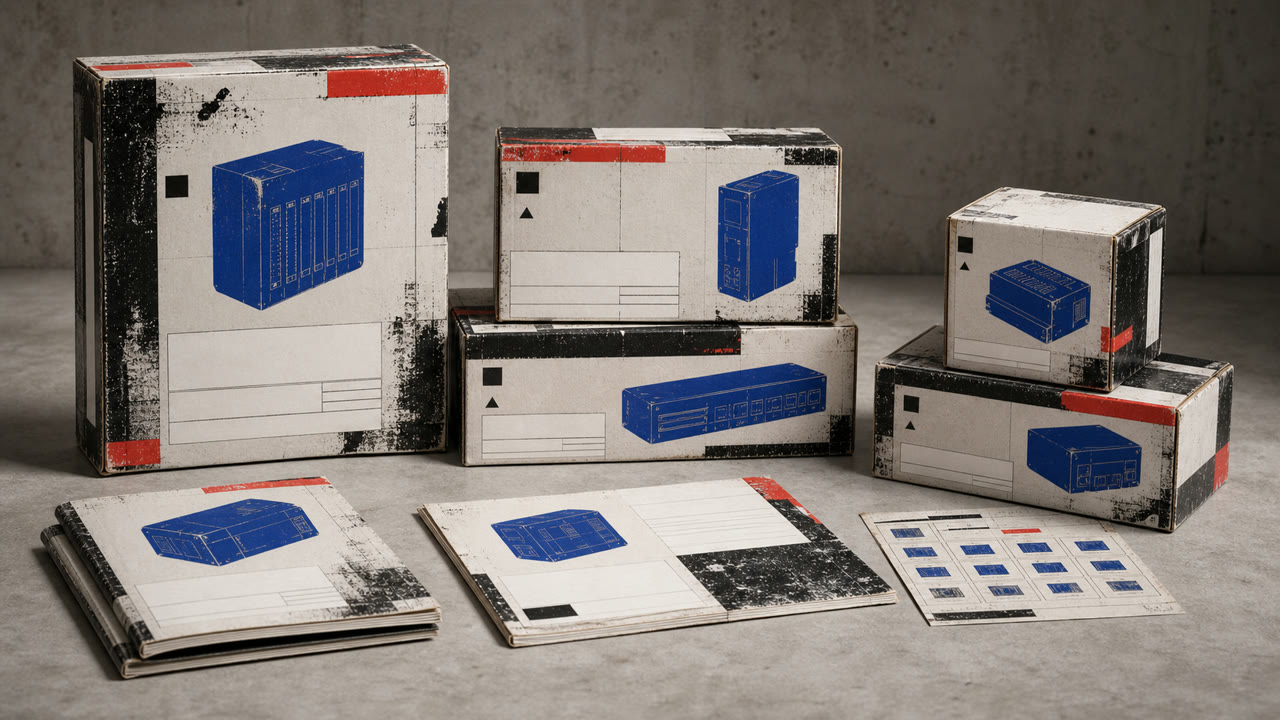
한눈에 판단
시각적 특징
- 손상되거나 과잉 인쇄된 디스플레이 헤드라인
- 정돈된 본문과 함께 기울어진 서브헤드
- 단색 사진 (빨간색 또는 노란색 1개) 과 함께
- 찢어진 가장자리, 손 자국 및 복사 소리 선택적으로 사용
적합한 용도
- Youth, sports, and music advertising that needs resistance without sacrificing price or feature information
- Editorial work about the commercialization of 1990s underground culture
이 양식 사용하기
짧은 지침을 프로젝트에 적용하거나 구조화된 사양을 AI 도구에 넘길 수 있습니다.
자세한 제작법과 출처제작 규칙, 실제 사례, 비교, 연구, 인용 형식
사전 항목
- 타이포그래피
- Distress display type only, then restore body copy to one face, alignment, and line length.
- 구성
- Lock the product and required information in rectangles; collide cropped photos and drawn marks around them.
- 재료
- Use crushed photocopy texture, worn paper, coarse halftones, and limited-color overprint locally.
- 주의
- When everything becomes unreadable, it is simply grunge. Corporate Grunge depends on destruction and legibility remaining visible on the same surface.
- 더 읽을거리
- David Carson and Ray Gun / Emigre and experimental typography / commercial appropriation of grunge
관련 항목
- Grunge (グランジ)공통 인상: Rebellion.Corporate Grunge와 Grunge 비교
- Corporate Cyberspace (コーポレート・サイバースペース)공통 인상: Trust.Corporate Grunge와 Corporate Cyberspace 비교
현대 브랜딩 더 보기
현대 브랜딩에서 공통 인상이 많은 항목을 우선해 골랐습니다.
- Sportsbrut (スポーツブルート)공통 인상: Exhilaration / Rebellion.
- Corporate Modernism (企業モダニズム)공통 인상: Trust.
- MUJI (無印良品)공통 인상: Trust.
이 항목을 인용하기
사전은 링크되기 위해 있다. 글을 쓰는 자리에 맞는 형식을 그대로 가져가면 된다.
- Link
- https://indexstyle.org/ko/styles/corporate-grunge
- Markdown
- [Corporate Grunge — IndexStyle](https://indexstyle.org/ko/styles/corporate-grunge)
- HTML
- <a href="https://indexstyle.org/ko/styles/corporate-grunge">Corporate Grunge — IndexStyle</a>