Corporate Grunge
コーポレート・グランジ / late 1980s–mid-1990s / 风格 / 当代品牌
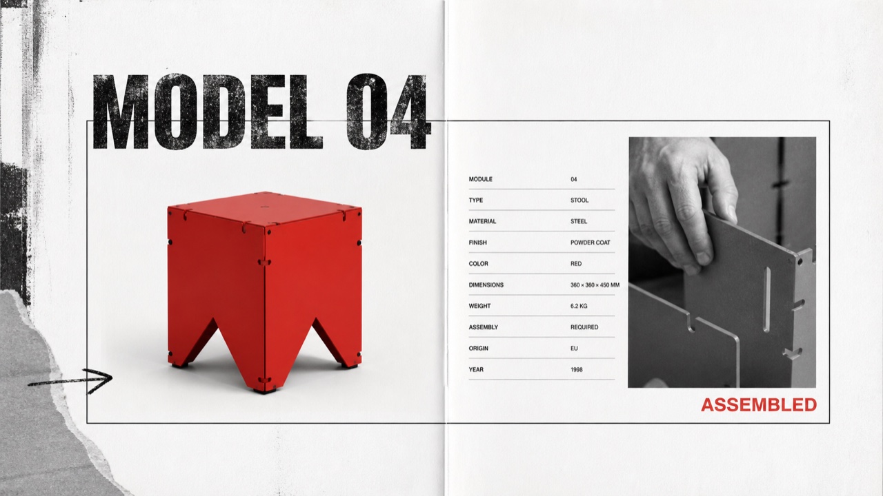
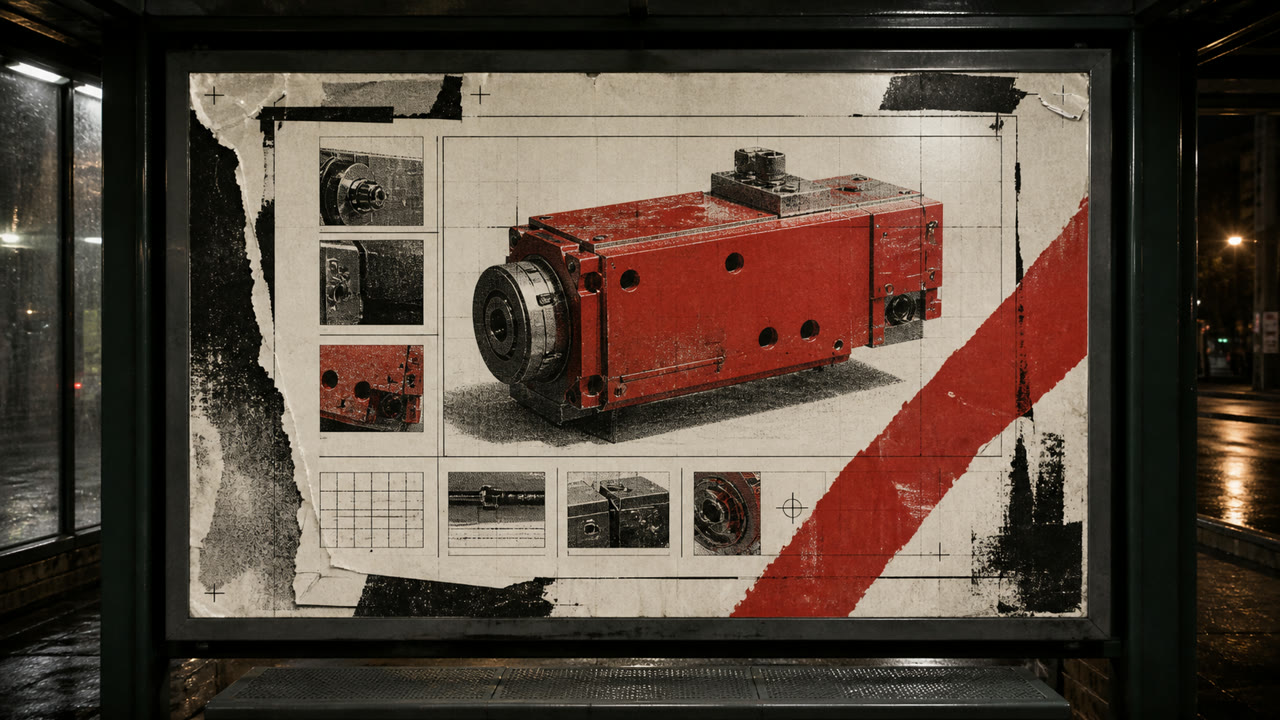
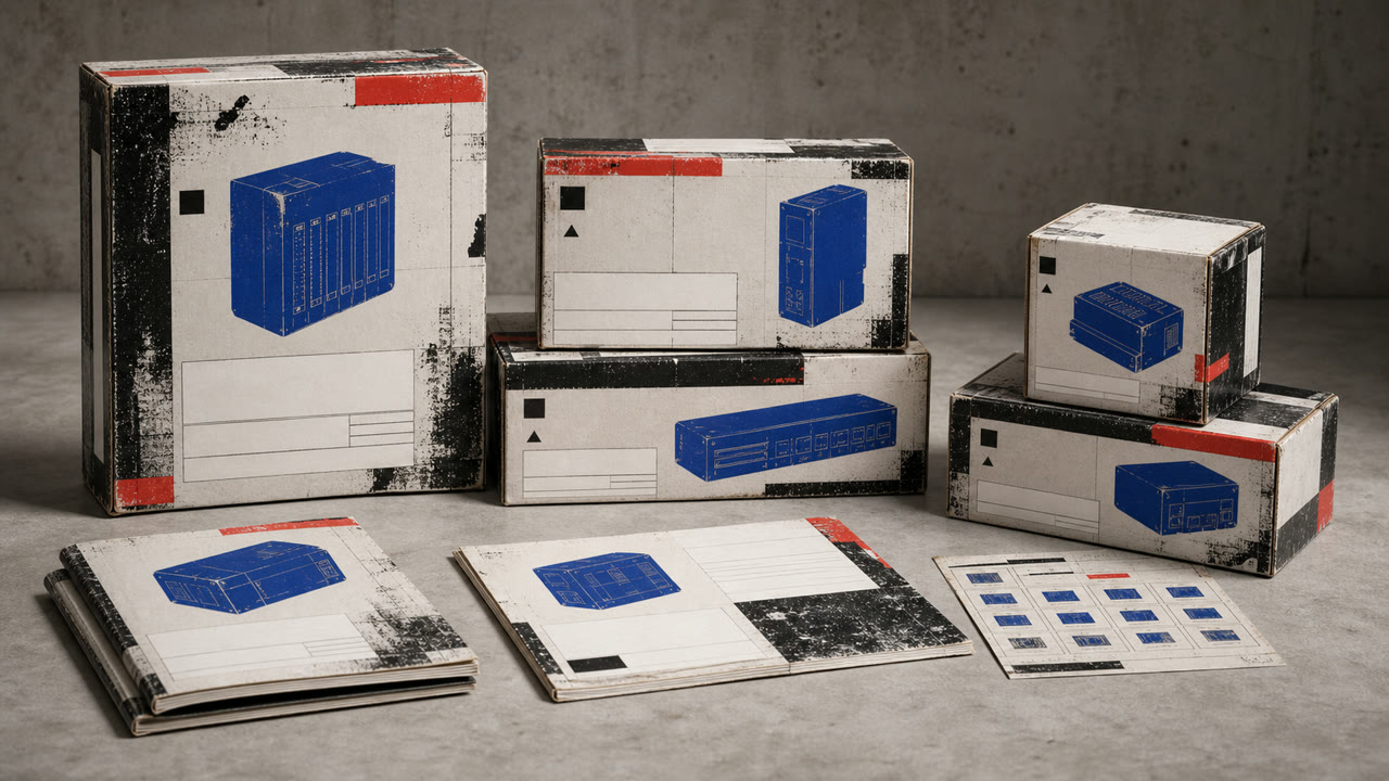
一种受损字体、破裂和分层的控制性转移,从音乐出版业转移到企业广告和产品目录。不可读性不是目标;反叛的痕迹围绕着其他有条理的产品信息。
快速判断
视觉特征
- 受损或过度印刷的标题
- 倾斜的副标题与整齐的正文
- 粗黑白摄影,带有单张红色或黄色叠加
- 撕裂的边缘、手印和复印机噪音被选择性使用
适用场景
- Youth, sports, and music advertising that needs resistance without sacrificing price or feature information
- Editorial work about the commercialization of 1990s underground culture
使用这一风格
把简短指引带入项目,或将结构化规格交给AI工具。
详细方法与出处制作规则、真实案例、比较、研究与引用格式
辞典词条
- 字体
- Distress display type only, then restore body copy to one face, alignment, and line length.
- 版面
- Lock the product and required information in rectangles; collide cropped photos and drawn marks around them.
- 材料
- Use crushed photocopy texture, worn paper, coarse halftones, and limited-color overprint locally.
- 注意
- When everything becomes unreadable, it is simply grunge. Corporate Grunge depends on destruction and legibility remaining visible on the same surface.
- 延伸阅读
- David Carson and Ray Gun / Emigre and experimental typography / commercial appropriation of grunge
相关词条
- Grunge (グランジ)共同感受:Rebellion。比较Corporate Grunge与Grunge
- Corporate Cyberspace (コーポレート・サイバースペース)共同感受:Trust。比较Corporate Grunge与Corporate Cyberspace
继续浏览当代品牌
从当代品牌中按共同感受优先推荐以下词条。
- Sportsbrut (スポーツブルート)共同感受:Exhilaration / Rebellion。
- Corporate Modernism (企業モダニズム)共同感受:Trust。
- MUJI (無印良品)共同感受:Trust。
引用此条目
这部辞典就是用来被链接的。请取用适合你写作场合的那一种形式。
- Link
- https://indexstyle.org/zh/styles/corporate-grunge
- Markdown
- [Corporate Grunge — IndexStyle](https://indexstyle.org/zh/styles/corporate-grunge)
- HTML
- <a href="https://indexstyle.org/zh/styles/corporate-grunge">Corporate Grunge — IndexStyle</a>