HarmonyOS Design
HarmonyOSデザイン / 2019– / 风格 / 平台界面语言
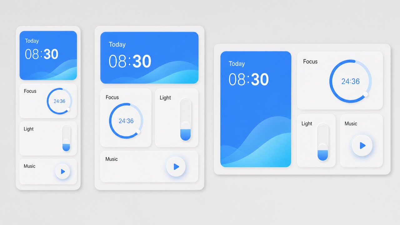
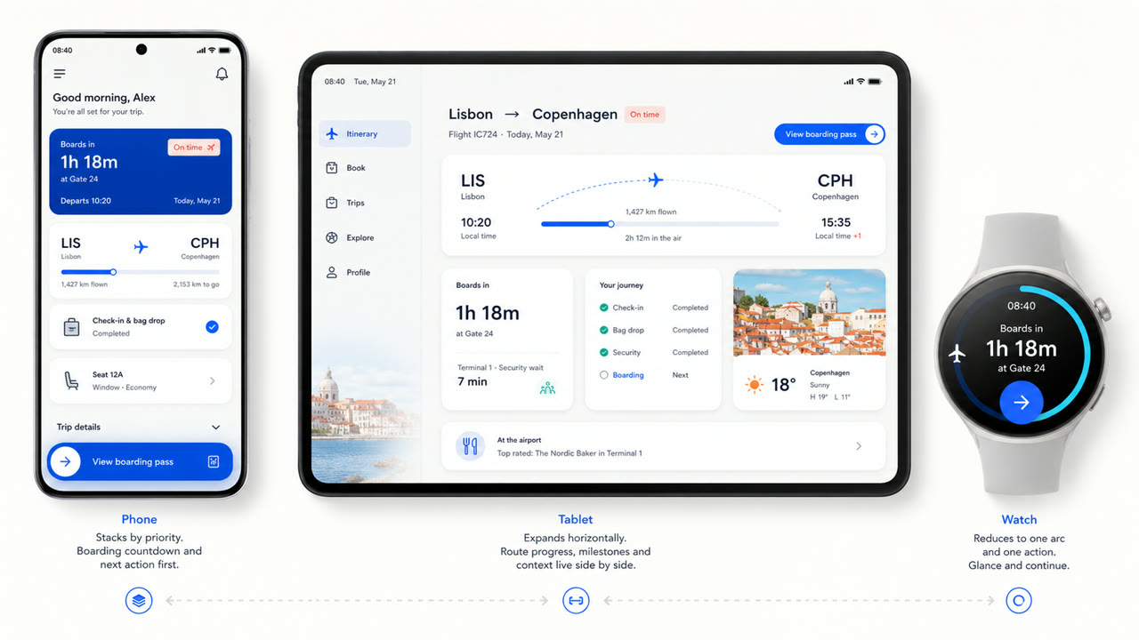
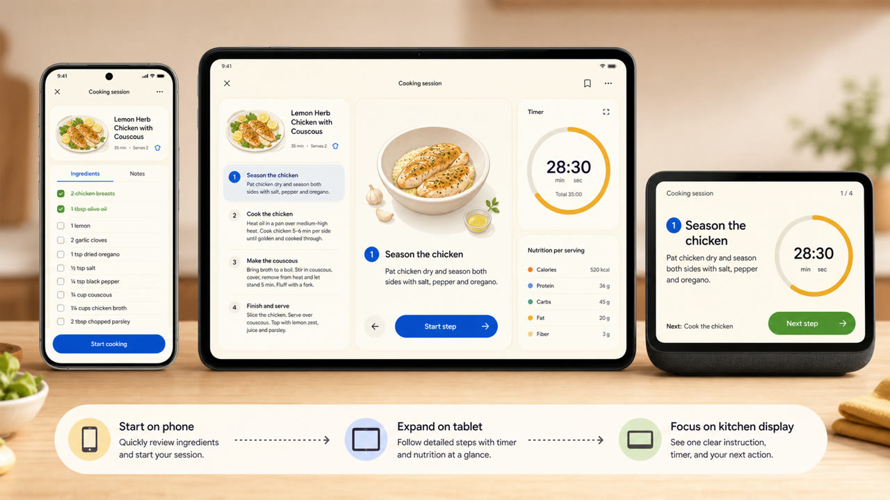
华为的视觉语言在不同屏幕尺寸和连接设备上重新组织了卡片、间距、弧形以及可变类型和半透明材料,优先考虑信息的连续性和操作性,而不是单一固定屏幕。
快速判断
视觉特征
- 大型圆角卡片,按功能分组信息
- 在浅色背景上留有宽阔的空间,并使用少量鲜艳的颜色作为强调
- 使用弧形、同心圆和柔和的缩放效果来表示操作状态
- 根据设备尺寸重新组合卡片和可变类型
适用场景
- Recomposing the same information across phones, tablets, vehicles and wearables
- Explaining continuity across devices through shared cards, motion and hierarchy
使用这一风格
把简短指引带入项目,或将结构化规格交给AI工具。
详细方法与出处制作规则、真实案例、比较、研究与引用格式
辞典词条
- 字体
- Adapt the weight and width of a variable sans to the display and enlarge short headings and numbers.
- 版面
- Group by function; spread cards sideways on wide screens and stack them by importance on small ones.
- 材料
- Start with bright neutrals, reserve diffusion and translucency for the control layer, and keep one accent family.
- 注意
- Rounded cards alone are not HarmonyOS. Information priority and action continuity must survive the move between devices.
- 延伸阅读
- HarmonyOS design principles / Multi-device adaptive layout / Cards, variable type and light material
相关词条
- Material You (Material You)共同感受:Intimacy / Technique。比较HarmonyOS Design与Material You
- Liquid Glass (リキッドガラス)共同感受:Futurity / Technique。比较HarmonyOS Design与Liquid Glass
继续浏览平台界面语言
从平台界面语言中按共同感受优先推荐以下词条。
- KDE Oxygen (KDE Oxygen)共同感受:Technique / Intimacy / Futurity。
- BeOS Interface (BeOS インターフェース)共同感受:Technique / Futurity。
- Xerox Star Interface (ゼロックス・スター・インターフェース)共同感受:Technique / Futurity。
引用此条目
这部辞典就是用来被链接的。请取用适合你写作场合的那一种形式。
- Link
- https://indexstyle.org/zh/styles/harmonyos
- Markdown
- [HarmonyOS Design — IndexStyle](https://indexstyle.org/zh/styles/harmonyos)
- HTML
- <a href="https://indexstyle.org/zh/styles/harmonyos">HarmonyOS Design — IndexStyle</a>