HarmonyOS Design
HarmonyOSデザイン / 2019– / 양식 / 플랫폼 화면 언어
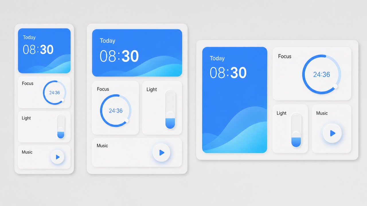
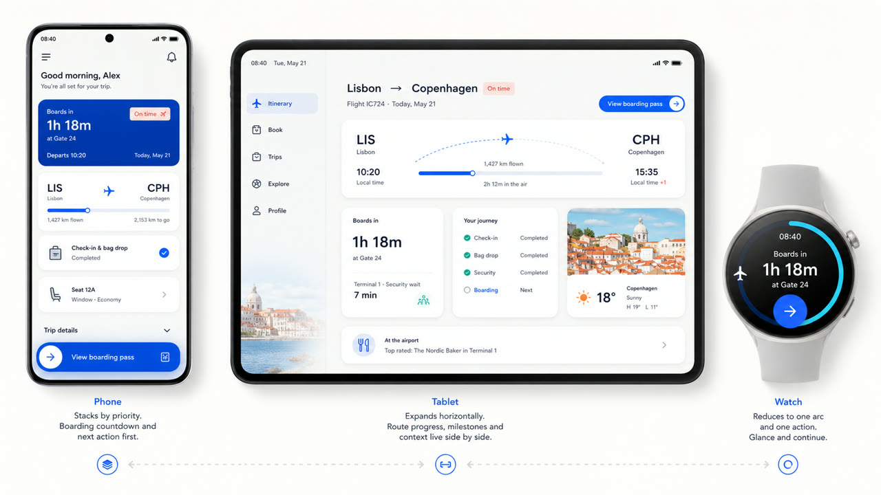
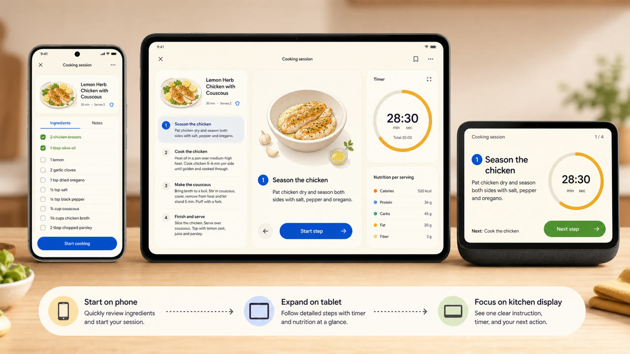
Huawei의 시각 언어는 카드, 간격, 호, 가변 서체와 반투명한 빛의 재질을 화면 크기와 연결 기기에 맞춰 다시 구성한다. 하나의 고정된 화면보다 정보와 동작의 연속성을 우선한다.
한눈에 판단
시각적 특징
- 기능별로 그룹화된 큰 둥근 카드
- 밝은 바탕의 넓은 여백과 소수의 선명한 강조색
- 작동 상태를 나타내는 호, 동심원과 부드러운 크기 변화
- 기기 크기에 맞춰 다시 짜이는 카드와 가변 서체
적합한 용도
- Recomposing the same information across phones, tablets, vehicles and wearables
- Explaining continuity across devices through shared cards, motion and hierarchy
이 양식 사용하기
짧은 지침을 프로젝트에 적용하거나 구조화된 사양을 AI 도구에 넘길 수 있습니다.
자세한 제작법과 출처제작 규칙, 실제 사례, 비교, 연구, 인용 형식
사전 항목
- 타이포그래피
- Adapt the weight and width of a variable sans to the display and enlarge short headings and numbers.
- 구성
- Group by function; spread cards sideways on wide screens and stack them by importance on small ones.
- 재료
- Start with bright neutrals, reserve diffusion and translucency for the control layer, and keep one accent family.
- 주의
- Rounded cards alone are not HarmonyOS. Information priority and action continuity must survive the move between devices.
- 더 읽을거리
- HarmonyOS design principles / Multi-device adaptive layout / Cards, variable type and light material
관련 항목
- Material You (Material You)공통 인상: Intimacy / Technique.HarmonyOS Design와 Material You 비교
- Liquid Glass (リキッドガラス)공통 인상: Futurity / Technique.HarmonyOS Design와 Liquid Glass 비교
플랫폼 화면 언어 더 보기
플랫폼 화면 언어에서 공통 인상이 많은 항목을 우선해 골랐습니다.
- KDE Oxygen (KDE Oxygen)공통 인상: Technique / Intimacy / Futurity.
- BeOS Interface (BeOS インターフェース)공통 인상: Technique / Futurity.
- Xerox Star Interface (ゼロックス・スター・インターフェース)공통 인상: Technique / Futurity.
이 항목을 인용하기
사전은 링크되기 위해 있다. 글을 쓰는 자리에 맞는 형식을 그대로 가져가면 된다.
- Link
- https://indexstyle.org/ko/styles/harmonyos
- Markdown
- [HarmonyOS Design — IndexStyle](https://indexstyle.org/ko/styles/harmonyos)
- HTML
- <a href="https://indexstyle.org/ko/styles/harmonyos">HarmonyOS Design — IndexStyle</a>