HarmonyOS Design
HarmonyOSデザイン / 2019– / Style / Langages d'écran
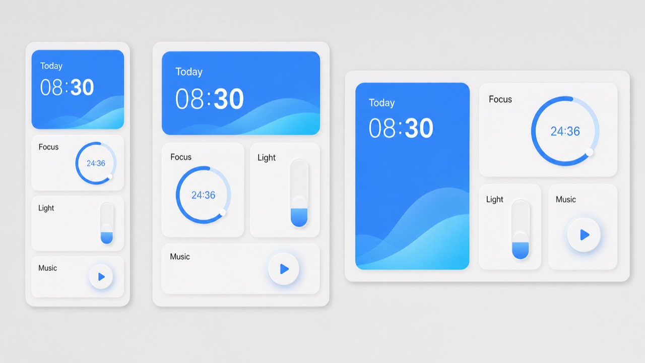
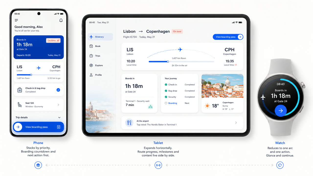
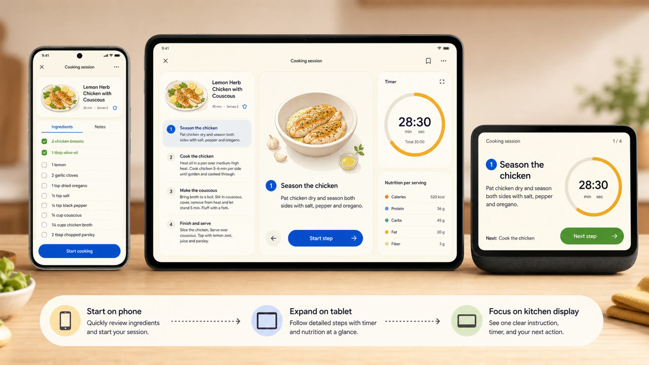
Le langage visuel de Huawei réorganise les cartes, l'espacement, les arcs, les types variables et les matériaux translucides sur différentes tailles d'écran et appareils connectés, en privilégiant la continuité de l'information et des actions plutôt qu'un écran fixe.
En un coup d’œil
Signes visuels
- Grandes cartes arrondies regroupant l'information par fonction
- Beaucoup d'espace sur les champs lumineux avec quelques accents saturés
- Arcs, cercles concentriques et mise à l'échelle douce pour les états d'opération
- Cartes et types variables récomposées pour s'adapter à la taille de l'appareil
Usages idéaux
- Recomposing the same information across phones, tablets, vehicles and wearables
- Explaining continuity across devices through shared cards, motion and hierarchy
Utiliser ce style
Appliquez le brief concis au projet ou transmettez la spécification structurée à un outil d’IA.
Guide détaillé et sourcesRègles de production, œuvres de référence, comparaisons, recherche et citations
Entrée du dictionnaire
- Typographie
- Adapt the weight and width of a variable sans to the display and enlarge short headings and numbers.
- Composition
- Group by function; spread cards sideways on wide screens and stack them by importance on small ones.
- Matière
- Start with bright neutrals, reserve diffusion and translucency for the control layer, and keep one accent family.
- Précaution
- Rounded cards alone are not HarmonyOS. Information priority and action continuity must survive the move between devices.
- Pour approfondir
- HarmonyOS design principles / Multi-device adaptive layout / Cards, variable type and light material
Entrées liées
- Material You (Material You)Effets partagés : Intimacy / Technique.Comparer HarmonyOS Design et Material You
- Liquid Glass (リキッドガラス)Effets partagés : Futurity / Technique.Comparer HarmonyOS Design et Liquid Glass
Plus de Langages d'écran
Poursuivez avec des styles de Langages d'écran, classés par effets communs.
- KDE Oxygen (KDE Oxygen)Effets partagés : Technique / Intimacy / Futurity.
- BeOS Interface (BeOS インターフェース)Effets partagés : Technique / Futurity.
- Xerox Star Interface (ゼロックス・スター・インターフェース)Effets partagés : Technique / Futurity.
Voir toutes les entrées Langages d'écran
Citer cette entrée
Le dictionnaire est fait pour être lié. Prenez la forme qui convient là où vous écrivez.
- Link
- https://indexstyle.org/fr/styles/harmonyos
- Markdown
- [HarmonyOS Design — IndexStyle](https://indexstyle.org/fr/styles/harmonyos)
- HTML
- <a href="https://indexstyle.org/fr/styles/harmonyos">HarmonyOS Design — IndexStyle</a>