HarmonyOS Design
HarmonyOSデザイン / 2019– / Stil / Bildschirmsprachen
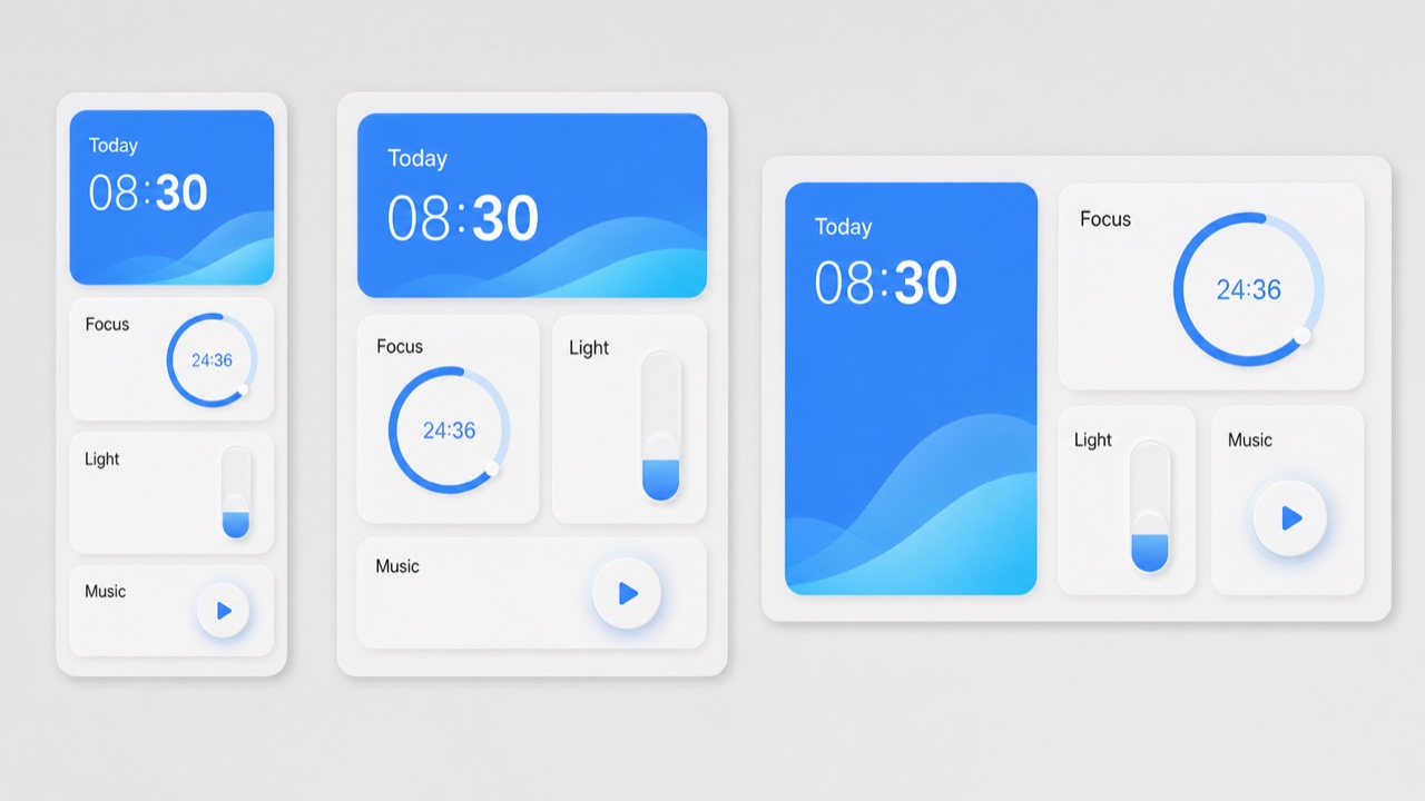
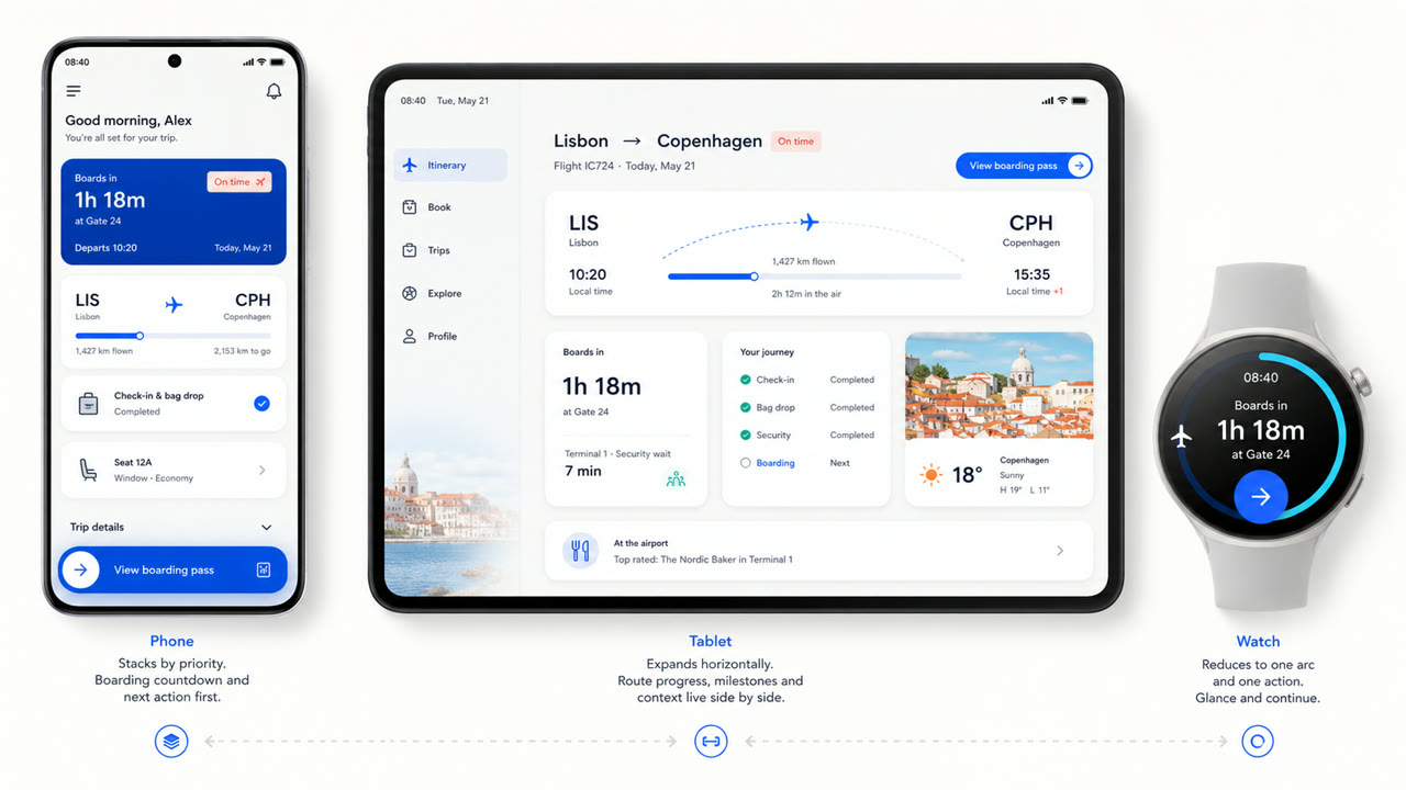
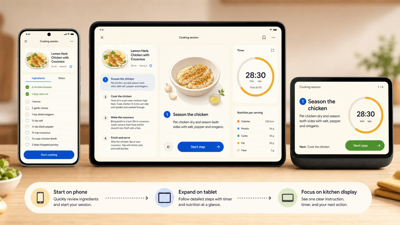
Huawei's visuelle Sprache organisiert Karten, Abstände, Bögen, variable Typen und transparente Materialien über verschiedene Bildschirmgrößen und miteinander verbundene Geräte hinweg und legt Wert auf die Kontinuität von Informationen und Aktionen gegenüber einem festen Bildschirm.
Auf einen Blick
Visuelle Merkmale
- Große, abgerundete Karten zur Gruppierung von Informationen nach Funktion
- Weites Feld mit hellen Akzenten
- Bögen, konzentrische Kreise und sanfte Skalierung für Betriebszustände
- Karten und variable Typen neu angeordnet, um der Gerätegröße zu entsprechen
Geeignet für
- Recomposing the same information across phones, tablets, vehicles and wearables
- Explaining continuity across devices through shared cards, motion and hierarchy
Diesen Stil verwenden
Nutze das Kurzbriefing im Projekt oder übergib die strukturierte Spezifikation an ein KI-Werkzeug.
Ausführliche Anleitung und QuellenProduktionsregeln, Referenzwerke, Vergleiche, Forschung und Zitate
Wörterbucheintrag
- Typografie
- Adapt the weight and width of a variable sans to the display and enlarge short headings and numbers.
- Komposition
- Group by function; spread cards sideways on wide screens and stack them by importance on small ones.
- Material
- Start with bright neutrals, reserve diffusion and translucency for the control layer, and keep one accent family.
- Zu vermeiden
- Rounded cards alone are not HarmonyOS. Information priority and action continuity must survive the move between devices.
- Zum Weiterlesen
- HarmonyOS design principles / Multi-device adaptive layout / Cards, variable type and light material
Verwandte Einträge
- Material You (Material You)Gemeinsame Wirkungen: Intimacy / Technique.HarmonyOS Design und Material You vergleichen
- Liquid Glass (リキッドガラス)Gemeinsame Wirkungen: Futurity / Technique.HarmonyOS Design und Liquid Glass vergleichen
Mehr aus Bildschirmsprachen
Weitere Stile aus Bildschirmsprachen, nach gemeinsamen Wirkungen geordnet.
- KDE Oxygen (KDE Oxygen)Gemeinsame Wirkungen: Technique / Intimacy / Futurity.
- BeOS Interface (BeOS インターフェース)Gemeinsame Wirkungen: Technique / Futurity.
- Xerox Star Interface (ゼロックス・スター・インターフェース)Gemeinsame Wirkungen: Technique / Futurity.
Alle Einträge aus Bildschirmsprachen ansehen
Diesen Eintrag zitieren
Das Wörterbuch ist zum Verlinken gedacht. Nehmen Sie die Form, die dorthin passt, wo Sie schreiben.
- Link
- https://indexstyle.org/de/styles/harmonyos
- Markdown
- [HarmonyOS Design — IndexStyle](https://indexstyle.org/de/styles/harmonyos)
- HTML
- <a href="https://indexstyle.org/de/styles/harmonyos">HarmonyOS Design — IndexStyle</a>