HarmonyOS Design vs Liquid Glass
HarmonyOSデザイン / リキッドガラス
HarmonyOS Design comes from Platform Screen Languages and Liquid Glass from Apple UI. They are reached for with some of the same intent, which is where they get confused.
HarmonyOS Design
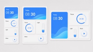
Huawei's visual language reorganizes cards, spacing, arcs, variable type and translucent light materials across different screen sizes and connected devices, favoring continuity of information and action over one fixed screen.
Liquid Glass
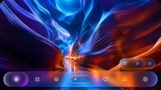
Unifies the floating control and navigation layer as a fluid glass material that refracts and adapts to the content beneath.
| HarmonyOS Design | Liquid Glass | |
|---|---|---|
| Era | 2019– | 2025– |
| Family | Platform Screen Languages | Apple UI |
| Kind | Style | Style |
| Cues | Large rounded cards grouping information by function / Wide space on light fields with a few saturated accents / Arcs, concentric circles and gentle scaling for operation states / Cards and variable type recomposed to suit device size | Dynamic refraction / Concentric corner radii / Floating control layers / Reflected background color |
| Best used for | Recomposing the same information across phones, tablets, vehicles and wearables · Explaining continuity across devices through shared cards, motion and hierarchy | Apps that show content full bleed while floating only the controls above it. · Screens where light, dark and wallpaper change but control positions must hold. |
| Type | Adapt the weight and width of a variable sans to the display and enlarge short headings and numbers. | Keep text off the material itself and set minimum sizes from measured contrast. |
| Composition | Group by function; spread cards sideways on wide screens and stack them by importance on small ones. | Hold controls to the edges and make inner and outer radii concentric. |
| Material | Start with bright neutrals, reserve diffusion and translucency for the control layer, and keep one accent family. | Use one refracting layer only, letting it pick up the color beneath. |
| Caution | Rounded cards alone are not HarmonyOS. Information priority and action continuity must survive the move between devices. | Keep it to the control layer rather than decorating content with translucent cards. Each added layer lets more background through until text fails, so check legibility on devices and honor Reduce Transparency. |