HarmonyOS Design
HarmonyOSデザイン / 2019– / Estilo / Lenguajes de pantalla
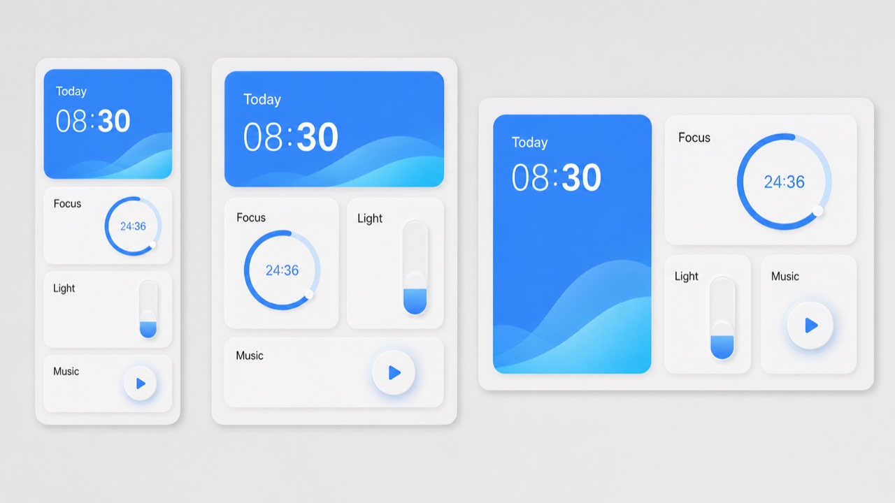
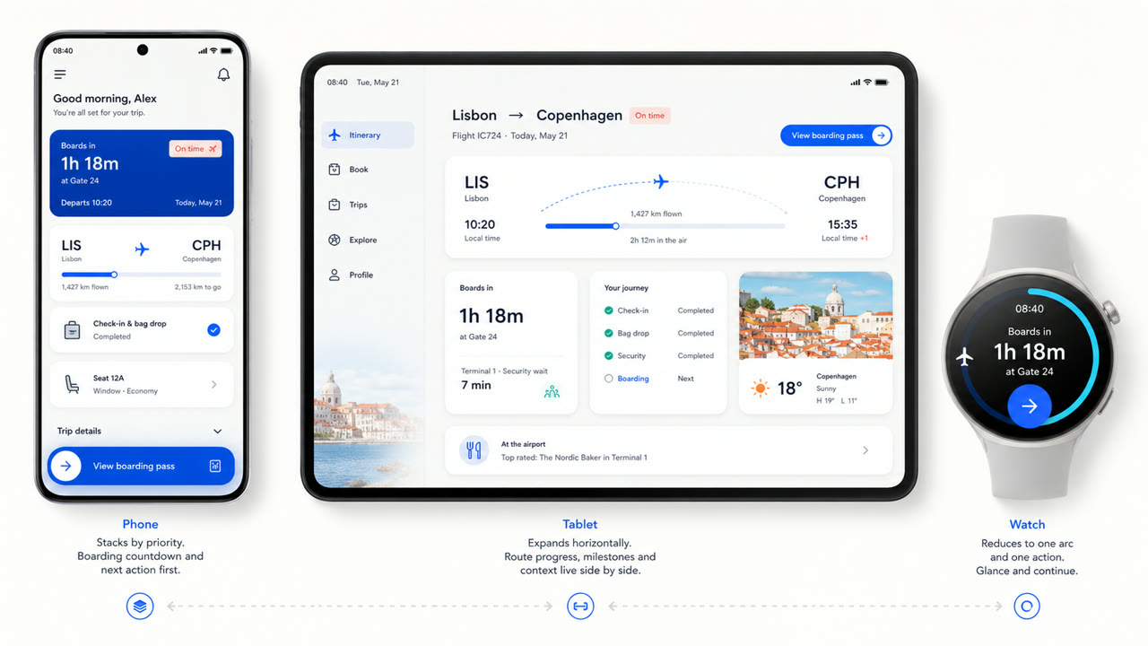
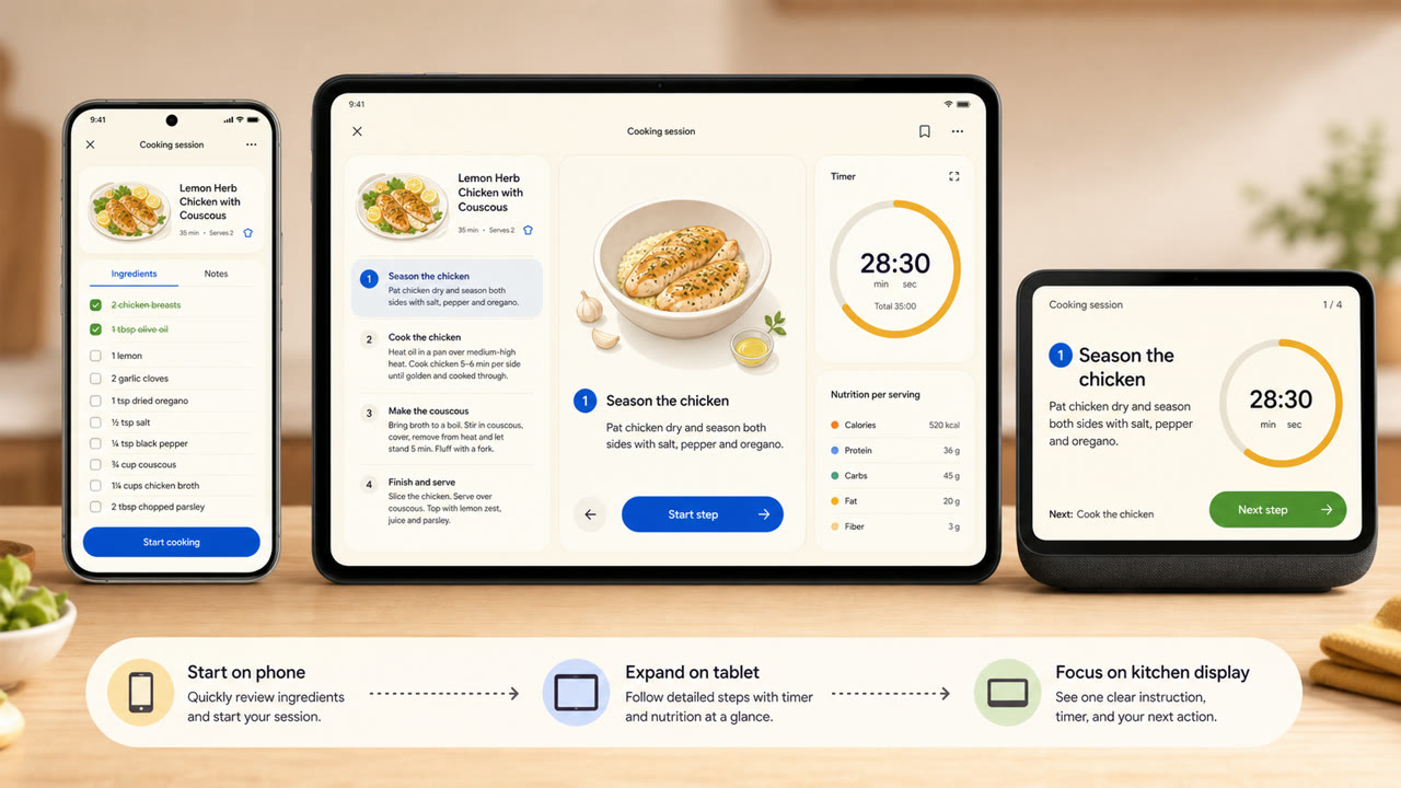
El lenguaje visual de Huawei reorganiza tarjetas, espacio, arcos, tipografía variable y materiales de luz translúcida entre distintos tamaños de pantalla y dispositivos conectados, favoreciendo la continuidad de información y acción frente a una pantalla fija.
De un vistazo
Rasgos visuales
- Grandes tarjetas redondeadas que agrupan información por función
- Mucho espacio sobre fondos claros con pocos acentos saturados
- Arcos, círculos concéntricos y escalado suave para estados de operación
- Tarjetas y tipografía variable recompuestas según el tamaño del dispositivo
Usos idóneos
- Recomposing the same information across phones, tablets, vehicles and wearables
- Explaining continuity across devices through shared cards, motion and hierarchy
Usar este estilo
Lleva el resumen al proyecto o entrega la especificación estructurada a una herramienta de IA.
Guía detallada y fuentesReglas de producción, obras de referencia, comparaciones, investigación y citas
Entrada del diccionario
- Tipografía
- Adapt the weight and width of a variable sans to the display and enlarge short headings and numbers.
- Composición
- Group by function; spread cards sideways on wide screens and stack them by importance on small ones.
- Material
- Start with bright neutrals, reserve diffusion and translucency for the control layer, and keep one accent family.
- Precaución
- Rounded cards alone are not HarmonyOS. Information priority and action continuity must survive the move between devices.
- Para profundizar
- HarmonyOS design principles / Multi-device adaptive layout / Cards, variable type and light material
Entradas relacionadas
- Material You (Material You)Efectos compartidos: Intimacy / Technique.Comparar HarmonyOS Design y Material You
- Liquid Glass (リキッドガラス)Efectos compartidos: Futurity / Technique.Comparar HarmonyOS Design y Liquid Glass
Más de Lenguajes de pantalla
Continúa con estilos de Lenguajes de pantalla, priorizados por sus efectos compartidos.
- KDE Oxygen (KDE Oxygen)Efectos compartidos: Technique / Intimacy / Futurity.
- BeOS Interface (BeOS インターフェース)Efectos compartidos: Technique / Futurity.
- Xerox Star Interface (ゼロックス・スター・インターフェース)Efectos compartidos: Technique / Futurity.
Ver todas las entradas de Lenguajes de pantalla
Citar esta entrada
El diccionario existe para que se enlace. Toma la forma que encaje donde estés escribiendo.
- Link
- https://indexstyle.org/es/styles/harmonyos
- Markdown
- [HarmonyOS Design — IndexStyle](https://indexstyle.org/es/styles/harmonyos)
- HTML
- <a href="https://indexstyle.org/es/styles/harmonyos">HarmonyOS Design — IndexStyle</a>