Frasurbane
フラサーバン / late 1980s–mid-1990s / 风格 / 出版与编辑
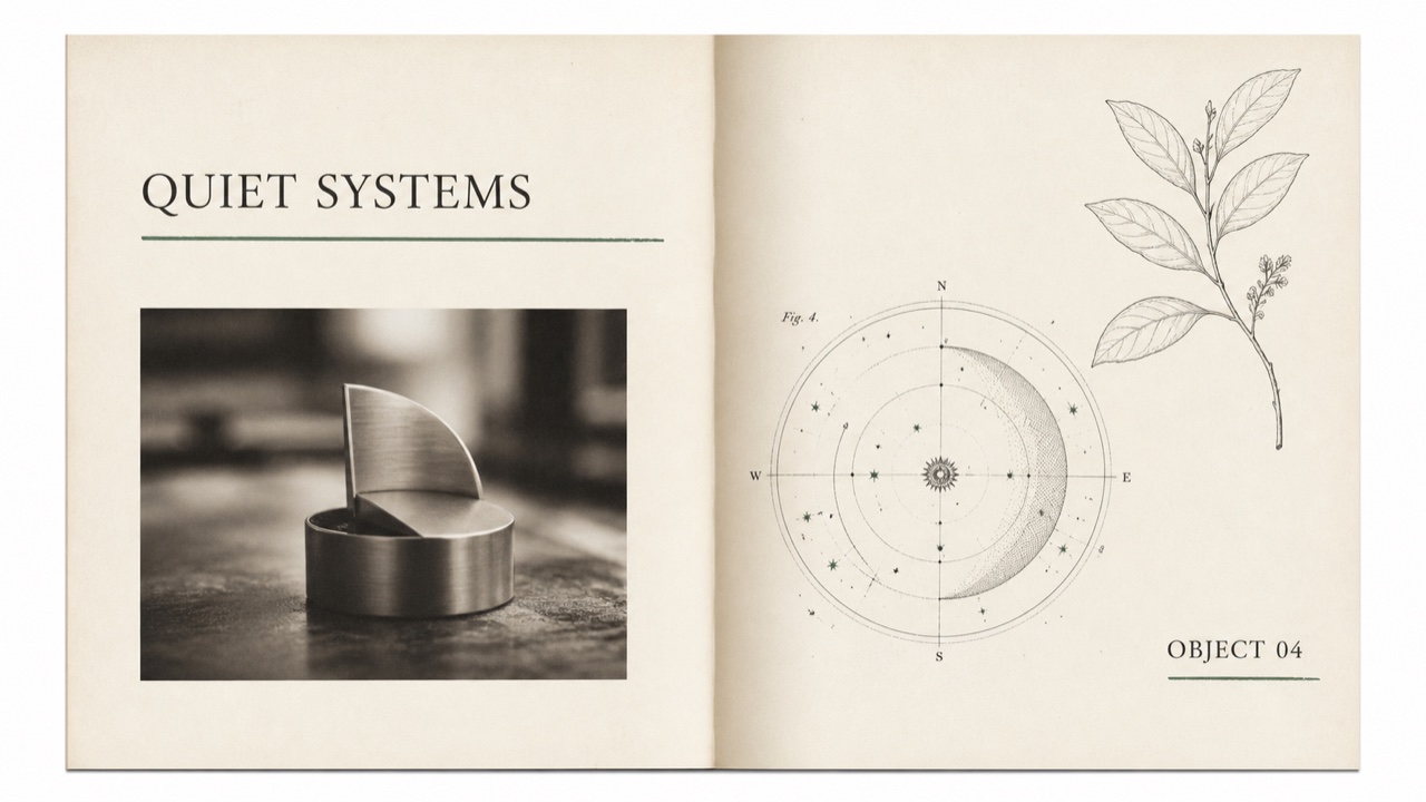
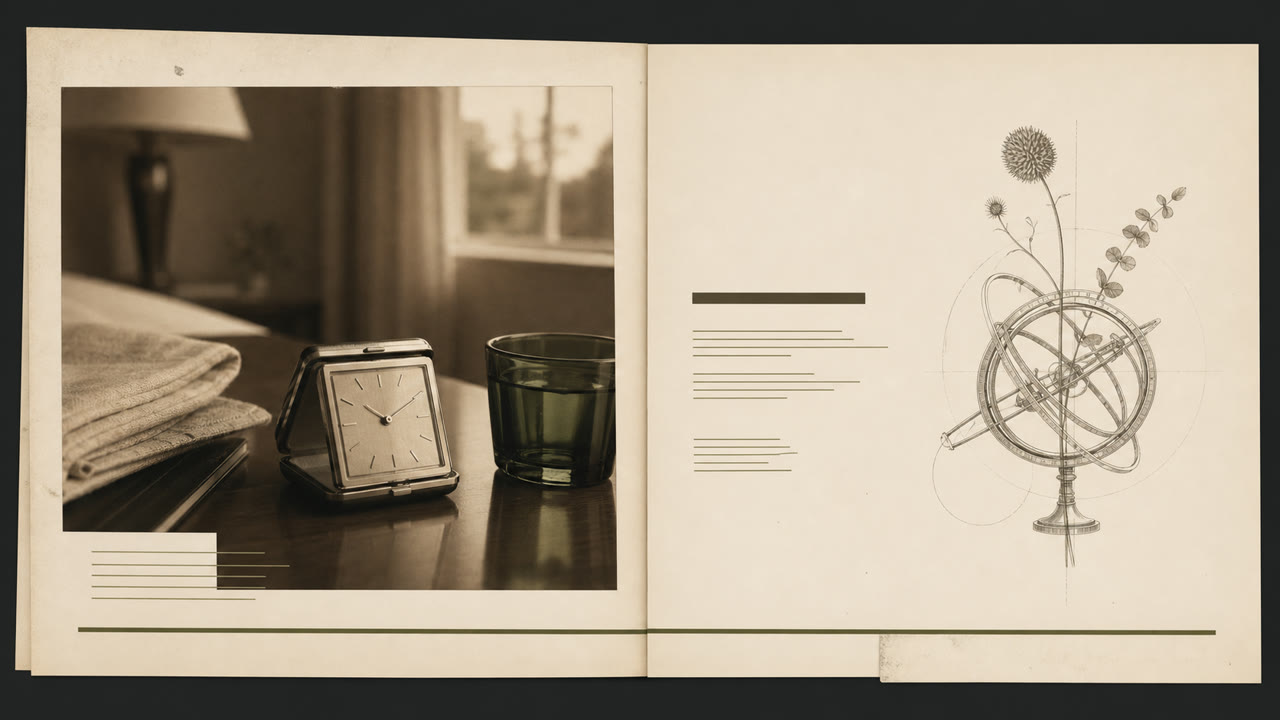
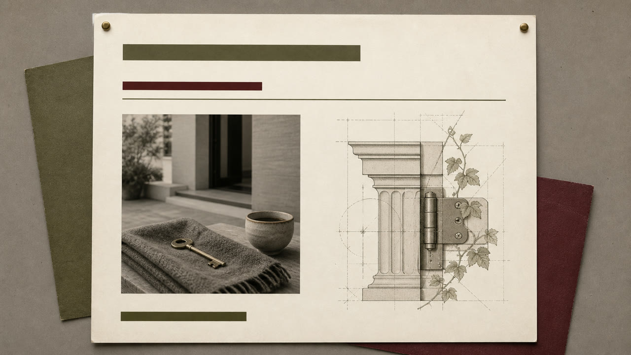
一种早 1990 年代的风格,安静了 grunge 的干扰,适用于富裕郊区的大众出版物和广告。衬线字体、古典插图和柔焦摄影略微被下划线和重叠所取代,以呈现城市生活。
快速判断
视觉特征
- 混合重量和斜体衬线字体,带有较长的下划线
- 古典雕塑、星形球、植物板和旧机器
- 棕色或单色的柔焦产品摄影
- 纹理纸和宽空白,带有小的对齐错误
适用场景
- 1990s food, travel, home, and finance advertising built around intellectual lifestyle
- Editorial work using classical imagery without pretending to be a historical reproduction
使用这一风格
把简短指引带入项目,或将结构化规格交给AI工具。
详细方法与出处制作规则、真实案例、比较、研究与引用格式
辞典词条
- 字体
- Use no more than two serif faces, switching weight and italic, with one long underline as structure.
- 版面
- Separate photographs and classical plates in large fields of whitespace, mixing periods only through partial overlap.
- 材料
- Combine ecru paper, sepia imagery, hairline rules, and one muted green or red accent.
- 注意
- Classical plates alone make generic vintage editorial. Retain a slight grunge-derived displacement and a restrained suburban polish.
- 延伸阅读
- 1990s urbane lifestyle publishing / serif typography after grunge / classical imagery and staged photography
相关词条
- Gen X Soft Club (ジェネレーションX ソフトクラブ)共同感受:Nostalgia。比较Frasurbane与Gen X Soft Club
- Corporate Grunge (コーポレート・グランジ)作为有意义的对照由编辑建立关联。比较Frasurbane与Corporate Grunge
继续浏览出版与编辑
从出版与编辑中按共同感受优先推荐以下词条。
- Illuminated Manuscript (彩飾写本)共同感受:Luxury / Calm / Nostalgia。
- The Face (ザ・フェイス)共同感受:Luxury / Calm。
- Private Press (プライベート・プレス)共同感受:Luxury / Nostalgia。
引用此条目
这部辞典就是用来被链接的。请取用适合你写作场合的那一种形式。
- Link
- https://indexstyle.org/zh/styles/frasurbane
- Markdown
- [Frasurbane — IndexStyle](https://indexstyle.org/zh/styles/frasurbane)
- HTML
- <a href="https://indexstyle.org/zh/styles/frasurbane">Frasurbane — IndexStyle</a>