Frasurbane
フラサーバン / late 1980s–mid-1990s / Style / Édition et publication
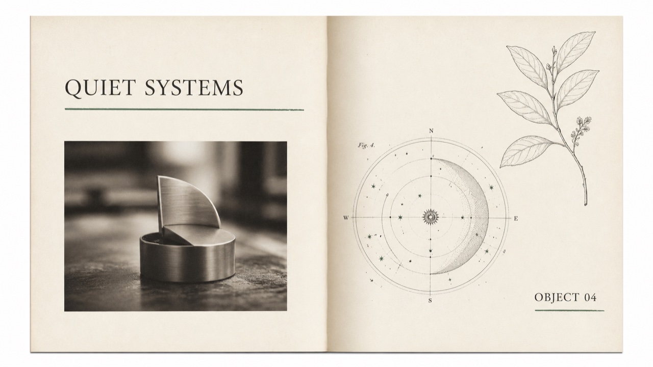
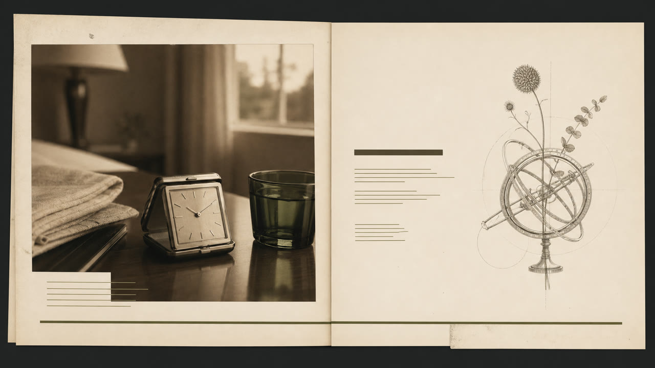
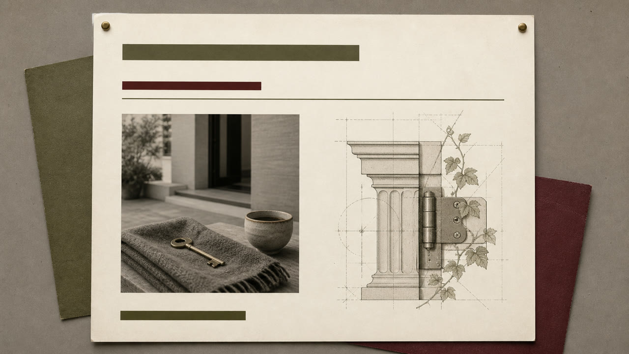
Un style des années 1990 qui adoucit la détresse du « grunge » pour la publication et la publicité de grands groupes, dans un cadre urbain. La typographie avec empattements, les illustrations classiques et la photographie au flou doux sont légèrement modifiées par des lignes et des chevauchements pour créer une ambiance urbaine.
En un coup d’œil
Signes visuels
- Typographie avec empattements de différents poids et en italique avec de longues lignes
- Sculptures classiques, sphères armillaires, plaques botaniques et anciennes machines
- Photographies de produits au flou doux en sépia ou monochrome
- Papier texturé et grand espace blanc avec de légers désalignements
Usages idéaux
- 1990s food, travel, home, and finance advertising built around intellectual lifestyle
- Editorial work using classical imagery without pretending to be a historical reproduction
Utiliser ce style
Appliquez le brief concis au projet ou transmettez la spécification structurée à un outil d’IA.
Guide détaillé et sourcesRègles de production, œuvres de référence, comparaisons, recherche et citations
Entrée du dictionnaire
- Typographie
- Use no more than two serif faces, switching weight and italic, with one long underline as structure.
- Composition
- Separate photographs and classical plates in large fields of whitespace, mixing periods only through partial overlap.
- Matière
- Combine ecru paper, sepia imagery, hairline rules, and one muted green or red accent.
- Précaution
- Classical plates alone make generic vintage editorial. Retain a slight grunge-derived displacement and a restrained suburban polish.
- Pour approfondir
- 1990s urbane lifestyle publishing / serif typography after grunge / classical imagery and staged photography
Entrées liées
- Gen X Soft Club (ジェネレーションX ソフトクラブ)Effets partagés : Nostalgia.Comparer Frasurbane et Gen X Soft Club
- Corporate Grunge (コーポレート・グランジ)Lien éditorial pour une comparaison utile.Comparer Frasurbane et Corporate Grunge
Plus de Édition et publication
Poursuivez avec des styles de Édition et publication, classés par effets communs.
- Illuminated Manuscript (彩飾写本)Effets partagés : Luxury / Calm / Nostalgia.
- The Face (ザ・フェイス)Effets partagés : Luxury / Calm.
- Private Press (プライベート・プレス)Effets partagés : Luxury / Nostalgia.
Voir toutes les entrées Édition et publication
Citer cette entrée
Le dictionnaire est fait pour être lié. Prenez la forme qui convient là où vous écrivez.
- Link
- https://indexstyle.org/fr/styles/frasurbane
- Markdown
- [Frasurbane — IndexStyle](https://indexstyle.org/fr/styles/frasurbane)
- HTML
- <a href="https://indexstyle.org/fr/styles/frasurbane">Frasurbane — IndexStyle</a>