Frasurbane
フラサーバン / late 1980s–mid-1990s / 양식 / 출판과 편집
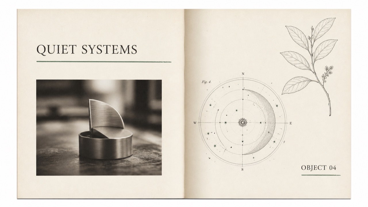
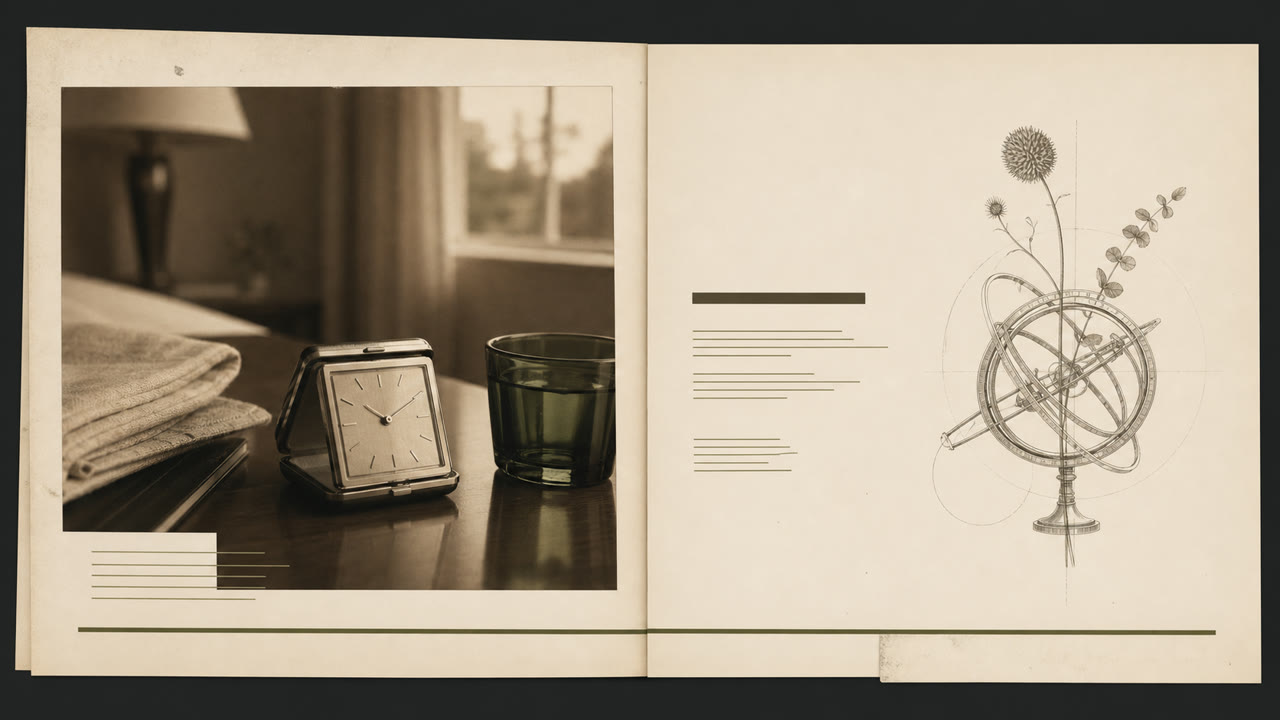
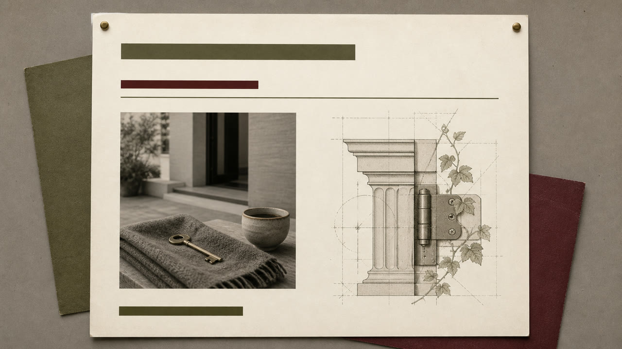
1990년대 초 부유하고 도시화된 성인 출판 및 광고에 Grunge의 혼란을 잠재우는 스타일입니다. 세리프 글꼴, 고전적인 일러스트레이션 및 소프트 포커스 사진은 하이라이트와 오버랩을 사용하여 도시적인 삶을 연출합니다.
한눈에 판단
시각적 특징
- 긴 하이라이트를 가진 혼합된 무게의 세리프 글꼴
- 고전적인 조각상, 아르밀러 스피어, 식물학적 판과 오래된 기계
- 세피아 또는 단색 소프트 포커스 제품 사진
- 작은 오버래핑 및 미세 정렬이 있는 질감 있는 종이와 넓은 흰색 공간
적합한 용도
- 1990s food, travel, home, and finance advertising built around intellectual lifestyle
- Editorial work using classical imagery without pretending to be a historical reproduction
이 양식 사용하기
짧은 지침을 프로젝트에 적용하거나 구조화된 사양을 AI 도구에 넘길 수 있습니다.
자세한 제작법과 출처제작 규칙, 실제 사례, 비교, 연구, 인용 형식
사전 항목
- 타이포그래피
- Use no more than two serif faces, switching weight and italic, with one long underline as structure.
- 구성
- Separate photographs and classical plates in large fields of whitespace, mixing periods only through partial overlap.
- 재료
- Combine ecru paper, sepia imagery, hairline rules, and one muted green or red accent.
- 주의
- Classical plates alone make generic vintage editorial. Retain a slight grunge-derived displacement and a restrained suburban polish.
- 더 읽을거리
- 1990s urbane lifestyle publishing / serif typography after grunge / classical imagery and staged photography
관련 항목
- Gen X Soft Club (ジェネレーションX ソフトクラブ)공통 인상: Nostalgia.Frasurbane와 Gen X Soft Club 비교
- Corporate Grunge (コーポレート・グランジ)의미 있는 대비를 위해 편집상 연결된 항목입니다.Frasurbane와 Corporate Grunge 비교
출판과 편집 더 보기
출판과 편집에서 공통 인상이 많은 항목을 우선해 골랐습니다.
- Illuminated Manuscript (彩飾写本)공통 인상: Luxury / Calm / Nostalgia.
- The Face (ザ・フェイス)공통 인상: Luxury / Calm.
- Private Press (プライベート・プレス)공통 인상: Luxury / Nostalgia.
이 항목을 인용하기
사전은 링크되기 위해 있다. 글을 쓰는 자리에 맞는 형식을 그대로 가져가면 된다.
- Link
- https://indexstyle.org/ko/styles/frasurbane
- Markdown
- [Frasurbane — IndexStyle](https://indexstyle.org/ko/styles/frasurbane)
- HTML
- <a href="https://indexstyle.org/ko/styles/frasurbane">Frasurbane — IndexStyle</a>