Corporate Grunge vs Frasurbane
コーポレート・グランジ / フラサーバン
Corporate Grunge comes from Contemporary Branding and Frasurbane from Publishing and Editing. They are reached for with different intent, which is the fastest way to tell them apart.
Corporate Grunge
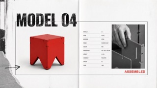
A controlled transfer of distressed type, rupture, and layering from music publishing into corporate advertising and product catalogues. Illegibility is not the goal; traces of rebellion sit around otherwise ordered product information.
Frasurbane
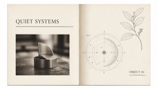
An early-1990s style that quiets grunge disruption for affluent, suburbanized adult publishing and advertising. Serif type, classical illustrations, and soft-focus photography are slightly displaced by underlines and overlap to stage an urbane life.
| Corporate Grunge | Frasurbane | |
|---|---|---|
| Era | late 1980s–mid-1990s | late 1980s–mid-1990s |
| Family | Contemporary Branding | Publishing and Editing |
| Kind | Style | Style |
| Cues | Distressed or overprinted display headlines / Tilted subheads alongside orderly body copy / Rough monochrome photography with one red or yellow overprint / Torn edges, hand marks, and copier noise used selectively | Mixed-weight and italic serif type with long underlines / Classical sculpture, armillary spheres, botanical plates, and old machinery / Sepia or monochrome soft-focus product photography / Textured paper and wide whitespace with small misalignments |
| Best used for | Youth, sports, and music advertising that needs resistance without sacrificing price or feature information · Editorial work about the commercialization of 1990s underground culture | 1990s food, travel, home, and finance advertising built around intellectual lifestyle · Editorial work using classical imagery without pretending to be a historical reproduction |
| Type | Distress display type only, then restore body copy to one face, alignment, and line length. | Use no more than two serif faces, switching weight and italic, with one long underline as structure. |
| Composition | Lock the product and required information in rectangles; collide cropped photos and drawn marks around them. | Separate photographs and classical plates in large fields of whitespace, mixing periods only through partial overlap. |
| Material | Use crushed photocopy texture, worn paper, coarse halftones, and limited-color overprint locally. | Combine ecru paper, sepia imagery, hairline rules, and one muted green or red accent. |
| Caution | When everything becomes unreadable, it is simply grunge. Corporate Grunge depends on destruction and legibility remaining visible on the same surface. | Classical plates alone make generic vintage editorial. Retain a slight grunge-derived displacement and a restrained suburban polish. |