Gekiga
劇画 / 1957–1970s / 양식 / 일러스트레이션 스타일
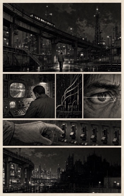
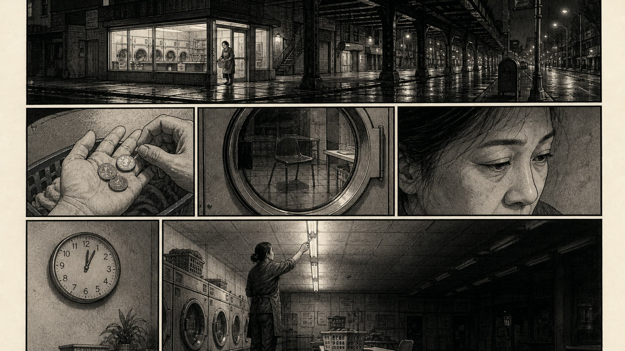
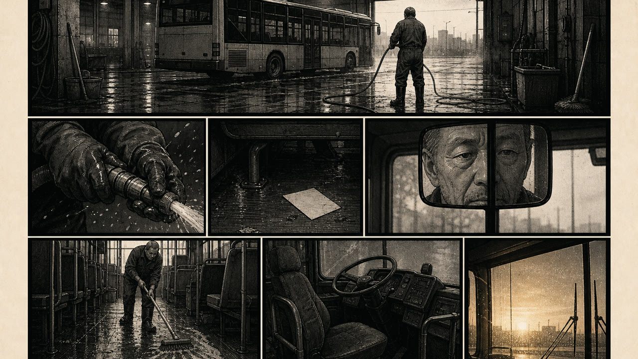
어린이용 「만화」와 갈라서기 위해 다쓰미 요시히로가 세운 이름. 가늘고 단단한 선과 짙은 음영, 영화적인 칸 운용으로 성인의 사회성과 폭력을 다루었다. 이후 만화가 다룰 수 있는 주제의 폭을 결정적으로 넓혔다.
한눈에 판단
시각적 특징
- 가늘고 단단한 묘선
- 강한 명암과 검정 채움
- 영화적인 칸 나누기
- 사실적인 인체와 배경
적합한 용도
- Supporting a heavy subject with the hardness of the line and the quantity of darkness
- Designing cinematic time through a sequence of panels
이 양식 사용하기
짧은 지침을 프로젝트에 적용하거나 구조화된 사양을 AI 도구에 넘길 수 있습니다.
자세한 제작법과 출처제작 규칙, 실제 사례, 비교, 연구, 인용 형식
사전 항목
- 타이포그래피
- Hold back hand lettering and bring the hardness of phototype onto the page.
- 구성
- Swing widely between long shot and close up, and insert silent panels.
- 재료
- Build the gradations of darkness from solid black and crosshatched screening.
- 주의
- A dark drawing style is not what gekiga is. The starting point is what the hardened line was meant to tell.
- 더 읽을거리
- The naming by Tatsumi Yoshihiro in 1957 / The rental book trade as a channel of distribution / The roles of Garo and COM
관련 항목
- Manga Lettering (漫画の描き文字)의미 있는 대비를 위해 편집상 연결된 항목입니다.Gekiga와 Manga Lettering 비교
- Shōjo Manga (少女漫画)같은 계열: 일러스트레이션 스타일.Gekiga와 Shōjo Manga 비교
일러스트레이션 스타일 더 보기
일러스트레이션 스타일에서 공통 인상이 많은 항목을 우선해 골랐습니다.
- Lowbrow (Pop Surrealism) (ローブロウ)공통 인상: Rebellion / Nostalgia.
- Push Pin Style (プッシュピン・スタイル)공통 인상: Nostalgia.
- Powell Peralta Deck Graphics (パウエル・ペラルタのデッキ図像)공통 인상: Rebellion.
이 항목을 인용하기
사전은 링크되기 위해 있다. 글을 쓰는 자리에 맞는 형식을 그대로 가져가면 된다.
- Link
- https://indexstyle.org/ko/styles/gekiga
- Markdown
- [Gekiga — IndexStyle](https://indexstyle.org/ko/styles/gekiga)
- HTML
- <a href="https://indexstyle.org/ko/styles/gekiga">Gekiga — IndexStyle</a>