Gekiga vs Manga Lettering
劇画 / 漫画の描き文字
Gekiga comes from Illustration Styles and Manga Lettering from Lettering. They are reached for with different intent, which is the fastest way to tell them apart.
Gekiga
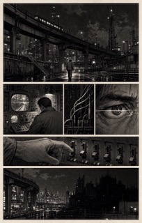
The name Tatsumi Yoshihiro raised in order to separate his work from manga for children. With a thin drawn line, heavy shadow and cinematic panel flow, it treated adult social themes and violence. It decisively widened the range of subjects comics could take on afterwards.
Manga Lettering


%E2%80%99%20by%20Okamoto%20Ippei%2C%20Honolulu%20Museum%20of%20Art.jpg)
In Japanese manga, sound effects and even the feel of silence are drawn as pictures, from a booming don to a hushed shiin. Hand-lettering turns the texture of a sound into line weight and shape, dissolving the border between image and word inside the panel.
| Gekiga | Manga Lettering | |
|---|---|---|
| Era | 1957–1970s | 1930s– |
| Family | Illustration Styles | Lettering |
| Kind | Style | Style |
| Cues | Thin, hard drawn line / Strong light and dark with solid black / Cinematic panel division / Realistic bodies and backgrounds | Sound drawn as shape / Weight matched to texture / Placement crossing panels / Even silence written (shiin) |
| Best used for | Supporting a heavy subject with the hardness of the line and the quantity of darkness · Designing cinematic time through a sequence of panels | Comics and paneled ads where sound must be written inside the picture · Still images given the flow of time without captions or balloons |
| Type | Hold back hand lettering and bring the hardness of phototype onto the page. | Line weight and edge shape carry the hardness of the sound |
| Composition | Swing widely between long shot and close up, and insert silent panels. | Lettering straddling panel borders and figures, following the reading path |
| Material | Build the gradations of darkness from solid black and crosshatched screening. | Written with the same pen as the art, reversed white against solid black |
| Caution | A dark drawing style is not what gekiga is. The starting point is what the hardened line was meant to tell. | Setting sound effects in a ready-made typeface keeps the hardness and speed out of the line, leaving a note floating above the drawing. |