GNOME Clearlooks
GNOME Clearlooks / 2005–2011 / 风格 / 平台界面语言
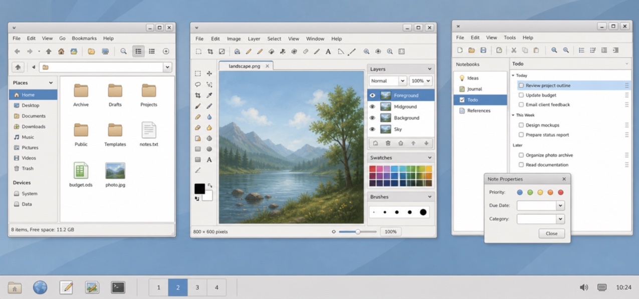
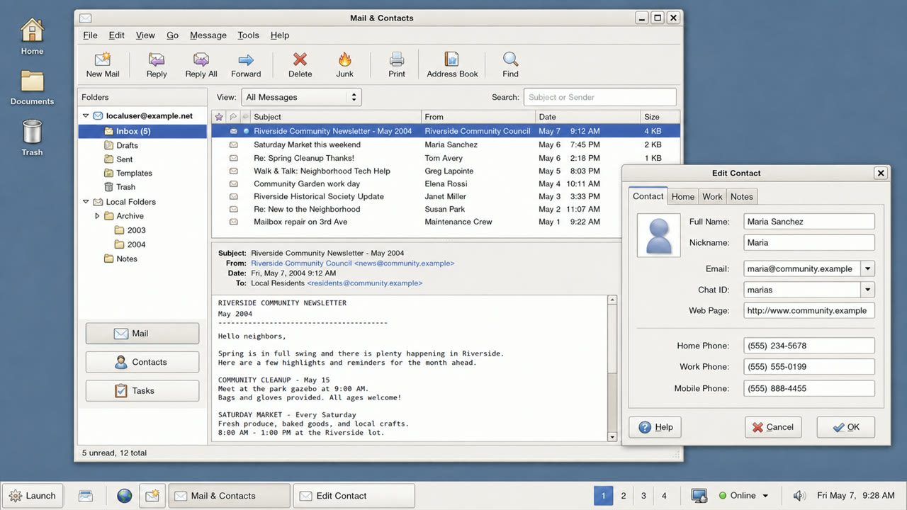
GNOME 2.12 的标准主题,通过浅灰色窗口、蓝色选择框、适度的光泽和清晰的界限,使 GTK 应用变得友好且简单。

快速判断
视觉特征
- 浅灰色表面搭配蓝色选择框
- 仅在按钮顶部有柔和的突出显示
- 带有适度圆角的标签和字段
- 小型的 GNOME 图标以及简洁的两层级结构
适用场景
- Aligning document, file and settings applications into one calm GTK environment
- Recreating a 2000s Linux desktop without loud brand color
使用这一风格
把简短指引带入项目,或将结构化规格交给AI工具。
详细方法与出处制作规则、真实案例、比较、研究与引用格式
辞典词条
- 字体
- Use a small system sans and create hierarchy through label weight rather than added decoration.
- 版面
- Stack menu, toolbar, work area and status bar shallowly, without ornamental regions.
- 材料
- Use one blue selection color over pale gray, a slight top highlight and one fine dark outer edge.
- 注意
- Old GTK widgets alone are not Clearlooks. State and hierarchy must be unified as a simple, friendly default surface.
- 延伸阅读
- GNOME 2.12 Clearlooks / GTK 2 theme engines / GNOME Human Interface Guidelines
相关词条
- Adwaita (アドワイタ)同属平台界面语言。比较GNOME Clearlooks与Adwaita
- KDE Oxygen (KDE Oxygen)同属平台界面语言。比较GNOME Clearlooks与KDE Oxygen
继续浏览平台界面语言
从平台界面语言中按共同感受优先推荐以下词条。
- One UI (ワンUI)共同感受:Calm / Intimacy / Trust。
- GOV.UK Design System (GOV.UK デザインシステム)共同感受:Trust / Calm。
- Breeze (ブリーズ)共同感受:Calm / Trust。
引用此条目
这部辞典就是用来被链接的。请取用适合你写作场合的那一种形式。
- Link
- https://indexstyle.org/zh/styles/gnome-clearlooks
- Markdown
- [GNOME Clearlooks — IndexStyle](https://indexstyle.org/zh/styles/gnome-clearlooks)
- HTML
- <a href="https://indexstyle.org/zh/styles/gnome-clearlooks">GNOME Clearlooks — IndexStyle</a>