GNOME Clearlooks
GNOME Clearlooks / 2005–2011 / 양식 / 플랫폼 화면 언어
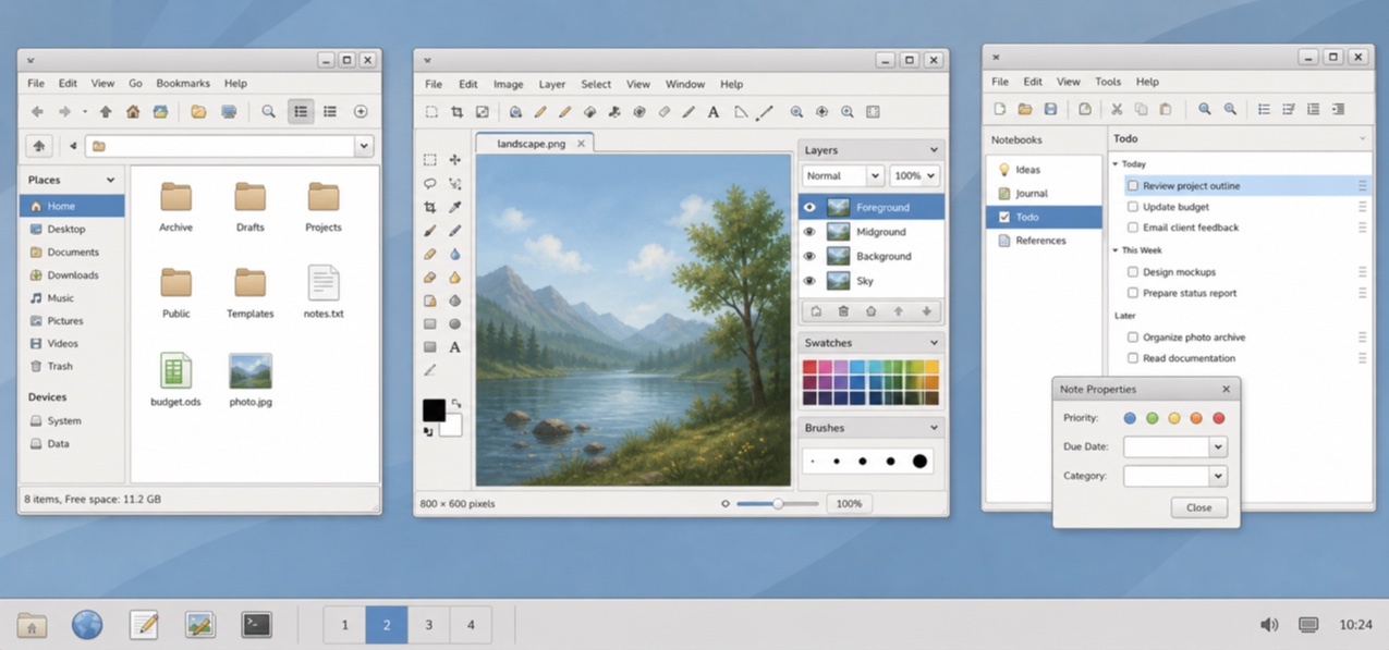
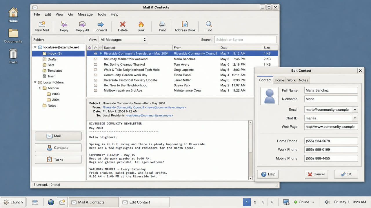
옅은 회색 창, 파란색 선택, 절제된 광택 및 단단한 경계를 통해 GNOME 2.12의 기본 테마를 GTK 애플리케이션을 친근하고 간단하게 만듭니다.

한눈에 판단
시각적 특징
- 파란색 선택 막이 있는 밝은 회색 표면
- 버튼 상단에만 나타나는 조용한 강조 표시
- 절제된 둥근 모양의 탭 및 필드
- 작은 GNOME 아이콘 및 간결한 두 레벨 계층 구조
적합한 용도
- Aligning document, file and settings applications into one calm GTK environment
- Recreating a 2000s Linux desktop without loud brand color
이 양식 사용하기
짧은 지침을 프로젝트에 적용하거나 구조화된 사양을 AI 도구에 넘길 수 있습니다.
자세한 제작법과 출처제작 규칙, 실제 사례, 비교, 연구, 인용 형식
사전 항목
- 타이포그래피
- Use a small system sans and create hierarchy through label weight rather than added decoration.
- 구성
- Stack menu, toolbar, work area and status bar shallowly, without ornamental regions.
- 재료
- Use one blue selection color over pale gray, a slight top highlight and one fine dark outer edge.
- 주의
- Old GTK widgets alone are not Clearlooks. State and hierarchy must be unified as a simple, friendly default surface.
- 더 읽을거리
- GNOME 2.12 Clearlooks / GTK 2 theme engines / GNOME Human Interface Guidelines
관련 항목
- Adwaita (アドワイタ)같은 계열: 플랫폼 화면 언어.GNOME Clearlooks와 Adwaita 비교
- KDE Oxygen (KDE Oxygen)같은 계열: 플랫폼 화면 언어.GNOME Clearlooks와 KDE Oxygen 비교
플랫폼 화면 언어 더 보기
플랫폼 화면 언어에서 공통 인상이 많은 항목을 우선해 골랐습니다.
- One UI (ワンUI)공통 인상: Calm / Intimacy / Trust.
- GOV.UK Design System (GOV.UK デザインシステム)공통 인상: Trust / Calm.
- Breeze (ブリーズ)공통 인상: Calm / Trust.
이 항목을 인용하기
사전은 링크되기 위해 있다. 글을 쓰는 자리에 맞는 형식을 그대로 가져가면 된다.
- Link
- https://indexstyle.org/ko/styles/gnome-clearlooks
- Markdown
- [GNOME Clearlooks — IndexStyle](https://indexstyle.org/ko/styles/gnome-clearlooks)
- HTML
- <a href="https://indexstyle.org/ko/styles/gnome-clearlooks">GNOME Clearlooks — IndexStyle</a>