GNOME Clearlooks
GNOME Clearlooks / 2005–2011 / Style / Langages d'écran
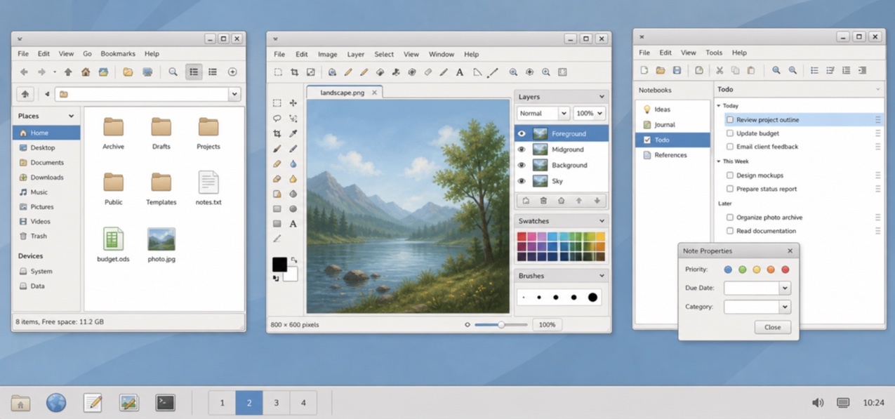
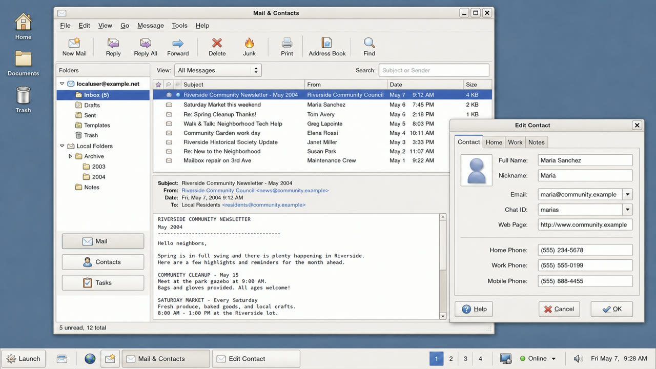
Le thème standard de GNOME 2.12 a rendu les applications GTK aimables et simples par des fenêtres gris pâle, une sélection bleue, une brillance discrète et des limites fermes.

En un coup d’œil
Signes visuels
- Surfaces gris pâle et barres de sélection bleues
- Reflet calme limité au sommet des boutons
- Onglets et champs aux arrondis retenus
- Petites icônes GNOME et hiérarchie concise à deux niveaux
Usages idéaux
- Aligning document, file and settings applications into one calm GTK environment
- Recreating a 2000s Linux desktop without loud brand color
Utiliser ce style
Appliquez le brief concis au projet ou transmettez la spécification structurée à un outil d’IA.
Guide détaillé et sourcesRègles de production, œuvres de référence, comparaisons, recherche et citations
Entrée du dictionnaire
- Typographie
- Use a small system sans and create hierarchy through label weight rather than added decoration.
- Composition
- Stack menu, toolbar, work area and status bar shallowly, without ornamental regions.
- Matière
- Use one blue selection color over pale gray, a slight top highlight and one fine dark outer edge.
- Précaution
- Old GTK widgets alone are not Clearlooks. State and hierarchy must be unified as a simple, friendly default surface.
- Pour approfondir
- GNOME 2.12 Clearlooks / GTK 2 theme engines / GNOME Human Interface Guidelines
Entrées liées
- Adwaita (アドワイタ)Même famille : Langages d'écran.Comparer GNOME Clearlooks et Adwaita
- KDE Oxygen (KDE Oxygen)Même famille : Langages d'écran.Comparer GNOME Clearlooks et KDE Oxygen
Plus de Langages d'écran
Poursuivez avec des styles de Langages d'écran, classés par effets communs.
- One UI (ワンUI)Effets partagés : Calm / Intimacy / Trust.
- GOV.UK Design System (GOV.UK デザインシステム)Effets partagés : Trust / Calm.
- Breeze (ブリーズ)Effets partagés : Calm / Trust.
Voir toutes les entrées Langages d'écran
Citer cette entrée
Le dictionnaire est fait pour être lié. Prenez la forme qui convient là où vous écrivez.
- Link
- https://indexstyle.org/fr/styles/gnome-clearlooks
- Markdown
- [GNOME Clearlooks — IndexStyle](https://indexstyle.org/fr/styles/gnome-clearlooks)
- HTML
- <a href="https://indexstyle.org/fr/styles/gnome-clearlooks">GNOME Clearlooks — IndexStyle</a>