GNOME Clearlooks vs KDE Oxygen
GNOME Clearlooks / KDE Oxygen
Both sit in Platform Screen Languages, so the question is not what they belong to but how they behave. They are reached for with some of the same intent, which is where they get confused.
GNOME Clearlooks

GNOME 2.12's standard theme made GTK applications friendly and simple through pale-gray windows, blue selection, restrained gloss and firm boundaries.
KDE Oxygen
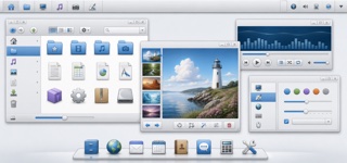
Oxygen unified KDE 4 applications, workspace and icons through clear blue, soft gray, fine outlines and icons that seem to rest on a shared shelf, bringing lightness to an information-dense desktop.
| GNOME Clearlooks | KDE Oxygen | |
|---|---|---|
| Era | 2005–2011 | 2006–2014 |
| Family | Platform Screen Languages | Platform Screen Languages |
| Kind | Style | Style |
| Cues | Pale-gray surfaces with blue selection bars / A quiet highlight only along button tops / Tabs and fields with restrained rounding / Small GNOME icons and a concise two-level hierarchy | Pale-gray chrome with blue selection and restrained gloss / Dimensional icons with one-pixel edges and a lower shelf shadow / One upper-diagonal light source across materials / Toolbars and docks grouped by fine separators |
| Best used for | Aligning document, file and settings applications into one calm GTK environment · Recreating a 2000s Linux desktop without loud brand color | Giving many desktop applications one icon and chrome language · Recreating the material character of late-2000s open-source desktops |
| Type | Use a small system sans and create hierarchy through label weight rather than added decoration. | Keep sans labels small and clear, letting distinct icon silhouettes lead recognition. |
| Composition | Stack menu, toolbar, work area and status bar shallowly, without ornamental regions. | Stack menu, toolbar, work surface and status areas with fine boundaries; color only priority actions blue. |
| Material | Use one blue selection color over pale gray, a slight top highlight and one fine dark outer edge. | Build from pale gray and blue, applying one-pixel edges, a common light source and a soft lower shadow to every icon. |
| Caution | Old GTK widgets alone are not Clearlooks. State and hierarchy must be unified as a simple, friendly default surface. | Glossy blue icons alone do not make Oxygen. Synchronize lighting, edge treatment and shadow height across the entire set. |