GNOME Clearlooks
GNOME Clearlooks / 2005–2011 / Estilo / Lenguajes de pantalla
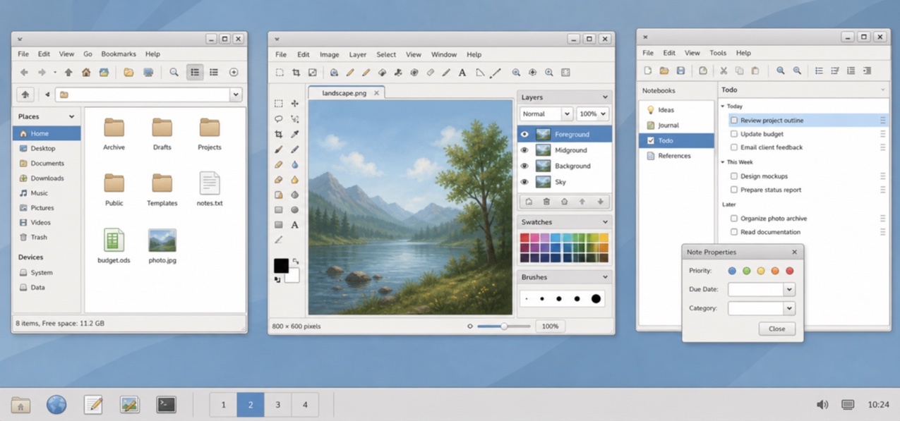
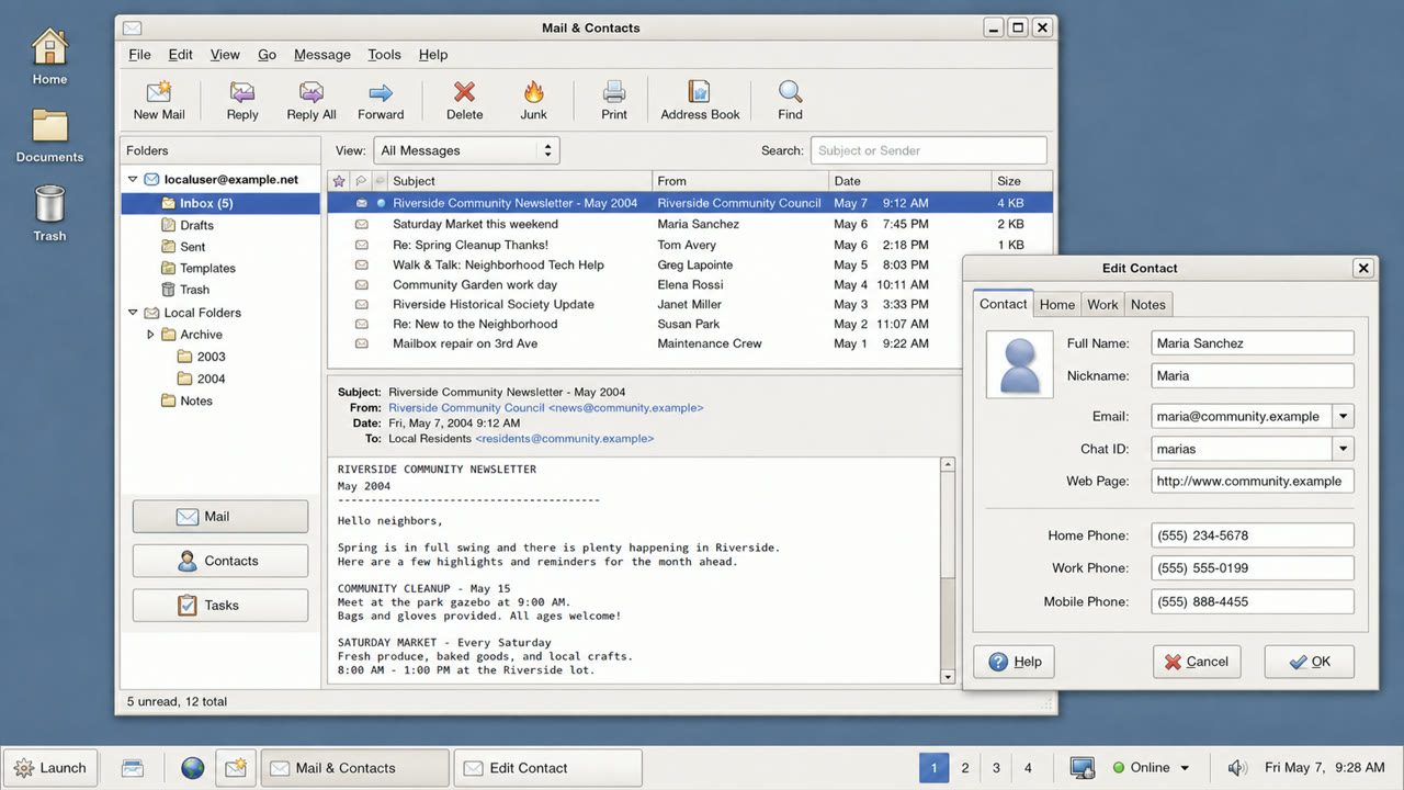
El tema estándar de GNOME 2.12 hizo las aplicaciones GTK amables y sencillas mediante ventanas gris pálido, selección azul, brillo contenido y límites firmes.

De un vistazo
Rasgos visuales
- Superficies gris pálido con barras de selección azules
- Un reflejo discreto solo en la parte superior de los botones
- Pestañas y campos con redondeo contenido
- Iconos GNOME pequeños y jerarquía concisa de dos niveles
Usos idóneos
- Aligning document, file and settings applications into one calm GTK environment
- Recreating a 2000s Linux desktop without loud brand color
Usar este estilo
Lleva el resumen al proyecto o entrega la especificación estructurada a una herramienta de IA.
Guía detallada y fuentesReglas de producción, obras de referencia, comparaciones, investigación y citas
Entrada del diccionario
- Tipografía
- Use a small system sans and create hierarchy through label weight rather than added decoration.
- Composición
- Stack menu, toolbar, work area and status bar shallowly, without ornamental regions.
- Material
- Use one blue selection color over pale gray, a slight top highlight and one fine dark outer edge.
- Precaución
- Old GTK widgets alone are not Clearlooks. State and hierarchy must be unified as a simple, friendly default surface.
- Para profundizar
- GNOME 2.12 Clearlooks / GTK 2 theme engines / GNOME Human Interface Guidelines
Entradas relacionadas
- Adwaita (アドワイタ)Misma familia: Lenguajes de pantalla.Comparar GNOME Clearlooks y Adwaita
- KDE Oxygen (KDE Oxygen)Misma familia: Lenguajes de pantalla.Comparar GNOME Clearlooks y KDE Oxygen
Más de Lenguajes de pantalla
Continúa con estilos de Lenguajes de pantalla, priorizados por sus efectos compartidos.
- One UI (ワンUI)Efectos compartidos: Calm / Intimacy / Trust.
- GOV.UK Design System (GOV.UK デザインシステム)Efectos compartidos: Trust / Calm.
- Breeze (ブリーズ)Efectos compartidos: Calm / Trust.
Ver todas las entradas de Lenguajes de pantalla
Citar esta entrada
El diccionario existe para que se enlace. Toma la forma que encaje donde estés escribiendo.
- Link
- https://indexstyle.org/es/styles/gnome-clearlooks
- Markdown
- [GNOME Clearlooks — IndexStyle](https://indexstyle.org/es/styles/gnome-clearlooks)
- HTML
- <a href="https://indexstyle.org/es/styles/gnome-clearlooks">GNOME Clearlooks — IndexStyle</a>