GNOME Clearlooks
GNOME Clearlooks / 2005–2011 / Stil / Bildschirmsprachen
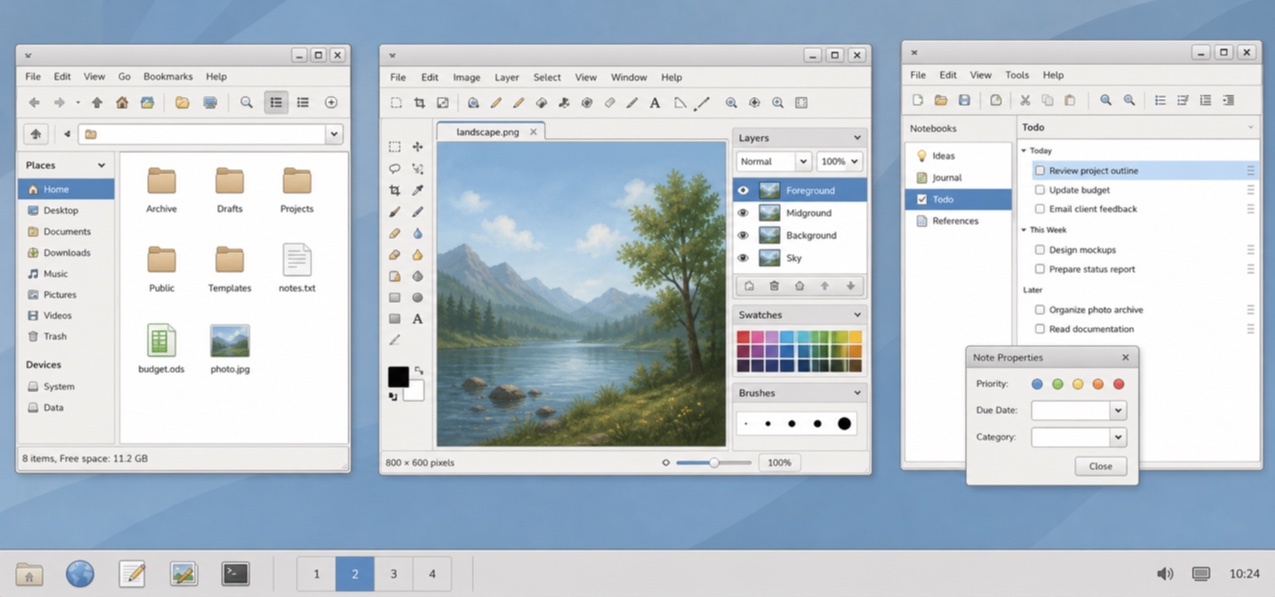
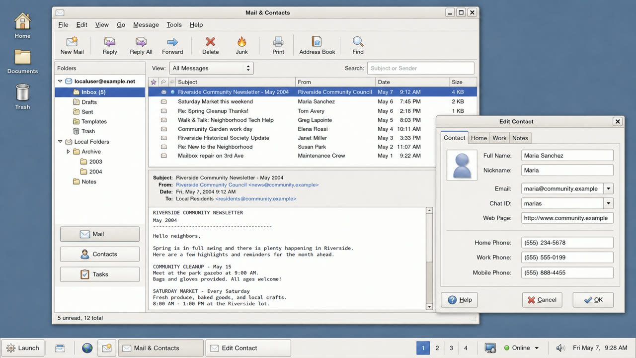
Das Standardthema von GNOME 2.12 machte GTK-Anwendungen durch hellgraue Fenster, blaue Auswahl, zurückhaltenden Glanz und feste Grenzen freundlich und einfach.

Auf einen Blick
Visuelle Merkmale
- Hellgraue Flächen mit blauen Auswahlbalken
- Ruhiges Glanzlicht nur an Tastenoberkanten
- Tabs und Felder mit geringer Rundung
- Kleine GNOME-Symbole und knappe zweistufige Hierarchie
Geeignet für
- Aligning document, file and settings applications into one calm GTK environment
- Recreating a 2000s Linux desktop without loud brand color
Diesen Stil verwenden
Nutze das Kurzbriefing im Projekt oder übergib die strukturierte Spezifikation an ein KI-Werkzeug.
Ausführliche Anleitung und QuellenProduktionsregeln, Referenzwerke, Vergleiche, Forschung und Zitate
Wörterbucheintrag
- Typografie
- Use a small system sans and create hierarchy through label weight rather than added decoration.
- Komposition
- Stack menu, toolbar, work area and status bar shallowly, without ornamental regions.
- Material
- Use one blue selection color over pale gray, a slight top highlight and one fine dark outer edge.
- Zu vermeiden
- Old GTK widgets alone are not Clearlooks. State and hierarchy must be unified as a simple, friendly default surface.
- Zum Weiterlesen
- GNOME 2.12 Clearlooks / GTK 2 theme engines / GNOME Human Interface Guidelines
Verwandte Einträge
- Adwaita (アドワイタ)Gleiche Familie: Bildschirmsprachen.GNOME Clearlooks und Adwaita vergleichen
- KDE Oxygen (KDE Oxygen)Gleiche Familie: Bildschirmsprachen.GNOME Clearlooks und KDE Oxygen vergleichen
Mehr aus Bildschirmsprachen
Weitere Stile aus Bildschirmsprachen, nach gemeinsamen Wirkungen geordnet.
- One UI (ワンUI)Gemeinsame Wirkungen: Calm / Intimacy / Trust.
- GOV.UK Design System (GOV.UK デザインシステム)Gemeinsame Wirkungen: Trust / Calm.
- Breeze (ブリーズ)Gemeinsame Wirkungen: Calm / Trust.
Alle Einträge aus Bildschirmsprachen ansehen
Diesen Eintrag zitieren
Das Wörterbuch ist zum Verlinken gedacht. Nehmen Sie die Form, die dorthin passt, wo Sie schreiben.
- Link
- https://indexstyle.org/de/styles/gnome-clearlooks
- Markdown
- [GNOME Clearlooks — IndexStyle](https://indexstyle.org/de/styles/gnome-clearlooks)
- HTML
- <a href="https://indexstyle.org/de/styles/gnome-clearlooks">GNOME Clearlooks — IndexStyle</a>